Immersive Arts Final Project

“Overwhelmed” is a virtual reality experience that explores the tough journey of people dealing with depression and anxiety. It shares their stories in a way that helps others understand and empathize with their struggles. The main components are three scenes: the first scene “Asphyxia” is about the pressure from school and life. The second scene “Vent” is about drug and alcohol addiction. The third scene is about finding a sense of relief in nature.

Through this project, I hope that more people will understand how it feels to be struggling with depression and anxiety disorder. Through the experience of different scenarios, accompanied by the presence of various metaphorical objects and sounds, the user can feel a sense of alienation from the perspective of the depressed and realize that fighting depression is a struggle. Finally, I would like to deliver the message that the essence of fighting against depression is to accept the imperfections and be reconciled with ourselves.

Here was the recorded video of my final project:

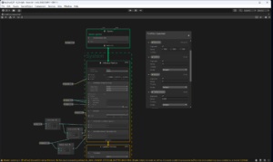
Since I chose to do an individual project, I was in charge of all the elements in the project. For the work process, I built scene one, two and three in order. For this project, since I was really struggled at VR and its controllers settings(I spent a lot of time working on this but later I still failed at completing the settings), I focused more on VFX and Visual Effects in unity and I managed to challenge myself to learn new things. Also, I focused more on the movement of the camera.

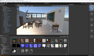
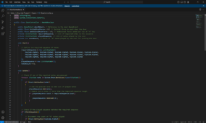
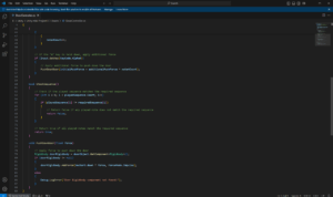
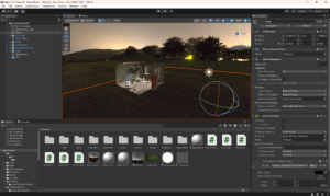
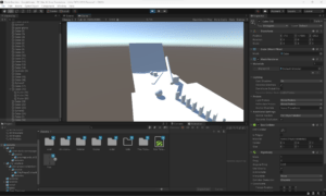
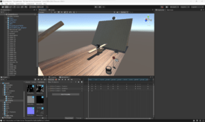
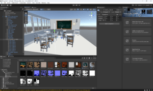
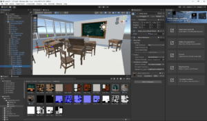
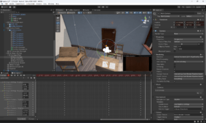
Here were some screenshots from scene 1 “Asphyxia”. This scene was about numerous paper falling down in a classroom environment.  My original idea of “drowing in paper” was too hard to realize and required too many complex codes, so I changed my strategy in the working process. The falling paper effect was made with VFX and I tested different settings to achieve a better result. In this scene, my intention was to demonstrate the pressure from peers, tests, scores and all the stressful components of school life that might affect a person’s emotions.
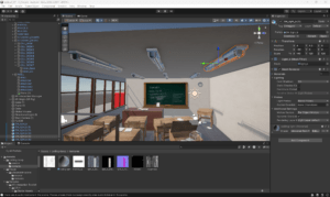
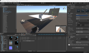
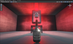
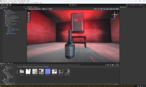
For the scene 2 “Vent”, I focused more on the lightning. I intentionally put a red light in a relatively dark environment to create a sense of depression. There were mainly two objects in the scene, which were a wine bottle and a medicine bottle. The former referred to a metaphor for alcohol addiction and the latter meant the overdependence and fear of drugs. These two phenomena were very common among people with depression and anxiety because they were not able to find a healthy way to face the emotions, so I thought this scene was more abstract and enlightening.

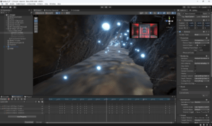
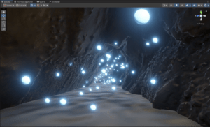
For scene 3 , I was inspired by the Waitomo Glowworm Cave in New Zealand because the natural environment there was incredibly beautiful and everyone who had visited there would feel a sense of relief. Hence, I learned how to make glowing firefly scenes by using Visual Effects in Unity and it worked pretty well. I really liked the glowing and floating effects, which made the viewers feel a sense of peacefulness and enjoy the beauty in nature.
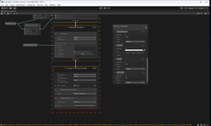
Then I designed the movement of the camera.
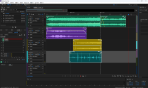
The last part that I spent much time was the audio. Personally, I was really into music and audio, so I hoped that audio could help the viewers better immerse in the scenes. I firstly used Suno AI to generate two ambient music: the first one was darker and heavier, the second one was more relieved. The second track was about some chatting voice in the classroom. I added some reverb and delay to create a sense of alienation. The third track was about effervescent tablet, the fourth track was about some clicking sound of wine bottles. I chose these two sounds to make it coherent with the objects in scene2 and they served as metaphors for drug addiction and alcohol addiction.
I did asked Shengyang some questions in Unity, but mostly it was only about logic rather than specific codes or methods, so I made all the things on my own.

If given more time, there were several parts that I would like to develop further. Firstly, I would spend more time to figure out how the VR controller interactions work so that I could make interactions in the second scene. My plan was to let the users grab the wine bottle and then throw it to the wall. If the collision time reached 5 times, then the viewer could enter the next scene. I would also add more objects like posters and signs in the second scene. Nextly, the lightning in the first scene needed some improvements. It would be better if I made the light darker in the first scene so that the sense of depression and anxiety would be stronger. Lastly, the transitions between different scenes should be smoother. I would write some C# scripts to transport the user from the ending position of the last scene to the starting position of the next scene.

Despite some technical issues, I think that my project fitted the topic of depression and anxiety. For artwork, I think its value was not only about beauty and aesthetics but also about its social implication and significance.
Unity II mini project

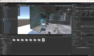
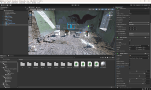
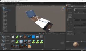
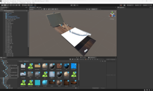
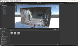
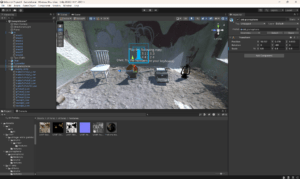
For the Unity II Mini Project, I want to experiment with animation, collider, trigger, and prefab in a scene similar to an escape room. The room has four objects: a chair, an old gramophone, a typewriter, and an oil lamp. These objects are correspondingly connected with four notes C, D, E, and F. The only way the user can escape the room is to follow the instructions on the wall: first, they need to hit the notes as the same sequence notes on the wall. Then they can keep hitting the note “4” to have more force to push the door down and escape the room.

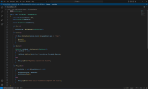
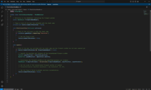
For the design process, I first figured out the idea of connecting an object to a corresponding note. Then I was thinking about using trigger and collider to make interactions between the ceiling and the objects. After this interaction, the user can push the door and enter the next scene. However, due to the limited time, a more feasible approach is to narrow all the interactions inside this escape room scene, and the “next room/scene” idea is changed into an ending animation or scene. 

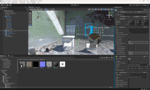
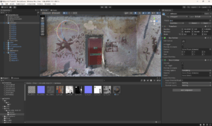
Here is the brief production process accompanied by some screenshots:

First, I searched for “Abandoned room/building” models and downloaded one with good quality.

Then I searched for models of a chair, a gramophone, a typewriter and an oil lamp. I also added the words instructions.

Next step is to combine the notes with the objects and add more details.

Here is the video of my project:

Prehistoric human’ visions of time and space

In the article, Edward Wachtel argues that even though prehistoric human creations have been generally presented as still images, other conditions, including tools and techniques, irregular cave surfaces, and lamps, make cinematic images (precursors to film and television).  

There are different ways to deal with time and motion in painting. One main approach is to exclude time completely from the image, which is called linear perspective. Another significant way is to change the light, thus letting the time enter into vision and form changes in colors and outlines. This is also related to our visual experience because it always includes the time it takes to scan, rotate, and move around it.

For the similarity between cave painting and cinema, the first thing I noticed is that they are both depicted in dark surroundings, and they both require light sources to be seen by viewers. Another main similarity is that time and space are both inextricably connected. The integration of time into the viewing experience helps form a cinematic experience.
However, there are still many differences between cave painting and cinema. Even though they are both set in a fixed space, cave painting are often painted on irregular surfaces, thus adding more changes in one image as the viewers move their perspectives and focuse, not to mention the effect of light and shadow in the cave. What’s more, viewers are the ones who move and the cave painting is correspondingly “moving”. But for cinema, the viewers just keep sitting on the chair and the movements are only demonstrated on the screen. From my understanding, in this sense, the viewing experience of cave painting is actually more flexible than the viewing experience of cinema.

The second main difference is that superimpostition is another common feature in cave painting while transitions of frames happens more in cinema. Cave painters prefer to do superimposition to achieve the effect that some objects appear and then disappear. What’s special about superimposition is that time and space also join the conversation: time refers to different art creatures co-exist and across the border of time; space means that creating things in a fixed space and keep creating layers on layers add more sense of depth. For cinema, time and space are all connected with the transitions of frames.

I would like to put the last comparison at the end of my post, because I’m still not sure whether it should belong to the catecory of similarity or difference. In the article, it mentions that “the superimposed spaghetti engravings help to create a visual effect that is similar to the hunter’s experience… prehistoric people were concerned with these creatures as sources of food, clothing and, sometimes, danger”. It seems that the contents and themes of cave painting are closely related to the hunting culture, which is quite different from modern life. But I’m also reminded of the sentence “Art imitates life”, and the contents of cinema also comes from life and imaginations, so it might also be a similarity.
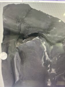
Chain Reaction

Here is the ultimate video of my chain reaction:

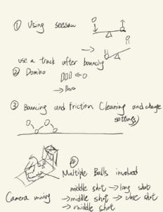
Here is the sketch of my designing process:

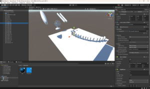
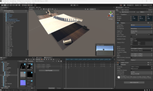
In short, I want to include a seesaw, a dominom. Sliding, bouncing and friction will all be considered. I also want to focus more on the movement of the camera so that the viewers can feel immersed in this video.

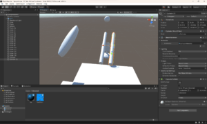
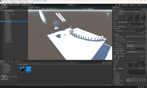
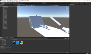
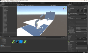
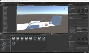
Here are the producing process:

At first, what came to my mind was creating two sticks that looks like chopsticks. And then the ball dropped on the “chopsticks” so that it would go to the correct path to hit the dominoes.

Later, I found that dropping the ball from the sky without any force or physical designs was too weird, so I made a jumping platform and put the ball on it.

Also, I used cubes with different shapes to create a seesaw. The expected effect was the second ball would jump high when the first ball reached the seesaw. Then it will land on the “chopsticks”.

While testing, I realized that if I had designed the movement trajectory very precisely, using only one cylinder was enough. So I kept trying and deleted the other cylinder. 

At last, it was time to add textures and camera movements!

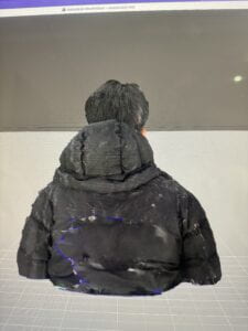
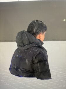
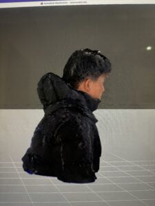
Workflow for Photogrammetry II

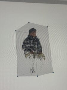
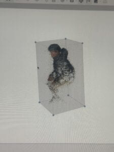
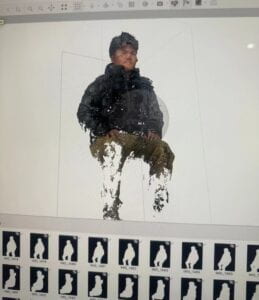
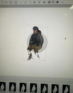
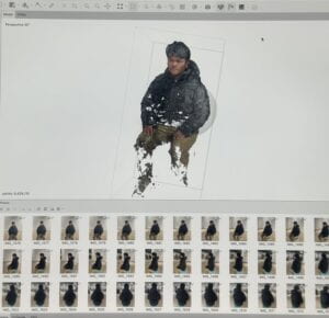
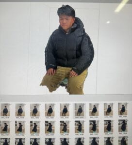
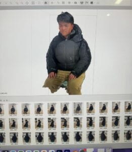
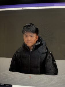
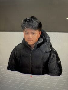
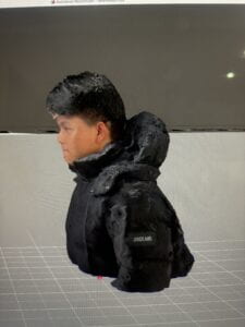
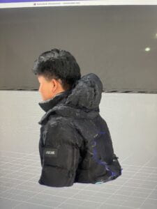
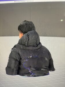
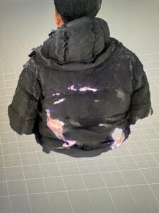
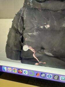
Here is my workflow for Photogrammetry II:
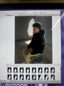
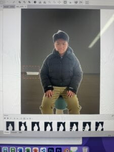
1. Masking with Metashape:

2. Aligning photos with point cloud and removing useless points

3. Building dense cloud

4. Building mesh and texture

5.Exporting the model and using meshmixer to fix some problems( I found the “pinch”, “flatten” and “move” function really useful when dealing with holes.)

After doing this project, I found out three tricks for the process. The first thing is that one should be careful and delete all the useless parts when doing masking. The second  thing is that taking more pictures won’t necessarily improve the quality of the model but the essence is that the distance of shooting should be always the same. The third thing is that the GPU of school’s computers are not activated, so changing the preferences settings in Metashape will definitely improve the speed of building dense cloud.( I wonder if speeding up the speed will affect the quality of the model?)