A. Concept & Story
The story in the project was that a boy was suffered from toothache due to procrastination. He was also very anxious, but at last he made the choice to go to see the dentist and face the problem directly. The main concept is that stop procrastinating so as to eliminate anxiety. There were two main inspirations of the project: one was that Rebecca had some bad memories of going to the dental clinic. Another was that Rebecca and I were very interested in the way Sindha Agha shot the short film “Birth Control Your Own Adventure” and we thought that the story was proper for this kind of style. Firstly, we set the topic and fiming style. Then we figured out the specific plots and how to shoot them while drawing the storyboard. The reason why I wanted to explore this topic was to stress the common problem of procrastination and anxiety among young people nowadays. Also, I regarded it as a golden chance to practise stop motion animation and advertising style shooting.
B. Creation Process & Execution
Here is the storyboard:
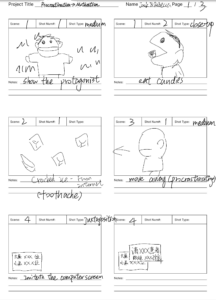
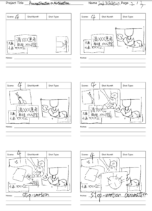
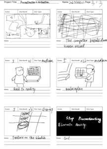
The processing of making storyboard let us have a clear understanding of the design and sequence of the plots. And the interesting point of storyboard was that it was mutable. In other words, it could be revised or improved based on better ideas, feedbacks or critiques.
We chose to film at school because most scenes were indoor shooting and closed spaces were easy to find at school. (But we didn’t show any elements related to NYUSH) What’s more, there were lawns within the campus which fitted the background scene for the beginning. The camera we used was a Canon 7D. For indoor shooting, we mainly used the flash in the cell phone while natural lights and color correction in post-production were used for outdoor shooting. The materials we bought were a hand puppet, an apple and a bottle of cola. One challenge we faced was the focus and stablization of the camera. Our solution was to keep shooting clips and choose the one with the best quality. We also put the hand puppet on the floor and shot it from the view above to avoid trembling of the object. Another one was the stop motion animation. Rebecca and I looked for tutorials online and then follow the steps to overcome this difficulty. Since we divided the video into several parts, we often edited one part once we finished shooting it. The basic tasks were matching the voice-over and sounds with the image, adding subtitles, changing the tracks and positions of the clips. Overall, we did it smoothly.
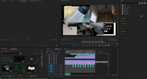
Here were two editing techniques/effects I learned:
1. Juxtaposition of multiple clips
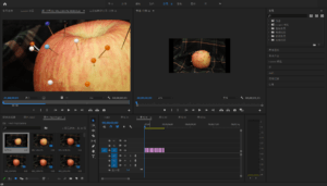
2.Stop motion animation
C. Collaboration
My own role included recording the voice over, making adjustments on the audios, editing the stop motion animation and shooting the clips. Rebecca did most of the editing work and I thought it was successful and high-quality. She was kind and easy to work with so that we could always communicate with each other easily and reach an agreement on the best solution if we had different ideas. I also learned a lot of editing skills from her, such as pop in effect. In short, the collaborative process and exchange with Rebecca allowed us to figure out the best way to demonstrate a scene. Besides, it formed an open atmosphere for us to communicate, which was crucial in teamwork.
D. Aesthetics & Results
I think there were two successful parts of metaphor. The first part was the stop motion animation in which the scenes of an apple hurt by needles, a flat cola can and a pinched paper ball could show the pain when the boy was suffered from the toothache. The second part was the usage of clips like drills, hammers and electric soldering. They perfectly demonstrated the anxiety and fear of the boy without showing the real scenes in the clinic. The effects of the sounds such as distortion also made contributions to the aesthetics. These sounds often appeared at the same time as the picture, which allowed the audience to better experience the boy’s feeling.