Jack—Trace of time
Concept
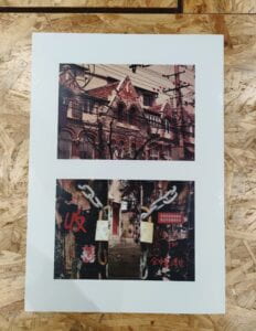
My concept was about the trace of time and I chose objects or scenes that could witness or reflect the elapse of time. When I first came up with the topic, I did a few reseaches on the internet to search for places in Shanghai that matched the idea. Then I noticed the “Ti Lan Qiao” area where the Jewish people once lived when they were under the threat of Nazi German. I found the architecture of that area combined elements of the West and East and had been built for decades. The photo in the upper part of the diptych is one of the representing buildings. Broken bricks and old windows of the building witnessed the changing times. What made the picture more interesting was that dense wires and tree branches blocked part of the buiding, which made the whole photo more layered. It could also be understood as a trend that the new things covered old ones. The idea that old buildings were visible but inaccessible to us was also demonstrated in the collage below. I split a locked door to create the feeling of peeking through the cracks in an old house. In the middle was an image of an old house that was not clear whether it was still inhabited. The two pictures were not only structurally consistent, but also conceptually.
Process
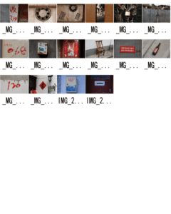
For staging and photographing part I, I firstly used high aperture, high shutter speed and middle ISO because it was in the afternoon and I needed the whole background to be clearly included in the photo. Other photo settings were transformed according to the transformation of light and the size of the object. When I uploaded these photos to the computer, I noticed that the pictures were all featured with cold color so that they didn’t match with the collage’s warm color. To solve this problem, I chose “Photo filter”(warming filter and red) to adjust the temperature of the photo. Then I used”Selective color” to subtly change the red,yellow and blue colors to create a nostalgic atmosphere.
In collage, I split the photo of a locked door at first and put another photo in the middle. The first problem I had was that the transition of middle and the sides were not natural since there were clear edge. Hence, I added layer masks to the two sides and used gradient tool to make the transition look better. After that, I used quick selection tool to move the old objects into the collage. However, I found that some objects didn‘t match the overall picture. So I made adjustments to the layer style, such as adding inner shadow, inner glow, or drop shadow. I also adjusted the item’s brightness, contrast, color threshold, etc. For objects like milk box and wine bottle that required leaning, perspective tool was my ideal solution. After continuous adjustment, the overall sense of the picture was enhanced.
Conclusion
I think my artifact showed what I wanted to express: many old buildings and objects keep vanishing in our sights and we should cherish and try our best to protect them because they have great value in witnessing the changes of history and the development of the city. Still, I thought that there were parts that needed improvement. For example, the split of the lock could be more natural because this cutting wouldn’t happen in real life. What’s more, the red words and picture on the door could also lean a little bit. The blurring of the two doors could also be a new attempt.
Image of Diptych&Contact sheet


