Photo Diptych Project Documentation
A. Your name, Name of the Project
Name: Jim (Jinnuo) Liu
Name of the Project: Surrealism: Things of Old
B. Concept
The concept of my project is to combine different obsolete-styled things to remind us of the charm of them, as well as giving new life to these obsolete things by combining them to show a kind of surrealistic feeling. The two photoes will be the two different aspects of the theme, but in a totally different style and layout. However, most of the elements from the second photo will be extracted from the first photo.
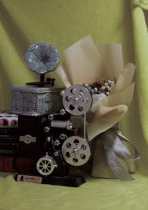
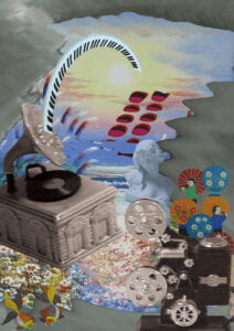
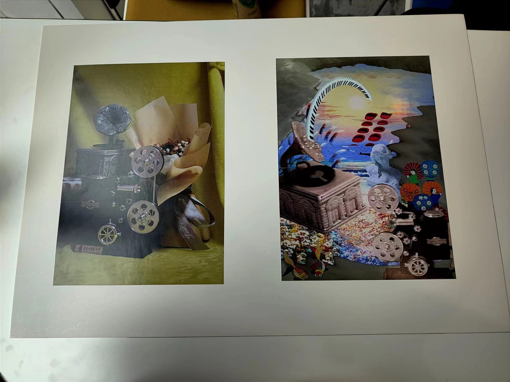
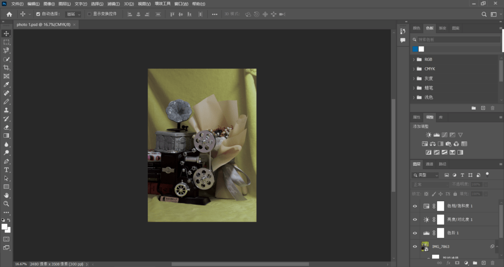
In my first photo that was shot originally by the camera, I combined different old-styled things together in a artistic way (at least I think it is): a gramophone, an old phone, a flower wrapped in old-styled paper, an obsolete camera. I used an old yellow curtain to wrap all the things as the background. Modified yellowish, this would express the charm of old things in a realistic and nostalgic way. On the contrary, for the second collaged picture, I extracted elements from the first photo and rearranged them together with other additional elements to express the charm of old things in a surrealistic and fancy way to bring new life to them. The two things have a sharp contract with each other, expressing my theme in a two different perspective, but are respondent to each other and have much similarities because they use the same elements.
C. Process
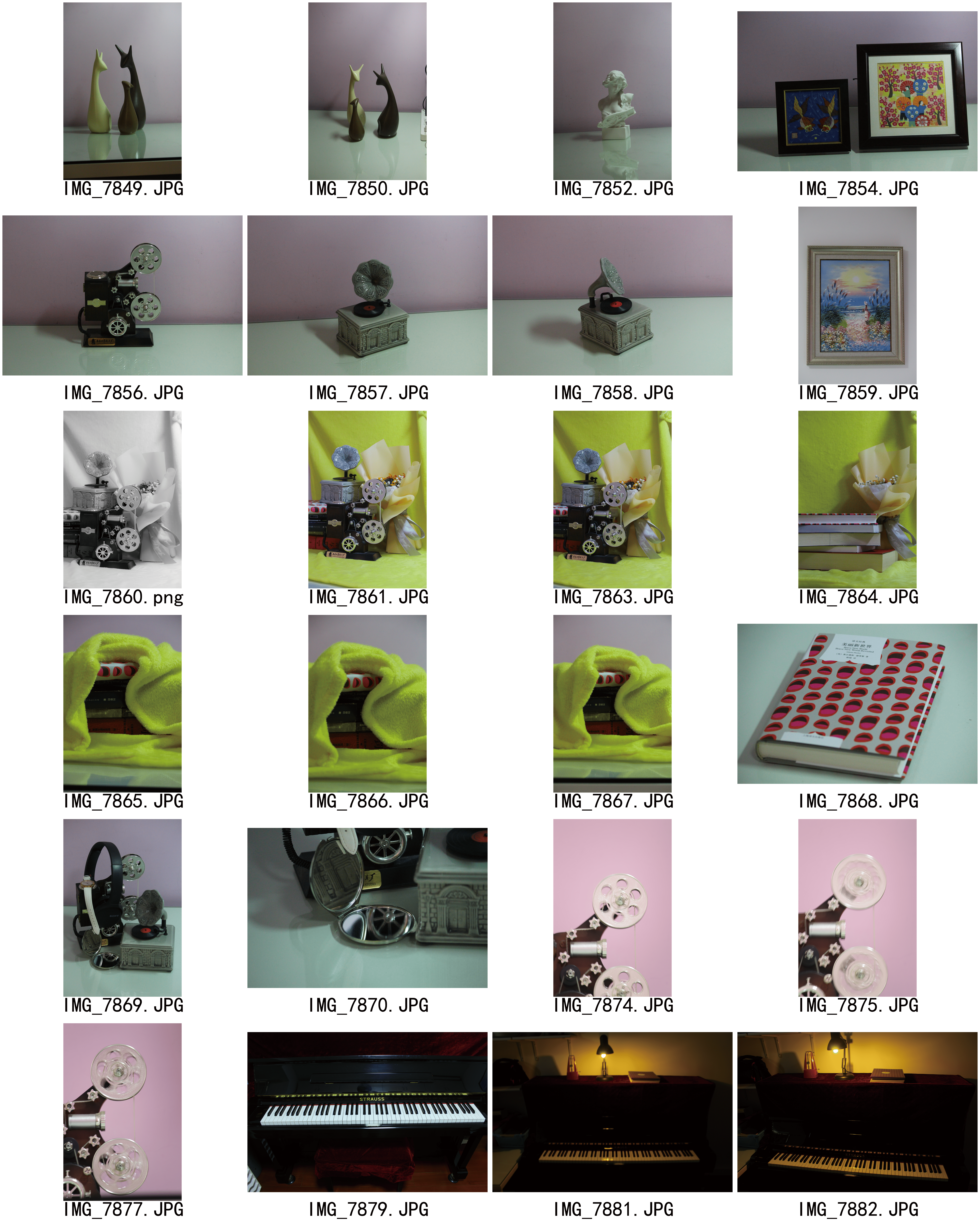
(1) For my part I photographing, I tried to collect all the old-styled things at home onto a table. I found the gramophone model, the old camera model, some old-styled flower bunches and an old book. Then I tried different arrangements of these objects and tried to shoot them. Finally, I found a relatively artistic way of arrangement and took some shoot. I placed the book beneath the gramophone, because the book cover’s fancifulness and the flower-like gramophone can be seen together, which is visually synonymous with the flower on the right. Also, I placed everything behind an old-styled camera to make it look as if the camera were shooting all the scene, thus representing the function and charm of the old styled things.
After that, I found that the background may be too dull, so I used a yellow curtain to cover the wall behind to make it look like I am shooting something in an old-fashioned style. Finally, I shot it and processed it using photoshop. At first try, I made the picture black and white to make it even more obsolete. However, many people in mid-critique thought it was ugly. Thus, I modified it colorful again, but made it more yellowish and a little blurry to make it seem old and realistic.
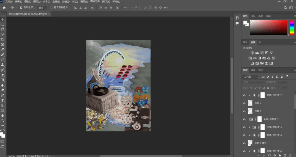
(2) For the second collaged photo, I tried to extract some elements from the first picture and add something relevant to make the collage. My thinking was to combine some most relevant things together, such as the piano keys and the gramophone (which are all things related to music), gramophone and flowers (look alike), and etc. And then I arranged and combined things together according to my subconsciousness so that it could be as surrealistic as possible.
For the background, I think the painting drawing a fairy-land like scene would be good to express the surrealism and uncanny feeling. Also, I extracted the curtain from the first picture and modified the shape and color of it to cover some of the painting, which expresses the idea that under the curtain lies the charm of old things.
Thus, I extracted the gramophone and made it a little blurry to make it look a bit imaginary. Then I extracted the keyboard of my piano and used the “distortion- polar” to make it twist into the sun in the picture. I then extracted the camera which was running the wheels and was shot in a long shutter speed. Behind which is some old-styled visual elements: elegant (the statue), traditional (people figures with umbrellas), patterns (the patterns extracted from the old book cover). Also, I arranged the patterns to make them like stairs to the sky, which align with the twisted piano design.
All the elements extracted are modified the color more or less to make a color feeling. The two pictures thus will create a sharp contrast, but the cores of them are the same.
D. Conclusion
From the critique, I came to realize that the connection of the two pictures are not so obvious. Thus, I think I have still room for improvement. For example, I could make the two pictures not contrasting so much.
Also, the “stairs” in the second photo were too sharp in contrast. So maybe I could make it more blueish.
E. Image of Diptych
