Sound Visualization Documentation
Name: Jim Liu
Title of Music: La Campanella
Artist name: Franz Lizst
I am an enthusiast in piano playing. The song la Campanella has been such a shock to me, covering lots of octaves with many insane performance skills that even professional pianists can’t master it. Also, the song has a playful and flamboyant melody, which represents a playful bell ringing. Thus, I really have affection for the song. This is what I am eager to visualize.
When it comes to how “One Black Square” influenced my project, the different usage of Gestalt Theory gave me some inspirations.
Because in the piece everything is played by the piano, which is the basic feature of the music, so I decided to use letters to draw a piano. However, I worked on it for 4 hours, only to find that it’s too difficult for me. After some struggles, I finally found that it would be good to use “b”s and “d”s to represent the keyboard of piano. Then, in order to make it look more like a keyboard, I also used an “I” overlapping the sticks of them to create some visual significance, which uses the figure and ground theory. Then, because the music represents a bell ringing, so I decided to use two symmetrical “R”s and slightly distort them to make it like a bell (This uses principle of symmetry). Additionally, I added some “v”‘s to represent the sound wave of the bell and used “figure and ground” theory to make it look cooler. The black and white background also serves as representation of the reality performance of the music and the depicted world of the music, respectively.
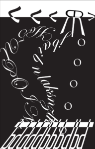
The middle part is the major thing that I want to convey. Because of the craziness and playfulness of the music, I mainly used a very crazy and wild style of font to demonstrate this kind of feeling. Before the mid-critique, I just drew two curves that connects the bell from the top to the keyboard on the bottom and text-filled it. At the same time, I put some “o”s sparsely on the right to represent the consistent high-pitch notes repeatedly played in the song. The sketch before the mid-critique looked like this:

During the mid-critique, some classmates commented that the fonts in the middle was too simple. There are some strong beats and soft notes in the music, but I didn’t visualize it. Also, the scales and wild movement of hands were also not visualized. Thus, I reformed it after the session.
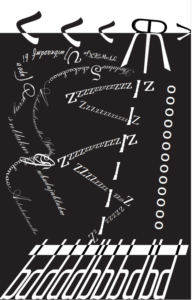
To reform the project, I randomly added some big letters to represent the randomly-emerging strong beats. I made two curves of fonts crossing, overlapping, to visualize the crossing and overlapping of voice parts noticable in the music. Also, I used a straight line of “I” to represent the half scales gradually going up during the middle part of the music. And the line was entwined by some “Z”s. Some small “z”s weren’t displayed to make it look like it is entwining the line. (This uses the principle of continuity). Alike, I changed the scale of some “Z”s to show the changes in the intensity of the music. Furthermore, I tried various other fonts to make the visualization seem more crazy and playful, and the contrast between this kind of craziness and the neatness of the row of “o”s created a strong sense of contradiction, which is in line with the performance of Lizst: there was a row of neat and consistent notes D#6, but other parts are crazy.
This is the final product of my project:

However, I think that there is still some room for improvement. Some peers do not like the neat “o”s. So maybe I think “~”s would be better? I would try it out. Additionally, the three parts of the picture could be more associated.
