Bon Appetit? (Taste)
Bon Appetit? (Taste)
Designers
- Samantha Cui
- Ericka Njeumi
- Nakyung Youn
Project Description
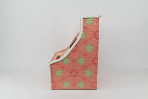
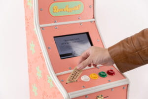
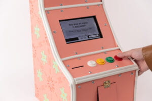
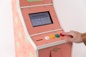
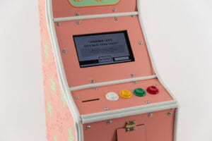
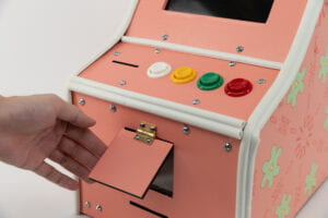
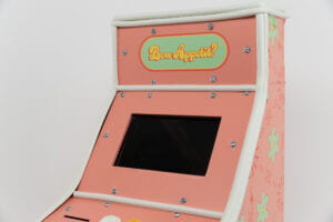
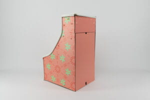
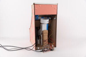
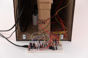
Does good taste exist? Can we typify our sense of taste into a binary categorization of good or bad? If your stylistic choices could be measured and categorized what would it say about you? Our physical sense of taste is rarely ever categorized as good or bad? Instead our preferences in our physical sense of taste are considered to be personal and are not judged by a binary metric. This project aims to collide users aesthetic sense of taste with their physical sense of taste to reveal something about the user and something about our conceptions of style.
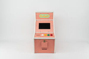
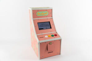
Bon Appetit: a retro single player arcade game that will test your taste on more than food. In this choose-your-adventure style game you will experience a bougie day in NYC.
- The game is a pink retro-style table top arcade game with a ticket reader, printer four playable buttons and a monitor. Bon Appetit? is a miniature table top sized arcade game with a pink kaleidoscopic design and pixelated graphics on a monitor
- Tell us what you like and we’ll tell you who you are? Bon Appetit? Is a personality test in the guise of a retro single player arcade game that interrogates what it means to have “good” taste”. The game takes users through a day in the city where their stylistic decisions reveal what sense of taste you have! The game will ask users to answer 6 questions including a bonus taste test where they must consume a curated treat to complete the game. In the end the game will give users their personal taste profiles.
- Users will play with the game by using buttons to make choices based off prompts and receive a “taste bud” (special jelly bean) to taste and judge as part of the experience. In the end users will receive a Taste profile that describes their sense of taste
Timeline
- 09/14/2023: Primary Research
- 09/21/2023: Final ideas brainstorm
- 09/28/2023: Finalized our Project Idea
- 09/28/2023: Finalized our Project Idea
- 10/05/2023:Developed first prototypes
- 10/12/2023: User testing
- 10/19/2023: Implementation of User testing
- 10/26/2023: Candy Distributor prototyping
- 11/02/2023: Established Distribution of Roles and continued Mechanism research/prototyping
- 11/09/2023: Updates in physical engineering, User Experience/Gameplay finalized, Prototyped Unity scenes
- 11/16/2023: Dispenser Mechanism Design and Outer case visual design: color palette and structure
- 11/30/2023: Thermal printer and Card reader troubleshooting + Sound Design
- 12/07/2023: Finalized Sound Design and outer case visual design for the console. Tested all components together. Case Built
- 12/14/2023: Documentation and Continued final testing/troubleshooting.
Weekly Updates
Click here for our Google Slides Presentation link
09/14/23
- During the research phase of our project, we found three resources to inform the direction of our installation.
- 1: Flavor: Making It and Faking It by MOFAD
- This exhibition by the Museum of Food and Drinks was a taste and smell experience where users would interact with objects and interfaces that exposed them to common flavors in our cultural milieu. This project succeeds in terms of its ease of development. However, the initial shock factor does not engage users in a way that leaves them feeling inspired by the experience. We believe this is because of the exhibition’s lack of strong storytelling. A possible development is adding more of a narrative for how flavors develop over space, for example, how flavors from one country transfer to the next.
- HeatCraft – Ingestible Games by The Exertion Games Lab
- This gadget allows users to ingest a sensor linked to an object that changes temperature in response to changes in the user’s internal body temperature due to food, exercise, and other activities. This project provides a unique experience by swallowing inorganic material which allows for an experience that is often taken for granted, that is the body’s response to how we behave. However ingesting inorganic/ electronic material can be anxiety-inducing for participants thus leading this project to have a high barrier for entry. A high barrier for entry is often a problem in taste-based projects as taste/ ingestion is done with caution due to the potential for bio-harm. A possible development is not having to ingest to use the product.
- Visualization of Taste by Jinhyun Jeon
- This set of data visualizations has an intriguing perspective on the qualities of taste. Jinhyun used data gathered from interviews with specialists in the world of taste to visualize our experiences of different flavors. This project succeeds in being aesthetically coherent and inclusive in its perspective on taste. However, the project reads as the beginning of something bigger and not the final stage. There seems to be more untapped potential in the visualizations. A possible development that could be made is turning the illustrations into sculptures scented with the foods most commonly associated with different tastes.
We also announced some potential project ideas related to the concept of bad vs. good taste, how our mouths have untapped knowledge, how color affects our response to food, and the relationships between taste and emotion.
Notes from our Design Crit:
- Liked the idea of food and culture. Similar to smell. Missing certain foods tied to experiences. Food + Emotion
- Taste is subjective. Is the audience getting consistent experience?
- Interactivity: everyone has their own experience. Does not need to be super consistent. Every sense is subjective.
- Audience reaction could contribute to the results of the project: good or bad
- How are the tastes going to be expressed? Maybe visuals?
- The visuals/colors are interesting. When one eats food, lighting impacts the experience
- Ex: mood lighting in a restaurant
09/21/23
Project Ideas
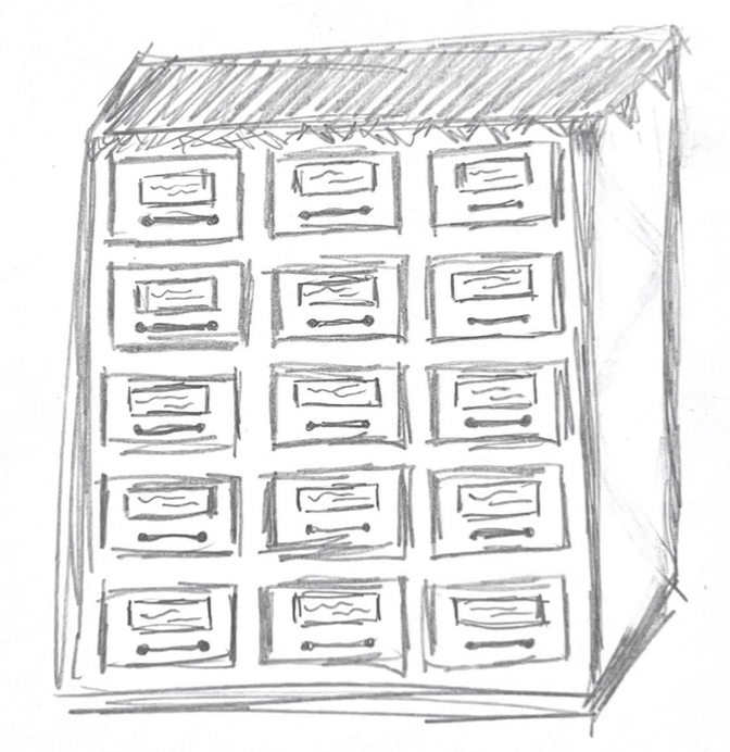
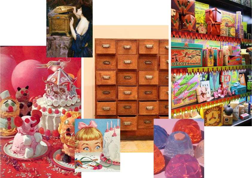
- Pandora’s Box is a drawer chest filled with tasteful & unpleasant surprises. Each drawer is titled with a description of a memory. Users will open the drawer of their choosing and embark on a comforting (or worrisome?) journey of taste.
- Sensory elements presented: Taste, Touch, Visual
- Sketch
-
- Mood Board (keywords: vintage, willy wonka, festive)
- Acquired Taste or Food Wars is an arcade game that will test your taste on more than food. It’s a one-player, choose-your-adventure style, experiencing a bougie day in NYC. Remember: you must cash your consent ticket, pay to know if you have good/bad taste.
- Sensory elements presented: Taste, Touch, Visual
- Sketch
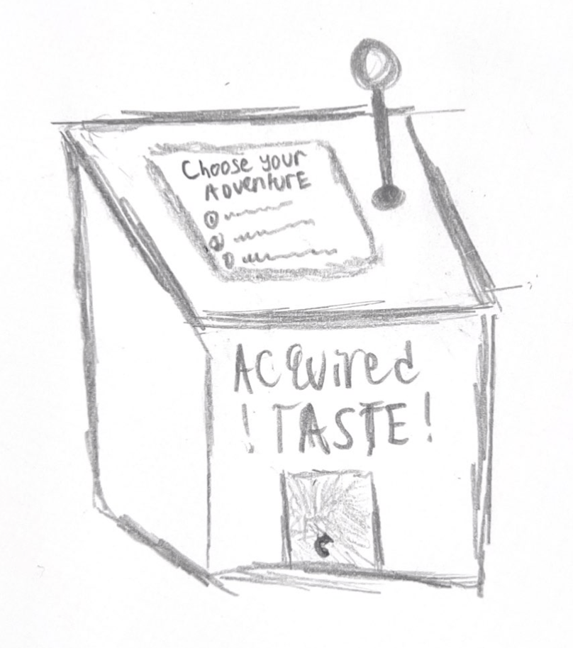
-
- Mood Board (keywords: arcade, y2k, retro)
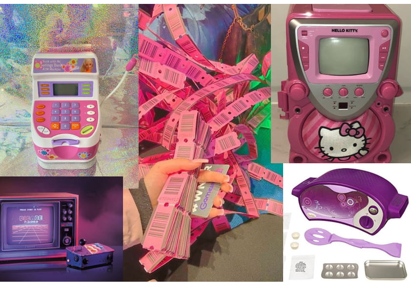
- Design inspiration board: https://pin.it/13KSnVl
- AR Taste Maze is a maze users have to complete with the aid of a set of AR glasses. During this, users will be guided to make choices to evoke their understanding of taste knowledge.
- Sensory elements presented: Taste, Visual, Audio
- Design Crit Notes
- Pandora’s Box
- Acquired Taste/ Food Wars (good vs. bad taste’) – The Arcade Game
- Single person vs. multiple players?
Tracking points?
Lauren: Instructions – think multisensory! as text and audio (blind) – an equivalent of audio and visual // brail – as touch interface?
- Single person vs. multiple players?
- AR Maze Experience
-
J – shows figure out what they are eating and be completely wrong / or distinguishing diff labels – the trickery aspect is mischievous…
How do people activate the AR game? – yes, glasses.
If it’s more speculative ,you can do an AR experience on the phone (as a test)
integrate sound? directional signal, giving people cues that they are on the right track (giving coins)
-
09/28/23
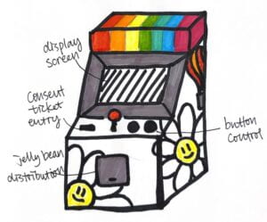
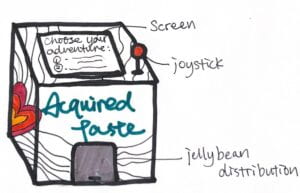
During last weeks Design Crit we received feedback on our three project Ideas.
The feedback included notes like:
- Should the game be multiplayer or single player?
- We chose single player
- Think multisensory for the instructions how can you provide an interface that isn’t completly reliant on a visual experience and is able to accommodate for blindness as well
- We decided we will include an audio reader and braille for the game.
10/05/23
We developed two rapid prototypes of our design
- 1-minute video with captions
10/12/23
Research Study Title
Hypothesis
An educated guess on what you think the results of the study will be. If we do the user test, user would understand the instructions clearly and play the game correctly.
Research Goals
- Goal 1 to test the game play
- Goal 2 to test the interface affordances
Methodology
Number of participants: 1
Location: United States only
Age range: 20
Gender: F
Disability Identity: N/A
Experience: College Student
Number of participants: 1
Location: United States only
Age range: 20-30
Gender: F
Disability Identity: N/A
Experience: College Student
Number of participants: 1
Location: United States only
Age range: 20-30
Gender: F
Disability Identity: N/A Experience: College Student
Procedure
Data collection: <Tasks? Thinking aloud? Find more methods here>
Length: 10 mintutes
Location: 3
Testing Script
Informed Consent
Hi, my name is <XX>. Today we want to learn how our users interact with the prototype. Please let me know if you’d like a break, have any access requirements, or need any accommodations. There are no right or wrong answers and we can stop at any point. Do I have your permission to video and audio record? Quotes will be anonymized and all data will only be shared internally with my team, stored on a secure, password-protected cloud server, and will be deleted after the study is completed.
Tasks
I’m going to ask you to perform a series of tasks and to think out loud as you go. Please describe your experience and what you’re thinking as you complete the task. I promise it won’t hurt my feelings because it’ll help me to improve the project.
- Task 1: Give the user a consent ticket. Insert ticket into the ticket slot on the far left side
-
-
- Probe question 1 (e.g., What do you think you can do with the ticket?)
- Probe question 2 (e.g., What do you think the ticket is for?)
-
- Task 2: User should be able to go through the game-play explanation. Read the following to the player:
- Screen 1: “Welcome to ____. To play press the button on the farthest right to continue to the next screen.
- Screen 2: Its time to RANK YOUR TASTE. You will be asked 5 questions.
- Screen 3: Press one of the corresponding buttons and Answer truthfully and to the best of your ability.
- Screen 4: Once youve answered all 5 questions, CRANK THAT LEVER. And you will get a specially curated taste bud to judge.
- Screen 5: Once youve eaten your treat. Judge whether it is good, bad, or an acquired taste.
- Screen 6: In the end you will get your receipt which tells you if you have good taste! Continue to START ”
-
-
- Probe question 1 (e.g.,Which button do you think you press to continue?)
- Probe question 2 (e.g., What do you think of the instructions? How clear are they?)
-
- Task 3: The game will ask the first question for choice A through D press buttons from far left to far right: Your favorite lyrics describes __________.
- Something mundane in a poetic way or something beautiful and wondrous
- Having a good time, making memories
- Social injustice or some strong emotion
- Something that celebrates life in general
- I don’t like songs that includes lyrics
- None of the above
- Time for Quesiton Two:
-
-
- Probe question 1 (e.g., What do you think you can do with this?)
- Probe question 2 (e.g., What do you think this does?)
-
- Heres Question Three
-
-
- Probe question 1 (e.g., What do you think you can do with this?)
- Probe question 2 (e.g., What do you think this does?)
-
- Ready for Question four
-
-
- Probe question 1 (e.g., What do you think you can do with this?)
- Probe question 2 (e.g., What do you think this does?)
-
- Time for the Final Question Five
-
-
- Probe question 1 (e.g., What do you think you can do with this?)
- Probe question 2 (e.g., What do you think this does?)
-
- Thank you for your responses its not over yet CRANK THAT LEVER on the upper right side of the screen and get your specially curated Taste Bud
-
-
- Probe question 1 (e.g., What do you think you can do with the taste bud?)
- Probe question 2 (e.g., What do you think this does?)
-
- Now that youve gotten a taste. What do you think?
- I love it
- It tastes terrible
- Its an acquired taste but i like it
- Its an acquired taste but it isnt for me
-
-
- Probe question 1 (e.g., What do you think you can do with this?)
- Probe question 2 (e.g., What do you think this does?)
-
- Great work. One moment while we generate your receipt
-
- Probe question 1 (e.g., What do you think you can do with this?)
- Probe question 2 (e.g., What do you think this does?)
User Feedback
- User clearly understands the process and knows how to play the game. First when she received the ticket, she seemed a bit confused but understood where to put it. She suggested that it would be better to make the selected answers to be highlighted in different colors and then right after the page moves to next questions. The slot handle is intuitive and not distracting, it reminds her of the game machine with snacks, and expected to receive the jelly right after levering down the handle. She knew how to get the snack from the doors, but also expected to put her hand right below the hole to get the jelly bean.
- User was a bit confused about where to put the consent paper and suggested making the ticket hole the same size as the ticket. Her first response to the consent was not to eat the jelly, but right after she agreed. She understood the process well, but said it’s a bit hard to understand the message of the project, when she heard that she needs to respond to the taste of the jelly and the receipt. She says it’s a bit complex. She suggested adding clear and simple instructions. She also mentioned that the position of the receipt would be better to add between the snack distributor and buttons.
- User felt like the consent ticket was great cause “its my little invitation to play”. She said the instructions are clear but quite wordy. Overall she felt the game felt exciting “i felt like a kid, i felt curious, the eat thing made me curious”
10/19/23
Findings:
- Revise the placement and label of the consent ticket
- Make the instructions clear and concise. Find the sweet spot where the information is not overwhelming and time consuming but also clear.
- Edit Taste But distributor
10/26/23
We consolidated our user data to implement imporvements on our design. We found three main areas that were points of concern and revision for users. Our findings led us to implement these changes to our design:
- Our users asked us to revise the placement and label of the consent ticket. We decided to include a small graphic image of the ticket above the ticket slot to indicate the location of the slot. We will also raise the ticket slot bed so that users will also have a tactile indication of the location of the ticket slot do to its physical different contrast to the rest of the machine. In addition the ticket slot will be the exact size of the ticket thus giving both visual and tactile indication of their compaitibility.
- Our users asked us to refine the continuity of the treat distribution system. In order to conitue the intuitive flow of the lever pulling down indicating that the treat will drop down the treat slot will be shaped as a bowl allowing the user to scoop their treat out with their hand.
- Our users asked us to make the instructions clear and concise. Our research led us to decided to put a strong emphaizs t our use of sound throughout the game to indicate the location of various buttons as well as to give instruction to the game play avoiding long winded explanations.
The following materials are being used as reference for our prototype revisions:
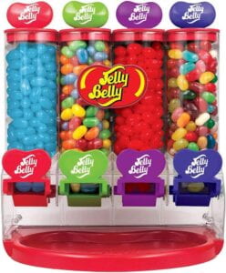
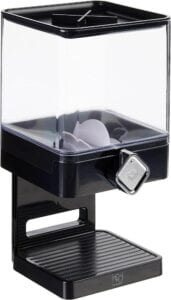
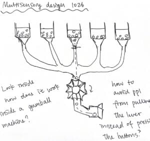
https://learn.microsoft.com/en-us/training/modules/intro-to-gaming/4-audio-accessibility?ns-enrollment-type=learningpath&ns-enrollment-id=learn.gaming-accessibility-fundamentals
Design Crit notes:
“It would be interesting to have different sounds that are customized for each players response. And whether the sounds could trigger people into responding specific ways”-Ploy
“Have a flow of sounds that indicate how the machine is actually working. The user does not know what necessarily going to happen so a hurray sound when the candy comes could be a good indicator. It could be tricky to get a treat “-Jimena
“it also could be messy so it would be good to wrap the treats.”- J
“David at ITP would know the keywords to search for differing hardware like the dispenser”-Andi
11/02/23
This week our team determined what were the main components of our machine that needed to be designed in order to determine what mechanisms we had to troubleshoot and thus what materials to buy. We were able to isolate the components comprising our Machine into:
UX Design led by Ericka
- Design flow of the game play
- Questions
- Accessibility
- Sound design
Physical Computing and Engineering led by Sam
- Mechanics
- Tickets inserting to turn on machine
- Buttons to make choices to proceed
- Lever is to activate the jelly bean dispenser
- Dispenser to select one corresponding jelly bean and let out
- Printer print out the experience receipt
Visual and Agile Graphic Production led by Nakyung
- Unity/Coding
- User Interaction/Interface
We decided to reach out to Mark Kleback a Brooklyn based Creative technologist who is cofounder of Wonderville an arcade bar in Bushwick. We felt that we needed an experts perspective on how to troubleshoot what mechanisms suit our machine the best. Our team reached out to Mark and asked the following questions in order to better gage what materials we wanted to buy.
These are the following questions we asked :

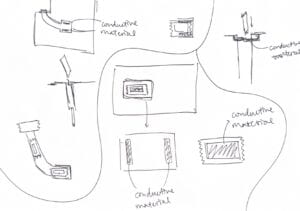
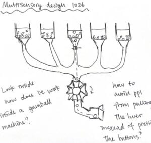
11/09/23
Updates on our progress.
Physical Engineering
This week we were able to speak with Mark Kleback and David Rios. Both have expereince in arcade game design and fabrication. We asked them for their help on designing and fabricating the major mechanics of our arcade machine. These components include:
- Ticket slot Mechanism where tickets are inserted to start the machine
- Buttons to make choices to proceed
- Functional lever to activate the jelly bean dispenser
- Dispenser to select one corresponding jelly bean and distribute
- The printer prints out the experience receipt
Our meetings with Mark and David allowed us to make progress on our designs. We decided to test using concentric shaft motors that are used in clocks for our jelly bean dispenser since we need it to distribute one specific candy. We will also be testing using a Roller limit switch for our ticket slot mechanism.
During our meetings we also became more aware of what we would have to develop in order to easily troubleshoot the machine in case there is any damage or malfunction. For example we decided to potentially add a feature in code so that it senses the distributor and says how many jelly beans are left in the machine.
User Experience
We also made updates to our gameplay by finalizing it along with the questions and results of the game. We designed the game play so that it is accessible and simple for users of differing abilities. For example there are graphic animations like an animation of the crank will show on the monitor and the machine audio will tell the user (crank the lever and enjoy your taste bud!”, so we will use a lot of graphics based communication and limited text on screen as to not overwhelm the user with information. We will rely on the sound design to inform the user of what direction/action to take. Limited text would be the screen would have abbreviated versions of the directions being said out loud by the machine. But the audio narration will not be overwhelming. We paired down the directions to simple clear instructions as well so that a non visual user won’t be bogged down by directions
Title: Pixel Palate or Byte: A Bougie Day in the Big Apple”
Game
GamePlay
| Audio Description and Direction | Monitor Graphic Image | Screen Text or Sound Design | User Action | Audio Clip File |
| Insert ticket in slot start | Game Logo and mini animation of the machine | Insert ticket to start | User inserts ticket into ticket slot | Scene1=
9 seconds |
| Tell us what you would do on a day in the city and we’ll tell you if you have Good, Bad, Or Acquired Taste
There are four playable buttons. From A on your far left followed by B and C leading to D on your far right. Press D to continue Press A to Repeat |
Pixelated city skyline with Game Logo in front l | Acquired TasteLets Rate your Taste!
Press D to Continue Press A to repeat |
User Press D | Scene2=
16 seconds |
| To Answer Prompts select the corresponding button on the console
Whenever you want to continue to the next screen press D |
Graphics
A, B, C, D Or shapes |
Select Using Buttons
Press D to Continue Press A to repeat |
User press D | Scene3=
22 seconds |
| To begin you will be asked 5 questions of different categories | Graphic pixelated icons of food,art/music, fashion/clothing, news/media, | You will be asked 5 Questions
Press D to Continue Press A to repeat |
User press D | Scene 4=
4 seconds |
| Once youve answered all 5 questions. You will assess a special taste tester for your final results. Now that | Jelly bean falling animation | Ready? Lets Start!
Press D to Continue Press A to repeat |
Scene 5=
17 seconds |
|
Yawn, it’s early! What drink do you start your day with?
|
A, B, C, D | What drink do you start your day with?
|
User select option | Question1=
16 seconds |
You’ve finished breakfast and your friend messages you to make plans for Saturday. Where should you go?
|
A, B, C, D | Where will you go Saturday Night?
|
User select option | Question2=
23 seconds |
Its the afternoon now and time to start running errands. Download a story to listen to from your favorite publication while on transit, what will you listen to?
|
A, B, C, D | What will you listen to?
|
User select option | Question3=
32 seconds |
It’s been a long day and you are on your way to your last errand when you are stopped by a tik tok influencer who asks you to give one styling tip to their followers? You say…
|
A, B, C, D | Give one styling tip to a social media influencer’s followers?
|
User select option | Question4=
24 seconds |
It’s the evening and you finally get home and realize you haven’t heard from your crush all day, you decide to post something to your instagram to get their attention
|
A, B, C, D | Post on your story to get your crushes attention
|
User select option | Question5=
26 seconds |
| Congrats you’ve completed a day in the city | Jelly Bean loading animation | Taste Assessment Generating…. | Scene11=
2 seconds |
|
| Ready to receive your Taste profile? There is one more step to complete your assessment .
Press D |
Animation of lever on machine cranking down | Press D | Scene12=
8 seconds |
|
| Your taste tester is ready for assesment.
Remove your specially curated taste tester from the open door in the bottom middle of the console and consume your taste tester before continuing. Once you’ve eaten your taste tester press d to continue to the final prompt |
Animation of mouth chewing and lever crank going down with hand reaching into machine | Ingest the test | User takes wrapped candy and eats it.
User press D |
Scene13=
18 seconds |
Describe the flavor of your curated taste tester
|
A, B, C,D | Describe the flavor of your curated taste tester?
A B C D |
User selects | Question6=
16 seconds |
| Thank you for your response.
Your taste profile is coming right up! |
Jelly Bean Loading animation | Taste Profile Generating | Scene14=
4 seconds |
|
| “You have
______ Taste! “Taste Quote” Description” Grab your printed Taste assessment from ____ |
Taste Assessment
Icon of the assigned taste |
You have
______ Taste! “Taste Quote” Description |
User take assessment and finishes game | ResultsSweet= 22 seconds
ResultsSpicy= 18 seconds ResultsSour= 22 seconds ResultsUmami= 20 seconds ResultsBitter= 20 seconds ResultsSalty= 20 seconds |
| Thank You for Playing Bon Appetit!
“Tell me what you like, and ill tellyou who you are”- John C Goodman |
Skyline animation | Thank You for Playing Bon Appetit!
“Tell me what you like, and ill tellyou who you are”- John C Goodman |
END | Scene16=
28 seconds |
Visual and User Interaction
We designed the graphics for the game.
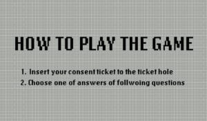
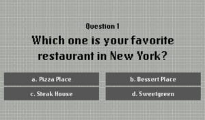

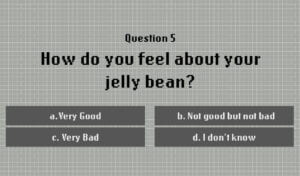
- We finished this week with questions to research on:
-
Does the position of the buttons and answers effectively convey the information to users?
-
What are some elements we can remove or add on to enhance the experience?
-
How would the actions of “inserting” or “placing/scanning” the consent ticket affect the experience?
-
How might we make a modular design so it is easy to troubleshoot issues with the mechanisms? – any mechanism references you would like to share?
11/16/23
Color Palette and Physical Computing
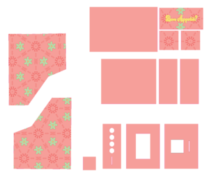
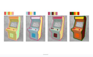
Color Palette: This week we focused on developing a color palette for the outer case of our arcade game. We developed four color palettes to choose from and asked for feed back on which color was the most attractive and appetizing.
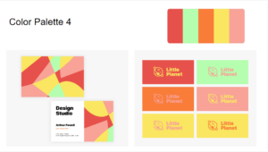
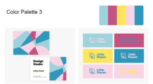
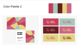
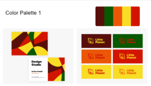
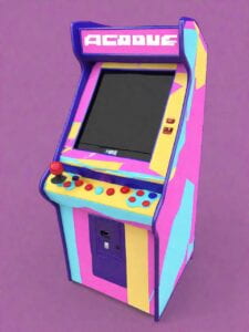
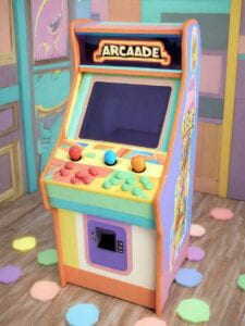
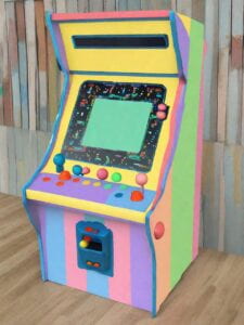
A.I generated Prototype: We then used A.I to generate rapid protypes of our outer case design using the color palettes.
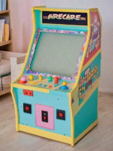
Physical computing of Dispenser Mechanism: This week we also focused on the fabrication of our dispenser mechanism. We were able to use physical computing to develop a dispenser using a motor for the games distributed treats.
In crit the feedback we got was that the palettes we chose were all appealing but lighter colors were more applicable to the whimsical nature of our design. We were told to consider how the outer case design is visually related to our graphics.
We also received feedback that the dispenser seems to successful accomplishes our goal.
11/30/23
Sound Design and Physical Computing:
This week we completed the narration for our game which includes audio description for non-visual users.
If you would like to listen to some of the sound design and audio descriptions open the link below
https://drive.google.com/drive/folders/1BuDM7NP_-fjftJN-ZImv4UDa4OVD6LcK?usp=sharing
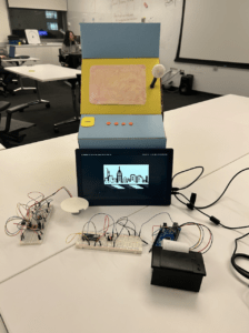
We also completed developing all the physical mechanisms of the game including Monitor and:
Thermal printer
Card Reader
Last session we were able to complete troubleshooting for the dispenser mechanism and 3d printed a custom piece for it.
During class we were able to continue testing the mechanisms altogether. We also were blessed with a Braille maker which allowed us to put braille along our main console board for users.
12/07/23
This week we focused on finalizing the audio descriptions for the game. We also finalized the visual design of the arcade games case. We built the case for the internal components from wood and laser cut it to our desired proportions. We printed our design but found that its proportions were a little off from the sizing of the case and so we will make adjustments. We have begun attaching all internal components together with the finished case and are adjusting/troubleshooting to make sure it all runs smoothly. We also 3d printed out components needed for our dispenser mechanism.
Some notes we got were to consider having the visual design of the options featured in the game to match the physical buttons used for the case. We also received a great note that our limited text prevents Deaf and hard of hearing users from experiencing the jokes featured in the game. We are working to adjust this. We also received a note to change our press b to continue function to press “a” as “b” could lead to confusion for users
12/14/23
This week we troubleshooted all of our issues with the game including issues with unity scenes script and audio, thermal printer, candy distributor, and ticket sensor.
We also filmed our documentation
5 W’s Chart
Source: Velasco, Carlos and Marianna Obrist. Multisensory Experiences. 2020.
| Components | Questions and considerations |
| Background (Why) | This project is an interrogation of what it means to have “good taste” by gamifying style and utilizing sense of taste as metrics for categorizing a persons taste. We believe that conjoining ideas of stylistic taste and physical sense of taste allows for us to liberate ourselves of conventional ideas of what good or bad sense of taste could mean |
| Impressions (What) | We want users to have a whimsical and joyful exploration of themselves and their personal choices and to experience a sense of wonder as they discover what their choices reveal about themselves |
| Events (When) | First users will insert a ticket into the games ticket/card reader/ Users will play with the game by using buttons to make choices based off prompts and receive a “taste bud” (special jelly bean) to taste and judge as part of the experience. In the end users will receive a Taste profile that describes their sense of taste |
| Sensory Elements (How) | Our project incorporates visuals, taste, and sound as their main sensory modalities as well as touch as buttons are a main feature of users interactions with the machine. Sound is heavily featured in the game which allows for users who are not primarily interacting with the game visually to still have a similar experience of the design. Since the game relies more on sound there are some nuances that may be missed by users interacting with the games more visually however we made adjustments so that no user is unable to interact with the game. However we are aware that there may be things we missed in our design process and hope to continue iterating on to make the game as accessibly to any preferred sensory experiences |
| Designer/User (Who/Whom) | The designers are Ericka Njeumi, Samantha Cui and Nakyung Youn. Ericka was in charge of designing the games User Experience as well as the inputs, outputs, and copy of the games design. Samantha was in charge of physical computation and the fabrication of the game. Nakyung was in charge of the User Interaction and graphic interface of the game. |
System Diagram
Multisensory Project Journey Map
Code
Sources
https://www.psycom.net/food-personality-types
