Motif
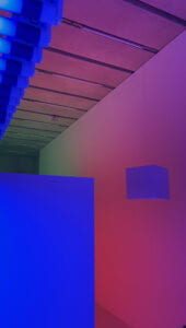
This is a picture I took at the Perez Art Museum in Miami when I went to visit with my Dad. This is a piece called Chromosaturation made by Carlos Cruz-Diez and it’s an immersive experience. The angle at which this picture was taken the diverse colors created by the red, blue, and green tones are illustrated. I was inspired to use this as my motif since it had a lot of geometric potential that could be programmed into processing!
https://www.pamm.org/en/exhibition/carlos-cruz-diez-chromosaturation/
(on the left is the photo I took, on the right is a photo of Carlos Cruz-Diez: © Courtesy of Atelier Cruz-Diez Paris/Bridgeman Images)
My Drawing
In my drawing I attempted to simplify the image as much as possible since color is the main component of the art and the photo so I planned to use simple shapes but vibrant colors in the processing.
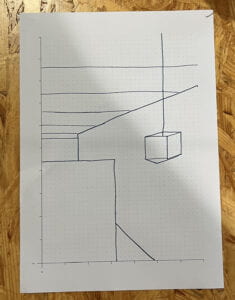
My Drawing in Code
float spin = 0.0;
void setup() {
size(600, 600, P3D);
}
void draw() {
background(252, 178, 190);
if (!mousePressed) {
lights();
}
spin += 0.01;
stroke(10);
line(0, 300 ,200, 300);
line(0, 275 ,218, 275);
line(0, 290 ,208, 290);
line(0, 250 ,230, 250);
line(0, 200 ,268, 200);
line(0, 150 ,300, 150);
line(300,300,300, 150);
pushMatrix();
translate(width/2, height/2, 0);
rotateX(PI/9);
rotateY(PI/5 + spin);
box(80);
popMatrix();
noStroke();
fill(68, 216, 156);
triangle(0,600, 300, 150, 344, 300);
fill(48,91,240);
square(0, 400, 200);
fill(214,89,120);
triangle(200,600, 200, 450, 300, 600);
fill(225, 131, 240);
square(300, 150, 600);
fill(105,62,227);
}
Reflection
Despite not being an exact replica of the picture, I really like my design using processing. It was something similar maybe I would say inspired by the original photo and I really liked how the cube moves in the end. If i could do anything differently it would be to figure out the specific method of coding to fill in shapes with a gradient since it would help it look more like the original picture.


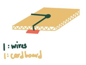
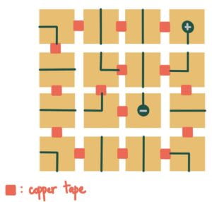
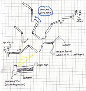
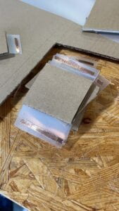
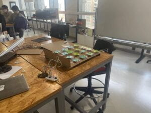
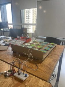

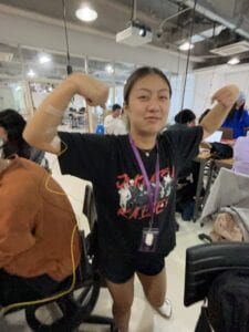
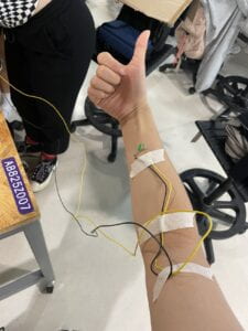
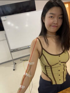
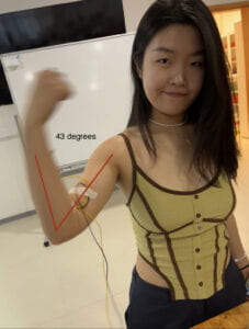
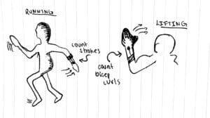 Some potential uses for a device like this, other than bicep curls, could be other lifting exercises such as deadlifts or squats. Not to mention it could be used to count strokes on a run, which can also help estimate the distance one has ran or walked during a workout.


 Task 2: building a switch