
Basic Information
Project Title: Barbell Life
Designer: Harry Lee
Concept
“Bald”, “ill-health”, “996”, “007” are some of the most common phrases used to describe computer programmers. Indeed, for most computer programmers, they are too busy with their work that it is hard for them to balance their health and work. As a student major in computer science, I came to realize the importance of this balance – work is surely important for us, but health should come to be in the first place. We should not let work destroy our life and body.
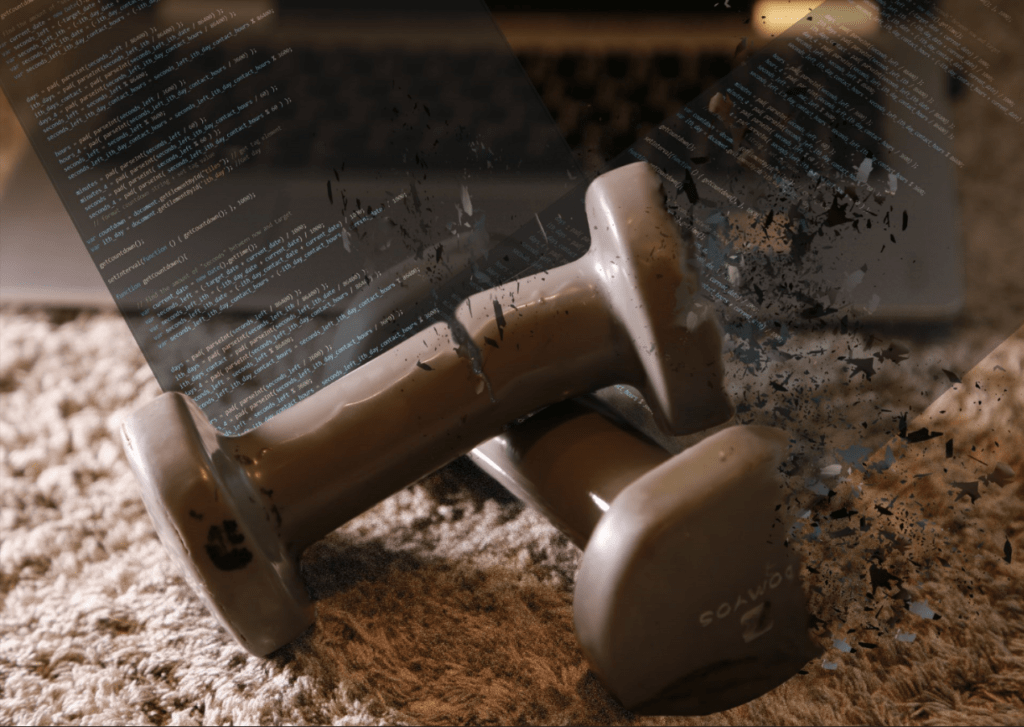
In the first part of my diptych, I want to show a balanced life and a healthy order, that is, “health first, work next”. The tone is also in a warm color, showing an enjoyable lifestyle. In my second part, the barbell is bracken off, some parts have even turned into some particles and drift in the air. Besides, 2 segments of codes are inserted into the barbells, seems like they interrupt and block people from working out.
Process
Part I: Staging and Photographing
Equipment used: LED Video Light YN600L 009, Canon 6D.
Properties used: a carpet, a pair of barbells, a Lenovo laptop.
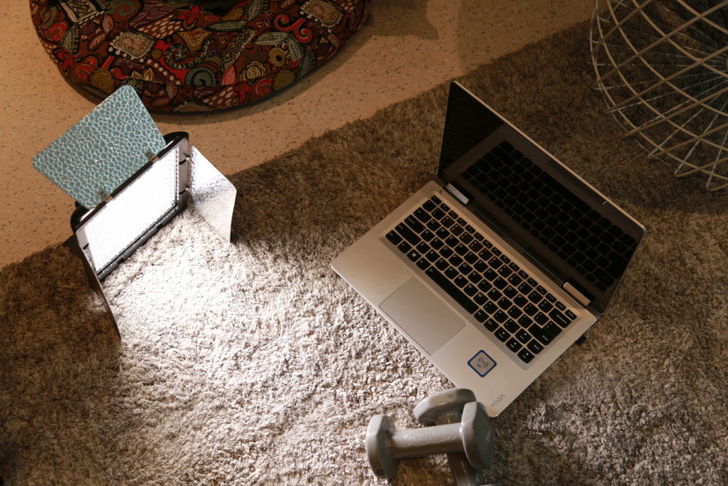
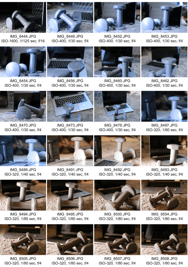
The process for part I of this project mainly centers on the configuration of objects and the adjustment of camera parameters. For the configuration part, I tried multiple positions, directions of objects and the light. At last, I think it is better for the barbells to lie against each other instead of standing vertically. As for the parameters, I mainly tested with different shutter speed, since I have abundant light, there is no need for me to increase ISO. And, to increase the depth of field, I also used F4.0 aperture – this is the largest aperture for my lens. I also tried 2 different white balance modes (as you can see from my contact sheet down below). At last, I think a warm tone would be better for me to express my theme.
Part II: Digital Process with Photoshop
My working process for part II is as follows:
- Make the fragments for barbell;
- Smudge the edge;
- Add the codes;
- “Cut off” the barbell;
- Add noise.
I will illustrate some of the most significant parts:
Fragments
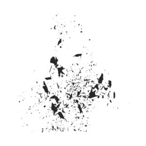
This material originates from a colored version of a particle picture from the internet. I used the B&W filter, reserving only its sketch. Then, I lock the transparent part of the layer of this fragment, colorize it with the “Clone Sample Tool”, sampling from the barbell.
Codes
The codes on my project 2 is not online material, they come from my own JavaScript code, from a timer program I wrote. The color schemes are from the dark theme of visual studio code.
“Cut Off”
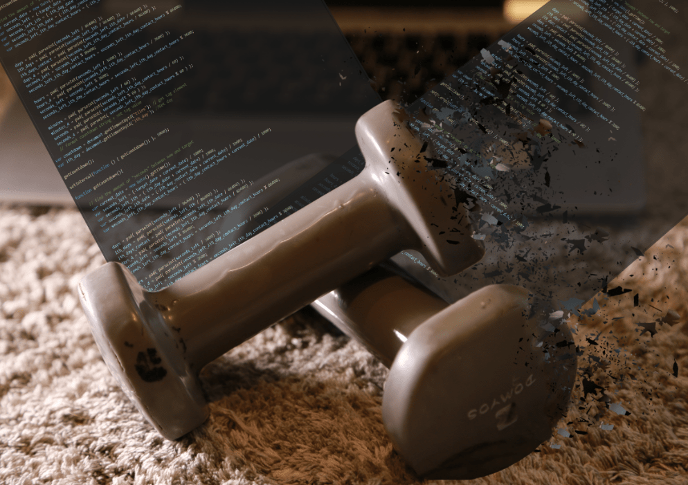
After previous steps, I thought I haven’t expressed the theme obviously – the fragmentized life. As a result, I then thought of “cutting the barbell off”. I firstly used the lasso tools to extract the whole barbells and move them into a new layer. Then, in the original layer, I used the “Colone Sample Tool” and the “Healing Brush Tool” to fill the background, since when the barbell is cut off, there is going to be something in the background at the place where it used to be the barbell. After that, I used the lasso tools again, selecting the right part of the upper barbell, rotate and move it a little bit. Next, I used the “Smudge Tool” to fix the edge of the incision. At last, I added some flying fragments to the notch.
Conclusion and Improvement
There are 3 main improvements I recognize:
More Contrast
In part I of the project, the barbell is in harmony with the background. However, in the second part, the incompatibility between work and health should be strengthened. In this way, we should bring more contrast to the second part. This could be done by changing the color tone, or reduce elements in the original photograph.
Sense of Layer
In part II, there are multiple layers: barbell (front), codes (2 segments), barbell (back), laptop, carpet… The original photograph vividly showed these layers using the depth of the field. But in my part II, I only adjusted the gradient transparency of the layers of the codes. I should also use gradient blur to make the sense of layers for the fragments and codes.
Dizzy Effect
Part II of my project shows the imbalance of life and work, when people get tired, they don’t see the world as the way they see when they are not tired. As a result, adding some dizzy effects simulating the way people see the world when they are tired and frustrated could be a good idea. This could be realized by adding more noise, blur, and warping the picture.