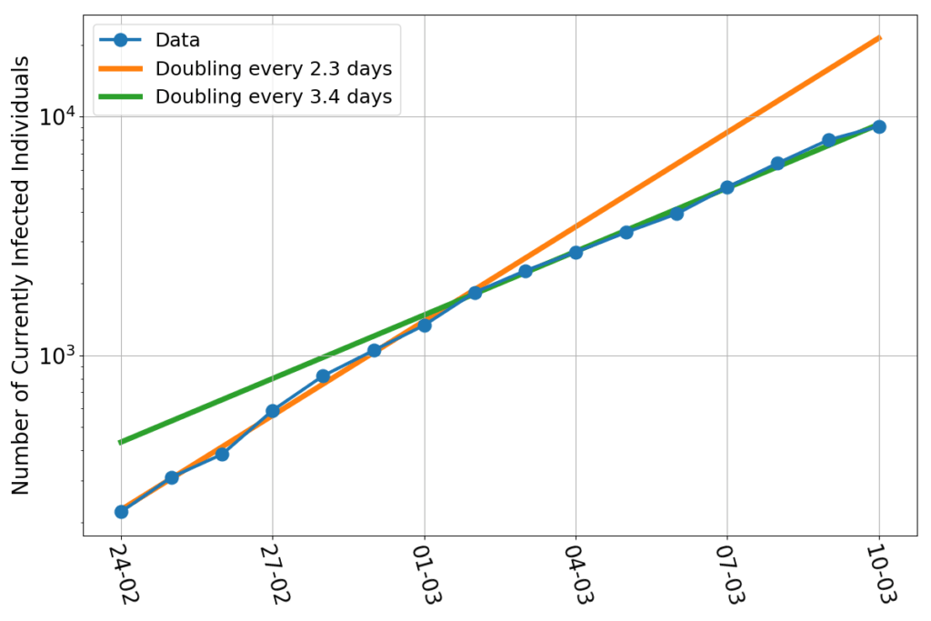
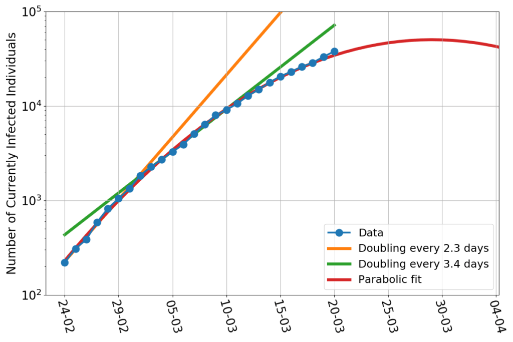
What could go wrong by extrapolating a fit into the future? We’re talking about a very good fit, after all. Just to show how good, here’s the relative error (this graph uses the additional data point relative to March 21st).
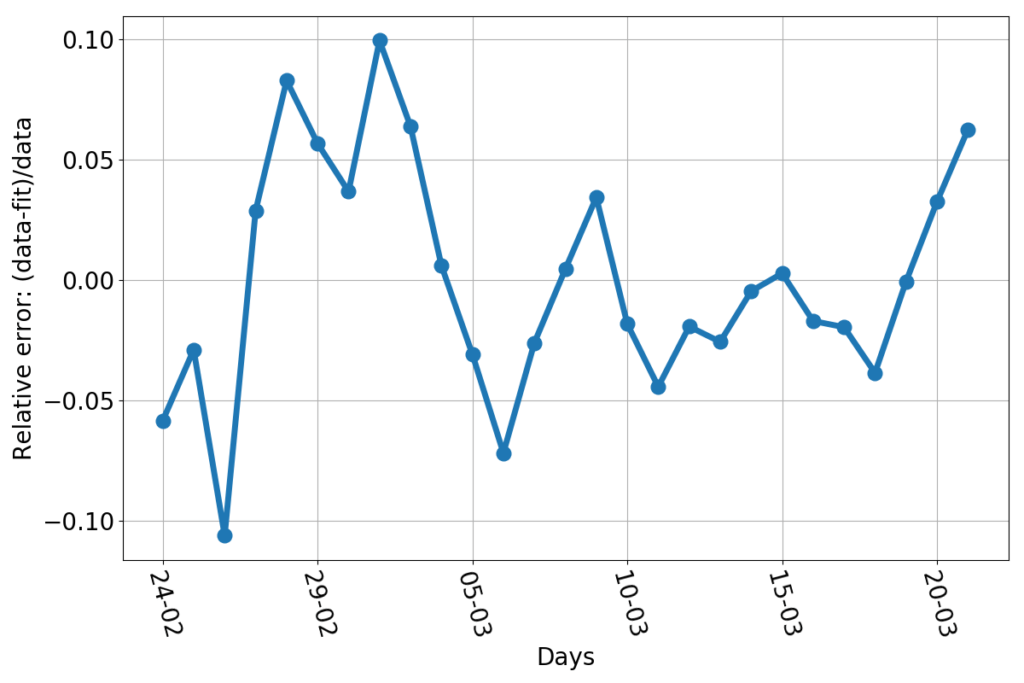
Every day, the discrepancy between the data and the fitted line is no more than about 10%. That’s pretty good for something as trivially simple as drawing a parabola through the logarithm of a bunch of data. Now, let’s say that we had a reason to believe that the fit really represented the true dynamics of the infection (we don’t… but allow me, for the sake of the argument). Then what would be the reason for discrepancies with the data? Errors! Errors in the sense a natural scientist would use the word: any unforeseen event that makes your measure a number while reality is represented by a different number. Finding and counting infected individuals is not easy. The incubation period is variable. Some infected people get tested when they are still asymptomatic, and are counted early, others may delay alerting healthcare personnel, and end up being counted later. Testing facilities may be overworked. The test themselves may be not 100% reliable. Finally, the information may arrive too late to Protezione Civile to be counted for that day. For example: the value of newly infected individuals for March 10th is about 600 individuals short, who have been counted on the next day. I fixed that in the plotted data. But other errors are not fixable, because no one can quantify their magnitude with certainty. But “errors”, if they really are such, have a nice characteristic: they’re independent of each other. They should appear as random numbers added or subtracted to the real data, without showing any pattern, bias or trend. And so does the relative error do in this case. I haven’t run any sophisticated statistical test, but, by just eyeballing the graph, I can’t see anything patently off. Sure, the largest errors occur at the beginning of the series, but that’s consistent with a system taken by surprise by the initial burst of the epidemics. Personnel had to be gathered, procedures has to be set in place, the entire public safety machine had to be set in motion. A 10% error in such a contingency is amazingly low. Kudos.
So, why am I scared? Yes, the last three days aligned in an upward trend, but that still amounts to no more than a 5% error (on today’s fit…).
Well, here is the trouble: today’s fit peaks on March 31st. Yesterday’s fit peaked on March 30th. And three days ago the peak was forecast to occur by March 29th. In the last three days the date of the peak has sensibly shifted forward as new data piled up.
That’s bad, and gives me pause. Is the fit wrong? No. Is it a bad fit? No. But it wasn’t a bad fit two days ago, either. The relative errors changed little or nothing…
And here’s the hint that sheds light on the problem: could it be that fits which are not the best, but are still believable, may extrapolate to wildly different peaks?
Let’s then play this game: we keep assuming that the infection will have a parabolic trend (in log-scale), but we impose by hand the date of the maximum. Namely, I select all the parabolas that peak at a given day, and use only the remaining two free parameters to fit the data. And here’s the dramatic result.
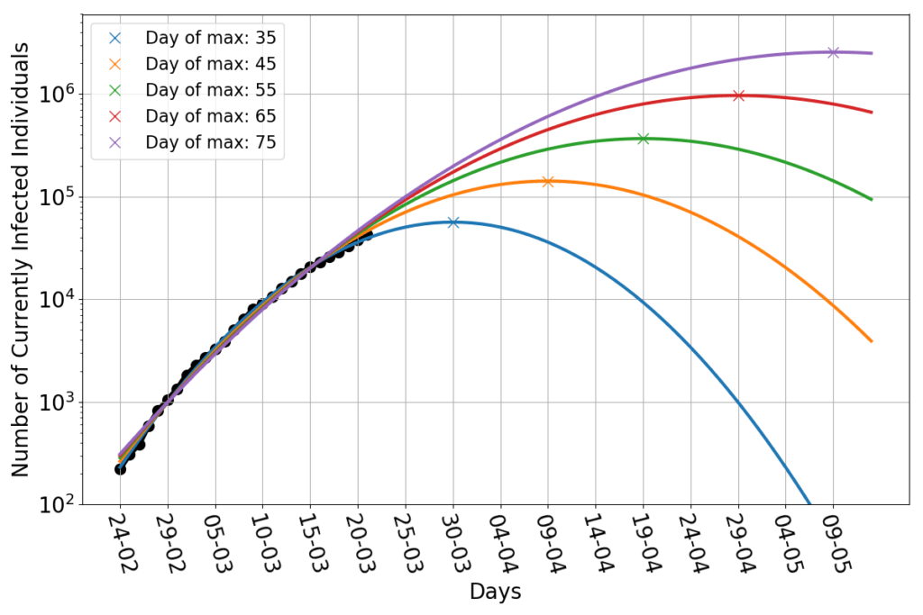
The blue line is yesterday’s best fit, which peaks 35 days after the day zero (February 24th). It still looks good as a fit today. By imposing the peak to occur on day 45, we obtain the orange line. That doesn’t look like a bad fit either! The green line has a peak on day 55. Even that is pretty darn close to the data. And so are the parabolas peaking at 65 and 75 days. They all look very close to each other in the region covered by data. But they are wildly different in the future: the last line peaks above two million infected people!
Here are the relative errors of those constrained fits.
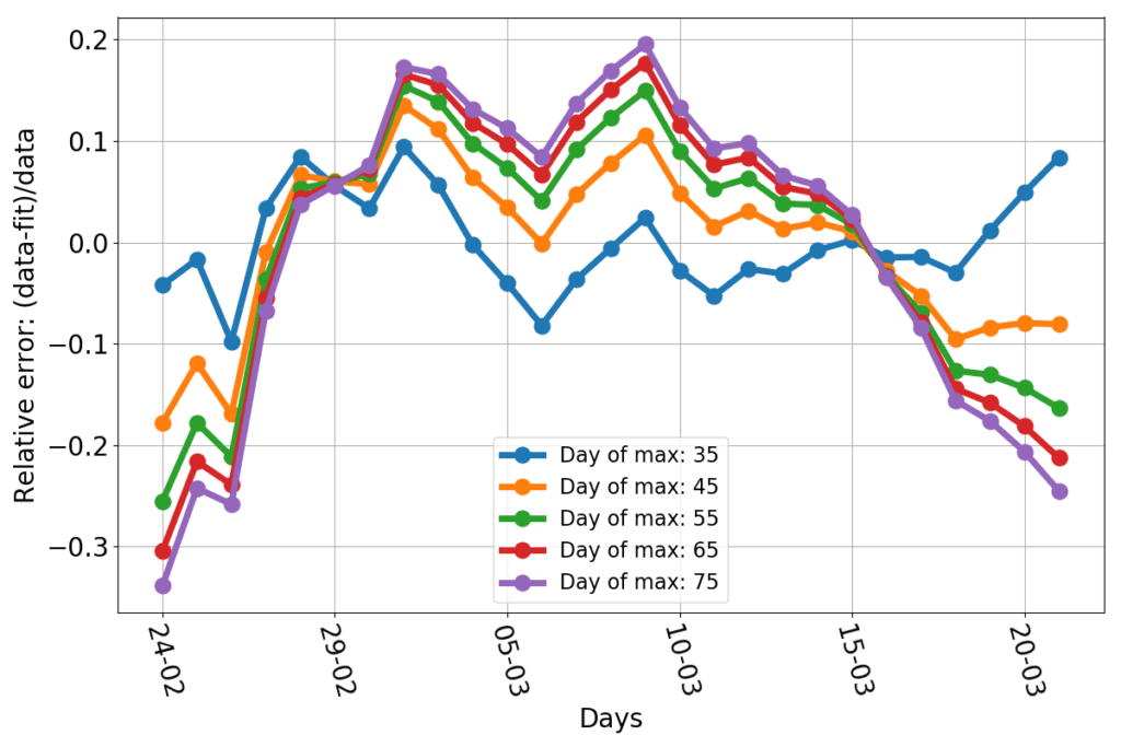
Obviously the blue line has the best-looking errors: the smallest and more evenly spread out. The other lines tend to have a negative bias at the beginning and the end of the data set, and a positive one in the middle. And yet, they are not that much off: nearly all data points are less than 20% off the fit. The bias is not surprising given that there’s no theoretical reason to expect the dynamics to follow exactly a parabola. We could just argue in favor of something whose slope decreases in time.
So, I’m baffled by two unexpected outcomes of this exercise. The first is that the data seems to be quite consistent with a simple parabolic fit (which I didn’t expect, because I saw no stringent reason for that, other than the little hand waving of the previous post). The second is that, among vastly different parabolic fits, the data seem terribly ineffective at ruling out alternative hypotheses (which I didn’t expect, because the best fit seemed so good).
But the conclusions are scary. We know little to nothing about the dynamics of this epidemics. There’s no reason for it to follow the parabolic trend lines that I am using as a fit. But the numbers can’t swing from a trend to another too quickly. The incubation period is about one week, and this suggests that hoping for a sudden stop of the growth of the infection is wishful thinking. Even if the contagions were to stop now, we’d still be counting new cases for about a week. The current best fit forecasts a peak in 10 days. That’s about as quick a slow-down as it can possibly be. Given that the epidemics is still growing at a rampant rate (the last doubling took little more than 5 days) and it’s impossible to keep everyone in isolation (for good reasons: essential services mustn’t be shut down) hoping for anything faster seems unrealistic to me.
If the data won’t follow the current line of best fit, all realistic alternative scenario involve reaching the peak of the epidemics later in April, or even after that (and it would be tragedy). The trend might remain parabolic, but the data may end up following a much higher curve than the current best fit. Or the parabolic trend may be broken, with data shifting to a different regime, which, nevertheless, won’t be one that slows down rapidly.
Thus, here we are, at the twelfth battle of Isonzo, with its outcome hanging in the balance. It can still be won, but it has to happen in the next few days. And yes, if Caporetto has to be, then later Vittorio Veneto will come. But the additional devastation will be staggering.
