Category: Popularization

The mathematics of an epidemics: (I) Naughty R-naught

Wash your hands! Wear masks! Keep social distance! And bring $R_0$ below one! (Right? Um… read on…)

As each of us frantically seeks information on the epidemics, chances are that you have met more than a few mentions of the quantity $R_0$ (“R-naught”) which the epidemiologists call the basic reproductive number. Journalists love to make a big fuss of it, so I bet that at a superficial glance you’ve felt like you’ve got everything crystal clear, but I also bet that those of you who have tried to figure out in detail what knowing $R_0$ actually implies, have walked away more confused than before. (Such is the magic of journalism: make things look simple by actually muddying the waters.)

$R_0$ is such a darling that even Hollywood started to love it. So, let me have none other than Kate Winslet explain what $R_0$ is:

Fantastic, isn’t it? In just a sentence she manages to say it all: $R_0$ is how many other people get infected, on average, by each infected individual. That’s easy to grasp…

And what’s so catchy is that anyone sees that if $R_0$ is larger than 1, then the epidemics will spread, but, if it’s less than 1, then the epidemics will shrink. So, that’s the one parameter that we absolutely need to know, right? (She says so… we need to know it!)

Sorry to rain on your parade, but… no.

The notion of $R_0$, albeit useful in some instances, is so fraught with problems and difficulties that in a situation like the current COVID-19 pandemics, framing policies in terms of $R_0$ may create more problems than it solves.  I’ll discuss an alternative at the end of this post, but first, let me highlight two big questions (one of them actually asked in the clip…) that reveal the naughtiness of $R_0$:

  1. How do we measure $R_0$?
  2. What knowing $R_0$ is good for?

How do we measure $R_0$?

First things first, let me give you a precise definition of $R_0$: “the number of secondary cases one case would produce in a completely susceptible population“. This sounds the same as Hollywood’s definition, just more wonkish. And yet it has a key addiction: “in a completely susceptible population”. Susceptible is jargon to denote a person who can catch the disease. (Those who can’t catch it are either already infected, or they are immune, possibly because they’ve already been through the disease and have recovered.) 

Thus, to measure directly $R_0$, we should be so good as to track down all the contagions that occur at the very beginning of an epidemics (when just about everybody is susceptible), and keep tracking until those initially infected either have died or have fully recovered. Considering that for new diseases, such as COVID-19, in the first weeks of the epidemics it is difficult even to ascertain who has the disease, it’s clear that a direct measurement would be a challenging task even in an Orwellian society ruled by a see-all, know-all Big Brother. 

Ruling out direct measurement of $R_0$, how do scientist come up with the numbers that one reads in the news? The endearing answer is: by modeling the disease!

Those of you who are not asleep must have jumped on the chair: in order to know the one number that, allegedly, allows one to model an epidemics, one has to model the epidemics first! That’s right. That’s how it is done for just about any $R_0$ value that you read about.

Further below I’ll give an example using the very simple SIR model. (Where SIR stands for Susceptible-Infected-Recovered).

What knowing $R_0$ is good for?

The obvious implication of $R_0$ has already been mentioned: if $R_0$ is larger than 1 then the epidemics will spread. If it is less than 1 then the epidemics will fizzle like wet firecracker. If one can manage to estimate $R_0$ for some disease when everyone is still healthy and well, then one knows whether that particular disease is a threat for that particular society. For example, in modern societies, where each household enjoys abundant chlorinated running water and a perfectly efficient sewage system, the $R_0$ of cholera is much less than 1. If somebody catches cholera, the disease won’t spread. Now, picture a society where sewage fluids are dumped down the street, and running water is scarce and non-chlorinated. It’s safe to bet that cholera’s $R_0$ for that society is larger than one. If anyone (for whatever reason) catches the disease, it’ll spread.

Let’s go back to COVID-19. The disease is spreading. So we already know that its $R_0$ is larger than 1 (duh!). What else could we learn by knowing the exact $R_0$ value? 

The answer is: in principle, $R_0$ determines how many individuals will not be touched by the disease (assuming that no changes are made along the way, such as lockdown measures, health care enhancements, social individual distancing (*),  vaccines)

In order to explain that, let me describe an experiment that each of us can perform. Take a box full of items. Those could be pistachio nuts, glass beads, paper clips, or anything else, provided that each item looks pretty much like any other one. Extract one item and mark it (e.g. by putting on it a dot with a marker pen). That’s your “patient zero”. Then take two items out of the box, and mark them, too. those are the individuals that “patient zero” has infected. In this game no one dies, so by now patient zero has recovered, and is immune to the disease. Put “patient zero” back into the box. But the two infected are still around… For each of them take two items out of the box (that’s four in total). Mark them all, and put the two back into the box. Then, for each of the four, take two out of the box (that’s eight). Mark the eight, and put the four back into the box. Keep going in this fashion. You may even want to shake the box before extracting the new generation of diseased-to-be. But you’ll soon notice that, as you proceed in this game, you end up extracting from the box items that have already been marked. (Of course you are not supposed to be picking the items that you extract. Don’t look when you put your hand in the box. That has to be a completely random process.) The game stops when all the individuals that you extract have already been marked. When that happens, it means that all the infected individuals have come into contact only with individuals that were already infected, or had already recovered from the disease. The items in the box have reached the so-called herd immunity: the disease can’t spread anymore. 

Now pour the content of the box on the table. Examine the items. Most likely you’ll find that several items have not been marked. Those are lucky individuals that, by pure chance, have managed to avoid being infected! Herd immunity has protected them.

In this game the value of $R_0$ was 2 (two extracted items for each marked item). If you had extracted three items for each marked item, that’d be $R_0=3$. Fractional $R_0$ are a little more difficult to achieve in this game, because you need to change the number of extracted items at each iteration, while maintaining a constant average (fractional) number of extracted items.  

But, at this stage, it should be clear that $R_0$ determines how many people remain untouched. (If we’re talking about a zombie apocalypse, that’s the number of people who remain human, and don’t turn into zombie. Although, in a zombie apocalypse the value of $R_0$ really is likely to be infinite, so that everyone eventually turns into a zombie. Figuring why it is so is left as an exercise for the reader.)

In real world, things are a little more complicated than in the box game. For example, some people die, and only some recover and gain immunity. Infected people can’t infect others before some incubation period has elapsed, the social network is not completely random: an infected individual is more likely to infect his/her immediate family, friends, coworkers, acquaintances (in decreasing order of likelihood) rather than Mr. J. Random Guy, while in the box game (if you shake well the box at every turn, and don’t look at what you pick) every item has the same likelihood of being picked as any other item in the box.

Anyhow, if you can compute $R_0$ before an epidemics even happens (and, because of all the complications that I have just mentioned,  that requires a heck of a good model) then you know how many individuals will be left untouched by the epidemics. Which sounds a moot quantity at first sight. But, in fact, it is not! If you happen to have a vaccine against that disease, then you know exactly how many people you should vaccine in order to shun the disease: as many as those who would end up being infected…

The SIR model

I’ll show how $R_0$ comes about in a simple model of epidemics. The exposition should be accessible to anyone who has taken a calculus class. But if math worries you, just skip this section. 

In the SIR model one divides the population in three large categories: the susceptible ($\mathcal{S}$) , the infected ($\mathcal{I}$), and those who have recovered ($\mathcal{R}$). In this idealization no one dies, and everyone eventually recovers. The disease is spread by those who are infected. Those who have recovered are assumed to be immune, and can’t be infected again. The poor susceptible, instead, can (and will) become infected if they “get into contact” with any of the infected.  What “get into contact” exactly means? That’s a question for a medical doctor, and the answer depends on the disease: you can’t catch hepatitis B by shaking hand with an infected individual, but you could catch warts in that way. Mathematical models try to lightheartedly forget as many details as possible (least they become unmanageable).  To estimate how many susceptible have become infected during one day, the argument goes nearly always like in the following.

Let me call $\dot{\mathcal{S}}$ the rate of change in the number of susceptible (that is, how many individuals turn from susceptible to infected in a unit time), in a population counting $N$ individuals. It’s a safe bet to take this rate as  proportional to the number $\mathcal{S}$ of susceptible: everything else being the same, the more susceptible individuals there are, the larger will be the number of them that will become infected. It is also very reasonable to assume that $\dot{\mathcal{S}}$ will increase with the fraction of infected population $\mathcal{I}/N$. This needs not be an exact proportionality, but in the SIR model,  for simplicity, a proportionality is assumed. Finally, we observe that if either $\mathcal{I}=0$ (there are no infected) or $\mathcal{S}=0$ (there are no susceptible) it has to be $\dot{\mathcal{S}}=0$ (no one becomes infected), and this suggests that $\dot{\mathcal{S}}$ should be taken as proportional to the product of $\mathcal{S}$ and $\mathcal{I}/N$.

So we have the first equation of our model:\begin{equation}\dot{\mathcal{S}}=-\beta\frac{\mathcal{IS}}{N}.\label{eq:Sdot}\end{equation}The positive number $\beta$ is the proportionality constant, and the minus sign denotes the fact that the susceptible can only decrease. In the SIR model, all of the biological details of the transmission process are summarized by the single parameter $\beta$, which represents the spreading rate of the disease: it measures the number of “contacts” per unit time within the whole population. If for the disease being modeled a “contact” means exchanging blood, then the value of $\beta$ will be quite low. But if it means breathing the same air, then $\beta$ will certainly be much higher. 

Any decrease in the the number of susceptible must correspond to an equal increase in the number of infected. Thus, we can write\begin{equation}\dot{\mathcal{I}}=\beta\frac{\mathcal{IS}}{N}.\end{equation}While this is correct, this is not the whole equation for $\dot{\mathcal{I}}$. The pool of infected individuals increases in number when a susceptible turns into an infected, but it decreases when an infected recovers. Of course, the larger is the number of those who are currently sick, the larger will be the daily number of recoveries. Thus, the second equation of the model becomes\begin{equation}\dot{\mathcal{I}}=\beta\frac{\mathcal{IS}}{N}-\frac{\mathcal{I}}{\tau}.\end{equation} where the time $\tau$ is an approximate measure of the typical duration of the disease. 

Finally, everyone who is not infected anymore, goes into the ranks of the recovered, which then increases according to the equation\begin{equation}\dot{\mathcal{R}}=-\frac{\mathcal{I}}{\tau}.\end{equation}This is the third and last equation of the SIR model.

These three equations, as they stand, are overcomplicated: they contain the parameters: $N$, $\beta$, $\tau$. That’s two parameters too many.  We can formally eliminate $N$ by dividing all three equations by $N$ and defining the new variables $S=\mathcal{S}/N$, $I=\mathcal{I}/N$, $R=\mathcal{R}/N$. Those represent the fraction of the total population which is, respectively, susceptible, infected, and recovered.

Then we re-scale time, and we use $\tau$ as the new unit of time. That makes a factor $\tau$ pop out at the denominator under $\dot{S}$, $\dot{I}$ and $\dot{R}$. And so we can rewrite the SIR equations as

$$\begin{cases} \dot{S}&=-R_0SI\\ \dot{I}&=\hphantom{-}R_0SI – I\\ \dot{R}&=\hphantom{-}I\\ \end{cases} $$

Lo, and behold! $R_0$ has appeared in the equations!

Those of you who have worked out the calculations by themselves, have realized that what I called $R_0$ is the product of $\beta$ and $\tau$. Let me repeat: in the SIR model, it is $$R_0=\beta\tau.$$Within the assumptions of the model, that makes sense: $\beta$ is the average number of contacts that an individual experiences in the unit time, and $\tau$ is the length of time during which an infected person can transmit the disease. So, if there is just a handful of infected, surrounded by susceptible individuals, this product matches the definition of $R_0$ that I gave above.

Now, if we want to use the model, we need to assign a value to $R_0$. The value of $\tau$ is relatively easy to observe. The first estimates by WHO refer to a typical recovery time of two weeks. Figuring out what the value of $\beta$ should be is next to impossible from direct observation. One would face the same difficulties mentioned above about a direct measure of $R_0$. Thus we need to fit the model to data, and estimate in this way a reasonable value of $\beta$. 

At the beginning of the epidemics nearly everyone is susceptible. Therefore, the fraction $\mathcal{S}/N\approx 1$.  Hence, the equation of  $\dot{\mathcal{I}}$ can be approximated to \begin{equation}\dot{\mathcal{I}}=\left(\beta-\frac{1}{\tau}\right)\mathcal{I}.\end{equation} This is easily solved (the solution is $\mathcal{I}(t)=\mathcal{I}(0)e^{\left(\beta-\frac{1}{\tau}\right)t}$), and the result can be compared with the data, seeking a suitable value of $\beta$, as in the figure below.
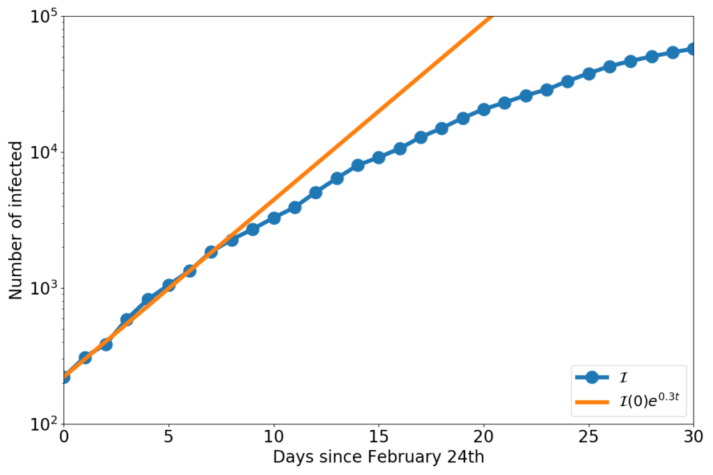
The blue dots represent the number of COVID-19 infected in Italy, and the orange line is the solution of the equation $\dot{\mathcal{I}}=(\beta-\frac{1}{\tau})\mathcal{I}$,  with $\beta-\frac{1}{\tau}=0.3$.

Taking $\tau=14$ days, now we have an estimate for the COVID-19 $R_0$ in Italy:\begin{equation}R_0=\beta\tau=\left(0.3+\frac{1}{14}\right)\cdot 14 = 5.2\end{equation}

Solving the SIR equations by hand is highly non-trivial. But they’re easy to approximate numerically on a computer. The figure below shows the numerical solution that one obtains by assuming that initially one millionth of the population is infected (for Italy, that’d be 60 individuals). For the geeks, I’ve used the midpoint method, with a time step of 0.01 time units.
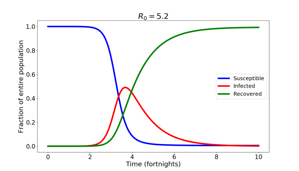
During the first month not much happens. Then, things go awry. The epidemics spreads, and by the end of the second month the infected amount to almost half of the population. After that, slowly, the epidemics subsides as the ill eventually recover and the number of susceptible that can still be infected wanes.

An epidemics like this is short. If the disease is harmful, it is also brutal. The number of those who will remain uninfected is tiny. According to the SIR model, just about 5‰ of the total population. At the peak, the situation is apocalyptic: with half of the population sick, not only the healthcare system collapses, but also the economy takes a dive worst than in a WW2 scenario. If a $R_0=5.2$ epidemics were to run unchecked, it is not exaggerated to say that human civilization would be at stakes. 

So, clearly my estimate is grossly wrong! I must have made a bad mistake! After all, yes, COVID-19 is a tragedy, yes, it is making a huge damage, but human civilization is not at stakes (and the economy will take a hit, but will go seriously sour only where it’ll be mismanaged). And yet… no, no mistake. The SIR model is simple-minded, but my estimates are as good as any. If you don’t believe my little calculations, look at those made by CDC: they estimate a range for $R_0$ from 3.8 to 8.9, with a median value of 5.7. I’m squarely within CDC’s range!

Why, then, COVID-19 is not the end of human civilization? Because we are intelligent people rather than dumb animals, we change our behavior in the  face of an epidemics. Thus the value of $\beta$ is not constant, but drops, even dramatically, if hygienic and lockdown measures are followed comprehensively. Here is what one would have, according to the SIR model, with $R_0=2$.
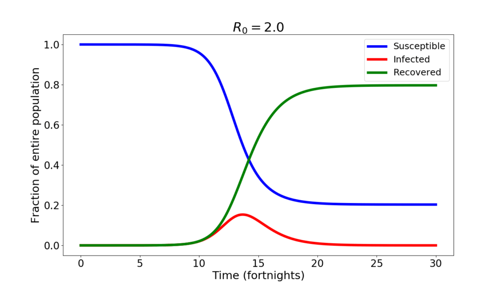
The changes are quite big. The infection peaks at 15% of the population. About 20% of the population never catches the disease. On the other hand, the peak occurs later, after about 7 months from the beginning of the epidemics, and the decline is also slower than before.

If the value of $R_0$ is further reduced to 1.2, here is what the SIR model forecasts.
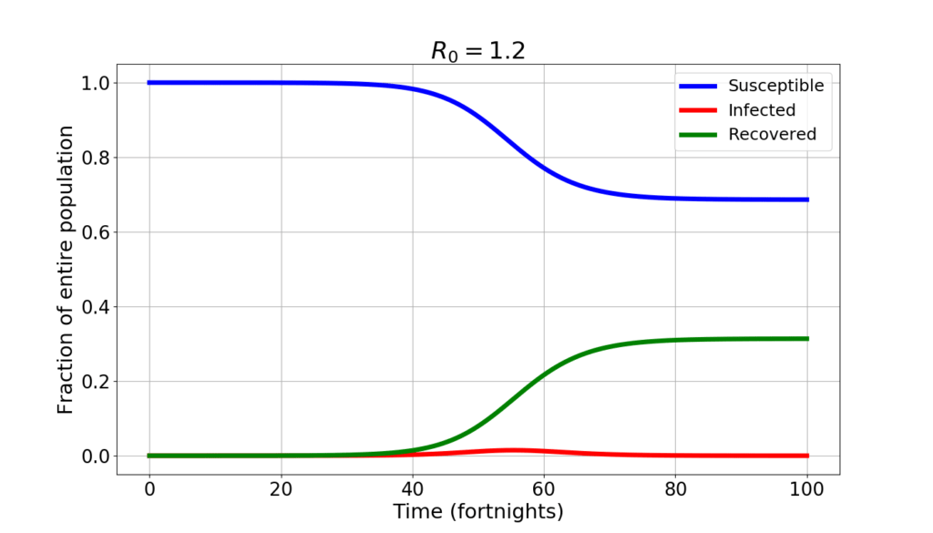
A whopping 70% of the population never catches the disease. The infected peak at 1.5% of the population. But the epidemics lasts much longer: to reach “herd immunity” (the situation where there’s enough immune people that the disease is unable to spread spontaneously) it takes well over a year.

Now you know what it is meant by “flattening the curve”: trading a higher value of $R_0$ for a lesser one lowers the peak, but makes the epidemics longer.

In fact, any measure that may result in lowering the contact rate is generally not taken at the beginning of the epidemics. The following graph shows the curve of the infected in four distinct simulations: initially it is $R_0=5.2$. Then after 4, 5, 6, 7 weeks, respectively the value of $R_0$ drops to 1.2, simulating a sudden and very harsh lockdown.
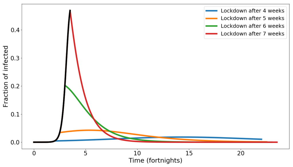
When the lockdown occurs early, the number of infected peaks late, and at low numbers. When the lockdown occurs late, the peak is early and high. 

Don’t manage an epidemics by estimating $R_0$

Let’s go back to what I was saying at the beginning. Is $R_0$ a useful concept for managing an epidemics such as COVID-19?

What I have shown above is enticing: the dynamics shown by the SIR model seem to make sense, and to provide guidance. And, on a general level, it does: taking containment measures as early as possible is important for reducing the height of the peak. But at that level, the model is just reinforcing common sense.

Troubles start when one wishes to be quantitative: which value of $R_0$ will maintain the number of infected below the healthcare capacity?

I like to think that my 24 readers have, by now, got to the core of the matter. Estimating $R_0$ with a model makes all deductions that we can make with that number model-dependent. And so, if the model is inappropriate, one may risk to take very bad policy choices.

The SIR model is too simplistic for most practical uses. Not only it doesn’t distinguishes between recovered and dead, but it also doesn’t allow for an incubation period: one becomes infected (and contagious) instantly after the contact. In addition, the SIR model is completely oblivious of space. Just as in the box game, any individual has the same chance of entering in contact with an infected: the gradual geographical spreading of an epidemics is not described. Of course fixing these flaws is possible, but only at the cost of introducing new difficult-to-measure parameters. 

Add to that the fact that monitoring an epidemics is far from easy. In particular for a new diseases such as COVID-19 (even testing for the virus is still a lengthy and costly process, and we are fortunate that a test was found very early in the pandemics). Some countries have even given up on carefully monitoring recoveries and deaths! Thus, hoping to reliably estimate many model parameters is a fool’s game.

A game that, unfortunately, many play. It doesn’t take much to fish out on the net sites that offer real-time estimates of $R_0$, and long-term forecasts of the epidemics.

There’s nothing wrong in making models and trying to learn from them (that’s what I do for a living…). But taking any model as a crystal ball is just plain wrong. As scientists, we should know better. 

What is to be done?

The information that really matters is the number of infected individuals present at any given moment: those are the ones who can propagate the contagion. That is what we called $\mathcal{I}$ in the SIR model, and is the difference of two quantities that need to be carefully tracked: how many individuals have caught the disease, and how many people have ceased to be diseased (either through recovery or, sadly, through death). 

To gauge whether the epidemics is speeding up or slowing down, the best indicator is the growth rate $r$. That’s the ratio $\dot{\mathcal{I}}/\mathcal{I}$ and can be estimated very simply from the data, as follows $$r=\frac{\mathcal{I}_n-\mathcal{I}_{n-1}}{\mathcal{I}_n}$$ where $\mathcal{I}_n$ is the number of infected on the $n-$th day of the epidemics. 

The growth rate is easy to understand if one converts it into doubling/halving times (the conversion formula is $h=(r\log_2(e))^{-1}$). Using days as a measure of time, a doubling time of, say, 5 means that the number of infected would double in 5 days (if nothing else changes in the meanwhile). A lower growth rate would translate into a higher doubling time. When yesterday’s number of infected $\mathcal{I}_{n-1}$ is higher than today’s $\mathcal{I}_n$, then one obtain a negative growth rate, and a negative doubling time, which, really, is a halving time. For example, if one finds a doubling time of -20 days, it means that, if the current growth rate doesn’t change, after 20 days the number of the infected will be half of the current one.

In the following graph I have plotted Italy’s growth rate (blue dots) as a function of time. The corresponding doubling/halving times are on the right-hand side axis. The red and magenta straight lines are linear trend lines, and the thin black and grey lines span the confidence interval of those trends. (See here and here for lengthier discussions of this graph). 
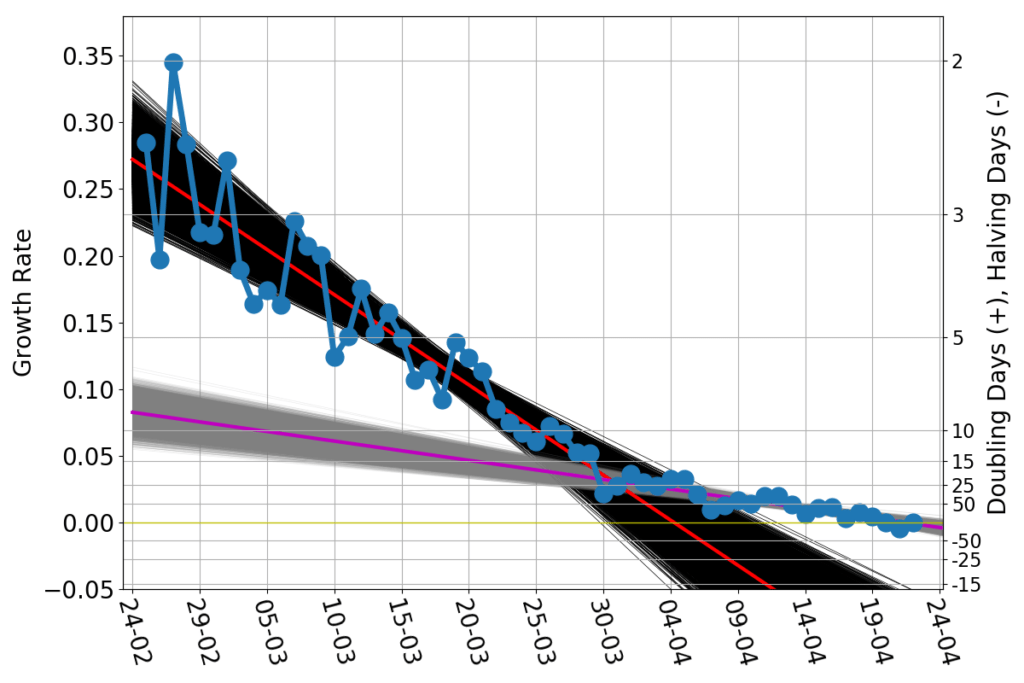
While the lockdown measures in February and March became harsher and harsher, the spread of the contagion progressed at a progressively slower rate. Once the lockdown measures could not made any harsher, the growth rate kept slowing down, but at a much lower pace. As of April 22nd, the current growth rate is about zero, suggesting that Italy has reached the peak of the number of infected.

For a policymaker, looking at the growth rate graph is alike for a sailor to looking forward, beyond the bow of the ship. One doesn’t see far, but bumps in the growth rate signal trouble just as surely as localized white caps signal dangerous shallows. Policies can (and should) be adjusted on the fly, based on what the growth rate graphs does.

Models are like maps. In the case of COVID-19 we are essentially checking the goodness of the maps by sailing into a largely unexplored territory. In this situation maps offer some general guidance, but there is no substitute for carefully looking at what lies just beyond the bow. Thus, carefully collecting data, and scrutinizing their pattern is much more important than attempting $R_0$ estimates or other vacuous exercises. Because those who rely exclusively on a map, and set the auto-pilot accordingly, are always in for some bad surprise.

____________________________________

(*) I apologize for my pedantic punctiliousness. But “social distance” is what forbids me to pat on the shoulder (or even address a word to) the V.I.P.s. That’s typically measured in dollars. The spread of a disease such as COVID-19 is reduced by maintaining a geometric (Euclidean!) distance between individuals. That’s measured in meters (or feet, if you happen to be living in some English-speaking countries).
COVID-19 in Italy: (VI) Germans don’t die, Britons don’t heal

This is the sixth installment of an ongoing series. The previous posts are here: (I), (II), (III), (IV), (V).

Remember the opening scene of the movie “Gladiator”? The almighty Roman legions unleashing hell over the brutish German tribes, doomed to be vanquished by the unstoppable advancement of civilization?

Hollywood’s baloney!

Ever since Varus lost three legions in Teutoburg’s ambush, almost all the vanquishing and of the pugnacious hell went the other way around. German generals and emperors have often dignified the Peninsula with their awe-inspiring might (and not always for war), hammering down in the minds of the Italian population the notion that German men and women must be some sort of nearly divine entities. (Yes, Frau Bundeskanzlerin, too.) 

And if European history is not your forte, just consider that they’ve won as many world cups as we did: they got to be semi-gods!

Of course, I’m not immune to that mindset. Therefore, when I heard a rumor stating that Germans have such a low COVID-19 death count because their genome is different from the rest of the world, making them more COVID-19 resistant, I instinctively told to myself: Of course! How could I have not thought about it? Then I recalled that the last time somebody talked about German’s intrinsic genetic superiority it didn’t bode well for anyone, so I gave myself pause. 

I do believe that the notion of Volksgeist  (Esprit des nations, if you live west of the Rhine) has some merit. But, as much as cultural and linguistic boundaries may be powerfully sharp (and dangerous fools are those who don’t acknowledge that), their genetic counterpart has to be fuzzy beyond belief, especially in a continent where history has stretched and folded people almost as much as a taffy candy.

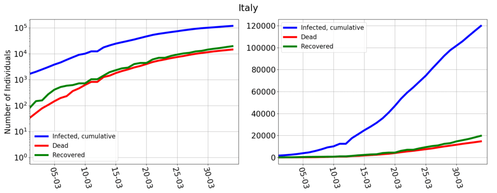
So let me stop blowing hot air balloons, and look hard at the data. Here I’m using the world-wide data collected by Johns Hopkins University. They track the cumulative number of (i) infected individuals, (ii) deceased individuals, (iii) recovered individuals. Their data for Italy is shown in the following figure (the left panel uses a vertical log-scale, the right panel a linear one, but the data is the same in both):

The numbers coincide with those of Protezione Civile (which appears to be Johns Hopkins’ data source for Italy). But they are reported differently: the cumulative number of infected individuals reported by Johns Hopkins (and many other data sources) is not the same as the number of currently infected individuals, reported by Protezione Civile. The relationship is the following:

cumulative infected = currently infected + dead + recovered

For epidemiological analysis, the number that matters is that of the  currently infected: only those that are alive and currently have the virus in their body can potentially spread it.  But the number that is actually measured is the cumulative infected: one simply counts all those that test positive to the virus. If then one is diligent enough to keep track of the deaths and of the recoveries, then the number of currently infected is easily computed by subtraction. 

At the EU level there is a clear and thorough definition of what is a COVID-19 case. Italy follows that. Furthermore, Italy adopts a strict definition of “recovered” patient: one that after having tested positive then tests negative for two times in a row. Finally, Italy tracks all of the deaths of individuals tested positive. According to this criterion, if I tested positive and then I were hit by a bus, I’d still be counted as a COVID-19 death. Which doesn’t make much medical sense, but makes perfect epidemiological sense, because the bus would have forcefully removed me from the pool of those who can spread the infection. 

(By the way, I have not been able to find any EU directive on how to count the recovered or the deceased. In fact, data collection and validation, pompously called “epidemic intelligence process”, appears to occur essentially at the national level, and according to national rules).

Anyhow, the Italian data show that the number of resolved cases (recovery + death) is roughly the same as the number of infected of 15 days before. An early assessment by WHO estimated the typical length of the illness to be about two weeks. Thus the data makes sense: those who got infected at day $n$, by day $n+15$ should either have healed or be dead.  The scary part is that in Italy deaths are almost as frequent as recoveries. It shouldn’t be this way. The WHO report mentions that “severe” or “critical” cases require three to six weeks “to recover”. Deaths are those who, have been “severe” or “critical” and, unfortunately, didn’t recover. Thus, they should then lag much more than 15 days, if we trust the WHO report. In Italy the median time from the onset of symptoms to death is 10 days, with a strong sensitivity on whether  intensive care units were available or not. Either that initial report was overestimating the length of the illness, or this is evidence that the Italian health care system is being overstretched beyond capacity (truth may be a little bit of both).

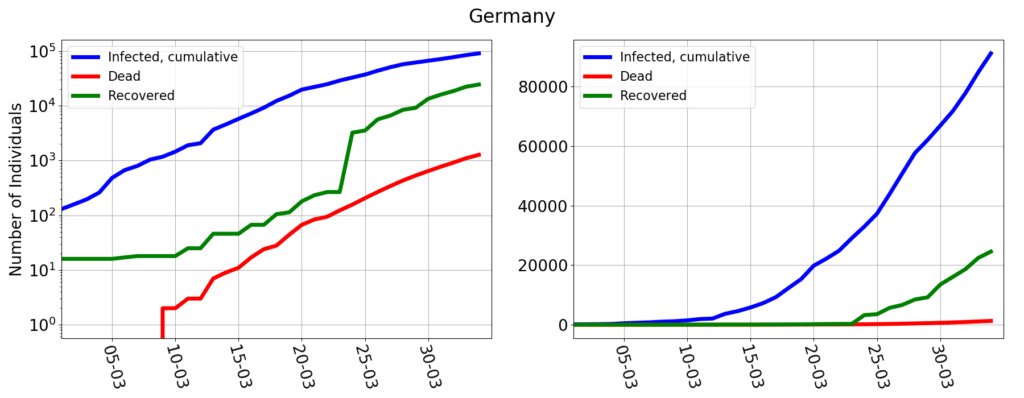
Germany’s data are here:

The number of deaths seems to be lagging that of the infected by almost 25 days (as usual, the log-scale graph gives a better understanding of this kind of dynamics than the usual, linear scale).

Aha!

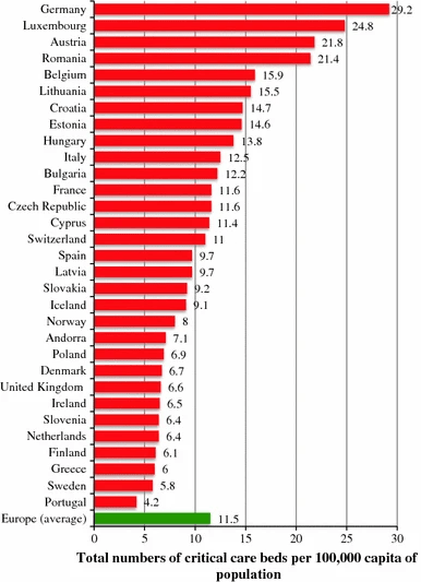
That would make Germany more in like with the WHO estimates and solidifies the idea that high mortality in Italy is a tragic side effect of an undersized healthcare system. After all, Italy’s hospital beds per 1000 people are two and a half less than in Germany. And if one restricts the statistics to intensive care units, the picture doesn’t get any better:

Given the data, it is perfectly possible that the difference between the death rate in Italy and in Germany is solely determined by a more capacious health care system.

But…

But!

What is that sudden spike in the number of recovered between March 23rd and March 24th? Up to March 23rd Germany never had more than 200 recoveries. Then suddenly on March 24th 2837 people healed up (I’m happy for them, but why did they all wait the 24th?). For there on, the number of daily recoveries went onward erratically, with days counting just a few hundred recoveries, and other days with recoveries in the thousands. This is the sort of things that a data analyst has nightmares about: the patterns visible in the data make no sense at all, and yet those are the data written down on the public record.

A data analyst’s memento is that data should never ever be analyzed, unless one is sure of what one is looking at. 

Because I wasn’t sure of what I was looking at, I tried to document myself. It appears that COVID-19 data in Germany is gathered and reported by the Robert Koch Institute. I can’t read German (so it’s possible that I have missed something) but they are kind enough to offer some reporting in English. Their latest epidemiological report clearly states that the number of recovered patients is an estimate! The language is quite vague: if somebody was sick before March 22nd and then didn’t report symptoms anymore, then he or she counts as recovered. And yet, not all cases are included in the count, because  they “were included in the algorithm only if information on date of symptom onset, symptoms, hospitalisation status and vital status were available“.

Aha!

This is the smoking gun proving that recovery numbers in Italy and in Germany are oranges and apples: you can’t compare them.

What about the deaths? The RKI document is not particularly exhaustive in this respect (I’m sure there’s plenty more information in German, somewhere). It generically speaks of “COVID-19 related deaths“. But what is the relationship? Just having tested positive and then having died makes a relationship exist? Maybe so, but a clearer language would have been appreciated.

The epidemiological document that I have already quoted shows that, in Italy, most of the deceased who had tested positive to COVID-19 where already affected by one or more illnesses. Only in about 3% of the cases the patient was previously perfectly healthy. Most of other cases had serious pre-existing conditions. And this begs the question: if a COVID-19 positive patient with, say,  a pre-existing heart disease dies from heart attack, how would that be counted in Germany?

If the Italians had decided to count only the instances where COVID-19 clearly and undoubtedly were the single most important cause of death, then the Italian number of COVID-19 deaths would drop dramatically, possibly reaching German levels, all depending on the exact definition of COVID-19 death that one elects to use.

Lacking a clear definition of what is a “COVID-19 related death“, the suspicion that death numbers of Italy and Germany are also like oranges and apples appears to be more than a wild hypothesis.

(Yes, that was an understatement.) As they say in Rome: “ma de che stamo a parla’?“.

(That idiom on the high table of a Cambridge college would more or less be translated as: “I’m terribly afraid that our debate has been revealed to be utterly moot!“.) 

I just mentioned the people who enjoy warm cervisia, (I do, too) which means it’s about time to have a look at the UK data.

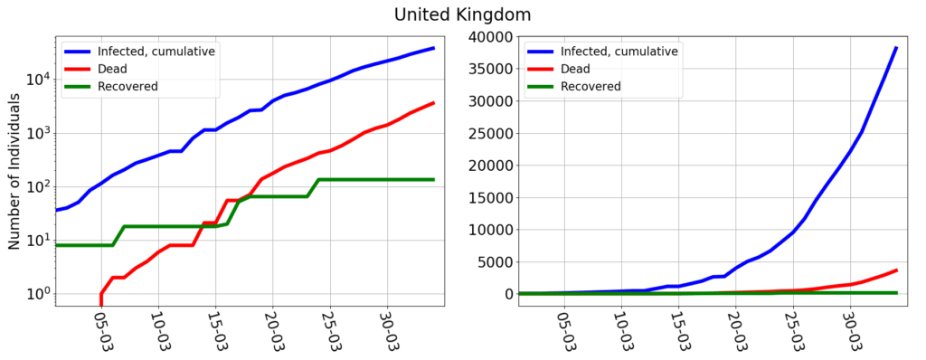
In Great Britain the number of those counted as coronavirus deaths lag less than 15 days behind the number of infected, suggesting that the UK health system might be even more overstretched than the Italian one. The official documentation very clearly states that “the figures on deaths relate in almost all cases to patients who have died in hospital and who have tested positive for COVID-19”, but “do not include deaths outside hospital, such as those in care homes”. In summary it’s the same criterion as in Italy, except that they are acknowledging that the count is incomplete. What the UK government doesn’t say (or I was unable to find) is how the recovered are counted. The graph shows a really peculiar pattern, where recoveries occur in jumps, every few days. And in any case, so far, only 135 people would have recovered, on a total of over 47 thousands infected.

Ma de che stamo a parla’?

At the end of this post, if my 24 readers walk away with a clear notion that different countries gather data in different ways, and this hampers a proper analysis of the COVID-19 epidemics beyond the national scale, then I have been successful. 

And yet there’s a more important, hidden, overtone. Here I have not done sophisticated mathematical modeling, subtle scientific arguments, or clever deductions. I have just gathered some documents and brought about some questions (yes, let me be clear: I have no clear cut conclusions to offer, just questions). But… shouldn’t be this the job of journalists?

Indeed, the huge discrepancy between Germany’s and Italy’s death count has not gone unnoticed, and a zillion news articles have been written on the topic. Let’s examine the one by the New York Times. On the surface it’s very eloquently written, but upon closer look it reveals to be a mash-up of plausible, but unverified, statements, outlandish theories, and plain falsehood. 

Let’s briefly go through some of those:

  • The coronavirus in Germany mostly affects the young (which are way more resistant than the elders to COVID-19).

Well, the population pyramid of Italy and Germany are very similar, if anything, Germany has a little more elders than Italy. Then, if really the median age of the German patient is so much lower than elsewhere, I see a question to be asked, not an answer being given: what avoids the contagion to spread to the elderlies? (No sci-fi, please, just reliable data: a speculation is that German’s social structure leads to a higher segregation of elderlies, but without objective data, it’s just hot air.)

  • Germany has been testing far more people than most nations.

(The implied explanation being that in other countries there are lots of patients with little or no symptoms that do not get counted.) It’s true that Germany has been testing more than Italy: 918,460 vs 691,461. But that’s not much more. The hypothesis would be believable if the fraction of German patients in serious or critical conditions were much less than elsewhere (for Italy that’s about 22.5%), but that figure is not disclosed. (At least not in RKI’s English documentation, which, however, mentions that 12499 intensive care beds are “occupied”, without clarifying whether it’s all from COVID-19 positives, or other people, too. If it were 12499 COVID-19 patients that would amount to over 15% of the infected…).

  • Effective tracking and shut down of at-risk areas (e.g. schools)

If tracking and shut-down were effective in reducing the number of deaths, it could only do so by reducing the number of infected. But that number is still growing at an alarmingly fast pace…  In other words, tracking and shut-down may affect the growth of the epidemics, but don’t explain the ratio between the number of infections and deaths.

  • More intensive care beds

That is something I could believe, because I’ve been able to substantiate the claim with hard numbers (see above).

  • Frau Bundeskanzlerin has thaumaturgic powers 

(Yes, no kidding, read the last section.)

It’s a journalist job that of asking questions, read official documents and evidence inconsistencies, ambiguities and shortcomings. 

On COVID-19, as that NYT article manifestly shows, journalist are acting just as spin masters. As the crisis rages on, people will ohh and ahh at what they read in the press. But in the long run, it will only take credibility away from any news. And that’s not good.

While collecting material for this post, I have greatly benefited from discussions with my colleagues and friends Luciano Jannelli and Christian Haefke. Of course, all opinions and any mistake is solely mine.

COVID-19 in Italy: (V) Is the lockdown working?

This is the fifth installment of an ongoing series. The previous posts are here: (I), (II), (III), (IV).

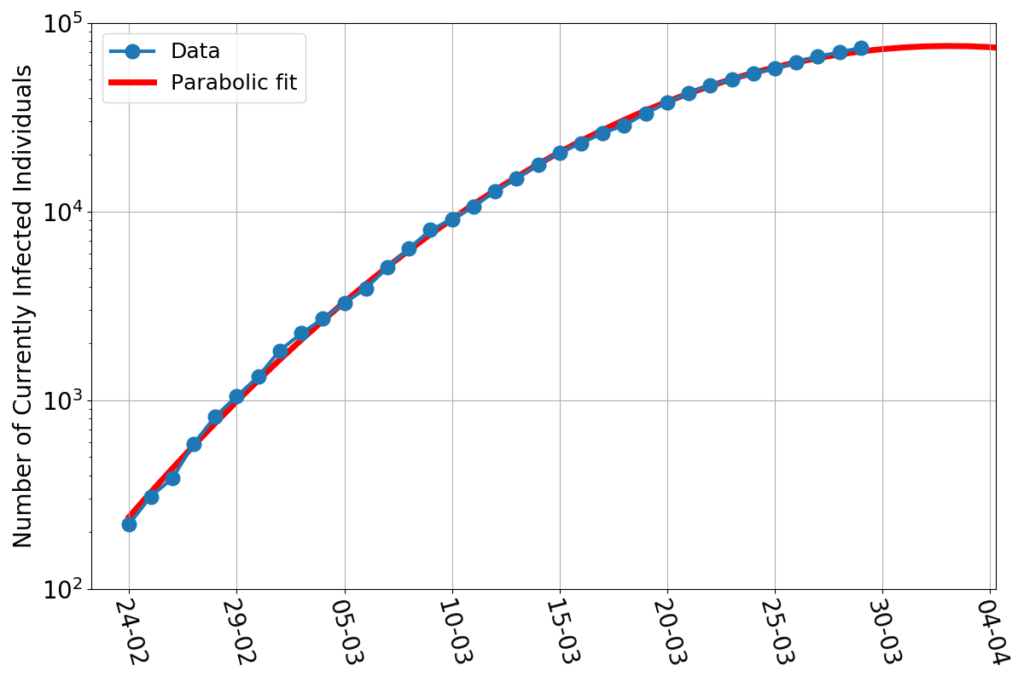
Day after day, the new data remain true to the trend that tickled my attention about three weeks ago. That trend makes the progress of the epidemics to appear as a parabola, in a graph that has a logarithmic vertical axis. As I explained here, that’s the same thing as to say that the growth rate of the epidemics decreases linearly in time (“decreases linearly in time” is jargon to say that something declines of the same amount every day). If the trend continues, we’re on track to see zero growth rate within one week, and that would be the peak of the epidemics. Thereafter, inshallah, the growth will become negative, corresponding to a decreasing number of infected.

What’s the cause of the epidemics slow-down?

One possibility is that the epidemics has already involved a large fraction of the population. In that case, just like a fire that has already burned most of the forest, it first slows down, and then becomes extinguished by lack of fuel. Or, in other words: if you are the only person infected in town, any person that comes into contact with you can become infected. But if  a large size of the town’s inhabitants are already infected, you’re not likely to contribute much to the contagion: most of the people you’ll meet are already infected!

In past centuries, that’s how most epidemics have ended: because new people to be infected had become scarce. Can it be the case for COVID-19? Apparently, according to some colleagues at the University of Oxford, yes. This article of the Financial Times (no less!) states: “Coronavirus may have infected half of UK population — Oxford study“. Oddly enough, at the time of publication there was absolutely no sign of slow down of the epidemics in the UK, making the Oxford study, and the FT article, more alike to fake news than serious reporting (now somehow acknowledged by a footnote at the end of the article).

But Italy appears to be at a much more developed stage of the epidemics than the UK, and the growth rate, indeed, is slowing down. Therefore, if the number of infected individuals really is underestimated by orders of magnitude, then it’s plausible that the Italian epidemics is slowing down because it’s running out of fuel.

(This scenario definitely has doomsday’s overtones, but, in fact, it is often presented like a blessing: the infected individuals that have not been counted can’t have developed any serious symptoms, or they’d have been recognized. So, the vast majority of COVID-19 infected would be asymptomatic or nearly so, which would make the disease, on average, less lethal than a common flu.)

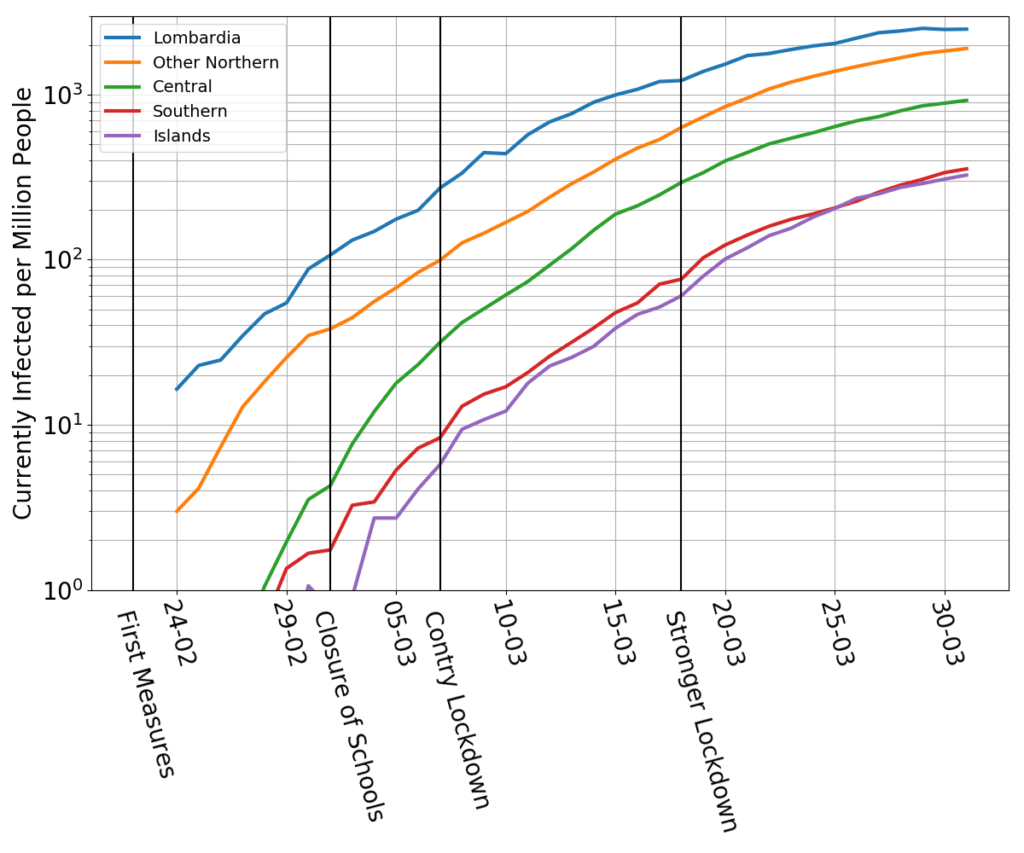
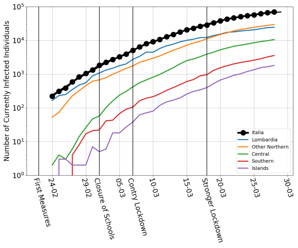
Data, however, tell us otherwise. The following figure shows the fraction of the local population which is officially infected for Lombardia (the most populous region in Italy, and the one that was hit the earliest and the hardest by the epidemics), for the rest of the North, and the Center, South and Islands.   

Even if we held that some sort of mechanism massively hampered the recognition of the infected, there’s no reason whatsoever to believe that the misses would occur more frequently in the South than in the North. Thus, looking at the data, we still need to conclude that the North has 10 times more infected per million people than the South and the Islands. 

And yet, the curves of North, Center, South and Islands bend in unison. If the slow down of the North were due to the virus running out of new people to infect, the South and the Islands, with a much lower proportion of infected, should have kept growing fast. Instead, they slow down, too. 

These data show that the cause of the slow down has acted simultaneously over the entire country, even though the contagion was much more advanced in the North than in the South.

And what then that cause would be? Short of inventing some other conspiratorial fantasy, the obvious conclusion is that the slow down has occurred because of the progressively harsher lockdown measures. In the last 15 days or so, Lombardia has slowed down a bit faster than the rest of the country. In fact, it might be peaking right now. That’s consistent with the harshest measures having been implemented there (and in Veneto, which goes at the same pace as Lombardia, as showed here). 

If I’m not fooling myself, then the linear decrease of the growth rate of the epidemics in Italy is due to a progressive crescendo of the lockdown measures. If we had gone suddenly from business as usual to a state of near curfew, the growth rate should have shown a transition between two nearly constant plateaus. Not a sharp transition, though. The disease requires several days to incubate, and this number appears to be highly variable. Lockdown measures may start to curb the growth rate of the disease a few days after their adoption, but their fullest effect would take no less than two weeks to manifest. The transition between a plateau and the next would be a gentle slope. Thus, a sequence of harsher and harsher measures taken at intervals of a week or so, might very well bring about a linear decrease of the growth rate.

And so I conclude contemplating a glass which is half full, and half empty.

It’s half full, because the lockdown is working. Italy’s fight is not in vain. The sacrifices are paying back.

But it’s also half empty. At this stage, which further measures can possibly be taken to reduce even more the growth rate, and take it to negative territory? The country is strained, the economy on the verge of depression. If further sacrifices were required to win the disease, would the country be able to endure them?

COVID-19 in Italy: (IV) making sense of the parabola

Today’s data look this way:

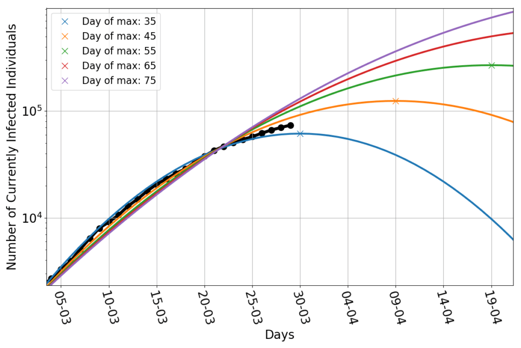
On a vertical axis logarithmic scale the data points still nicely align along a parabolic fit. The maximum of this fit, however, didn’t stay put. It now has shifted to about April 2nd, and the last few points are a little above the curve, so it’s quite likely to keep shifting in the next few days. 

There’s news, however. If I repeat the exercise of fitting parabolas whose maximum is set beforehand, (see here for details), I now find this:

The data points appear to be wedged between the parabola peaking on March 30th and that peaking on April 9th. Shifting the peak much beyond that date would require a significant deviation from the parabolic trend.

Big deal! – One might say. After all, there’s no obvious theoretical reason to believe that the data have to align along a parabolic trend. If no natural law forces them to take that shape, then we shouldn’t hope to see them following that pattern forever. And yet, so far, they did. 

This calls for a little additional investigation.

I said that the number of currently infected individuals $I$, seen as a function of time, must obey the equation $$\frac{dI}{dt}=r(t) I$$ (last time I used Newton’s dot notation $\dot{I}$ for the time derivative of $I$). This is always true, provided that one picks the correct growth rate function $r$. And this, obviously, begs the question of who or what is going to tell us which is such an $r$. Well, the honest answer is: no one. But thinking in terms of growth rate, rather than in terms of number of infected individuals, may give us a more powerful (albeit more abstract) way to think about the epidemics.

If you have ever taken calculus, you’ll now that the equation can be rearranged in this way: $$\frac{d \log(I)}{dt} = r(t).$$ In plain English, this tells us that the rate of change of the logarithm of $I$ is the same thing as the growth rate. 

If one plots a function (say, the number of currently infected individuals vs time) using a logarithmic scale on the vertical axis, that’s obviously just the same as plotting the logarithm of the same function on regular axes. 

So, the above equation tells us that, at each time $t$, the growth rate is just the slope of the curve that we see in the first figure of this post. As you might recall from calculus, if you were to draw the values of slopes at each point along a parabola, you’d get a straight line.

In short, and in the simplest possible terms: if the infection shows a parabolic trend on a log-scale graph, then its growth rate decreases linearly in time. The converse is also true; if the growth rate decreases linearly, then the trend of the infection will be parabolic (on a log-scale graph).

So, on one hand we should really look at the growth rate, and see if it goes straight, on the other hand, the growth rate is the one thing that we don’t know.

Ouch! 

Well, we still have the data. And we can use them to compute some approximate estimate of the true growth rate. I shall use the simplest and crudest one: $$r(n) \approx \frac{I(n)-I(n-1)}{I(n)}.$$ That is, the growth rate at day $n$ is the ratio between the increment of infected with respect to day $n-1$ and the total number of infected at day $n$.

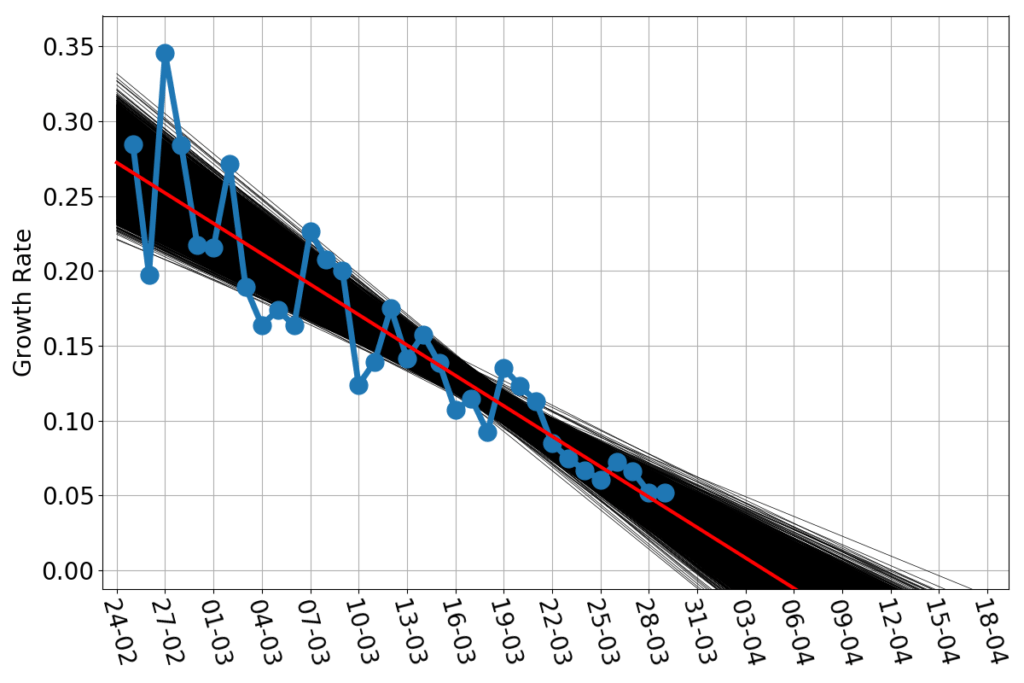
This yields the blue dots in the following figure:

The estimated growth rate wiggles a lot, in particular in the early part of the time series, but surely seems to have a downward linear trend. The red line is the straight line that best fits the blue dots. As before, we should note that the best fit is not the only reasonable fit. What would be the variation among fitting lines that are decent approximations to the data? The answer obviously depends on what is your criterion for a “decent” fit, as well as a host of other hypothesis. I’ll just go the rough and easy way: bootstrapping my data set.  Imagine to put your $m$ data points in a jar, extract one, note what that is, reinsert it into the jar. Shake the jar and repeat $m$ times. Now, on your notes, you have a new dataset of $m$ data points. Most likely, some of them are repeated (they’ve been extracted twice or more), and some that appeared in the original dataset are missing (they’ve never been extracted). And yet the straight line which is the best fit for such a bootstrapped dataset is also a decent fit for the original one. The beauty of bootstrapped datasets is that, even with few data points, there’s plentiful. The 10000 black lines in the above figures are each the best fit to 10000 bootstrapped versions of the blue data points. That bunch of black lines shows visually how much, at most, we can expect the red line to be wrong. Provided, of course, that the growth rate really keeps a linear trend.

I don’t think it will. Maybe it’s the late hour, maybe it’s the long days of home confinement, but I’m not so inclined to optimism. It appears that the public health measures have slowly, steadily decreased the growth rate of the epidemics. But can they bring it to a halt, and then make it negative? 

That’s the topic for another post.

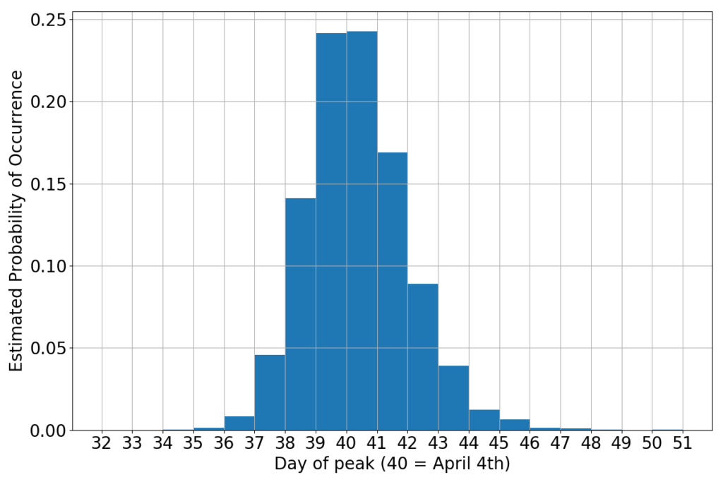
For now, I just say that if the growth rate really decreases in time as a straight line, then we have another predictor for the peak. The peak, obviously, is the moment when the infection curve will neither grow, nor decrease. That’s growth rate zero. We now have ten thousand different estimates for such a zero (one for each black line). All together they yield this probability curve:


If you believe this little alchemy (the math is sound, but the hypothesis that the growth rate will keep straight is a gamble) then the peak should occur sometimes during the first week of April. Not surprisingly, this is consistent with the wedging of the data between the parabola peaking on March 30th and that peaking on March 9th. It’s just a different way to say the same thing.

It wouldn’t be bad if it stayed this way…

COVID-19 in Italy: (III) regional breakdown

The fight against the virus rages on. It’s obvious that the peak won’t be attained in March, but there’s no evidence that it has slipped forward by a humongous amount. The situation is hanging in the balance and uncertainty is still sovereign. Yet there’s still hope for a peak in the first few days of April. 

Or there’s is not?

I hoped to gain more information by looking at the regional breakdown of the national data. At the moment of this writing, the situation in Italy is highly inhomogeneous. One of the northern regions, Lombardia, is in truly dire straits. The rest of Northern Italy is not in good shape, either. As you move South, the numbers taper down tremendously, but don’t vanish. This begs the question whether the overall trend is the same over the entire country, or different regions are showing different dynamics.

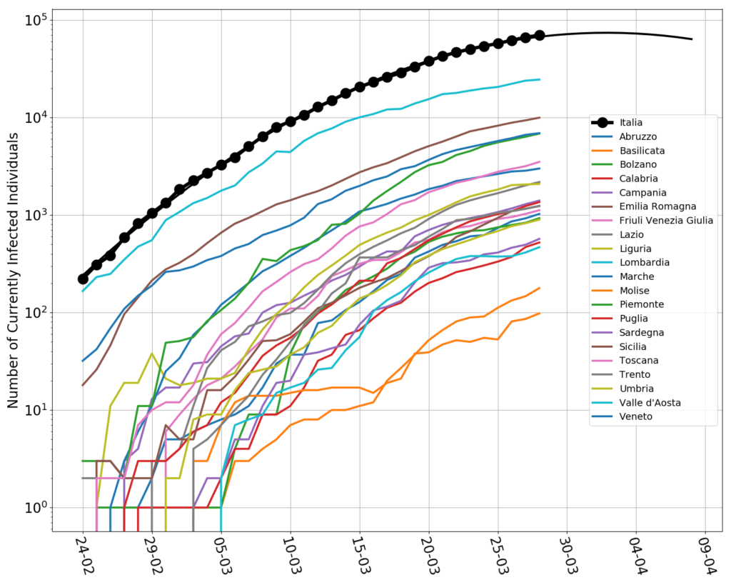
I spent a few minutes weaving together a little python script that reads the regional data by Protezione Civile (here). These are the plots, in log-scale.

Even though I’m Italian, I can’t handle this bunch of jerking spaghetti. There are surely some interesting patterns, but, all together, is too much. In addition, laboratory backlogs and other data processing issues, have created spikes and sudden turns on the curves, making it difficult to distinguish what is real from what is, arguably, an artifact of the data collection process.

Therefore I have aggregated the data. Lombardia is still kept on its own. The rest of the country is broken down in “Nortern”, “Central”, “Southern”, “Islands”.  On the graph, I have also marked the dates of the first lockdown measures, involving only selected municipalities in Lombardia and Veneto, of the closure of all schools and universities, of the country-wide lockdown, and of a further restriction on the citizen’s freedom of movement. (A detailed timeline here.)

The clearest pattern is that Lombardia is, yes, the most affected region, but it is also the one that, since the beginning of the data collection, has slowed down the most. By and large, the other parts of the country have gone along roughly parallel curves. The central part of the country was speeding up the most in the first part of the epidemics. The southern and the islands may possibly have not slowed down as much as the others in the last few days. 

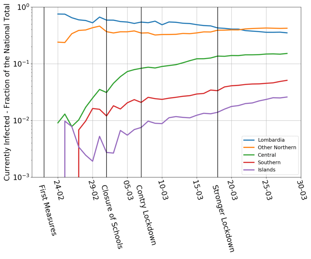
These eyeballed patterns are confirmed by the next graph, which plots the fraction of currently infected individuals with respect to the national total.

Southern Italy and the islands currently have a small minority of the overall infected population (less than 10%, jointly). But their fraction is increasing at a disturbing pace. A vague possibility is that this is a delayed effect of the wave of Southern residents who worked in the North and hurryingly returned South when news of the country-wide  lockdown leaked from the government’s offices. After all, if you were a temporary worker subletting a room in Milan, what would you do when your employer shuts down for what may be a long stretch, and simultaneously you hear than you might be stuck for many months, without an income, in a highly expensive city? Parents and grand parents back home may be the only social safety net left…

And this leads to a more general consideration. A country hit by an epidemics is just like a body bitten by a venomous snake. In the absence of an antidote (there’s no vaccine yet) one needs exert pressure to slow down the blood circulation. But that is feasible only up to a point. If not enough blood circulates, any poison damage avoided will be more than compensated by gangrene’s. So, economic measures must go in lockstep with hygienic ones, and are not antithetic to them (as the comments of some brainless pundits and cheeky politicians have sometimes implied on the news). A subsistence salary for anyone who may need it, even (in fact, especially) for those who were undocumented workers, as well as state-granted credit lines for companies, especially tiny ones, may be the most effective way to convince everyone to stay at home.