Author: Francesco Paparella

COVID-19 in Italy: (IV) making sense of the parabola

Today’s data look this way:
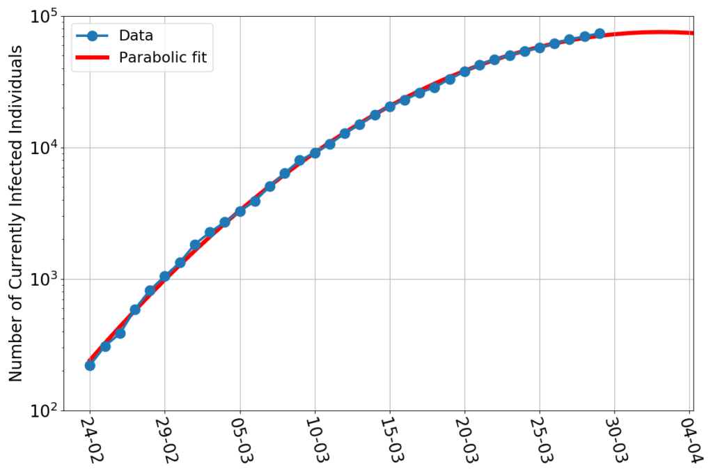
On a vertical axis logarithmic scale the data points still nicely align along a parabolic fit. The maximum of this fit, however, didn’t stay put. It now has shifted to about April 2nd, and the last few points are a little above the curve, so it’s quite likely to keep shifting in the next few days. 

There’s news, however. If I repeat the exercise of fitting parabolas whose maximum is set beforehand, (see here for details), I now find this:
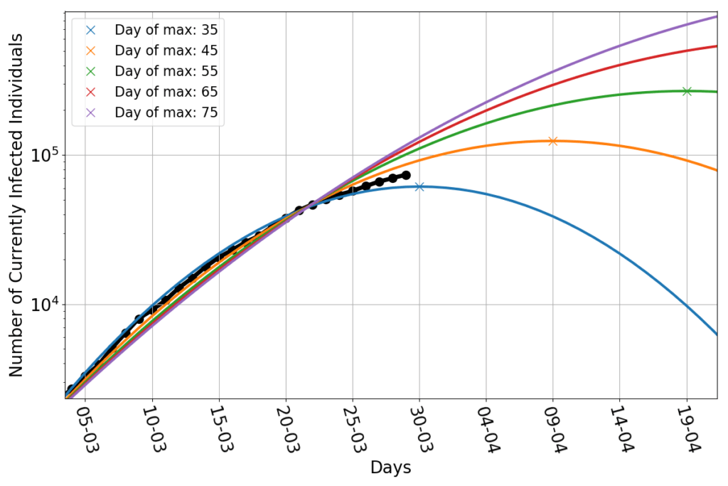
The data points appear to be wedged between the parabola peaking on March 30th and that peaking on April 9th. Shifting the peak much beyond that date would require a significant deviation from the parabolic trend.

Big deal! – One might say. After all, there’s no obvious theoretical reason to believe that the data have to align along a parabolic trend. If no natural law forces them to take that shape, then we shouldn’t hope to see them following that pattern forever. And yet, so far, they did. 

This calls for a little additional investigation.

I said that the number of currently infected individuals $I$, seen as a function of time, must obey the equation $$\frac{dI}{dt}=r(t) I$$ (last time I used Newton’s dot notation $\dot{I}$ for the time derivative of $I$). This is always true, provided that one picks the correct growth rate function $r$. And this, obviously, begs the question of who or what is going to tell us which is such an $r$. Well, the honest answer is: no one. But thinking in terms of growth rate, rather than in terms of number of infected individuals, may give us a more powerful (albeit more abstract) way to think about the epidemics.

If you have ever taken calculus, you’ll now that the equation can be rearranged in this way: $$\frac{d \log(I)}{dt} = r(t).$$ In plain English, this tells us that the rate of change of the logarithm of $I$ is the same thing as the growth rate. 

If one plots a function (say, the number of currently infected individuals vs time) using a logarithmic scale on the vertical axis, that’s obviously just the same as plotting the logarithm of the same function on regular axes. 

So, the above equation tells us that, at each time $t$, the growth rate is just the slope of the curve that we see in the first figure of this post. As you might recall from calculus, if you were to draw the values of slopes at each point along a parabola, you’d get a straight line.

In short, and in the simplest possible terms: if the infection shows a parabolic trend on a log-scale graph, then its growth rate decreases linearly in time. The converse is also true; if the growth rate decreases linearly, then the trend of the infection will be parabolic (on a log-scale graph).

So, on one hand we should really look at the growth rate, and see if it goes straight, on the other hand, the growth rate is the one thing that we don’t know.

Ouch! 

Well, we still have the data. And we can use them to compute some approximate estimate of the true growth rate. I shall use the simplest and crudest one: $$r(n) \approx \frac{I(n)-I(n-1)}{I(n)}.$$ That is, the growth rate at day $n$ is the ratio between the increment of infected with respect to day $n-1$ and the total number of infected at day $n$.

This yields the blue dots in the following figure:
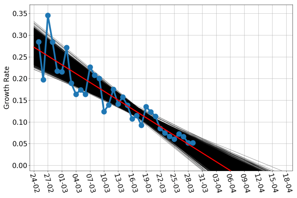
The estimated growth rate wiggles a lot, in particular in the early part of the time series, but surely seems to have a downward linear trend. The red line is the straight line that best fits the blue dots. As before, we should note that the best fit is not the only reasonable fit. What would be the variation among fitting lines that are decent approximations to the data? The answer obviously depends on what is your criterion for a “decent” fit, as well as a host of other hypothesis. I’ll just go the rough and easy way: bootstrapping my data set.  Imagine to put your $m$ data points in a jar, extract one, note what that is, reinsert it into the jar. Shake the jar and repeat $m$ times. Now, on your notes, you have a new dataset of $m$ data points. Most likely, some of them are repeated (they’ve been extracted twice or more), and some that appeared in the original dataset are missing (they’ve never been extracted). And yet the straight line which is the best fit for such a bootstrapped dataset is also a decent fit for the original one. The beauty of bootstrapped datasets is that, even with few data points, there’s plentiful. The 10000 black lines in the above figures are each the best fit to 10000 bootstrapped versions of the blue data points. That bunch of black lines shows visually how much, at most, we can expect the red line to be wrong. Provided, of course, that the growth rate really keeps a linear trend.

I don’t think it will. Maybe it’s the late hour, maybe it’s the long days of home confinement, but I’m not so inclined to optimism. It appears that the public health measures have slowly, steadily decreased the growth rate of the epidemics. But can they bring it to a halt, and then make it negative? 

That’s the topic for another post.

For now, I just say that if the growth rate really decreases in time as a straight line, then we have another predictor for the peak. The peak, obviously, is the moment when the infection curve will neither grow, nor decrease. That’s growth rate zero. We now have ten thousand different estimates for such a zero (one for each black line). All together they yield this probability curve:
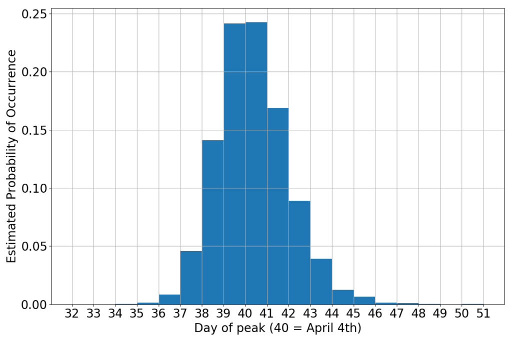
 

If you believe this little alchemy (the math is sound, but the hypothesis that the growth rate will keep straight is a gamble) then the peak should occur sometimes during the first week of April. Not surprisingly, this is consistent with the wedging of the data between the parabola peaking on March 30th and that peaking on March 9th. It’s just a different way to say the same thing.

It wouldn’t be bad if it stayed this way…
COVID-19 in Italy: (III) regional breakdown

The fight against the virus rages on. It’s obvious that the peak won’t be attained in March, but there’s no evidence that it has slipped forward by a humongous amount. The situation is hanging in the balance and uncertainty is still sovereign. Yet there’s still hope for a peak in the first few days of April. 

Or there’s is not?

I hoped to gain more information by looking at the regional breakdown of the national data. At the moment of this writing, the situation in Italy is highly inhomogeneous. One of the northern regions, Lombardia, is in truly dire straits. The rest of Northern Italy is not in good shape, either. As you move South, the numbers taper down tremendously, but don’t vanish. This begs the question whether the overall trend is the same over the entire country, or different regions are showing different dynamics.

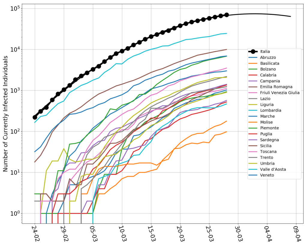
I spent a few minutes weaving together a little python script that reads the regional data by Protezione Civile (here). These are the plots, in log-scale.

Even though I’m Italian, I can’t handle this bunch of jerking spaghetti. There are surely some interesting patterns, but, all together, is too much. In addition, laboratory backlogs and other data processing issues, have created spikes and sudden turns on the curves, making it difficult to distinguish what is real from what is, arguably, an artifact of the data collection process.

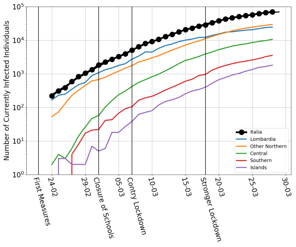
Therefore I have aggregated the data. Lombardia is still kept on its own. The rest of the country is broken down in “Nortern”, “Central”, “Southern”, “Islands”.  On the graph, I have also marked the dates of the first lockdown measures, involving only selected municipalities in Lombardia and Veneto, of the closure of all schools and universities, of the country-wide lockdown, and of a further restriction on the citizen’s freedom of movement. (A detailed timeline here.)

The clearest pattern is that Lombardia is, yes, the most affected region, but it is also the one that, since the beginning of the data collection, has slowed down the most. By and large, the other parts of the country have gone along roughly parallel curves. The central part of the country was speeding up the most in the first part of the epidemics. The southern and the islands may possibly have not slowed down as much as the others in the last few days. 

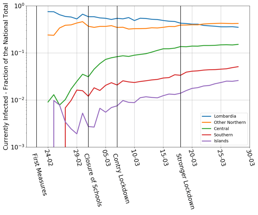
These eyeballed patterns are confirmed by the next graph, which plots the fraction of currently infected individuals with respect to the national total.

Southern Italy and the islands currently have a small minority of the overall infected population (less than 10%, jointly). But their fraction is increasing at a disturbing pace. A vague possibility is that this is a delayed effect of the wave of Southern residents who worked in the North and hurryingly returned South when news of the country-wide  lockdown leaked from the government’s offices. After all, if you were a temporary worker subletting a room in Milan, what would you do when your employer shuts down for what may be a long stretch, and simultaneously you hear than you might be stuck for many months, without an income, in a highly expensive city? Parents and grand parents back home may be the only social safety net left…

And this leads to a more general consideration. A country hit by an epidemics is just like a body bitten by a venomous snake. In the absence of an antidote (there’s no vaccine yet) one needs exert pressure to slow down the blood circulation. But that is feasible only up to a point. If not enough blood circulates, any poison damage avoided will be more than compensated by gangrene’s. So, economic measures must go in lockstep with hygienic ones, and are not antithetic to them (as the comments of some brainless pundits and cheeky politicians have sometimes implied on the news). A subsistence salary for anyone who may need it, even (in fact, especially) for those who were undocumented workers, as well as state-granted credit lines for companies, especially tiny ones, may be the most effective way to convince everyone to stay at home.

COVID-19 in Italy: (II) the twelfth battle of Isonzo

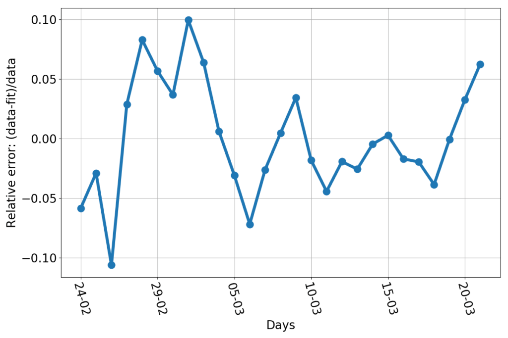
What could go wrong by extrapolating a fit into the future? We’re talking about a very good fit, after all. Just to show how good, here’s the relative error (this graph uses the additional data point relative to March 21st).

Every day, the discrepancy between the data and the fitted line is no more than about 10%. That’s pretty good for something as trivially simple as drawing a parabola through the logarithm of a bunch of data. Now, let’s say that we had a reason to believe that the fit really represented the true dynamics of the infection (we don’t… but allow me, for the sake of the argument). Then what would be the reason for discrepancies with the data? Errors! Errors in the sense a natural scientist would use the word: any unforeseen event that makes your measure a number while reality is represented by a different number. Finding and counting infected individuals is not easy. The incubation period is variable. Some infected people get tested when they are still asymptomatic, and are counted early, others may delay alerting healthcare personnel, and end up being counted later. Testing facilities may be overworked. The test themselves may be not 100% reliable. Finally, the information may arrive too late to Protezione Civile to be counted for that day. For example: the value of newly infected individuals for March 10th is about 600 individuals short, who have been counted on the next day. I fixed that in the plotted data. But other errors are not fixable, because no one can quantify their magnitude with certainty. But “errors”, if they really are such, have a nice characteristic: they’re independent of each other. They should appear as random numbers added or subtracted to the real data, without showing any pattern, bias or trend. And so does the relative error do in this case. I haven’t run any sophisticated statistical test, but, by just eyeballing the graph, I can’t see anything patently off. Sure, the largest errors occur at the beginning of the series, but that’s consistent with a system taken by surprise by the initial burst of the epidemics. Personnel had to be gathered, procedures has to be set in place, the entire public safety machine had to be set in motion. A 10% error in such a contingency is amazingly low. Kudos.  

So, why am I scared? Yes, the last three days aligned in an upward trend, but that still amounts to no more than a 5% error (on today’s fit…). 

Well, here is the trouble: today’s fit peaks on March 31st. Yesterday’s fit peaked on March 30th. And three days ago the peak was forecast to occur by March 29th. In the last three days the date of the peak has sensibly shifted forward as new data piled up.

That’s bad, and gives me pause. Is the fit wrong? No. Is it a bad fit? No. But it wasn’t a bad fit two days ago, either. The relative errors changed little or nothing…

And here’s the hint that sheds light on the problem: could it be that fits which are not the best, but are still believable, may extrapolate to wildly different peaks?

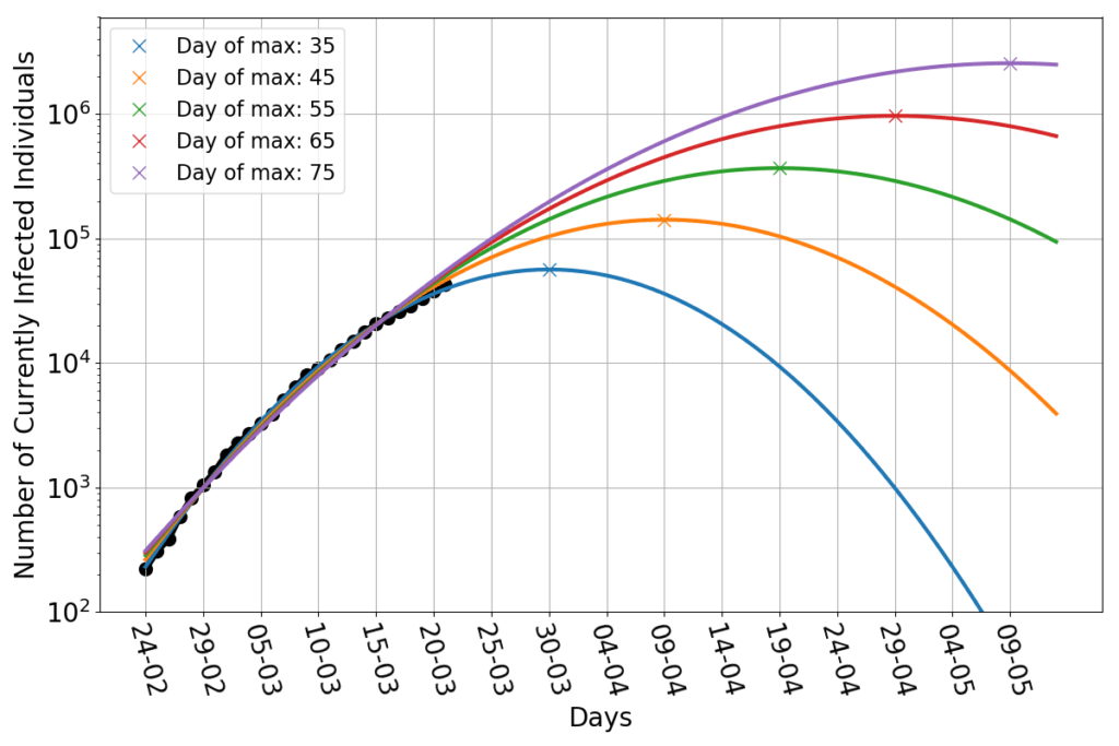
Let’s then play this game: we keep assuming that the infection will have a parabolic trend (in log-scale), but we impose by hand the date of the maximum. Namely, I select all the parabolas that peak at a given day, and use only the remaining two free parameters to fit the data. And here’s the dramatic result.

The blue line is yesterday’s best fit, which peaks 35 days after the day zero (February 24th). It still looks good as a fit today. By imposing the peak to occur on day 45, we obtain the orange line. That doesn’t look like a bad fit either! The green line has a peak on day 55. Even that is pretty darn close to the data. And so are the parabolas peaking at 65 and 75 days. They all look very close to each other in the region covered by data. But they are wildly different in the future: the last line peaks above two million infected people! 

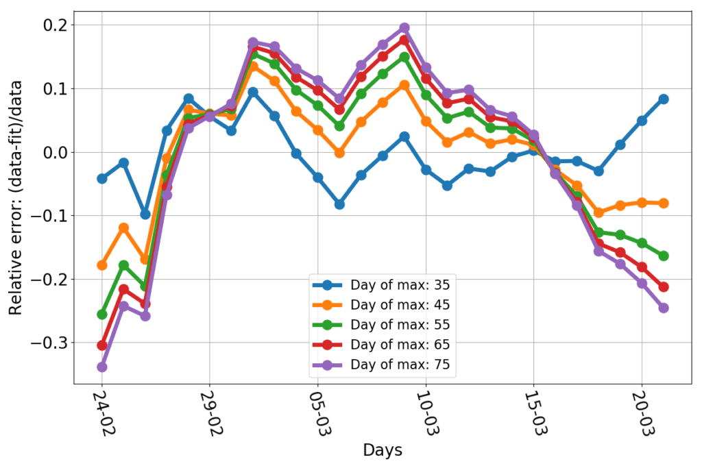
Here are the relative errors of those constrained fits.

Obviously the blue line has the best-looking errors: the smallest and more evenly spread out. The other lines tend to have a negative bias at the beginning and the end of the data set, and a positive one in the middle. And yet, they are not that much off: nearly all data points are less than 20% off the fit. The bias is not surprising given that there’s no theoretical reason to expect the dynamics to follow exactly a parabola. We could just argue in favor of something whose slope decreases in time.

So, I’m baffled by two unexpected outcomes of this exercise. The first is that the data seems to be quite consistent with a simple parabolic fit (which I didn’t expect, because I saw no stringent reason for that, other than the little hand waving of the previous post). The second is that, among vastly different parabolic fits, the data seem terribly ineffective at ruling out alternative hypotheses (which I didn’t expect, because the best fit seemed so good).   

But the conclusions are scary. We know little to nothing about the dynamics of this epidemics. There’s no reason for it to follow the parabolic trend lines that I am using as a fit. But the numbers can’t swing from a trend to another too quickly. The incubation period is about one week, and this suggests that hoping for a sudden stop of the growth of the infection is wishful thinking. Even if the contagions were to stop now, we’d still be counting new cases for about a week. The current best fit forecasts a peak in 10 days. That’s about as quick a slow-down as it can possibly be. Given that the epidemics is still growing at a rampant rate (the last doubling took little more than 5 days)  and it’s impossible to keep everyone in isolation (for good reasons: essential services mustn’t be shut down) hoping for anything faster seems unrealistic to me.  

If the data won’t follow the current line of best fit, all realistic alternative scenario involve reaching the peak of the epidemics later in April, or even after that (and it would be tragedy). The trend might remain parabolic, but the data may end up following a much higher curve than the current best fit. Or the parabolic trend may be broken, with data shifting to a different regime, which, nevertheless, won’t be one that slows down rapidly.

Thus, here we are, at the twelfth battle of Isonzo, with its outcome hanging in the balance. It can still be won, but it has to happen in the next few days. And yes, if Caporetto has to be, then later Vittorio Veneto will come. But the additional devastation will be staggering.

COVID-19 in Italy: (I) an exercise in data fitting.

Ten days ago I started looking at the epidemiological data of the coronavirus infection in my country. The Italian government had just declared a national lockdown, following an escalation of measures (the first of which occurred on February 21st), that affected a progressively larger number of “red zones” in the North of the country, and culminated with emergency measures for the entire region of Lombardia, along with selected additional northern provinces. It was clear that those attempts at containing the epidemics had not been effective enough to preserve the rest of the country.

Data about the COVID-19 epidemics in Italy are released by the National Department of “Protezione Civile” and are available here. Similar sites reporting data for other countries like to post the total number of infected individuals. Italy’s Protezione Civile highlights the number of currently infected people. The difference being that the latter counts only the those who are carriers of the virus at the date of reporting, while the first also includes healed and deceased persons. Looking at the number of currently infected individuals seems more sensible to me, because it is them who can spread the contagion. Therefore I decided to stick to that metric. Anyhow, Protezione Civile makes available for download all the relevant figures (look in the lower right pane of the same page). 

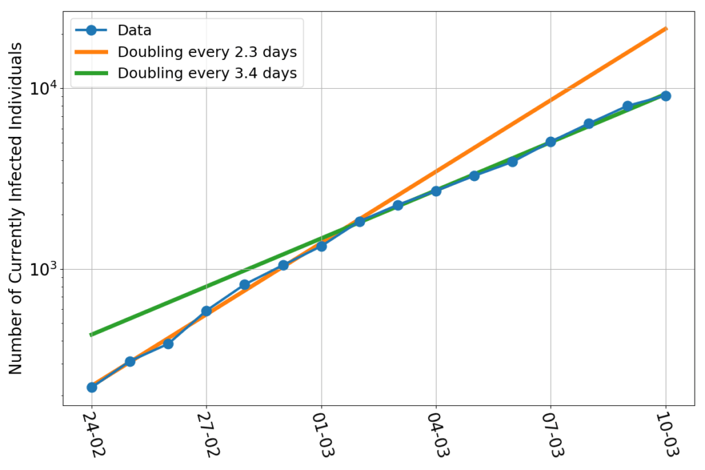
Epidemics in their initial phase are supposed to grow exponentially. Exponential growths appear as straight lines in graphs whose vertical axis has a logarithmic graduation.  Here’s what I get when I plot the country-wide, daily number of currently infected individuals.

The epidemics appeared to have grown with a doubling time of 2.3 days during the first week of data availability, and to have slowed down to a doubling time of 3.4 days in the following week. 

Difficult to say what the cause of the slow-down may be. One may wish to hope that it is the merit of the containment measures. But it is difficult to justify a sudden change in slope from one day to the next: containment measures have been ramped up gradually over those two weeks. Even though both fits look good, the sudden change in slope might be a statistical artifact… 

The simplest model for an epidemics is the following differential equation $$\dot{I} = r(t)I$$ where $I$ is the number of infected individuals, $\dot{I}$ is its rate of change, and $r(t)$ is the growth rate of the epidemics at time $t$. The model is exceptionally accurate… if you know what the growth rate is. (Bear with me, mathematicians, including applied ones, have befuddling ways to declare their own ignorance…) Figuring out the growth rate is the tricky part, and the reason why forecasting epidemics is even more uncertain that forecasting the next thunderstorm, stock market fluctuations, or the results of sport events. 

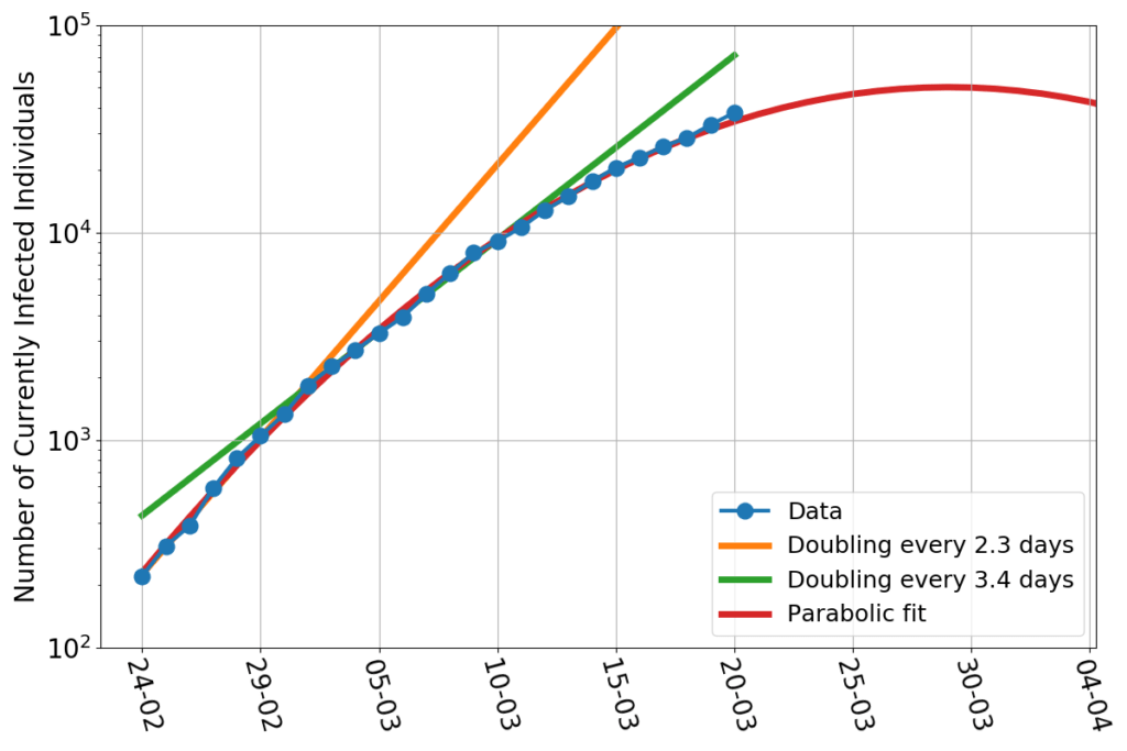
But one can make hypothesis, and attempting to draw conclusions from those. Here the obvious hypothesis is that the ramp-up of containment measures has gradually decreased the growth rate. As a consequence, the data representing the currently infected people should not appear as a straight line in our logarithmic plot, but as a curve whose slope decreases gradually. This notion was reinforced in the subsequent days, when the new data points on the graph systematically appeared to be below the green straight line. What could that curve be? If we stick to polynomials, the next in the line after a straight line is a parabola. So, here’s my attempt at a parabolic fit. In the figure below I include all of the data available as of today.

Indeed, the red parabolic curve fits very well all of the dataset. The idea that the sudden change in slope were just a fluke seems now more substantiated. In fact, the fit is so good that one feels authorized to do what it should never be done: extrapolate a fit well beyond the region covered by data, and use that trend as a forecast. 

If you accept such a gamble, the parabolic fit forecasts that the maximum of the epidemics will be reached on March 30th, with a total of 57000 infected people. All in all, it doesn’t seem to be bad news! Ten more days and the worst will be behind us… Given the world situation, it would seem like a good deal. 

Up to two days ago I was being quite optimistic, and I confess I started believing in this little extrapolation. The last two datapoints, and further analysis scared me pale. Things are on the edge, forecasts are an uncertain business, and data ain’t looking good. When I’ll find the time for another post I’ll show what I mean.

Cambiamenti climatici: la realtà scientifica, la comunicazione mediatica e gli interessi politici.

That’s the title of a talk that I gave at Cicer (the Italian Social Club in Abu Dhabi) on May 3rd. 

The slides can be downloaded from this link (they’re in Italian…). I gave a very simple and brief overview  of the fundamentals of climate science, discussed the impacts of climate change, and then concluded with some personal opinions on how well (or how badly) the media are covering the subject, and how this coverage leverages on some political interests.