This is the seventh installment of an ongoing series. The previous posts are here: (I), (II), (III), (IV), (V), (VI).
At the end of March, I argued that the progressive decline of the epidemics growth rate was a most likely effect of a sequence of progressively harsher lockdown measures taken by the Italian government, both at the central and regional level.
(For reasons that my friend and colleague Shafer Smith recently brought to my attention, I might be wrong on that interpretation. But for the moment that’s the best interpretation of the data that I have to offer. Weighing-in on Shafer’s alternative is a job for another day. And chances are that it’ll be even bleaker than what I’m going to write.)
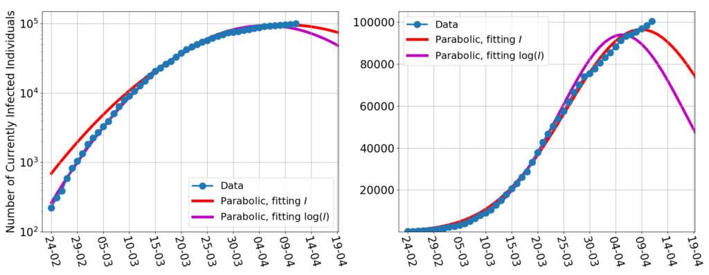
What is beyond doubt, is that if the growth rate had kept declining at the same roughly constant rate that it had in March, by now Italy’s curve of the infected would have peaked.
Instead, this is what happened:

Here the blue dots are the daily data of the currently infected $I$ (made available by Protezione Civile), the magenta line is the usual parabolic fit of $\log(I)$, and the red line is a fit to $I$ of the function $e^{at^2+bt+c}$. Fitting $\log(I)$ gives more weight to the first part of the curve, and fitting $I$ to the second, but if the data were following the March trend, the difference between the two methods would be negligible.
Instead, here we’re pulling a cover too short. No fitting method produces a satisfactory fit of all of the data sequence.
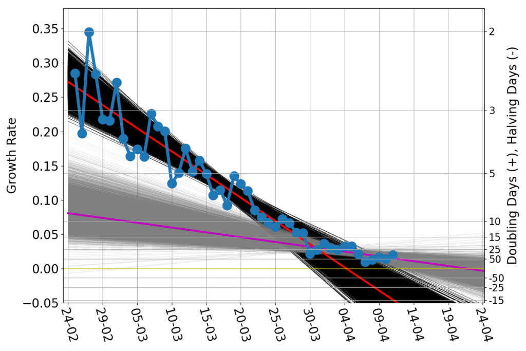
The March trend is broken, and the growth rate now looks like this:

To make clear what is the significance of the growth rate, on the right vertical axis I marked the equivalent doubling time. A growth rate of 0.35 $d^{-1}$ (left axis) corresponds to doubling the number of the currently infected people in just about 2 days (right axis). If the growth rate drops to 0.05, the time needed to double the number of infected raises to about 15 days.
The good news turn up when the growth rate becomes negative. In that case the number of infected decreases in time. So, if the growth rate were -0.05, the number of infected would be cut in half in 15 days.
The straight red line is the trend that produced the log-scale parabolic-looking curves. Recently, the data have been consistent with a much flatter linear trend, the magenta line. The slow-down of the epidemics has all but stalled.
Of course one shouldn’t read in my usage of two straight lines any statement that something suddenly happened at the end of March. The straight lines are mostly a visual artifice to suggest the presence of different trends in different parts of the curve. The change of trend must really be a gradual phenomenon, taking place over several days, and masked by the inherent noise in the data.
I started this post by recalling the hypothesis that a progressive reduction of the growth rate had to be caused by a correspondingly progressive exacerbation of the lockdown measures. The lockdown rules, however, have not changed since March 18th. As I wrote on March 31st:
At this stage, which further measures can possibly be taken to reduce even more the growth rate, and take it to negative territory?
No one was taken, and no one was likely to be feasible. So the tapering-off of the growth rate is consistent with the fact that the lockdown has not (and could not) become any harsher since over 20 days.
A very plausible scenario is that the growth rate will flatline, horribly close to the zero line, but still in positive territory, on a level corresponding to a doubling every one or two months.
It really seems that the worst has yet to come.