Soundscape Memory

I realized that most of the memories I thought of when brainstorming for this project don’t have the potential of being turned into a sound. But working at my moms cafe is a memory that would fit this project since there are many sounds I could include.

My alarm would ring at 8am meaning it was time to wake up. There would be people mumbling in the background as I brushed my teeth and washed my face. There would be many footsteps as everyone got ready to head out. My parents would start the engine of the car and we headed to the closest BJs. After BJs, we would head to the cafe and prepare to open at 11am. Before opening, there are many things we need to do including brewing the coffee, restocking snacks, making green tea/ milk tea and cleaning the whole cafe thoroughly. I think this would make a good memory for the soundscape because there are many sounds I could include that will allow the listener to recreate the scene while listening to my soundscape composition. 

Photo Diptych

Ellen Wang

Reminiscing Youth

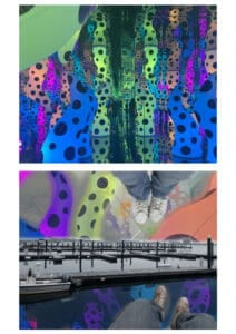
For my concept, I  wanted to show the yearn for youth as one grows older. I took a picture of a installation by Yayoi Kusama ‘LOVE IS CALLING’ which composed of a “mirrored room illuminated by inflatable tenticle-like forms”.  For the picture on the right, I took a picture on a Harborwalk which represents the dullness and unfiltered adult life. I wanted these two pictures to contrast eachother since I wanted to illustrate the difference between youth and adulthood. 

At first I was going to edit the first image to make it more colorful and bright and leave the second picture unfiltered but I realized that there would be too much contrast between the two pictures. Therefore, I decided to edit the second picture and include some elements of the first picture so the second picture somewhat resembles and connects to the first picture. As for photoshopping, I used the lasso tool a lot to select areas of an image that I wanted to paste and include in my second image. I also aded two cropped pictures of my feet from different persecptives which represents loneliness and solo adventures. On the water, I added elements of the first image to make it look like reflections and I also added wave to make it more water and ripple like. I also individually pasted the colorful tentacles and then used the paint brush to outline the edges. I inverted the colors of the tentacles to create a contrast between the brighter ones. Additionally, I included a subway map to represent the “adventures”. Problems I encountered was not being able to make the edges smooth after using the lasso tool but I figured out that I could change the hardness and use the eraser tool smoothen out the edges. 

If I had more time, I would most likely retake my pictures because of the time crunch, I wasn’t able to take pictures I wanted for my concept which is why I had to alter my concept to make it fit the pictures. I would also want to play around with making collages because it seems like an interesting technique to try.

In Our Own Image

Due to the evolving state of digital media and technology in general, the “fluidity of the digital” is the concept where people begin to manipulate media/ photos in order to deceive their audience to make a profit or benefit off of the manipulation. For example, “For a company, photography as an image design is an opportunity to sell more products and services”. 

Ritchin implicitly implies how photography used to be an easy concept, meaning it was  captured a moment in time with no type of manipulation so the meaning was just in black and white.  Compared to now, where there are many depths and meanings to one photo which might be manipulated in some type of way. 

One example that examples the “fluidity of the digital” are photo editing applications. In the reading it states that electronic retouching technology is able to “render the photographer, even the subject, virtually powerless.” This is because photo editing applications allow people to manipulate the image and ultimately alter it to the way they want as well as how they want the audience to view it . 

Photography is a great way to capture a moment of time but compared to video and virtual reality, it can be considered one of the weaker kinds of media that is able to capture reality. Photos are only one frame and capture a moment in time as video and virtual reality are able to capture many frames within a specific amount of time and sometimes with sound included. Photos can also be very deceiving based on who takes the photo and how they want the audience to view/ interpret it since they have to take angle, distance, focus, etc. into consideration. I do believe there are ways to manipulate a video to make it seem deceiving as well, but compared to photos, videos have more of an advantage when it comes to capturing reality. 


Diptych Concept

When we were kids, everything was like magic to us. Our world was made up of rainbows, unicorns and balloons. We were easily wowed and our biggest worry was if our pets on webkins.com were starving. But as we get older and older, we come to realize that the world is not all sunshine and rainbow. We begin to view the world in a different light as we carry on more responsibilities and burdens that were once non-existent. 

Therefore, for this project, I want to create something that illustrates the concept of youth and coming of age. I plan on taking a trip to Boston and visit some parks and museums to find inspiration. At the park, I will take pictures as I put myself into a little kids shoes. I may take pictures of other children and colorful things I see. Then, I may take another picture where there are not a lot of people and where everything seems dull. These ideas I have in mind will allow my audience to clearly see the contrast between the two pictures to identify the message.

For the editing process, I plan on making the youth image vibrant by playing around with the saturation of the image to make the original photo more colorful. The pops of color will show the colorful world we once lived in. Then in another image, it will be monotonous which will portray the concept of fading innocence as we grow up and face reality. I will most likely photoshop the youthful image to make it look unrealistic and leave the second image as is. I think leaving the second image untouched will allow me to further illustrate the unfiltered world we see through our current eyes. 

Pioneer Plaque

Walkie-Talkies 

Walkie-takies are basically “a two way portable radio”. The reason as to why my partner and I chose this is because it might be easier to explain to the heptapods since one way of communicating for them is “using sounds that the human tract can’t reproduce”. What is so interesting about how the walkie-talkie functions is that the heptapods don’t necessarily need to speak the human language in order for them to use it, they can simply making fluttering sounds to communicate. Walkie-talkies also don’t use wifi, instead it functions by using radio waves to communicate wirelessly.  This would come in handy and be easy to use and understand if the heptapods decided to take a few to their own home. Walkie-talkies also don’t have many functions so the heptapods would most likely understand if you just showed them how to use by actions and showing them which button to press. 


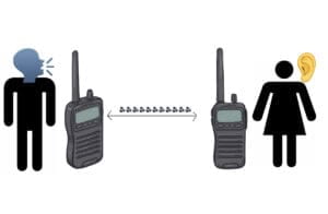
For my plaque, I decided to just include two humans on the opposite side with walkie talkie’s so it shows that there is distance in between them. In the middle I drew an arrow and then included the sound emoji since it further shows the distance and that there is sound traveling between the humans. Finally, I added the man speaking emoji showing that the man is producing sound which will thence transmitted through the walkie talkie for the woman to hear. The woman then has a ear emoji showing that she is listening.

In the beginning of the passage, Louise mentions how her first impression of the heptapod’s handwritten language is logographic, meaning simple emojis and images would allow them to understand what us humans are trying to convey. Therefore, my design is simple in terms of trying to explain how walkie-talkies work. I feel like if my design was more complicated or had a lot of “logos”, it would be harder for heptapods to understand since their eyes go all the way around their head which means they have no sense of direction. 

One thing  I had a hard time incorporating into my plaque was the limited distance since walkie-talkies only work a certain distance from eachother. Another challenging aspect of this is how I would be able to show more of the two way communication. Heptapods don’t read left to right and they jump around when reading so they may misunderstand the plaque. Additionally, a potential problem that came to mind was the radio waves since their radio waves on their planet may not be the same as ours. 

All in all, I do believe the heptapods would find the walkie-talkies interesting since it’s much easier to explain that to them then to explain how phones and other technologies function in our rapidly technological driven world.


Sound Visualization Project


Song: “Beauty and the Beast” by The Rose

Concept and Design 

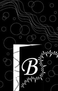
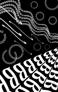
When I started listening to “Beauty and the Beast”, my first impression was that it was a melancholic and sad song. The song is mainly composed of vocals, guitar, bass, piano and drums. Each one of those instruments had a vital role in the song and so I tried to create a different design for each of them. The B’s in my project represent the guitar, the semi enclosed and closed circles represent the drums, the wavy flow of characters represented the vocals and the S’s just represent how I felt in general when listening to the song. The opening of the circles face towards the wave because it draws attention to the vocal and flow aspect of the piece.

My project design reflects Gestalt theory because I used a black background and white letters, which in my opinion added to the meaning of the piece because using a white background would have made the audience have a different interpretation and view of the piece.One Black Square inspired my design because I played around with similarity and continuation. Each of the elements used in my project can be clearly group together since I used the same letters but different scaling for them. The scaling allowed me to somewhat create a 3D effect. The right side of my project has larger scaled letters than the right side. As for continuation, I made sure my design went out of dimensions of the project so it gives an illusion of the letters continuing to flow outside of the frame. 


Process

At first, it was really hard for me to come up with ideas since I focused on interpreting the song and how I was able to make my audience understand it. I later redesigned more than half of my project after the first half mid critique and after I heard what others could improve on. After realizing that instead of trying to interpret the song, I needed to focus on the composition and flow. Therefore, I was able to create other elements in my piece that connected to flow of the song which was clearly understood when it was my turn to present for mid-critque. I was also given some suggestions to play around with scaling and positioning of the layers so I ended up rescaling them in order to create more of a 3D effect rather than 2D

Conclusion

If I had more time to improve my project, I would have definitely tried to create more symmetry and or balance between the top and bottom of my piece. The B’s on the bottom have a heavier weight on them so a good idea would be to scale them smaller or get rid of a row in order to create space in the bottom right so I can include the circles I did on the top half of my piece. I think that would bring more balance and the peace/ comfort to my project

Image 

 final draft & first attempt
Final DraftFirst Attempt