📌 Assignment
Using the PWA template, design your own app with assets and a cool icon!
✍️ Process
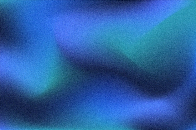
For this project, I wanted to create a pattern generator, similar to the ones we looked at earlier in the semester. I was inspired by noisy gradients that are so popular in design right now.

I wanted to find a way to generate something similar in p5 and remembered learning about pixel arrays. I figured that using the pixel array would be a good way to go about this to be able to generate pixel noise. Using this tutorial and our class notes to get back up to speed on pixel arrays, I created a simple gradient generator.

That then evolved to this:

As you can see from this demo, I’m mapping the index value to a value from 225 to 0. This ending up taking way too much processing power because index can reach insanely high numbers (640,000 in this case) and was not scalable.
For simplicity, I stuck to working with a linear gradient and ended up writing this code:

Even this solution still uses a lot of mapping functions (which seem to slow p5 down a lot). This led to me having to limit the frame rate to something lower like 10 or 15 in order for the app to not be insanely resource heavy.
The closer the pixel is to the top (or bottom) of the screen, the more likely it is to be the full color values of r, g, and b. As the outer y loop moves further down the array, the color slowly becomes white. The values of r, g, and b are randomly generated during the setup function. This allows the user to refresh the page and get a new result every time.
I got the code uploaded to Neocities and was able to download the app. I ran into an issue, however, where the canvas was not resizing properly. It took me way too long to figure out that the problem was that I was only calling loadPixels() in the setup function. This meant that the pixel array would only ever be the size of the original viewport until the setup function ran again.

Once this problem was solved, I added some finishing touches to the project. This included:
- App Icons


- UI Elements
Before adding UI, the user did not have much control on the mobile and desktop app version. It was less clear that you were supposed to refresh the page to get a new gradient color. I added a refresh button and a save canvas button (in case the user really loves their gradient). I then animated these icons using CSS.


✨ Conclusion
I am pleased with the development progress of this project. I learned a lot more about using the pixel array and was able to deploy the progressive web app fairly with little trouble. I feel, however, that there is a lot more that could be done with this code. Here are some future developments:
- Color Picker: Allow the user to pick the color of gradient instead of having them refresh until one looks cool
- Gradient Variety: Give the user options between which gradient they would like (radial, linear, blobs…)
- Noise Application: Use this code as a filter for images to create cool noise effects that could replicate a film photography look.
- Optimization: Is there a more optimized way to achieve this look with more advanced Javascript?
- Dynamic App Icons: I wonder if there is a way to update the icons based on the last generated gradient in the app. I know this can be done with favicons, not sure how similar it would be for app icons.
- This guy made the Google dinosaur game playable entirely through a favicon