Why focus on color contrast?
Users, including users with visual disabilities, must be able to perceive content on the page. Text that is offset poorly by its background can be difficult to perceive. This can also apply to icons or images on a page. Some individuals have difficulty with or are unable to perceive color. For example, people who are blind and use screen readers hear rather than see content, so they don’t have access to colors at all. Some people are unable to distinguish specific colors, for example red and green; while the aging process can lead to reduced visual perception of certain colors.
Accessibility Checklist
Your goals for creating accessible content with effective color contrast:
- Use sufficient contrast. Make sure that the contrast ratio between text color and background color is at least 4.5:1. There are color contrast checkers that can help you test color pairs for contrast and adjust the values as necessary.
- Avoid very high contrast. Be aware also that for some people, especially people with dyslexia, a very high contrast color scheme can make reading more difficult. It is a good idea to choose an off-white background color rather than a white background to aid on-screen reading.
Examples of bad and good practice
| Element | Good practice | Bad practice |
|---|---|---|
| Color Contrast | 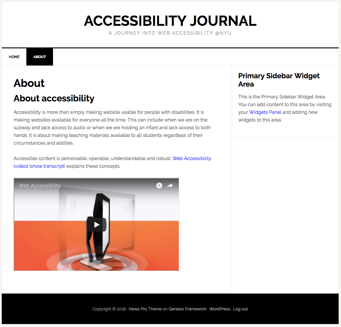 |
 |
Additional resources
- Digital Accessibility Best Practices: Color Contrast & Use of Color
- Color Contrast Checkers:
- Colour Contrast Analyser (TPGi)
- Contrast Checker (WebAIM)