Why focus on text accessibility?
Clear structure is a fundamental accessibility rule that can be applied to web content as well as other digital formats. Organized pages benefit everyone. Pages with a clear layout and descriptive links are easier for users to navigate and read.
Accessibility Checklist
Your goals for creating accessible text include:
Ensure headings are clear and descriptive
Descriptive headings help users predict what each section contains. Most readers scan websites rather than read them word-by-word. Descriptive headings help users identify content relevant to their needs and understand relationships between content on a page. Users with a screen reader, in particular, browse the headings of a page to orient themselves within the Web page.
Properly nest all headings in descending order
Headings help organize and structure your page for users of assistive technology. Like Russian Matryoshka dolls, headings range from H1 (the largest) to H6 (the smallest). Nesting subheadings in a parent heading helps communicate how the information fits together.
- On the Web Publishing platform, the page title is considered a H1 heading, so the first heading created for the page should be a H2.
- When nesting headings, remember not to skip levels when creating sub-sections. For example, a H2 heading can be followed by a H3 but not a H4.
- Don’t use the heading format solely for aesthetic purposes. To call out an important point, consider making that sentence bold.
Use descriptive text when sharing links; avoid “click here” or “read more”
- Screen readers are unable to provide context to a link beyond the linked text — which means multiple “click here” links on a page all appear to be the same.
- When linking a file, provide the file type and size as part of the linked text. For example, NYU Identity Style Guide (PDF: 367 KB).
Set the language of your web publishing site
The default language setting for NYU Web Publishing is US English. If your website is in another language, the language must be updated. The language can be updated from the Settings > General on your NYU Web Publishing dashboard.
Examples of correct and incorrect practices
| Element | Correct Practice | Incorrect Practice |
|---|---|---|
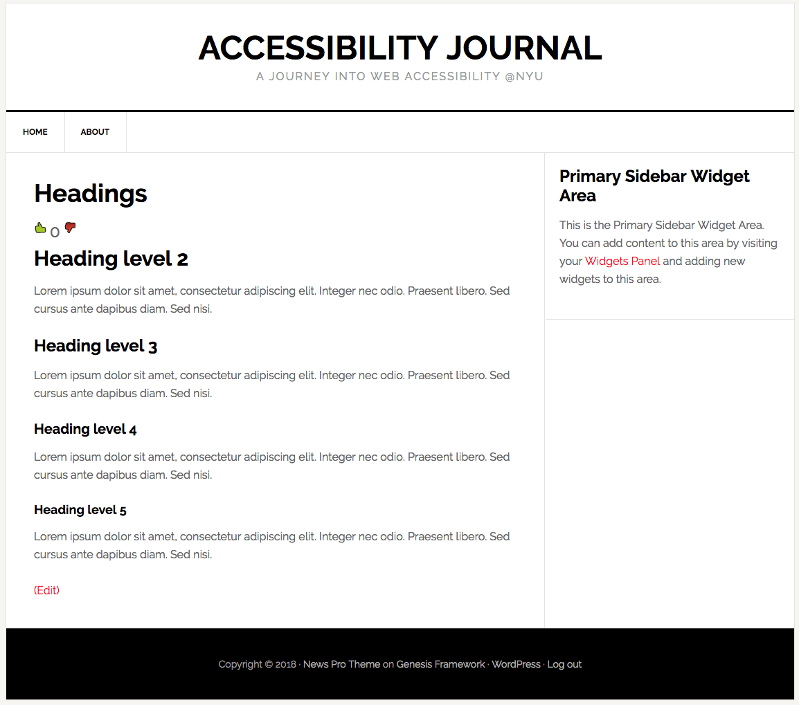
| Headings | Example of correctly nested heading levels.
The title of a page or post is always heading level 1. In this example, the heading levels progress from 2 to 5.
|
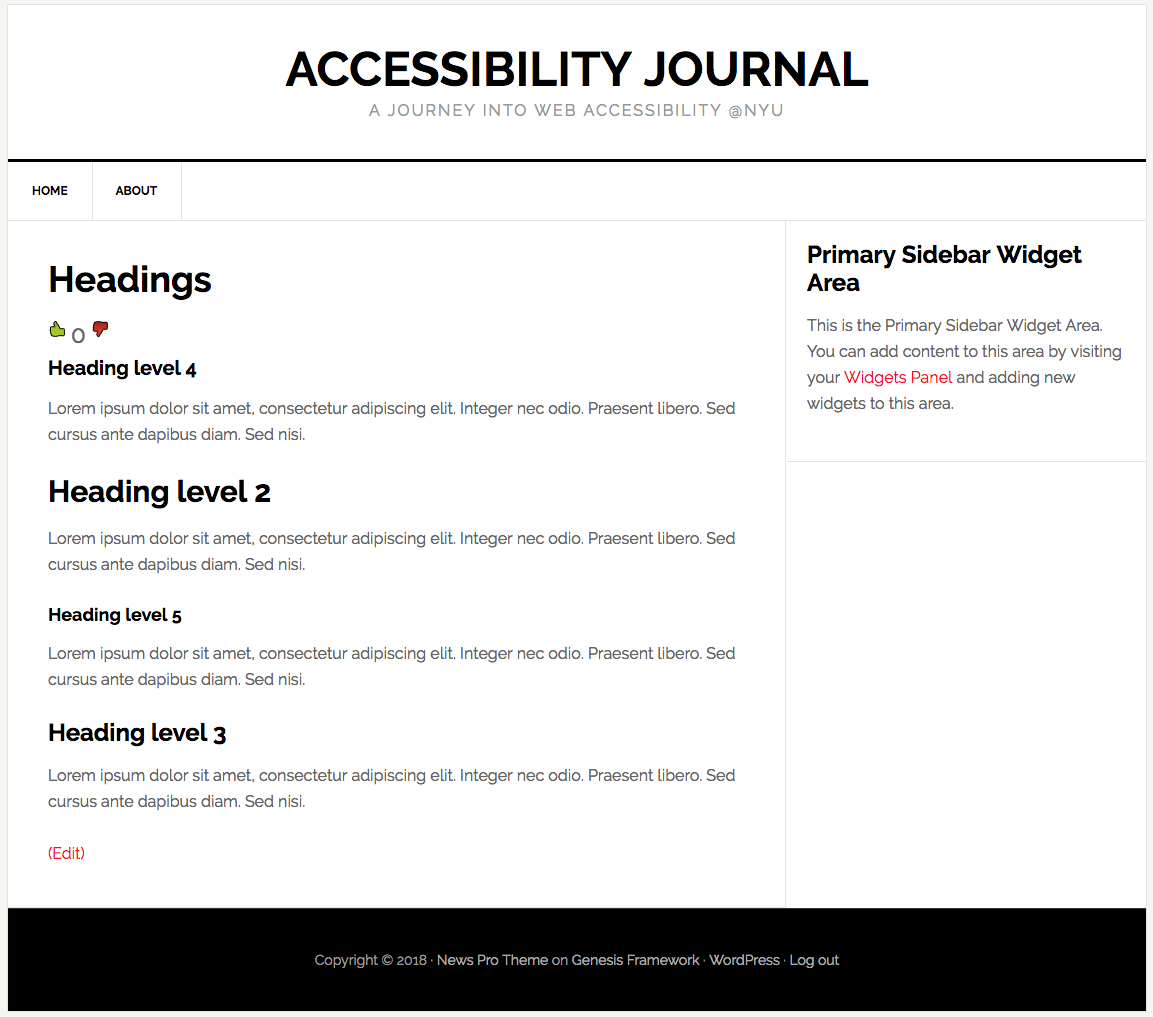
Example of poorly nested heading levels.
In this example, heading levels jump around from heading level 1 to 4, and from heading level 2 to 5.
|
| Contextual Links | Example of an accessible link:
Consult the NYU Digital Accessibility guide to Creating Meaningful and Contextual Links. |
Example of an inaccessible link:
For more information on creating accessible links, click here. |
Additional resources
- Digital Accessibility Best Practices: Headings and Heading Order
- Digital Accessibility Best Practices: Readability
- Check your content for digital accessibility compliance: Tota11y Plugin

