Crystal Boyuan Zhang
The Two Me
Concept and Design
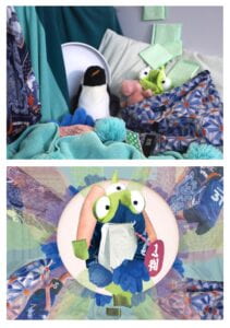
With the warmth of the woven blanket, the softness of the stuffed toys, and the stillness of the stable setup, part 1 of my Photo Diptych represents my characteristic of being a gentle, quiet girl at home. Showing my inclusiveness of possibilities and mindsets, I also presented myself by incorporating various colors – mint green, forest green, blue, orange, pink, black, etc. – rather than a stereotypical female image in pink or purple. The still-life setting composition forms triangles to deliver the sense of stability and comfort, which again emphasizes the introverted portion of my personality.
Part 2 of my Photo Diptych is a drastic contrast with part one, representing the other side of my personality – an energetic, outgoing girl. I displayed the image in a symmetrical composition with a white circular shape and a radial pattern towards the edges – like the glaring sun. The low-opacity patterns in pink and green expanding from the middle to the sides are like the rays of light delivering my energy and passion. Further highlighting my passion and extroverted character, the figure in the middle is a rearranged picture of me playing Ultimate Frisbee, my favorite outdoor sport. Using the same elements of color scheme, texture, and patterns as in part 1, I implied an unchanging nature of my warmth and gentleness. But through the additional elements, I showed the multifaceted nature of myself and the courage of breaking the conventional views.
Process
In general, the process of creation went on smoothly. I mainly spent most of my time working on part 2 of my Photo Diptych, studying the different filters and tools in Adobe Photoshop and iterating more versions of my design according to my instructor’s suggestions.
Photo Diptych Part 1.1 – Still-life Setup
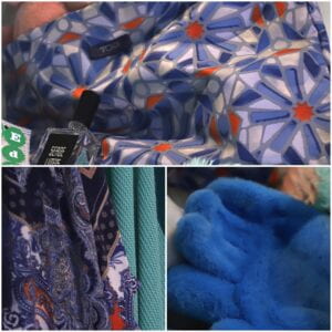
I started the project by setting up a still-life scene with the things that I often use – my blanket, pillow, stuffed toys, hair band, frisbee disc, etc. To make the picture more “interesting” and personal, I chose many objects with unique textures or patterns, such as the soft blue handbag, my file pocket in blue and orange geometric shapes, and my dress in intricately detailed patterns. Instead of choosing a monochromatic color scheme, I combined a wide range of colors with a significant tone in pistachio green and stone blue
While displaying the objects, I referred to the composition of some famous still-life paintings such as Jug, Curtain and Fruit Bowl by Paul Cézanne.
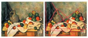
In Cézanne’s still-life setup, he incorporated a lot of triangles in different sizes formed by the curtains in the background, the jug with the table, and the fruit bowl with the tablecloth. He also combined the clothes patterns in the horizontal direction (the tablecloth) and vertical direction (curtain). Cézanne placed the objects in the left bottom half of the picture and left the top right space empty to balance the whole image. Applying the knowledge into my composition, I placed my objects accordingly to show old-school-styled stability.
Photo Diptych Part 1.2 – Contact Sheet
Then, I took out my camera and played with different shooting directions, ISO, shutter speed, color balance, and f-number. During the exploration, I made some more changes to the still-life arrangement looking for the best effect. I
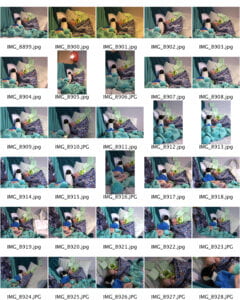
After the exploration, I realized that since the shooting environment was not bright enough, I should use a larger number of ISO. The shutter speed was also generally slow because the objects were still. The f-number did not significantly influence the image because my scene did not include much depth of field. In terms of color balance, the larger the value, the warmer the color tone gets, and vice versa.
Photo Diptych Part 1.3 – Choosing Image
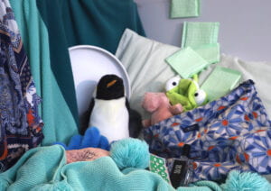
Among dozens of pictures in the contact sheet, I chose this picture for the final Photo Diptych Image 1 for several reasons:
- The composition is the most balanced and stable among all. Similar to Cézanne’s still-life painting, all the elements in this image form triangles;
- The two blocks of intricate patterns in similar colors on both left and right sides match with each other – forming an interesting conversation;
- The foldings of the blanket and pillow with a balanced combination of vertical and horizontal directions lead the eyes to the optical center.
Photo Diptych Part 2.1 – first draft
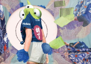
To enhance the connection with Image 1, I maintained a similar asymmetrical composition in the first draft of Image 2. As I added the central figure of me playing frisbee, I turned down the opacity of the blanket and put it in the background to make the figure pop out. I also adjusted the hue of my skin color to fit the pink bags, which I have also turned down the opacity level and turned up the brightness. To increase value on the right side of the image, I inserted other images of myself.
This first version of the design looked fine for me. A strong connection was made because I used the same elements and exact color scheme as Image 1. Yet, the composition seemed to lack creativity, and the figure in the middle seemed too dull.
Photo Diptych Part 2.2 – Draft 2
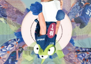
Based on the reflections on the first version, I made several amendments. First, I changed the composition into symmetrical by putting the while, round frisbee disk in the middle. The pictures also seemed more balanced with the elements surrounding the center radially. To break the conventional mindset, I horizontally flipped the central figure to look very dull.
I would admit that there were improvements compared to the first version, but the image still looked conventional and boring. Ian then suggested I disassemble the central figure and rearrange the pieces into a familiar shape that occurred in Image 1 – making it more surreal.
Photo Diptych Part 2.3 – Draft 3
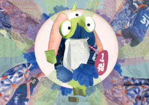
In light of Ian’s suggestion, I cropped the central figure with the Lasso and Quick Selection tools. By recombining them together, I put them into the shape of the penguin in Image 1 to form a further layer of connection. I also decreased the brightness of the green blocks of rectangles to move them backward in terms of visual layers.
How to improve?
Overall, I think the two images were done exceptionally well after multiple times of iterations. But if I had the chance to redo my Image I, I would have done better on the focus. Now, the image focuses on the fluffy ball of the blanket and my perfume in the foreground. However, the picture would look more comfortable if I could focus on the penguin and the Little Green Man hairband to the optical center in the middle-ground.
For Image 2, I would have created a more compositional connection between the two images (but not the same), especially when I mounted them together on one board as a singular piece. There are already abundant links between the two, including the colors, elements, and patterns. Yet, it would be more visually appealing if the two images could create a continuous flow.
Citation
Artst. “10 Most Famous Still Life Paintings.” Artst, 29 June 2021, https://www.artst.org/famous-still-life-paintings/.
