Crystal Boyuan Zhang
Afterglow by Ed Sheeran
Concept and Design
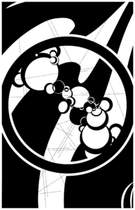
My first impression of the song, Afterglow by Ed Sheeran, was the absolute quietness and warmth. Intuitively, I used many circular shapes and curvy lines to illustrate this mild feeling created from the acoustic music production. I used the central largest black circle that embodies the small detailed circles to show the sense of enclosure and warmth, just like a hug. With the circles using both positive and negative spaces, I represented the guitar plucks that sound like the dazzling lights that flicker softly in orange, hazel brown, and gold. The circles intertwine with the thin, pointy lines that boldly cross through the picture, showing the organic fusion of the fond guitar plucks and the dull vocal sound. As the background layer, I outlined the dark streamlined shapes with heavyweight as the base harmony of the music reminded me of the invisible water, gently flows and moves the notes forward.
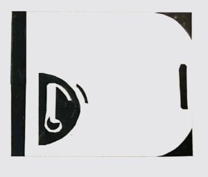
The One Black Square assignment pushed me to constantly consider the use of space, especially the corners, to create a sense of integrity. The picture above shows one of the eight thumbnails I created. The corners are designed to form a “D” with a white background. But the inner black “D” also performs as the object containing the musical note. Gaining experience from that design, I fully utilized the four corners of the artboard with the black wave-like shapes that form white wave-like shapes in the ground. I also focused on the extensive use of similarity with the repetitive circles and lines. The big curved lines show a sense of continuity to the two opposite compositions. The large black circle creates a symmetrical composition. Still, the curved lines and the circles forming the diagonal crossing direction meet in the middle, concentrating the visual concentration to the center.
Process
In general, the process of creation was smooth. Taking advice from the class critique sessions and Ian’s feedback, I iterated my design for several versions.
Sound Visualization 1.0

The first version of the design was very intuitive, reflecting my first reaction to the music – the assembly of circles in various shapes representing the soft plucks of the guitar. In this version, I successfully set up the basis of the later designs. I liked my large circle design consisting of the details of the small circles as it reflected the exquisite emotions that merge both loneliness, hope, and sorrow through the combination of round lines and pointy edges, black and white, positive and negative space. However, the corners seemed pale and bland in complete black. The picture’s weight seemed unbalanced with the heavy details in the middle and blank space outside the central circle. Following the principle of similarity and proximity, the circles appeared to be in a separate group apart from the rest of the picture. Also, as there are no similar patterns outside of the large central circle, it enhanced the sense of separation.
Sound Visualization 2.0

Filling in the blank space in the corners, I added similar patterns of the curved lines with a pointy edge after the in-class mid-critique. Thus, the picture seems more like a unity as the similar elements in the design spread across the composition. The additional patterns also extend the original line of circular shapes inside the large central circle, creating a sense of continuity from the left top corner to the right bottom corner. Besides these, I enlarged the central group of circles. The big black circle then extended outside the artboard’s rectangular frame, thus reducing the sense of restriction.
Sound Visualization 3.0
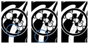
After the second version, I received feedback from Ian about adding another layer of information so that the picture would not look too flat. Instead of directly incorporating rigid lines, I inserted lyrics in small font size, which made the lines of characters seemed like lines. During this second iteration process, I encountered the most difficulty: I had to add a whole pattern to the existing design without breaking the balance. The first attempt of adding lines was acceptable, except that the central bottom part seemed empty. Then, I added a few more horizontal lines, but it was too messy. Therefore, I found a balanced point in between.
How to improve?
According to the final class critique, I think there is still much space for my design to improve:
- The lines displayed across the image are still messy, especially the lines at the central bottom part. Looking back at the first version of iteration 3, I think the arrangement was better as it provides extra space balanced with the rest of the areas.
- Afterglow is not a heavy song. Yet, my extensive black design created a depressive mood, which is not according to the original warm tone of my chosen song. If I were given a chance to make further amendments, I would try to delete the two large blocks of black on the top left and bottom right corner, leaving more light space.
