Coastline Paradox
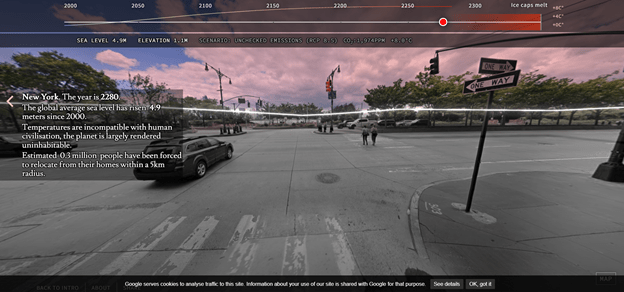
The Coastline Paradox is a project that visualizes the different sea levels over the years. This was my inspiration to tackle an environmental issue in my final project. Timo Aho and Pekka Niittyvirta, the artists behind this climate data experiment, present data that is hard to grapple with in a visually pleasing way. The audience is faced with the reality of future sea levels laid on top of the streets they know. The exact moment that inspired me while going through the project is the screenshot shown below as it shows an area that’s become part of my daily life here.
Dear Data
Dear Data is a year-long project created by Giorgia Lupi and Stefanie Posavec. Throughout this time, they kept track of a type of data for a week, visualized it, and mailed it to each other on postcards. Before seeing this project, my way of thinking about visualizing the environmental data was very literal. This inspired me to look at abstract and minimalist designs. 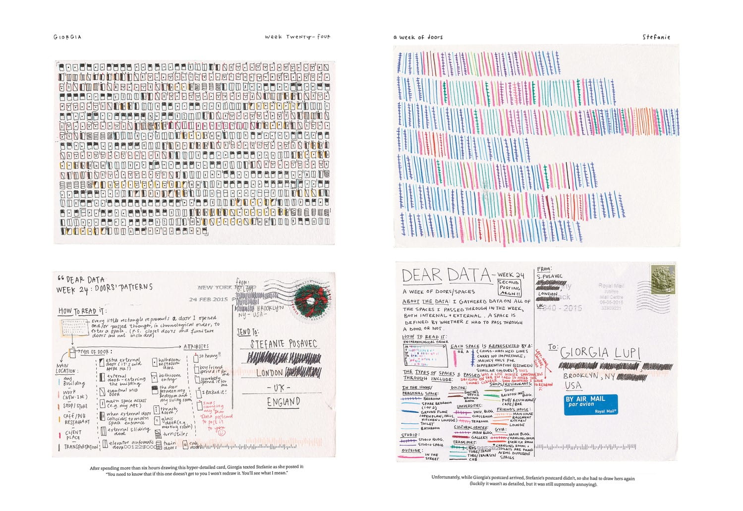
DOHMH Indoor Environmental Complaints
While scrolling through possible API’s or datasets to use, I came upon one that consists of indoor environmental complaints received through the 311 number. This caught my attention because asbestos, indoor air quality, indoor sewage, and mold are not usually given as much attention when it comes to casual discussions on the environment. This dataset inspired my choice of the categories “asbestos, indoor air quality, indoor sewage, and mold” as possible design parameters for different visualizing designs. The complaints are categorized by boroughs as well.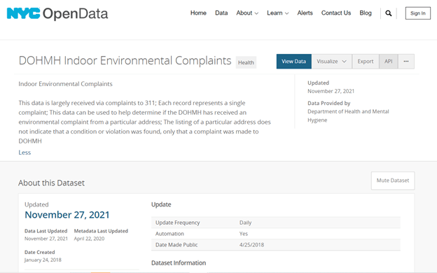
Resources:
- https://experiments.withgoogle.com/coastline-paradox
- http://www.dear-data.com/theproject
- https://data.cityofnewyork.us/Health/DOHMH-Indoor-Environmental-Complaints/9jgj-bmct






 One more main inspiration I had was The Riddler from DC comics. The Riddler, a riddle-obsessed supervillain, is one of my favorite characters in the show and I always wanted to make a project that had to do with riddles. The idea of having riddles be a timed thing that could lead to consequences was very unique and intriguing to me.



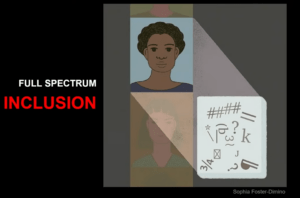 The second concept that needs much more attention is the inclusion of everyone in facial recognition software. The software works off of data sets that are fed into it and can only recognize faces that are similar to what it was given. This is why we need software to encompass a full spectrum. The software itself is not to blame, but the humans feeding the data sets into the software.