Author: Ozioma Chukwukeme
Final Project – The Sound of Topography
The Sound of Topography
Overview
Throughout my time in middle an high school, my attention often drifted in class and I would find myself creating doodles in the margins of my notebooks. One of my favorite things to sketch were circular squiggly lines that repeated themselves growing further outward over and over and over again. It wasn’t until recently that I discovered that those doodles closely resemble topographic maps. Topographic maps are great visualizers of geographic terrain. Lines, line thickness and proximity, and color are used to convey real places two dimensionally.
Initial Sketch + Inspiration
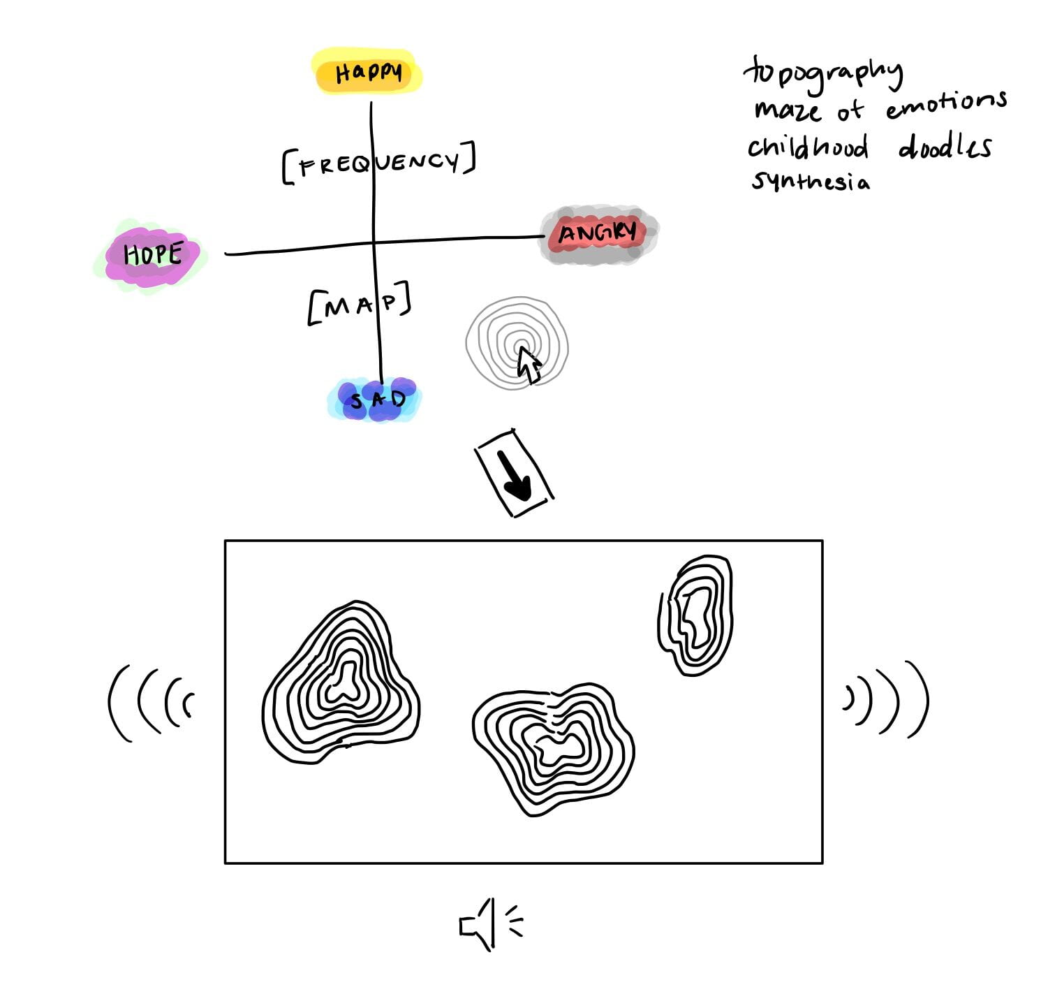
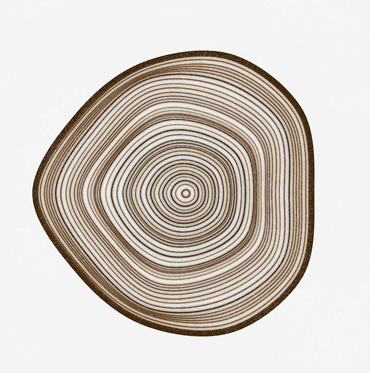

For the project I wanted to create three dimensions from two, and add sound and color to create a complete three dimensional audio-visual experience. I loaded 10 images of topographic maps and have the program randomly choose three images at a time when the user clicks the canvas to display with varying transparency values controlled by the lerp function. Then, based on the RGB value located at the current mouse position, a three-note chord is generated using p5JS oscillators that correspond to a frequency on a scale comprised of the middle notes ABCDEF. The sound can be toggled on or off using a controller in the bottom right of the canvas.
https://editor.p5js.org/ozioma/full/fDTKTxduH
Bibliography
The Coding Train Sound Synthesis Tutorial: 17.6: Sound Synthesis – p5.js Sound Tutorial
Music Note Frequency Reference: https://pages.mtu.edu/~suits/notefreqs.html
P5Js Sound Library: https://p5js.org/reference/#/libraries/p5.sound
Research Post #3
The article that struck me most was Nabil Hassein’s “Against Black Inclusion in Facial Recognition”. I’ve always heard and seen people of color passionately pushing for more diversity and representation in artificial intelligence to counteract algorithmic bias, like Joy Buolamwini and Timnit Gebru and thus I also began advocating for the same. But Hassein’s take on how we’ve seen “unbiased” facial recognition software continue the legacy of wrongful accusation and criminalization of Black people caused me to take a step back. Hassein explains: “…by refusing to don white masks, we may be able to gain some temporary advantages by partially obscuring ourselves from the eyes of the white supremacist state”. I’d never thought of algorithmic bias against Black people as a positive side effect, however I still wonder what remains to be done for those who have been wrongfully convicted by facial recognition. It seems far-fetched that we would be able to eradicate law enforcement’s use of AI, so I think it’s important for our focus to go to making the systems less biased to stop even more people from being framed.
In Kyle McDonald’s course notes on “Face as Interface”, I learned more about the principles and terminology of facial recognition technology. I also learned about an interesting piece of information where McDonald describes a phenomenon in Japan where customer service workers develop emotional trauma from something called “smile mask syndrome”. This results from workers having to force a positive attitude in a society that places a significant value on exceptional customer service. This connected to McDonald’s earlier claim that facial expressions actually generate emotions and affect the nervous system. Although I’ve heard people say that smiling actually makes you feel better, I’d never considered the flip side where you’re smiling and faking emotion so much that it throws your nervous system into distress, and it seems very plausible. This information does not appear to be widely know which makes me concerned that workers in certain industries are experiencing a degree of suffering that may not be treated and taken seriously.
Research Post #4
As I work on my final project my vision for it continues to morph. However, at the foundation of my inspiration lies topographic maps and the interaction between vision/color and sound. When looking for line inspiration I stumbled upon works by Joshua Bagley. Bagley uses processing to create intricate works of art which feature a lot of geometric figures. I was especially drawn to his line-based works that reminded me of doodles but are able to convey different personas.
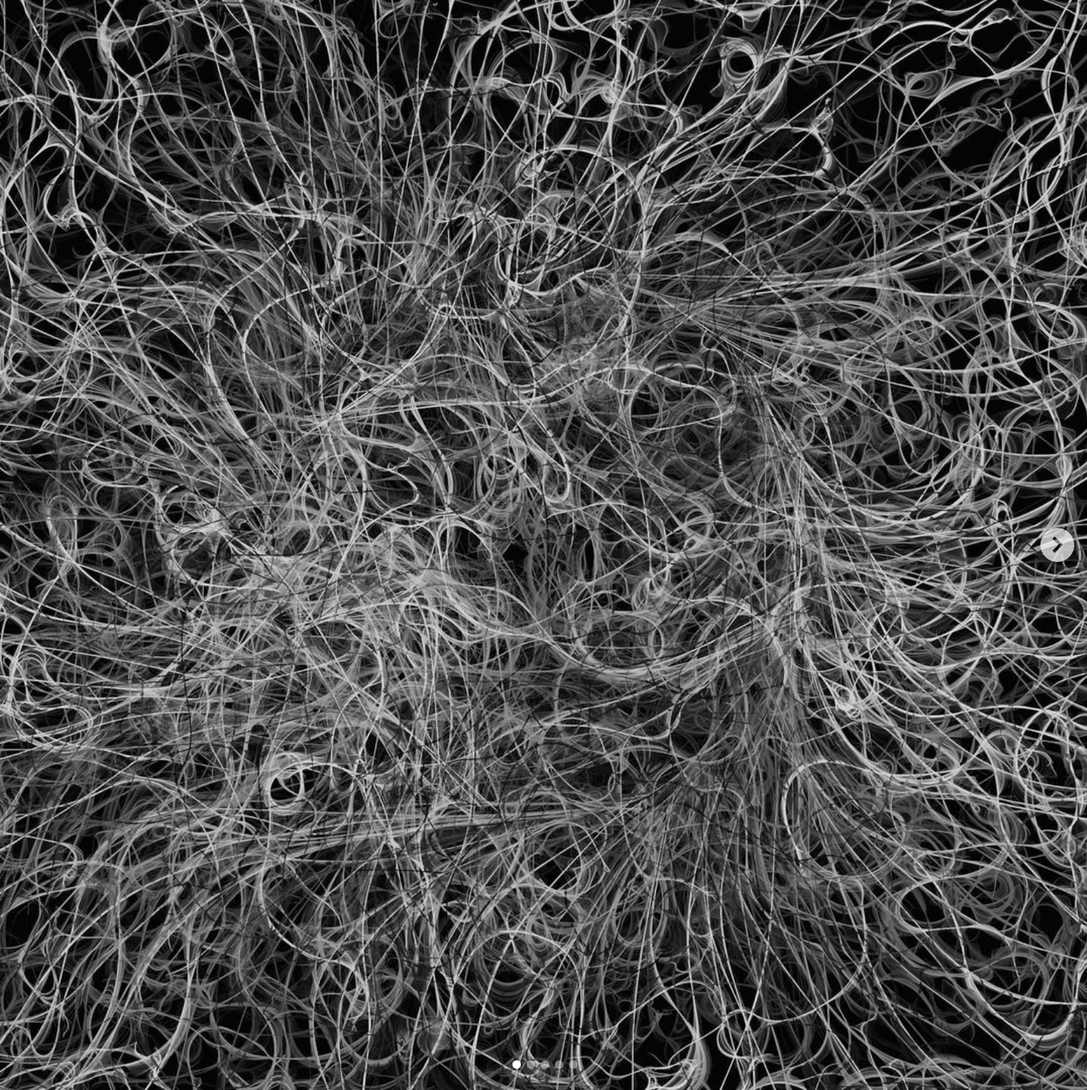
I specifically used instagram as a resource to find what artists were creating under the #p5js tag so I could find inspiration for techniques that I would actually be able to employ. I also personally resonated with works by Andrea Diotallevi who uses p5js to create colorful linework which is almost exactly the same idea as my topographic-esque doodles.

I then looked for examples similar to the scene above, but also incorporated motion. For that I checked out openprocessing.org for inspiration. Here I found tons of examples of line animation using processing with fairly simple code:
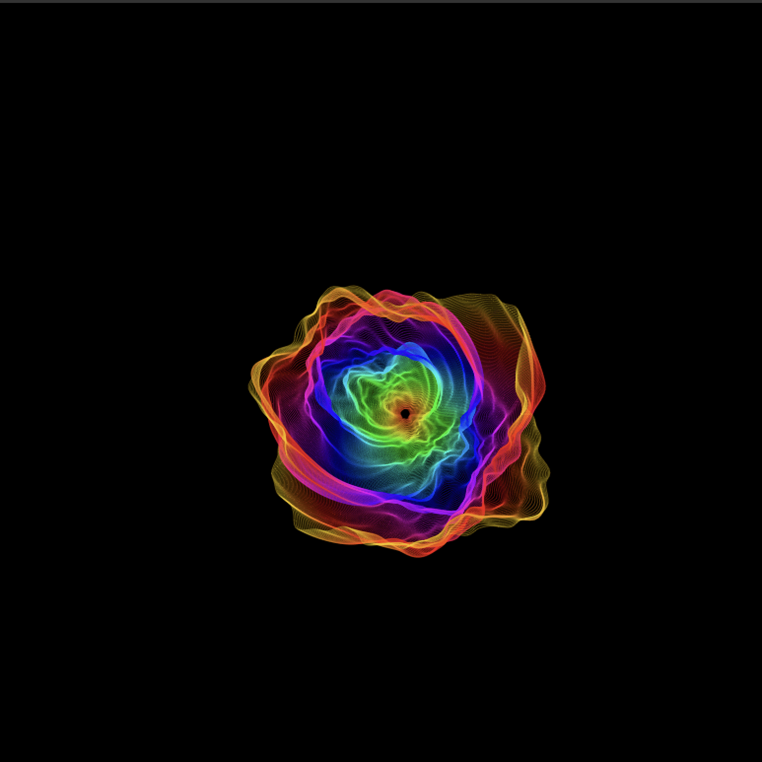

I was surprised to find that a lot of artists who post their work on processing had similar ideas to mine. I would like to take my work a step further however by incorporating sound which I plan on using Google’s Magenta.JS to do. Magenta is a javascript library/API that uses Google’s machine learning models.
Classify This – “Yassify This”
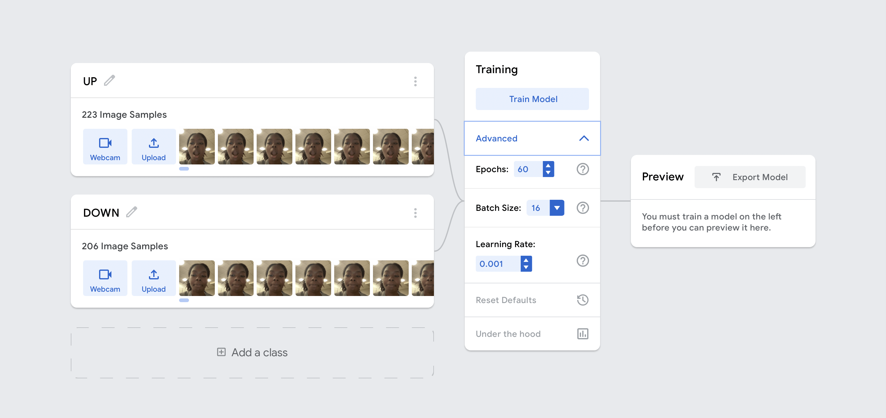
My “Classify This” project is a simple game where the user can control a yellow dot, moving it up and down on the canvas by opening or closing their mouth. The aim is to stay within the bounds of the canvas. I created an image model using Google’s TeachableMachine Toolkit. For the model I designated two classes of images: “UP” and “DOWN”. I then added about 200 images of my mouth opened to various degrees for the “UP” class, and my mouth closed for the “DOWN” class. I also sourced stock images from Google of people doing the same expressions to create a bit more diversity in my data set. When training I kept the default settings for batch size and learning rate, but increased the epochs from 50 to 60, meaning each sample was fed through the model 60 times. I found that this small tweak improved the accuracy of my model while taking a bearable amount of time.
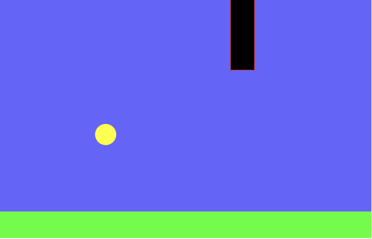
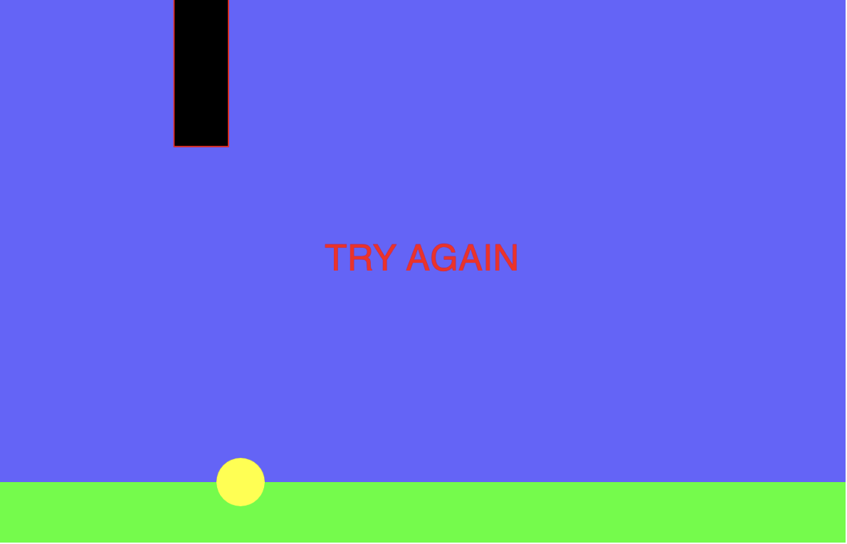
The program is reminiscent of the popular mobile indie game Flappy Bird, where the user taps the screen to move a bird that must evade obstacles coming in both above and below from the right side of the screen. I decided that I wanted to create something similar and found that it was more enjoyable to use facial expressions to control the circle. A challenge I faced while creating this program was the dimensions of the obstacles in the game. The height of the incoming obstacles is supposed to vary which makes the game more difficult since it would end if the yellow dot touches a rectangle. Instead of each new rectangle being a new randomized height, the height would change rapidly while on screen.
Clock Project
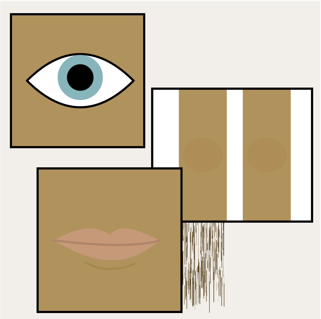
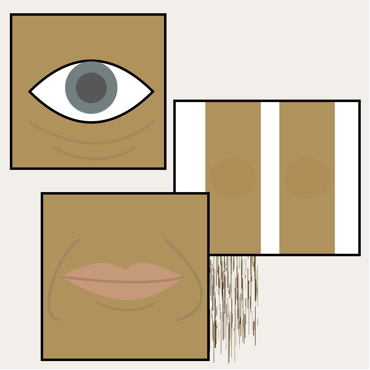
Link: The Human Clock
The concept of time has always fascinated me since I was a child. I always wondered who decided when to start counting time, what made them worthy enough to do so, how we came to know seconds, minutes, weeks, and months. Days and years were concepts that made slightly more sense to me since we base those off of planetary systems, but time itself seemed to be something so intangible and fluid that it would be silly for humans to try and categorize it. Yet for centuries we’ve followed the same arbitrary standards. There are time zones and leap years and daylight savings periods. There are historical records of a point when the sun never moved in the sky for hours. After all these years I’m still not fully confident in standard time. Time and its measurement varies in different cultures and it seems backward for everyone to follow the same time tracking methods. To me time is something personal and individual, it’s reflected in our minds, our gaining of wisdom, our physical features, and our memories. Time is kept naturally by the body and the spirit. The rhythmic beating of a heart that changes tempo. The graying and loss of hair. Deterioration in eyesight. Growth and loss and growth again of teeth. The emergence of lines and wrinkles. The rise and fall of our heights. As babies we know nothing, then we gain knowledge and experience with age, which manifest in our features as we get toward the latter stages of life. We humans are clocks with the ability to adapt to change. This is why I chose the body to represent The Clock. Aging is something beautiful, which I also fear, thus this project had a lot of emotional meaning to me. It allowed me to ponder this inescapable fate and see it in a new light.
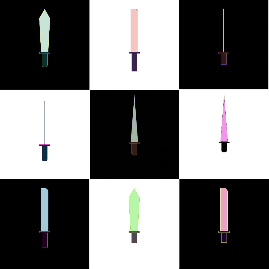
For this project I created a sword generator which creates variation in the silhouette of the blade, the length of the blade, the color of the blade, the length, color, and shape of the handle, and the outline color for the entire sword. Each time the code is run, a completely new sword is generated.
To create randomness for this project I utilized the “random” function in p5.js. For color randomness, three variables representing RGB values were created for the outline, blade color, and handle color. Originally the outline color can be any random color from 0-255, while the blade color ranged from 140-255 with the intention of restricting to a lighter color palette, and the handle color was from 0-90 trying to achieve a darker color palette. However I quickly realized the RGB values don’t work like that and allowed a full color range instead.
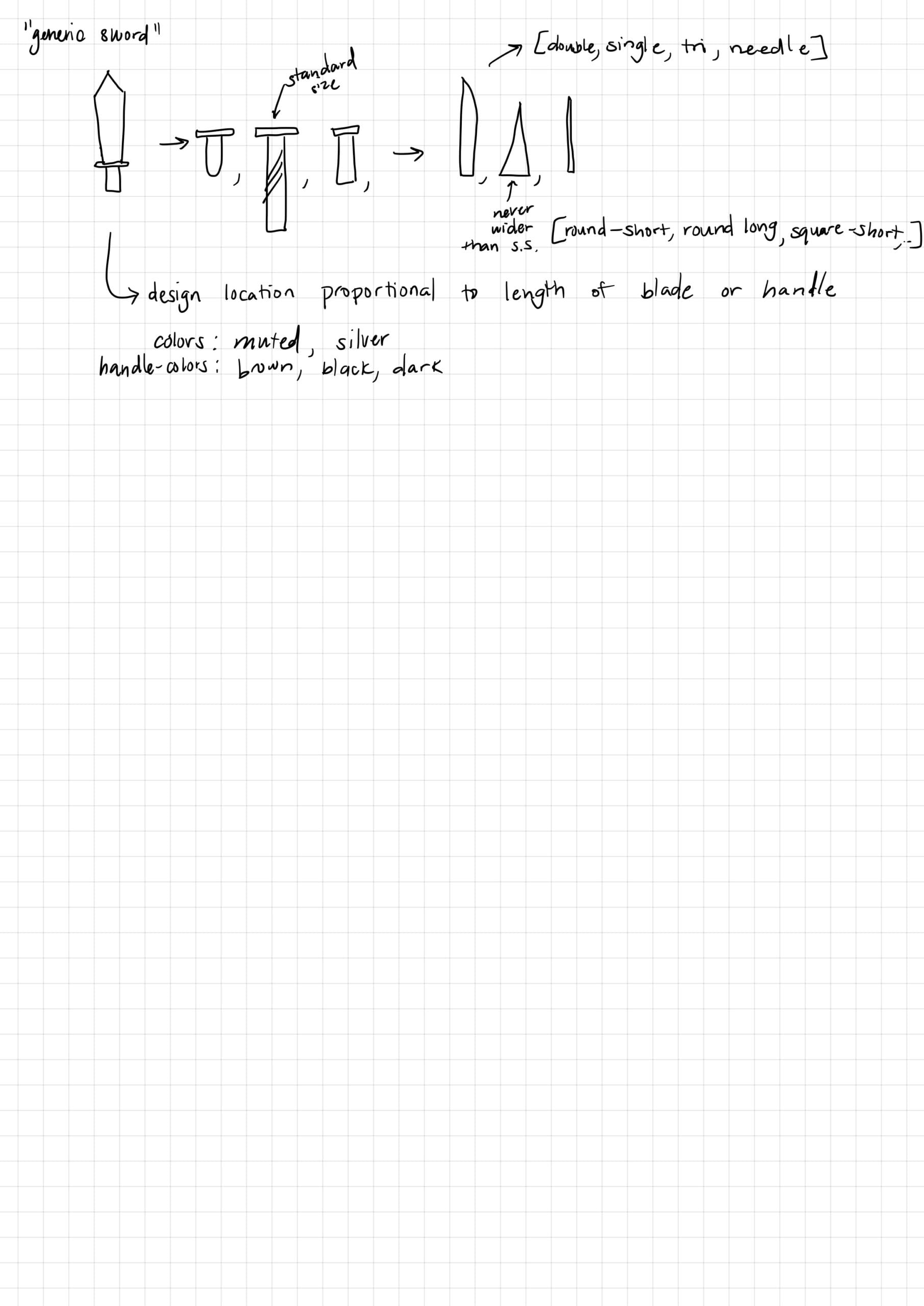
I would’ve liked to spend more time adding jewels/designs on the blade and handle however that would require me to store the width of the component to make sure the design wouldn’t exceed the width. It would also require coming up with multiple pattern algorithms. I believe this code can generate up to 9.67 x 10¹³ different sword combinations!
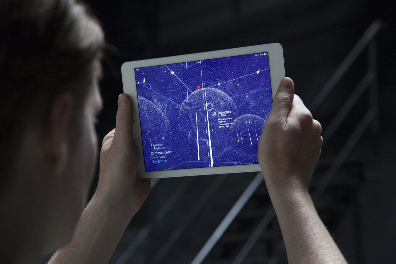
The project I dove into is called “Architecture of Radio”. It is an application created by Richard Vijgen in 2016. The project is meant to visualise the invisible radio signal networks that we are constantly surrounded by dubbed the “infosphere”. The infosphere is an interdependent environment of invisible networks that is made up of “informational entities”. These signals come from cell towers, wifi routers, and various types of satellites. The application is site-based meaning that it’s appearance morphs based on your geographic location and where your device is pointed to. In the video demonstration we see the lines of the network shift, shrink, and grow as the user moves around which shows us how these invisible networks actually behave in 360 degrees. The application relies on openly available data which includes almost 7 million cell towers, 19 million wifi routers, and hundreds of satellites.
What drew me to this project was the initial appearance of it. The blue and white map reminded me of something I’d see in some futuristic sci-fi movie. Like some piece of technology that’s meant to look completely advanced and impossible, however the Art of Radio is very much a living representation of the present and not the future. Vijgen could’ve represented the infosphere in so many ways: dots, lines, pink or green or yellow circles but he chose this specific appearance for the project. It’s clean and simple, yet is a spectacle once you understand what you’re looking at. It opens the observers eyes and lets them into a world that you’d never get to see otherwise. I suppose the algorithm that makes this infosphere visualization might be quite complicated. It’s constantly taking in millions of data points that change each frame, and mapping them out. For this I’d assume the code takes in the coordinates of the current location and the signals passing through it at that exact time, then draws a line to symbolize the origin, direction, and destination of the signal.
Research Post #1
Mimi Onuoha is a Nigerian-American researcher and artist who has produced work examining the implications of data collection. In her Eyeo Talk – “How We Became Machine Readable” Onuoha discusses the practice of data collection, and how something seen as objective and accurate can be skewed and riddled with bias in reality.
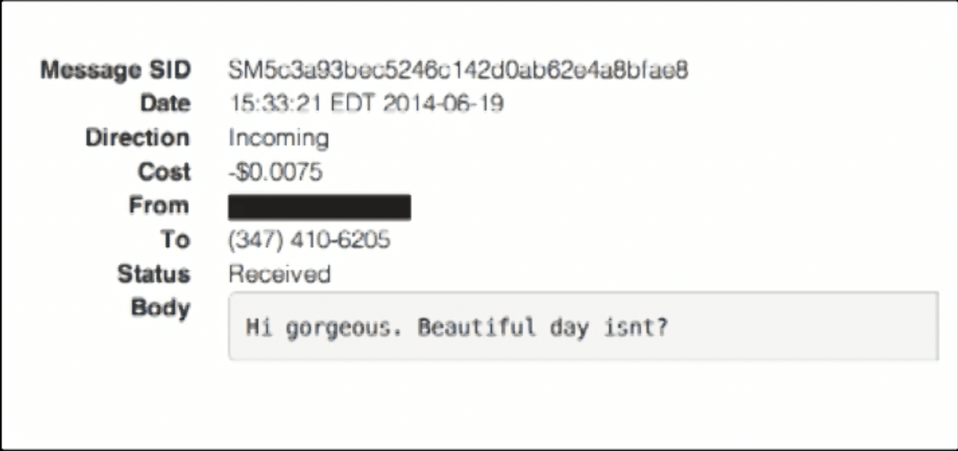
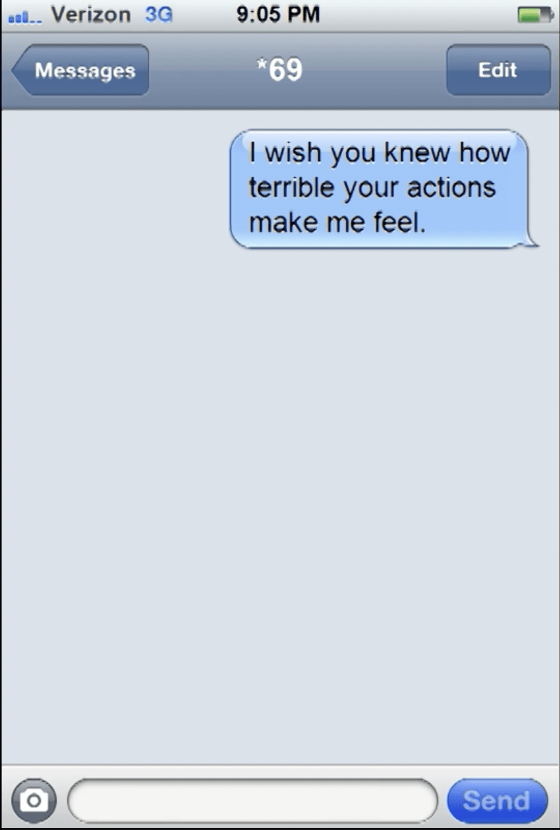
In data science, people are seen simply as objects of data collection. In project called *69, Onuoha uses men who catcall her as objects of data collection. She was moved by emotion which is evident in the fact that she took note of how she felt after every “grotesque” interaction. To collect her data on these catcallers, Onuoha puts herself on the frontlines of the experiment by handing a fake phone number to the assailant herself. She then uses an automated system to send them a message about how their actions made her feel. In this specific project Onuoha notes that neither the manner in which the numbers were collected nor what she did with them afterwards have any importance. What matters is what led to the generation of the dataset–a factor which is often overlooked. In this case it was men who couldn’t keep their vulgar comments to themselves. Someone who reviews this data with all its context has no choice but to feel the emotion that Onuoha felt firsthand: confusion, anger, vulnerability. Onuoha puts humanity back in data, or in her words, “reunites artifacts with the process of collection”.
In her experiment to reveal subjectivity in data disguised as a “visualisation project” Onuoha collects geolocation data from various groups of people–families, coworkers, roommates, partners–and comes to another conclusion about data: “If you haven’t considered the collection process you haven’t considered the data”. Datasets are the results of their means of collection and scientists tend to prioritize things that fit patterns of collection in order to eliminate outliers. However these outliers are essential to a complete dataset. Although it tends to resist metrification, is harder to collect, and can even be beneficial in its non-existence, these”complicating factors” as Onuhoa calls them reveal patterns of exclusion that are all too common in data collection, and can negatively impact entire communities of people.
By sharing this knowledge with people, that data collection is “contextual” and “mediated”, Onuoha hopes to level the knowledge playing field and prompt people to think more critically about where their data is coming from.
Lost and Found – Ozi
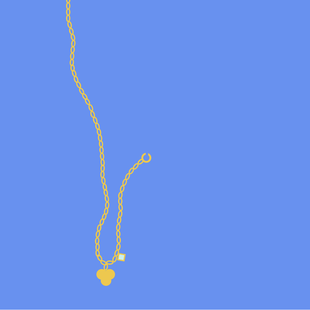
Artist: Ozi
Partner: Natalie
Object Description: “gold flower pendant, gem to the right of it, flower had 3 petals”
Reflection: This task was way more tedious than I had anticipated it to be. I got absorbed in the rotation and positioning of each individual chain which took up a lot of time, but it was enjoyable.
Link: https://editor.p5js.org/ozioma/sketches/NX1QJ_Zfw