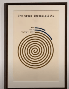
For my second research post, I chose to look at the work of Mimi Onuoha, a Nigerian American artist and researcher who centers a lot of her work around visualizing data relating to black, queer, and marginalized folks who are often underrepresented or left out of data. I found her work to be very interesting and powerful. She is able to represent inequalities that the algorithms that are used in our daily lives. I think this work is so important because tech spaces are mostly dominated by men, white men at that. This causes bias, intentionally or unintentionally, to be coded into these algorithms. The data visualization piece I chose to focus on was her piece called In Absentia. In this piece, Onuoha highlights the work of W.E.B. Dubois. W.E.B. Dubois was a famous sociologist and civil rights activist who centered his work around black liberation and anti-racism. In the early 1900’s he was requested by the US Government to go to a rural county in Alabama to gather data about the black population. After interviewing over 20,000 black residents, and gathering data and maps about the experiences of the black population in that area, the study was never published. The data gathered by Dubois, went against the narratives the Beauru of Statistics wanted to hear. Dubois’ data highlighted the inequalities and hardships black people in the south were facing post-civil rights era, regarding employment, land ownership, and the creation of wealth. This data highlighted issues systemic issues in the government, that the government did not want the general population to find out. Instead of publishing these statistics, they came up with a series of lies ranging from the manuscript being lost, or it having technical errors, that Dubois went to debunk later on in his career. In her exhibition In Absentia, uses the style of Dubois’ infographics to tell the story about the society we live in, rather than the data that is missing.


In Absentia emphasizes not the data, but the structures that represent where the data is coming from. Onuoha’s exhibit serves as an homage and a critique of W.E.B. Dubois’ lost work. An homage acknowledging the work that was intentionally destroyed by the government. But also a critique as to why the only way we can acknowledge human suffering is through numbers and data and not simply seeing the obvious pain and suffering. The need to validate pain with numbers and data, when simply the pain that is present should be good enough. I found Onuoha’s piece to be such a brilliant and thought-provoking piece of work. The way she is able to highlight the misfortunes of the government and how they suppressed data that existed in an attempt to not look bad. While also making a greater commentary on how as a society we have been trained to need numbers and charts and data to prove what already exists. Bringing about the bigger question of how can you quantify human suffering?