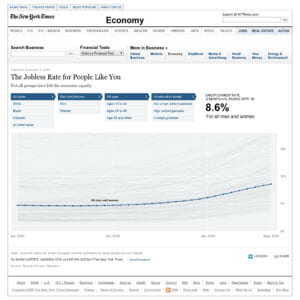
The Jobless Rate for People Like You
Amanda Cox’s Data Set, “The Jobless Rate for People Like You” really interested me.

This article was published in 2009, and I imagine that it was a visual representation of the effects of the 2008 recession. Unfortunately, the code for this project no longer runs due to Adobe Flash Player not being supported. However, I still think there is a lot to take away from what we can see from the article. What’s really interesting about this project is the title, because it influences the way people interact with the visual information. The data is objective, but the way its presented makes the reader think about their relationship to the data in a deeper context. This graph could just be titled “The Jobless Rate”, but in being titled “The Jobless Rate for People Like You”, it makes readers acknowledge their biases. Data is used in newspaper articles all the time, but the execution of this data is particularly interesting to me because of how it changes the reader’s relationship to the data.