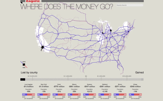
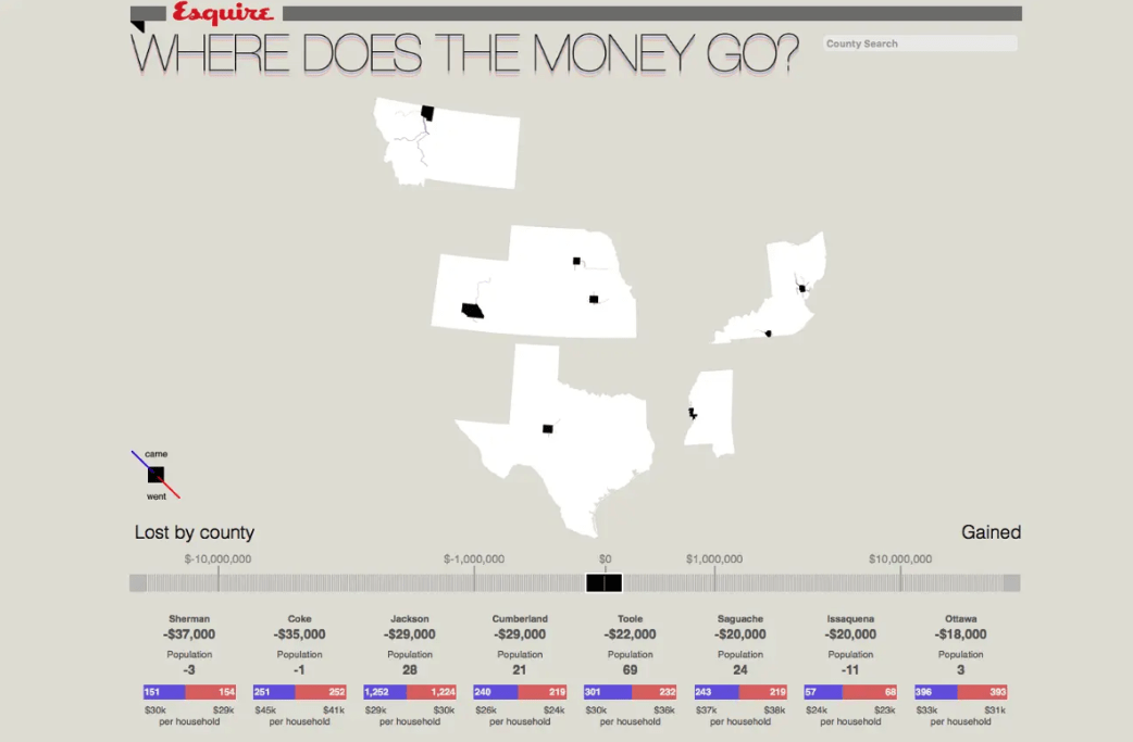
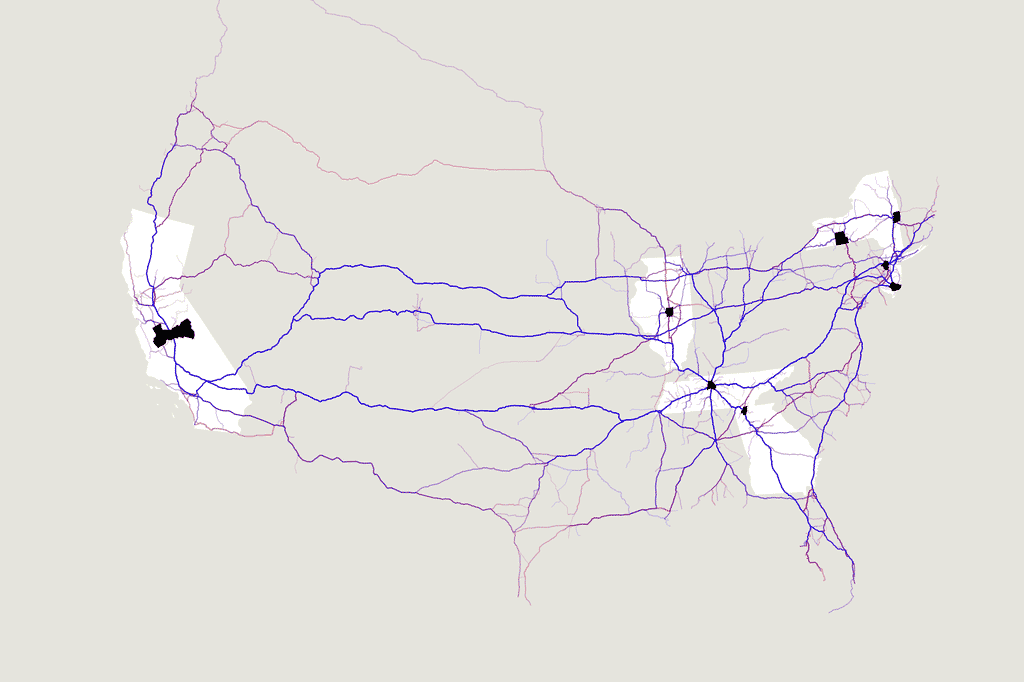
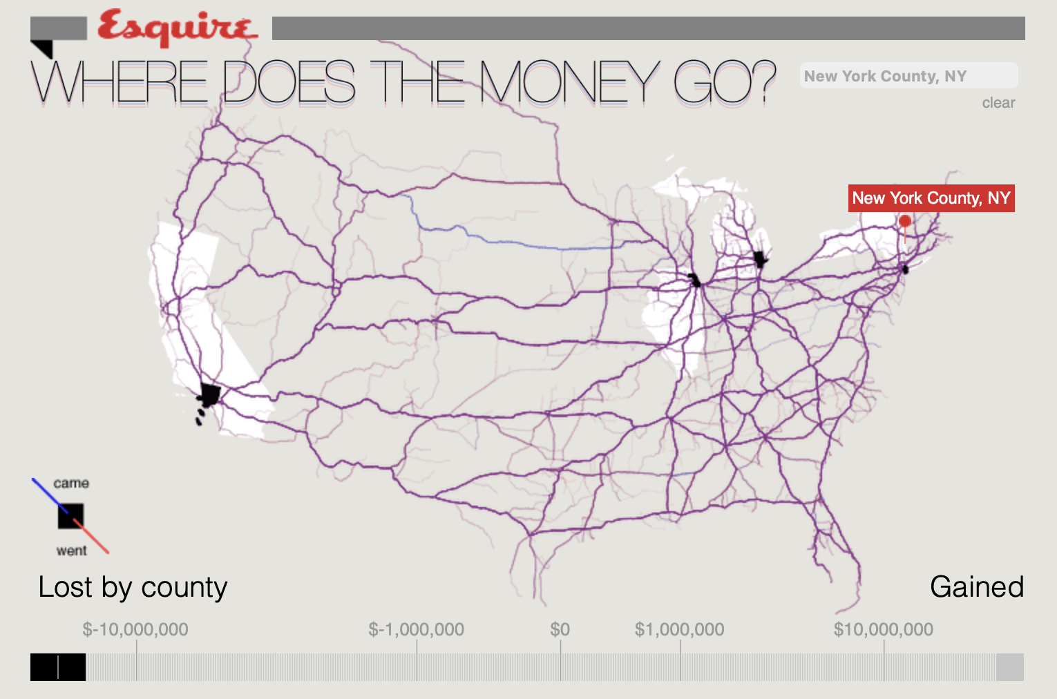
I choose to look into Stamen Design. They are a data visualization and cartography design studio, based in the Mission District of San Francisco and founded by Eric Rodenbeck in 2001. I took a MCC course last semester and we also did one project about data visualization, our group chose map as the visualization form, so the project “Where Does Money Go” is relatable and very interesting to me. I can see all the research and break down of data and the process of deciding what kind of information to keep and show, and what kind of data is irrelevant to the idea. The concept is that when people report a new address on their tax return, the Internal Revenue Service (IRS) assumes you’ve moved. They store this data and use it to generate a country to country migration in the US, and released these information as a dataset annually. In this project, they looked specifically at population movements some time in the 2009 tax year. By combining the IRS data with Open MapQuest route information, they were able to illustrate interstate movement.


It is obvious when you look through the maps, migration across the country was parallel to the movement of money.  When there’s no income nor population shifted, the map is quiet, not much is going on.
you can see a heavily active map when you look at the big and busy cities, like Los Angeles, Chicago, and New York. They all have a very heavy lost of money, and it is because they are the major exporters of the country.
