Category Archives: CCLab

Documentation of Project B

Project Description

  • Project Title: Unravel the Message
  • Project Subtitle: A Visual and Sonic Exploration of Communication Dynamics
  • Project Webpage Link: Unravel the Message.
  • Creator: Qiya Huang
  • Short Description: This project explores how messages can undergo transformation as they pass from one person to another. Through a combination of visual and auditory elements, I aim to create an engaging and thought-provoking experience. Feel free to browse the next three canvases.
  • Abstract: Dive into the complex dynamics of the evolution of information in this carefully programmed project named “Unravel the Message” in the digital realm. Inspired by the intriguing “megaphone game,” the project blends visual and auditory elements to demonstrate the metamorphosis of communication. Chaotic pixels triggered by mouth movements visually depict the distortions inherent in the transmission of information. Meanwhile, speech-to-text technology brings a tangible dimension to the audio, providing a concrete representation of the transformation of information. Join the exploration in three fascinating canvases that give communication a visualized form.
  • Demos

Process: Design and Composition

Initial Concept:
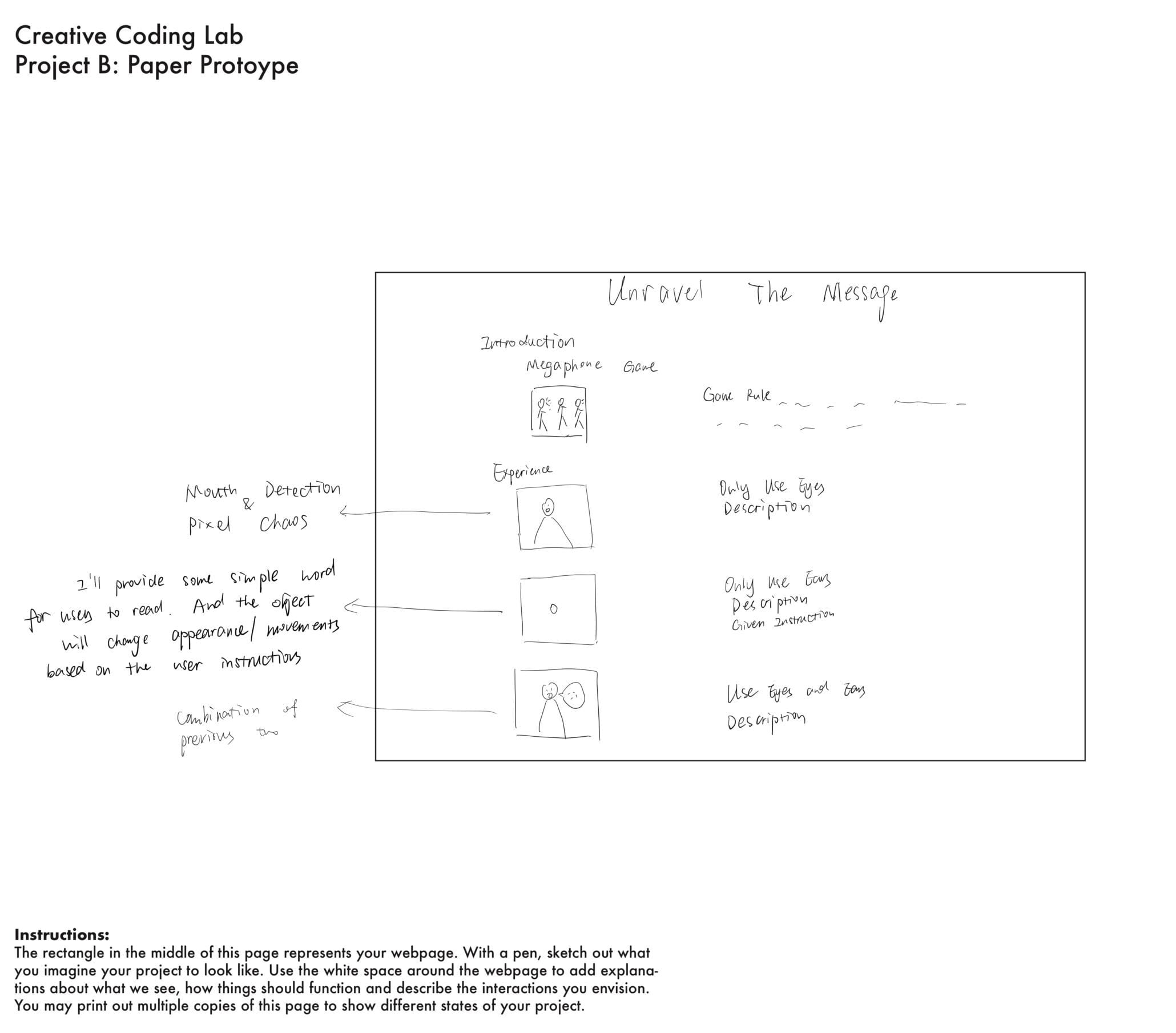
The design process began with the conceptualization of how to visually represent the transformation of messages. Inspired by the Megaphone Game, I wanted to incorporate changes in objects’ movements on the sketch triggered by mouth movements or speech as a symbolic representation of the distortions in communication.

Control of Speech Sketch:

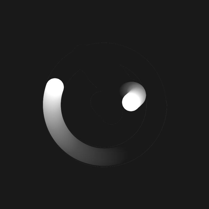
The initial control mechanism involved a red ball to experiment with user interaction.
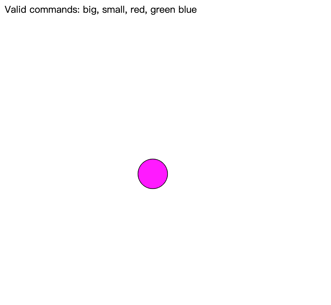
Initial Concept

In the second iteration, to improve the aesthetics, I added the bubble setting. At the same time, I expanded the control mechanism beyond color to include directions and a “blow” feature to align with the bubble setting. This decision aimed to enhance both the visual appeal and user engagement, allowing users to have a more dynamic influence on the evolving visual elements.
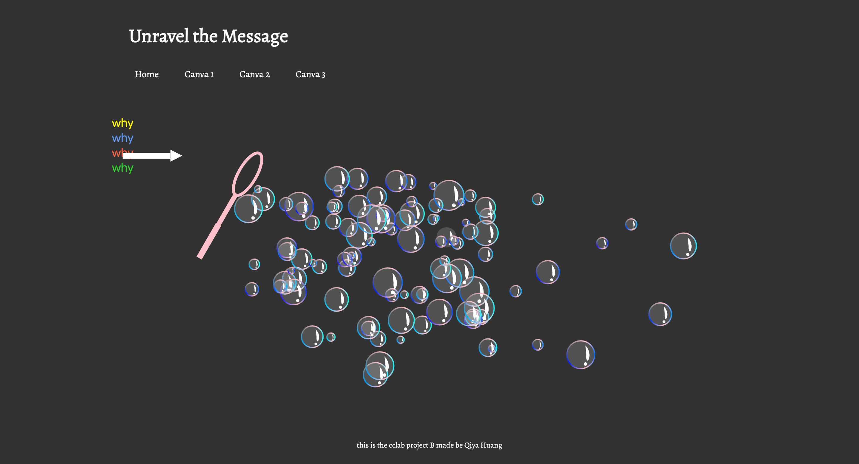
Second Iteration

Showcase Mouth Detection and Pixel Chaos:

To integrate the impact of mouth movements on the canvas, I implemented mouth detection to visualize the impact of mouth movements. Then, I designed pixels to change size based on variations in mouth width and height. This part is aimed to visually represent the distortions inherent in communication.
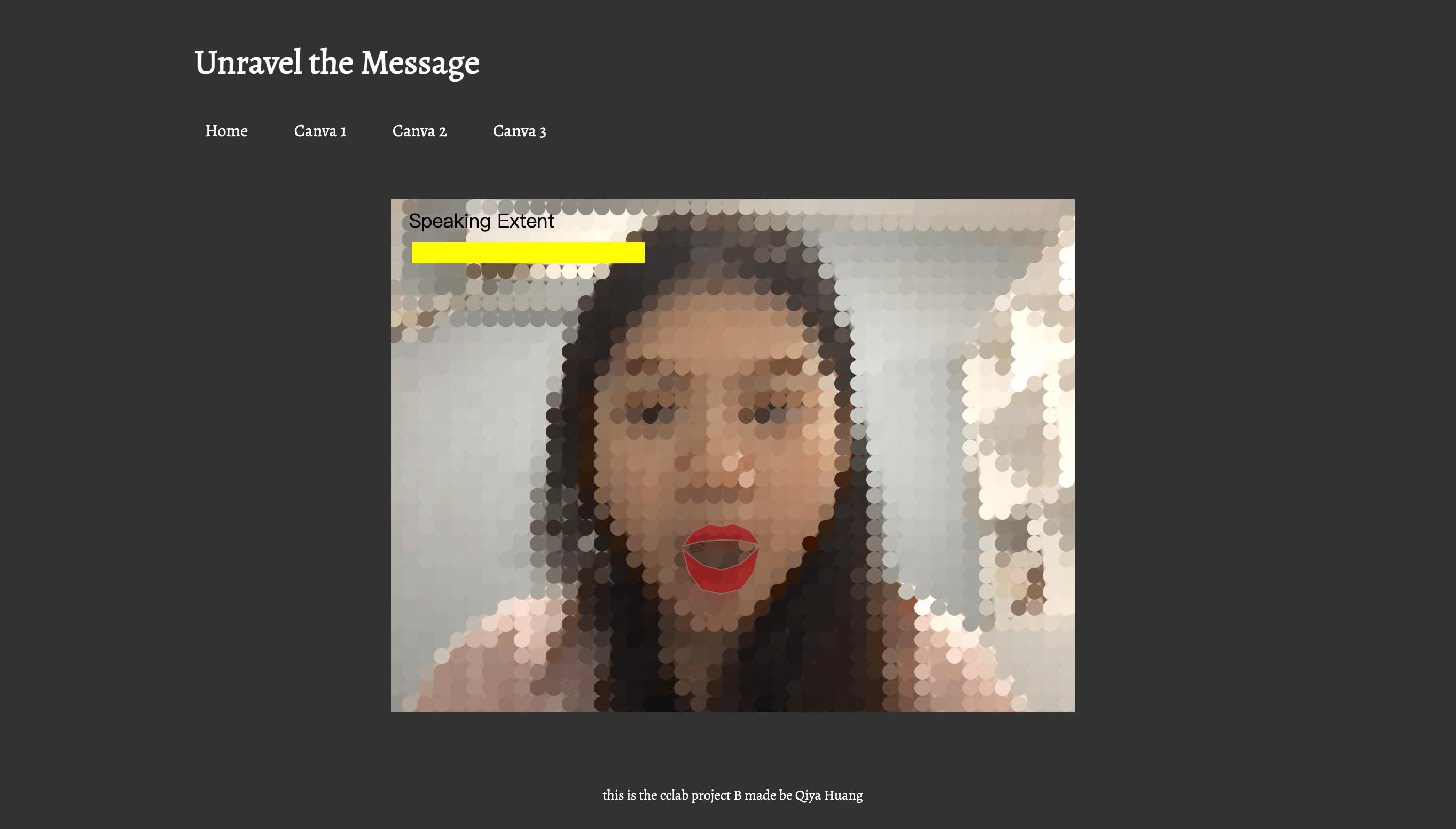
Mouth movements and pixel chaos

Integration of Mouth Movements and Speech:
To further integrate the impact of mouth movements and speech on the canvas, the third sketch combined ideas from the first two sketches. The most recent word detected was initially displayed in a fixed position on the top of the canvas, but feedback from Professor Marcela suggested exploring dynamic text placement for a more immersive experience. Therefore, I changed the text (the most recent word) position to be closer to each ear image to show a deeper connection to the message being spread.
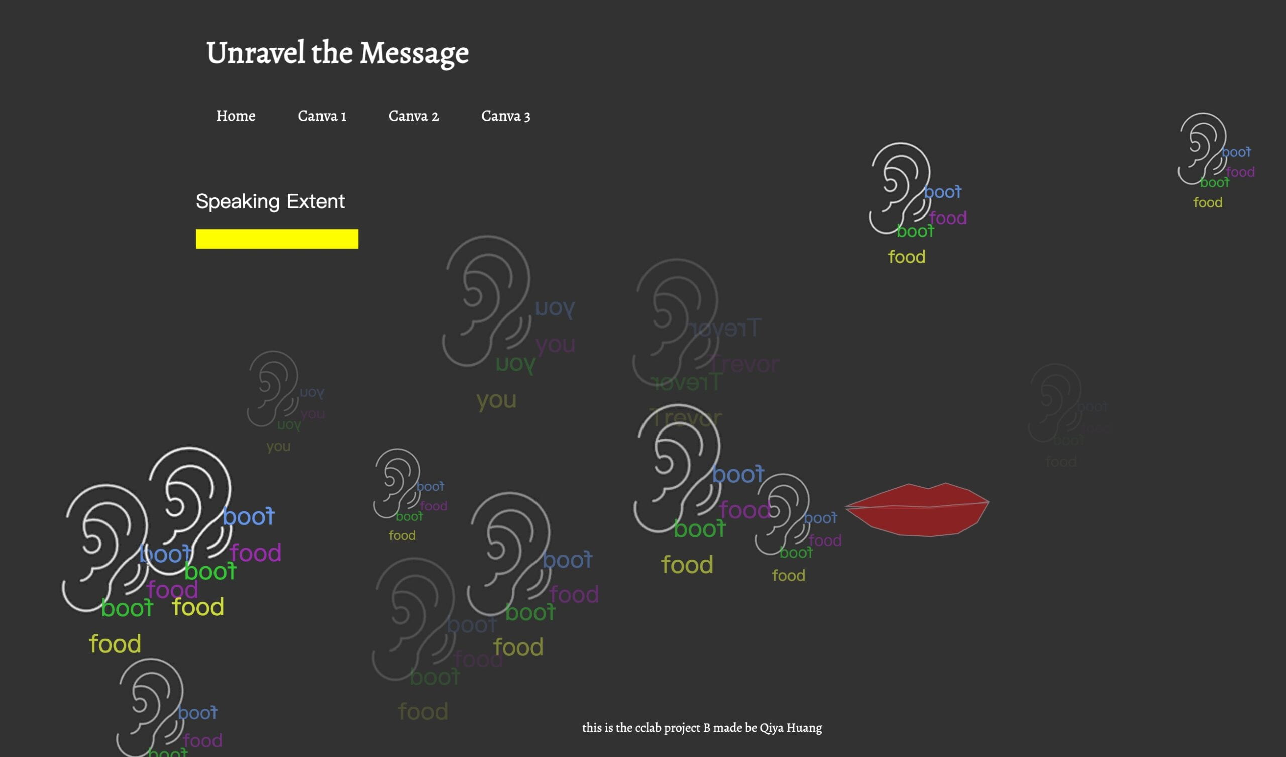
What Is Heard: Combination of Speech Recognition and Facial Recognition

Final Composition

The final composition involved refining the design based on feedback and testing. In addition, the website was structured to optimize sketch positioning, ensuring a seamless and intuitive user experience. The combination of chaotic pixels, dynamic text placement, and the expanded control mechanism contributed to a visually engaging and thought-provoking exploration of message transformation.

Process: Technical

Speech to Text

  • Utilized the p5 library for speech-to-text functionality.
  • Created a function, parseResult(), called on each word detection.
  • Displayed the current result using text() and logged it to the console.
  • Extracted the most recent word for further interaction.
function parseResult() {
  // myRec.resultString is the current recording result
  text(myRec.resultString, 25, 25);
  console.log(myRec.resultString);

  // grab the most recent word (the word on the right side of the string)
  let wordArray = myRec.resultString.split(" ");
  mostRecentWord = wordArray[wordArray.length - 1];
} 

Mouth Tracking

  • Leveraged the provided source from the professor for mouth-tracking.
  • Studied references to determine how to find the position of the mouth accurately.
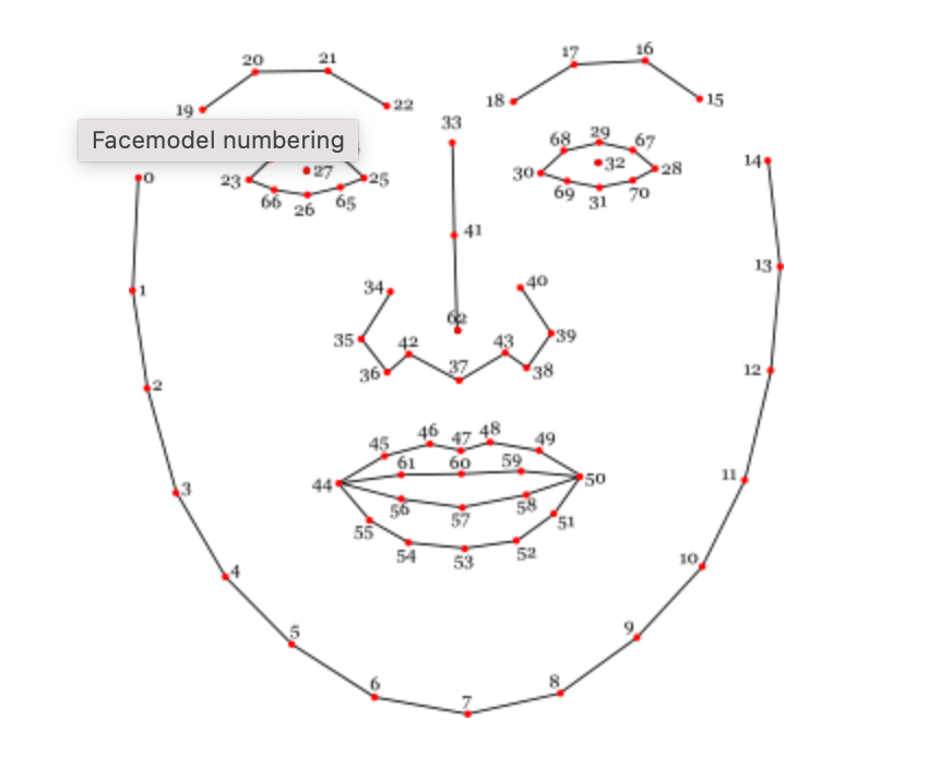
Face model Numbering

  • Here is how I use the face model numbering to display the mouth on the sketch: 
class Mouth {
  constructor(positions) {
    this.positions = positions;
    this.opened = false;
    this.defaultClosingValue = 8;
    this.mouthWidth = 0;
    this.mouthHeight = 0;
    this.distance = 0;
  }

  display() {
    stroke("rgba(141,117,122,0.75)");
    fill("rgba(164,28,28,0.75)");
    //upper lip
    beginShape();
    for (let i = 44; i <= 50; i++) {
      vertex(this.positions[i][0], this.positions[i][1] - 1);
    }
    vertex(this.positions[59][0], this.positions[59][1] + 1);
    vertex(this.positions[60][0], this.positions[60][1] + 1);
    vertex(this.positions[61][0], this.positions[61][1] + 1);

    endShape(CLOSE);

    //bottom lip
    beginShape();
    fill("rgba(164,28,28,0.75)"); 
    vertex(this.positions[44][0], this.positions[44][1]);
    vertex(this.positions[56][0], this.positions[56][1]);
    vertex(this.positions[57][0], this.positions[57][1]);
    vertex(this.positions[58][0], this.positions[58][1]);

    for (let i = 50; i <= 55; i++) {
      vertex(this.positions[i][0], this.positions[i][1] + 2);
    }
    endShape(CLOSE);
  }
}

Pixel Chaos

Adjusted pixel size based on mouth size, seeking assistance from the professor Marcela for optimization.

function pixelsChaos(mouthWidth, mouthHeight) {
  //gridSize = 20;
  let mouthSize = mouthWidth * mouthHeight;
  //gridSize = int(map(mouthSize, 500, 1000, gridSize, 19));
  gridSize = int(map(mouthSize, 500, 1000, 20, 10));
  gridSize = int(constrain(gridSize, 10, 20));
  //console.log(mouthSize, gridSize); //200-4000
}

Reflection and Future Development

Evolution from Proposal to Current Version:
The project has evolved considerably from the initial proposal, transitioning from conceptual ideas to a tangible exploration of message transformation. The Megaphone Game inspiration shaped the project’s interactive and dynamic nature. However, adjustments were necessary due to technological limitations and the need to align with the actual outcomes.

Strengths:

  • Sketch 1 and 3 effectively convey the desired message transformation.
  • Successful incorporation of speech-to-text and mouth tracking technologies.
  • Integration of chaotic pixels visually represents communication distortions.

Future Developments:

  • Continue refining and expanding Sketch 2 to achieve a more impactful visual representation.
  • The suggestion to incorporate additional elements beyond visuals and auditory elements was considered. Recognized the potential to add more elements to enrich the expression of the message transformation concept. 
  • Experiment with different visual effects or techniques to enhance the overall visual experience. As the guest critics mentioned, there is potential for enhancing the CSS style of the webpage.

Overall Reflection:
This project has successfully explored the dynamics of message transformation, utilizing both visual and auditory elements. While certain aspects performed well, ongoing adjustments and improvements were recognized. The feedback received from peers, instructors, and guest critics has been instrumental in refining my project, and future development will focus on further enhancing the user experience and expanding the expressive elements of the concept.

Credits and References

Project B Website Draft Documentation

Project Link and Brief Description

Here is the GitHub website link: https://cassiehuang72.github.io/CCLab/project-b-draft/.

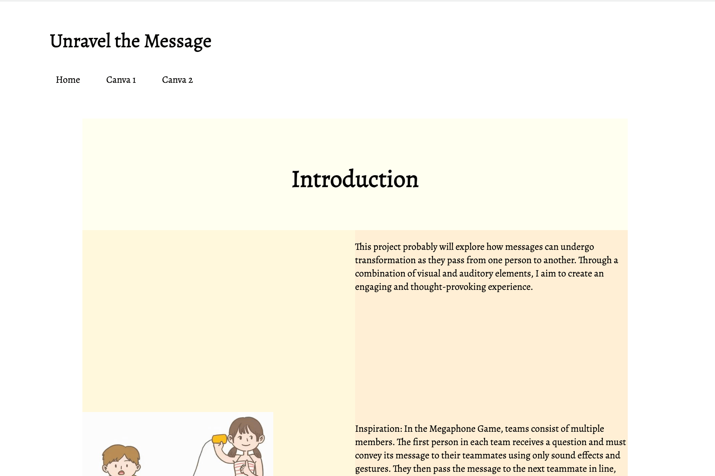
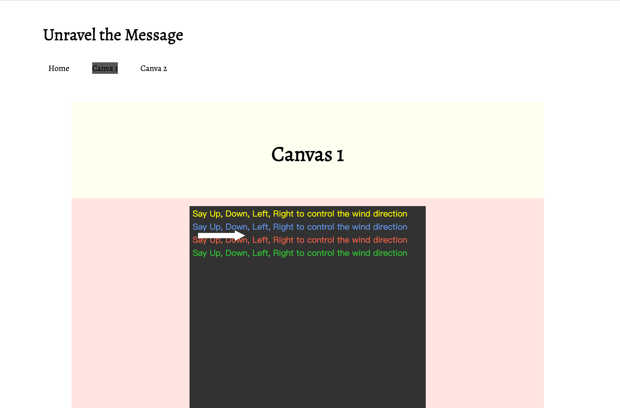
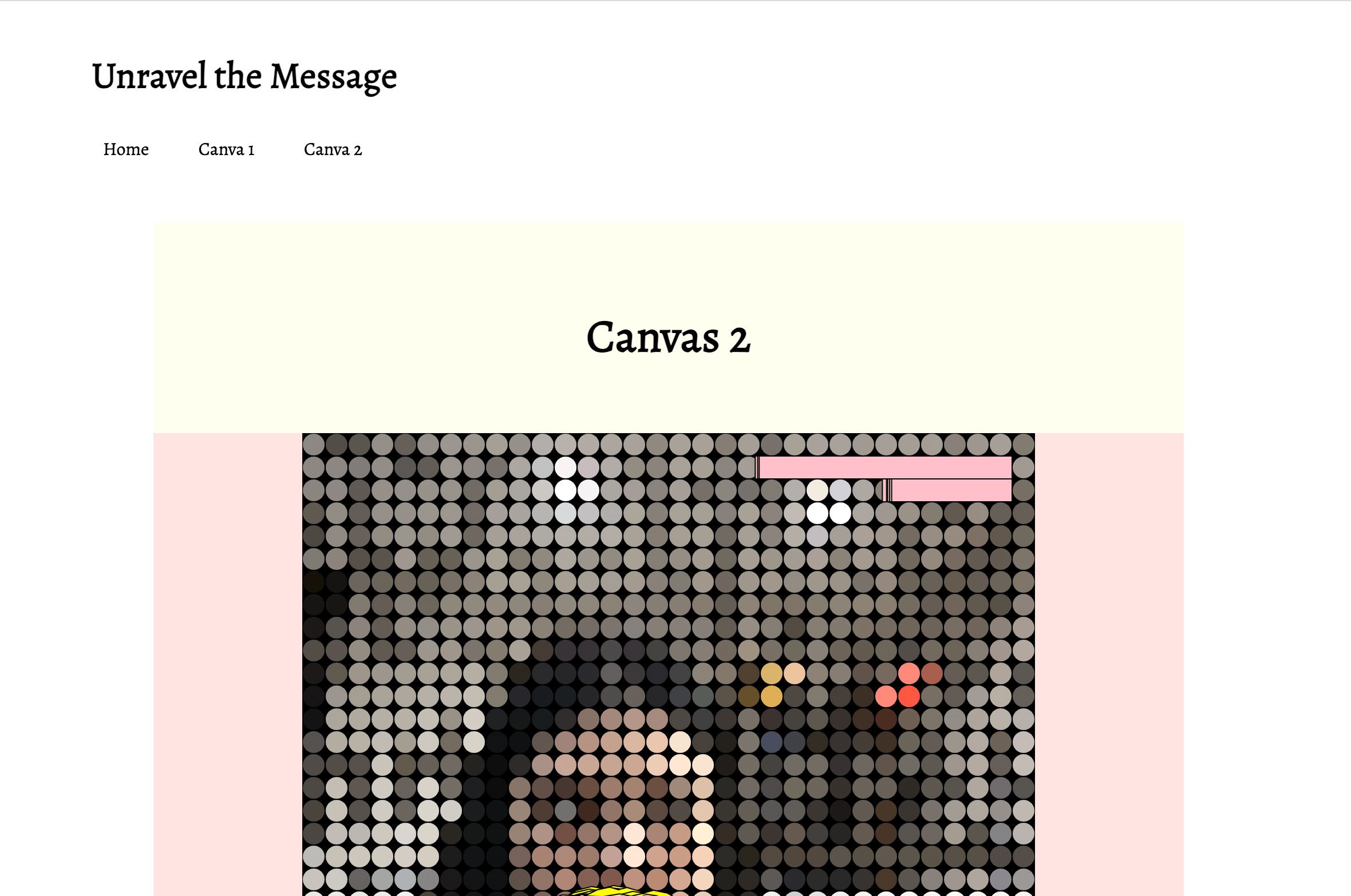
I’ve designed the Project B website using the box model to create a clean and organized layout. At the top of the site, there’s a compact navigation bar that allows users to easily navigate between three distinct sections: Home, Canvas 1, and Canvas 2.

  • The Home section serves as the introduction to Project B. Here, visitors will find a concise overview and description of the project, providing context and background information.
  • In the Canvas 1 section, I’ve incorporated an engaging p5.js sketch. The canvas is thoughtfully placed within its designated box, creating a visually appealing and centered presentation. Accompanying the sketch, there are detailed descriptions to provide insights and context about the creative elements.
  • Similarly, the Canvas 2 section features another captivating p5.js sketch enclosed within its designated box. Users can explore the interactive canvas, supported by informative descriptions that enhance their understanding of the sketch.

Demo

home page

home page

sub page

subpage 1

subpage 2

subpage 2

Coding

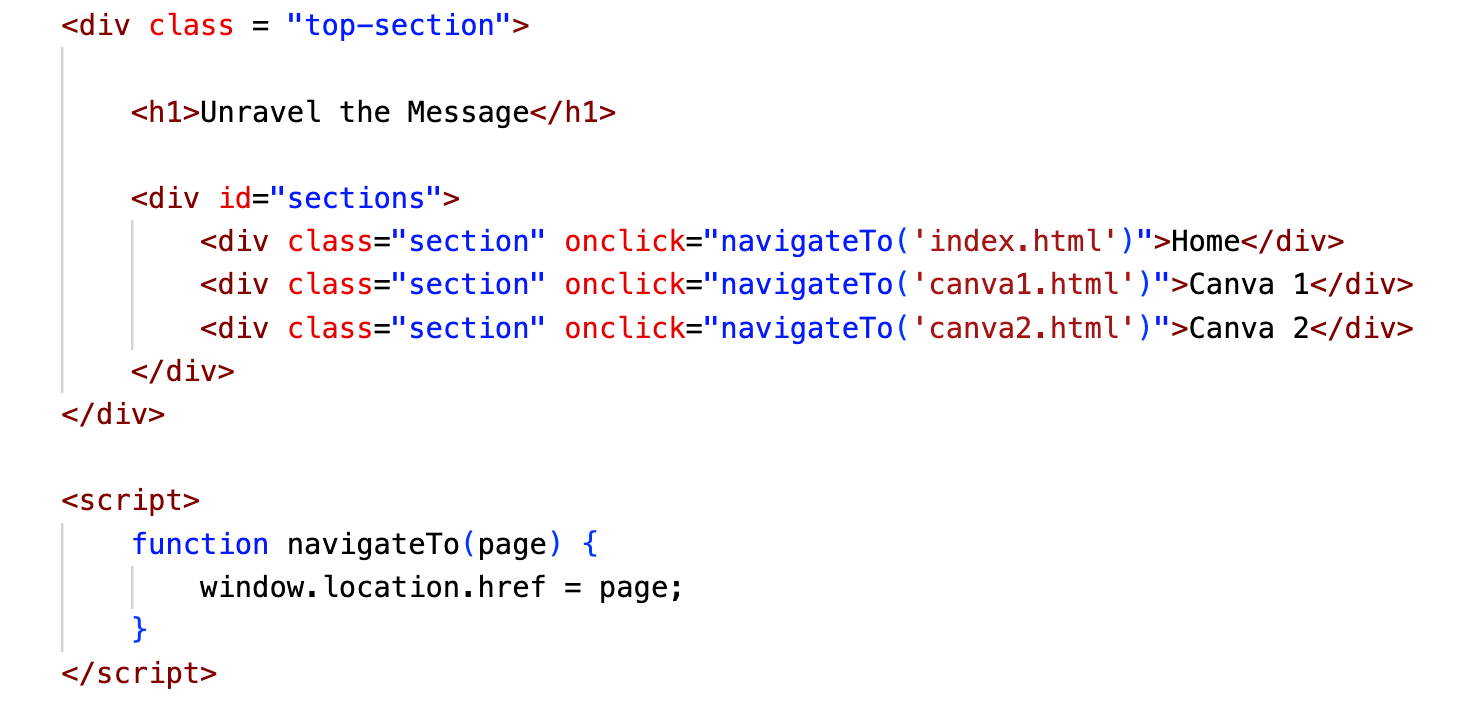
The main body of the website is constructed by applying the box model principles covered in our class. A notable skill acquired involves the implementation of a navigation bar, showcasing a proficiency in structuring and organizing content effectively.

code

code snippet

Reflection

  • Orderly filename conventions help organize files logically and make it easier for me to find and manage different components. For example, using a consistent naming convention for HTML files, CSS files, and images prevents confusion and reduces the risk of linking errors.
  • Classes and IDs
    Classes are generally used for multiple elements that share the same style. They allow you to apply specific styles to a group of elements. IDs, on the other hand, are unique identifiers for individual elements. IDs should be used when an element’s style or behavior is significantly different from that of other elements. However, IDs must be unique within a page, whereas classes can be used for multiple elements.
  • WYSIWYG text editor vs. HTML
    • WYSIWYG editor:
      Pros: User-friendly, no coding skills required, easy formatting and styling.
      Cons: Limited control over text styling; possible compatibility issues between different editors; may not be suitable for complex page designs.
    • HTML:
      Pros: Provides complete control over code structure, ensures concise and semantic markup, is better suited for complex and customized designs, and provides greater control over the ordering of filenames. Cons: Coding skills are required.
  • Web Technologies in a Web Page
    • HTML and CSS are primarily used for building web content, structure, and style. To be more specific, HTML defines the structure and content of a web page, and CSS styles HTML elements, defining layout and colors.
    • p5.js is used to create dynamic graphics and interactive content. It focuses more on interactive visual elements than the structural and presentation aspects of HTML and CSS.

Project B Proposal: Messages of Confusion

Project Description

Project B was titled “Messages of Confusion,” and it will delve into the interesting dynamics of how messages evolve by being passed from one person to another. The inspiration for this project stemmed from the intriguing Megaphone Game, a team activity where participants communicate a sentence solely through sound effects and gestures. To visually represent the evolving nature of communication, the project incorporated elements reminiscent of chaotic pixels, triggered by the camera detecting facial and mouth movements. These disorganized animated pixels materialize on the screen as the mouth moves, serving as symbolic representations of the inherent visual distortions that accompany the communication process. Complementing this, the audio element employs speech-to-text technology to provide a concrete demonstration of information transformation. I’ll first start with a mini project where participants can read some provided instructions to control the appearances or movements of the provided object. In the process, participants may be able to see how hard it is for the computer to execute the wanted instruction. Furthermore, there will be a part where the participant’s voice message undergoes successive transformations, first translated into text by the computer and then converted back into speech in the robot tone, with each transformation displaying subtle changes. As a result, “Messages of Confusion” thus delivers an engaging and thought-provoking encounter, seamlessly blending visual and auditory elements to underscore the intricate and sometimes unpredictable pathways through which information navigates in the realm of communication.

Additional Link:

Reading Response about New Media Art: Evolution and Innovation in the Digital Age

According to the reading, new media art is a type of art that uses emerging media technologies to investigate possibilities on the levels of culture, politics, and aesthetics. It was included in more general categories, such as Media Art and Art and Technology, which included techniques like Electronic art and Video art. The essay focused on how New Media artists used these tools for experimental or critical aims to turn them into art media.

Fast forward to 2023, New Media Art has undergone significant evolution. The spread of new digital platforms and technologies, such as social media, augmented reality, virtual reality, and AI-driven applications, is the most noticeable shift. These advancements have given artists greater creative freedom to create immersive and interactive works. Furthermore, the combination of blockchain technology and NFTs has opened up new possibilities for the production, marketing, and verification of digital art.

This evolution has also reshaped the dominant themes in New Media Art, with a heightened focus on issues such as data privacy, and the societal impact of technology. It has become clear that new media art is a powerful medium for bringing these subjects to light and encouraging critical conversation. At the same time, the domain has adjusted to the emergence of streaming services, podcasts, and the worldwide accessibility of digital information. In order to produce hybrid forms of art, artists now combine digital technologies with conventional artistic processes.

I have selected and discussed the works of two artists who are mentioned in the text below. The 2011 work “SCRAPYARD CHALLENGE” by Katherine Moriwacki is a prime example of the theme of audience interaction in new media art. In this program, volunteers are given a time constraint to construct robots out of recycled items, and then these homemade robots must compete in interactive tasks. In her work, multidisciplinary artist Moriwacki—who is skilled in both engineering and art—integrates technology, art, and education. By erasing traditional lines between artist and audience and encouraging active participation, “SCRAPYARD CHALLENGE” gives participants the freedom to mold their experiences according to their imagination and decisions. It represents the development of audience participation in New Media Art, where viewers are an essential part of the creative process.

On the other hand, “Alter Stats” by John F. Simon (1995–1998) demonstrates the conceptual quality of New Media Art prior to 2000. Simon is renowned for his innovative use of computer programming and algorithms to create art. “Alter Stats” visualizes web traffic data by translating online visitor hits into a three-dimensional graph. It anticipates the data-driven and conceptual direction that New Media Art would embrace in the 21st century. Drawing inspiration from the historical antecedents of Conceptual art, which prioritize ideas over tangible objects, Simon’s work exists as a conceptual construct, emphasizing the significance of the underlying concept rather than the visual representation. It aligns with New Media Art’s inclination to explore the conceptual possibilities of technology, data, and interactivity, foreseeing the growing role of data and digital information in contemporary art and culture, particularly in the context of big data and the digital age.

Mini Project 6 Particles: Bubble Particle System with Wind Direction

Project Link and Brief Description

Here is the p5 link: https://editor.p5js.org/CassieHuang/sketches/honE1Rbrw.

In this mini project, I created an interactive particle system using OOP that features colorful bubbles of varying sizes and speeds, each with its own unique appearance and disappearing time. Additionally, the user can change the wind direction using arrow buttons to influence the bubble movement.

Demo

Coding

Bubble Appearance:

I initially attempted to give the bubbles different reflected colors by assigning their color properties individually, like this. However, after exploring some references, I discovered an alternative approach using a conical gradient to create a more dynamic and visually appealing edge color for the bubbles. This conical gradient method provided a smoother transition between colors, enhancing the appearance of the bubbles.

Bubble Removal:

  • To manage the removal of bubbles from the canvas when they reach their predefined disappearing time, I implemented a mechanism that automatically detects when a bubble’s time limit has been exceeded. In order to achieve a natural and gradual “break” of bubbles, I created a checkDuration function inside of the Bubble object. This function helps me to remove bubbles from the array once they’ve reached the end of their lifespan, ensuring a seamless visual effect as they disappear.
  • What’s more, to ensure the fluency of the animation, I limited and controlled the number of objects in the bubble array.

Interaction Between Bubbles and Wind:

I created a method within the Bubble object called updateDirection(other) to control the interaction between bubbles and the wind direction. This function allows the bubbles to adjust their movement based on the current wind direction. Depending on the wind’s direction (up, down, left, or right), the bubbles adapt their motion accordingly. 

Reflection

  • OOP Understanding: Based on the reading and the project, I learned that OOP is a programming paradigm that revolves around the concept of objects. Objects are instances of classes, and they encapsulate both properties and functions. And a class is a template for creating objects. It defines the structure and behavior that its objects will have. An instance is a specific object created from a class. Each instance has its own set of attributes and can invoke the methods defined in the class.
  • Effectiveness of OOP: OOP makes code more modular because code can be organized into classes, making it easier to understand and manage. Also, classes can be reused in different parts of the program or in different projects.
  • Objects in the Bubble Project:
    • Bubble Class:
      • Properties: x, y, dia, speedX, speedY, hOffset, resistanceX, resistanceY, duration, and startTime.
      • Methods: move, display, updateDirection, and checkDuration.
      • Behaviors: Bubbles move, and disappear over time.
    • Wind Class:
      • Properties: x, y, and direction.
      • Methods: update and display.
      • Behaviors: Wind direction can be changed by user interaction and influences bubble movement.

    With the Bubbles project, I effectively learned how to use OOP to create an interactive and visually appealing particle system. By designing the Bubbles and Wind classes, which encapsulate the properties and behavior of Bubbles and Wind, the code is modular and maintainable. The use of dynamic and random properties of Bubbles and vanishing times adds to the complexity and interactivity of the project. The key challenge is to strike the right balance between abstraction and implementation while keeping the code clear and organized.

Patrick Star Dancer: Code and Creativity Combine for a Grand Dance Party

Project Link and Brief Description

Here is the p5 link: https://editor.p5js.org/CassieHuang/sketches/YxHUzLxXi.

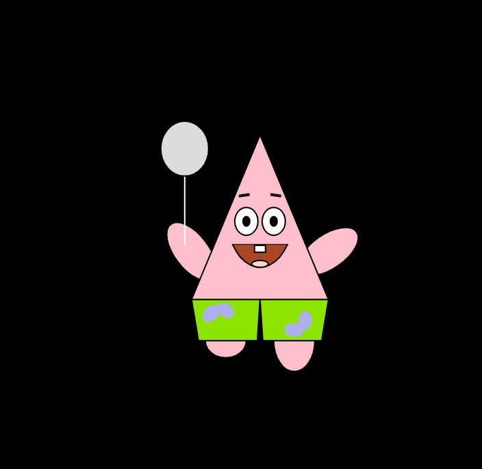
This mini-project presents an engaging and self-contained animated character that draws inspiration from the beloved Patrick Star character from SpongeBob SquarePants. The character is designed to exhibit rhythmic movements in its arms and legs, imparting a sense of dynamism and entertainment.

Key Features:

  • Dynamic Movements: The character is programmed to perform rhythmic arm and leg movements, adding a playful and lively dimension to its presence.
  • Interactive Element: The project includes an interactive component. By simply clicking the mouse, users can trigger a change in the character’s facial expression. Specifically, the character’s eyes change in size, conveying an expression of surprise.
  • Object-Oriented Programming (OOP): The codebase of this project adheres to the principles of Object-Oriented Programming (OOP), ensuring a well-structured and organized framework. This makes it easy to extend and maintain the project, and allows the character to be seamlessly integrated into larger scenarios later.

Demo

Dancing Patrick Star

Coding Snippet

In the project, the properties and attributes of the Patrick Star have been meticulously defined. Various properties, such as ‘this.yMov’ and ‘this.leftArmR,’ have been assigned specific roles and behaviors, enabling precise control over different aspects of Patrick’s appearance and dance movements.

To achieve the character’s engaging dance movements and the interactive feature, the code relies on a strategic utilization of mathematical functions. The ‘sin(frameCount/num)’ function plays a central role in generating rhythmic and repetitive motions. These movements, including Patrick’s arm and leg swings, are carefully synchronized with the passage of time, creating an animated and lively dance performance.

class Patrick{
  constructor(startX, startY){
    this.x = startX;
    this.y = startY;
    this.yMov= random(5,20);
    this.leftArmR = 5;
    this.Boo = false;
    this.rightArmR = 175;
    this.eyeSize = 15;
    this.legLeft = 25;
    this.legRight = 45;
  }  
  update(){
    this.x += 2*sin(frameCount/20)
    this.y += 2*cos(frameCount/this.yMov)
    
    if (this.leftArmR>70){
      this.Boo = true
    }
    else if (this.leftArmR<5){
      this.Boo = false
    }
    if (this.Boo) {
      this.leftArmR = this.leftArmR - noise(6 * sin(frameCount / 50));
      this.rightArmR = this.rightArmR + noise(6 * sin(frameCount / 30));
    }
    else{
      this.leftArmR = this.leftArmR + noise(6 * sin(frameCount / 50));
      this.rightArmR = this.rightArmR - noise(6 * sin(frameCount / 30));
    }
    if (frameCount % 10 == 0){
      if (this.legLeft == 25 ){
        this.legLeft += 15
        this.legRight -= 15
      } 
      else{
        this.legLeft -= 15
        this.legRight += 15
      }
    }
    if (mouseIsPressed){
      this.eyeSize += sin(frameCount / 2)
    }
  }
}
}

Reflection

  • A self-contained class operates as an independent unit, with all its logic (like properties and methods) encapsulated in its own definition. This isolation reduces the risk of external factors affecting its behavior, making it more predictable and easier to maintain. As a result, an individual class can be reused in different projects without worrying about dependencies on external code. When we introduce this Patrick Star Dancer into the Grand Dance Party project, we will minimize the mess and trouble.
  • Ensuring that my dancer’s code works seamlessly with code from a different source, such as the Grand Dance Party, requires a deep understanding of the structure and functionality of the external code in order to effectively integrate my code. Lack of comprehensive documentation or unclear code can make coordination challenging.
  • Modularity: The Patrick class is an example of modularity, encapsulating the full properties and functionality of the Dancer character in a well-defined class. It separates the character’s properties, appearances, and movements into separate modules, making it easy to manage and maintain different aspects of the character independently.
  • Reusability: The design of the Dancer class promotes reusability. People can instantiate multiple instances of the class in different scenarios without worrying about external dependencies. It is a self-contained, reusable unit that ensures that the character’s dance animations and interactions can be effortlessly integrated into different contexts.

Jellibop: The Birth of a Cute, Wavy, Jellyfish-Like Creature

Project Links

Below is the project Jellibop: The Birth of a Cute, Wavy, Jellyfish-Like Creature by Cassie Huang.

P5 sketch link: https://editor.p5js.org/CassieHuang/sketches/vsDeWFSxi

Website link: https://cassiehuang72.github.io/CCLab/projectA/

Elevator pitch

Meet the Jellibop, a mesmerizing digital marine creation that evolves with every generation, delighting in its ever-changing colors, shapes, and playful, aquatic motion. Experience the fusion of art and science as you watch these charming creatures grow, interact, and even enjoy snacks. Dive into the world of the Jellibop, explore this fascinating creature and discover its mysteries.

Abstract

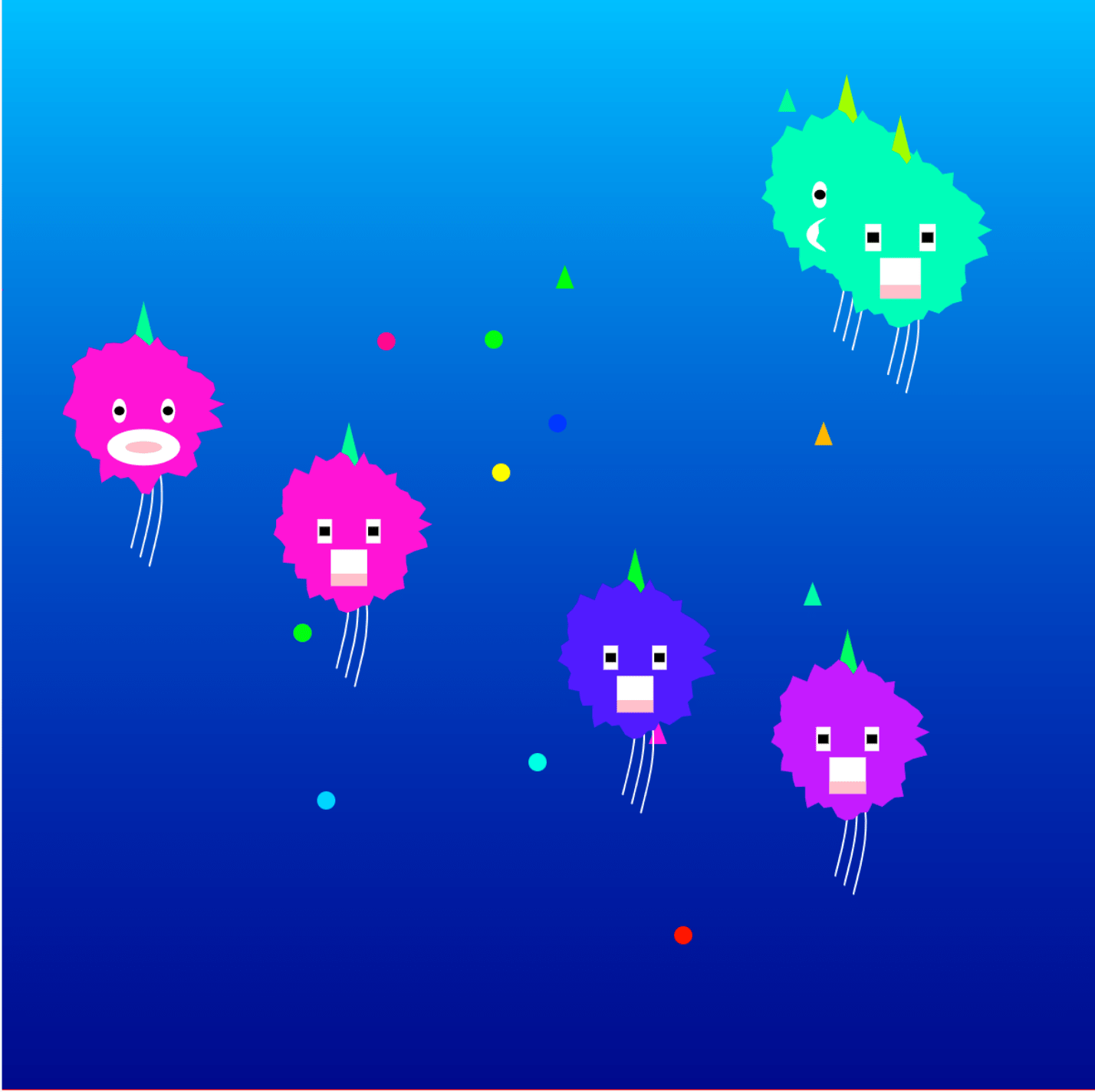
This unique, wavy, jellyfish-like creature that thrives in the depths of the ocean, which we call Jellibop, starts out as a small droplet of digital magic and then begins to move, moving with noisy fluidity. What makes the Jellibop really special is that it’s not the same every time. Its color, shape, and the way it moves are different with each new one we create. As it glides through its watery world, it grows naturally, and when it reaches a certain size, it changes direction. The Jellibop even enjoys snacks – it’s a bit of a carnivore, and when you release tasty treats, it happily gobbles them up and gets bigger. Once it gets big enough, it splits into two, starting the cycle all over again. In groups, Jellibops synchronize their colors, revealing a social, colorful dance.

Instructions

  • Click to release the wavy marine organisms
  • Press “Enter” key to switch to feeding mode and click to release the snack
  • Press “Enter” again to switch back to creature release mode

Images

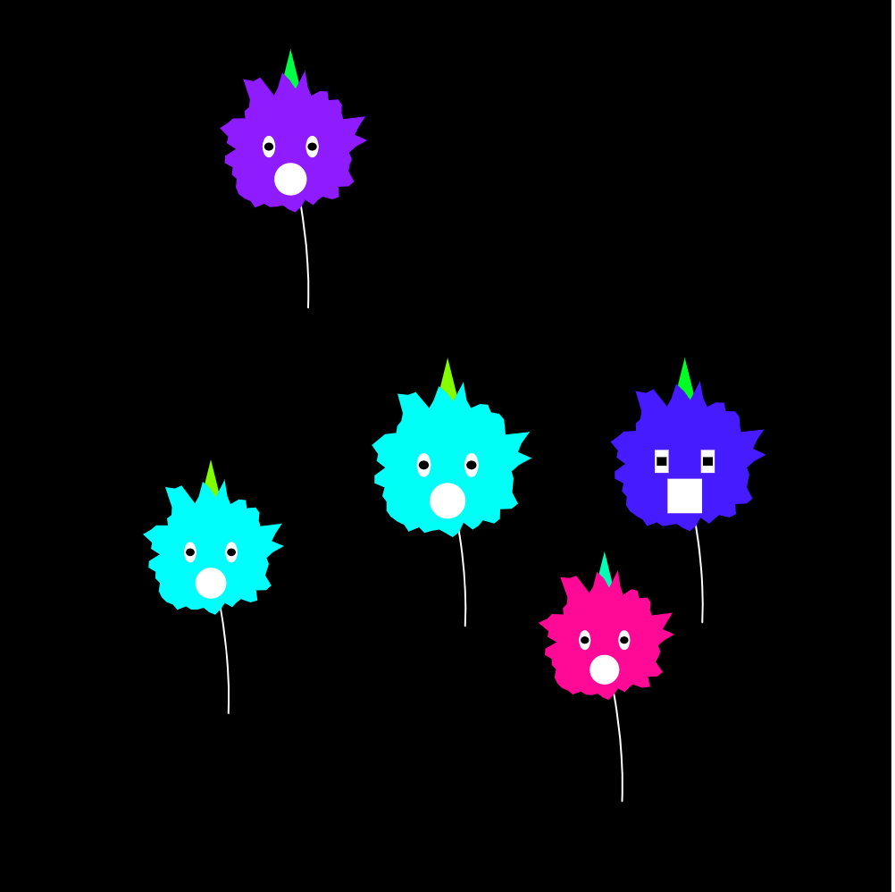
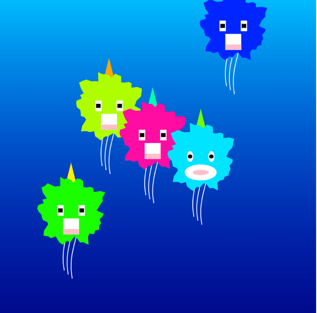
Jellibops Synchronize Colors as They Encounter Each Other Amidst a Sea of Snacks. A mesmerizing display of social dynamics and harmony in the digital marine world.

Design and Composition

The creation of the Jellibop project was a journey of exploration, experimentation, and continuous iteration.  It all started with a tiny, randomly moving dot, gradually evolving into the endearing digital marine life shown here today.  Here, we delve into the design process that shaped the Jellibop’s appearance and user interaction:

  • Appearances Design Evolution: The project’s genesis was marked by a simple dot moving randomly in space (mini project 3). To achieve the desired visual appearance, a meticulous evolution occurred. To craft the body shape of the Jellibop, a reference to blobby creatures plays a pivotal role. Parameters such as offset and increment were tweaked until the desired shape was achieved.  Similarly, inspiration for the cirrus (tails) was drawn from growing wavy lines, with variables such as frequency and amplitude providing control over their form.
  • Code Structure Optimization: Initially, the code (a version without arrays) was somewhat disorganized, with two creatures drawn directly in the draw function. This made it challenging to manage multiple creatures, each requiring a unique appearance and behavior. It became evident that a more structured approach was needed. Therefore, I applied arrays of x, y, speedX, speedY, noiseBallSize, eyeShape, and h to better track and control their movement speed, body size, facial features, and color.
  • Interactions: An important goal was to allow the Jellibops to interact with each other, including color interchange upon encountering one another. This, however, presented challenges. Early attempts resulted in erratic color changes due to coding complexities. Several iterations were made to rectify this, leading to the final version where Jellibops synchronize their body colors upon meeting, a solution that proved both effective and visually engaging.
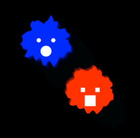
  • Image records of how it evolved:

Origin

With a blobby shape and facial features

With more detailed features

With more detailed features

Overall, the Jellibop creation is a testament to the creative possibilities that emerge from continuous refinement. Personally speaking, the iterations and experimentation were crucial in achieving the desired visual appearance and user interactions.

Technical Chanllenge

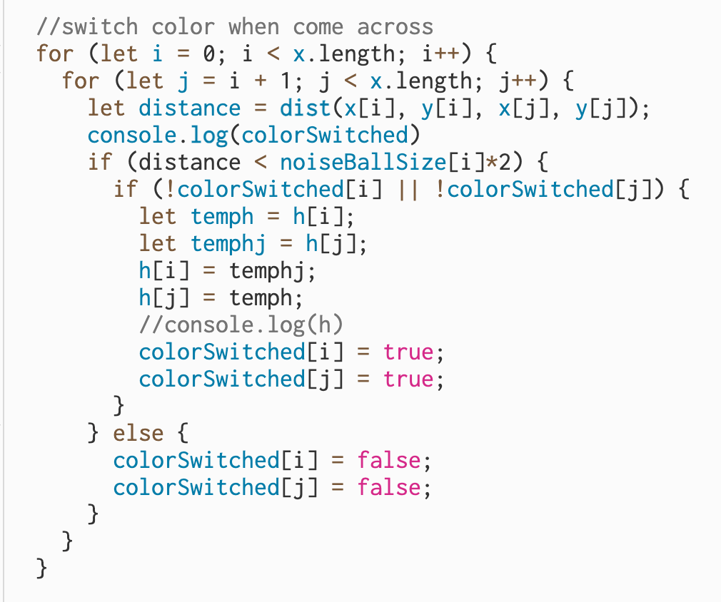
In the creation process, I encountered an interesting coding challenge that provided an unexpected twist to the creature’s behavior. As mentioned before, my original plan was to implement a color switch mechanism where, when two Jellibops came into close proximity, their colors would interchange as if they were engaged in a vibrant conversation. However, technical issues surfaced here, and I found that the two creatures kept changing colors continuously until they moved apart (p5 sketch code). This unexpected behavior, while fascinating, wasn’t in line with my initial vision. In response to this challenge, I decided to pivot and introduced a rule that allowed the Jellibops to adopt a uniform color when in close proximity. This change brought about a unique form of social interaction.

Failed code snippet for switching color

Failed code snippet for switching color

Reflection and Future Development

The process of creating the Jellibop project has been a valuable learning experience, emphasizing the iterative nature of innovation and the importance of seeking inspiration from diverse sources. I’ve come to appreciate that finding the perfect solution often requires experimentation and adaptability and that it’s not a one-shot endeavor. The project’s development has also underscored the significance of drawing insights from others’ work, as it can provide fresh perspectives and solutions.

For future development, I’m eager to enhance the project’s dynamics by introducing movements to the snacks and exploring interactions between Jellibops and snacks. As suggested by Professor Godoy, endowing snacks with their own movements once they’re released into the water could add an exciting dimension. Guest critics have also raised the idea of diverse interactions between Jellibops and snacks. I’m intrigued by the concept of mapping the Jellibop’s color with the snack’s color, making it a more immersive experience. Additionally, diversifying the functions of snacks, such as certain snacks causing a reduction in Jellibop size when consumed, offers exciting avenues for further exploration.

Balancing the Benefits and Concerns of the Web: A Decade Later

Beneficials and Ill Effects

The web, as highlighted in the article, presents both beneficial and concerning aspects. On the positive side, the web is a platform built on egalitarian principles, promoting open access, global conversation, and free speech while connecting individuals and institutions. However, it also faces challenges, with governments monitoring online activities, threatening human rights and potentially leading to a controlled and fragmented web, affecting access to information.

As for me, the web has been an invaluable resource for my educational journey. It has enabled me to access a vast repository of online courses, coding tutorials, and development tools, allowing me to hone my coding skills and broaden my knowledge in web development. I’ve also had the chance of connecting with a global community of fellow learners, which has fostered cultural exchange and collaborative projects that transcend borders. However, on the other hand, I’ve encountered instances where access to certain websites and content is restricted, limiting the availability of diverse perspectives and information. This not only hampers my educational pursuits but also raises questions about the fundamental principles of online freedom and privacy.

Concepts Understanding

Universality and Isolation: Universality underscores the open accessibility of the Web for all users, regardless of their devices, software, languages, or connectivity. It promotes inclusivity and diverse participation. Isolation, on the other hand, arises from closed, proprietary platforms, which trap user data within their confines, hindering open data exchange and potentially fragmenting the web.

Open Standards and Closed Worlds: Open standards are the backbone of web innovation, offering free and royalty-free technical standards that empower diverse website and application creation. Closed worlds, like Apple’s iTunes, restrict access and creativity by creating closed, proprietary environments that prioritize control and exclusivity.

The Web and the Internet: The Web is an application layer that operates on top of the Internet infrastructure, offering user access to the World Wide Web. The separation of layers is crucial, enabling independent innovation in both the Web and the Internet. The Internet is the underlying electronic network that transmits data packets among computers using open protocols, and improvements in one layer don’t disrupt the other. This separation supports ongoing innovation and compatibility between the Web and the Internet. 

Vision for the Web: A Decade Late

The author’s vision for the future of the web still holds relevance in several aspects.

  • Open Data: The concept of open data has thrived, allowing information to be shared and leveraged for real-world benefits such as safety, discrimination awareness, and disaster relief.
  • Web Science: Research into how the web influences the real world has progressed, though it’s a developing field with growing relevance.
  • Social Machines: The influence of user-generated content on various sectors remains strong, but challenges of misinformation and manipulation have emerged.
  • Internet Access: While efforts have been made to improve access in developing countries, challenges related to affordability, digital literacy, and infrastructure persist.

Mini Project 4: Patterns

Project Link and Brief Description

Here is the p5 link: https://editor.p5js.org/CassieHuang/sketches/YPrShsIQy 

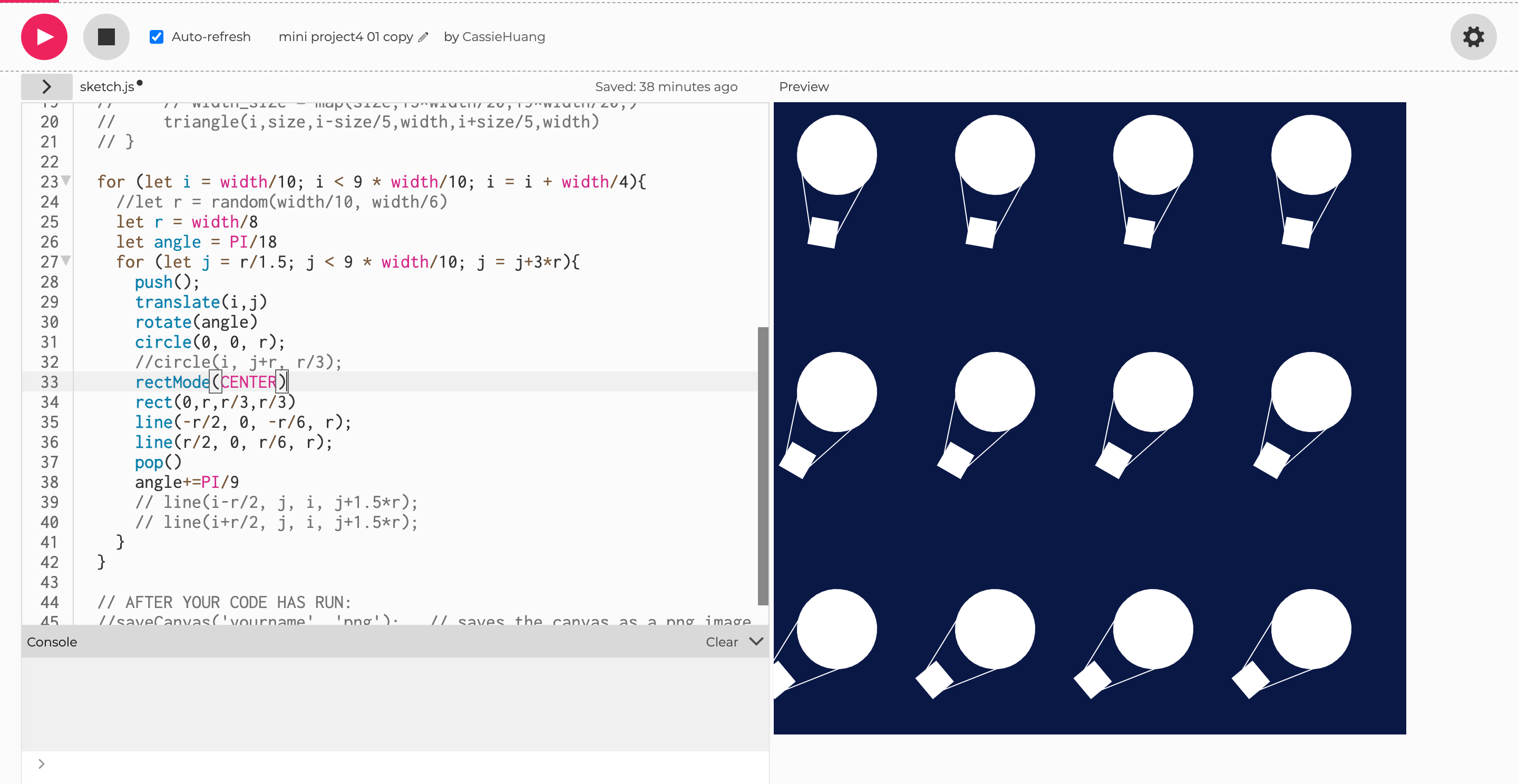
In the first set of three images (Shown in Visual Output), I delved into geometric shapes, utilizing circles, rectangles, and lines. By randomizing some of the variables while adjusting key variables, I carefully controlled the position and size of these shapes.

In a subsequent set of three images, I moved into the realm of rotation. I chose a shape from the initial set and applied three different rotations: an even rotation with a fixed angle, an incremental rotation with an increased angle, and a reverse rotation with a negative angle.

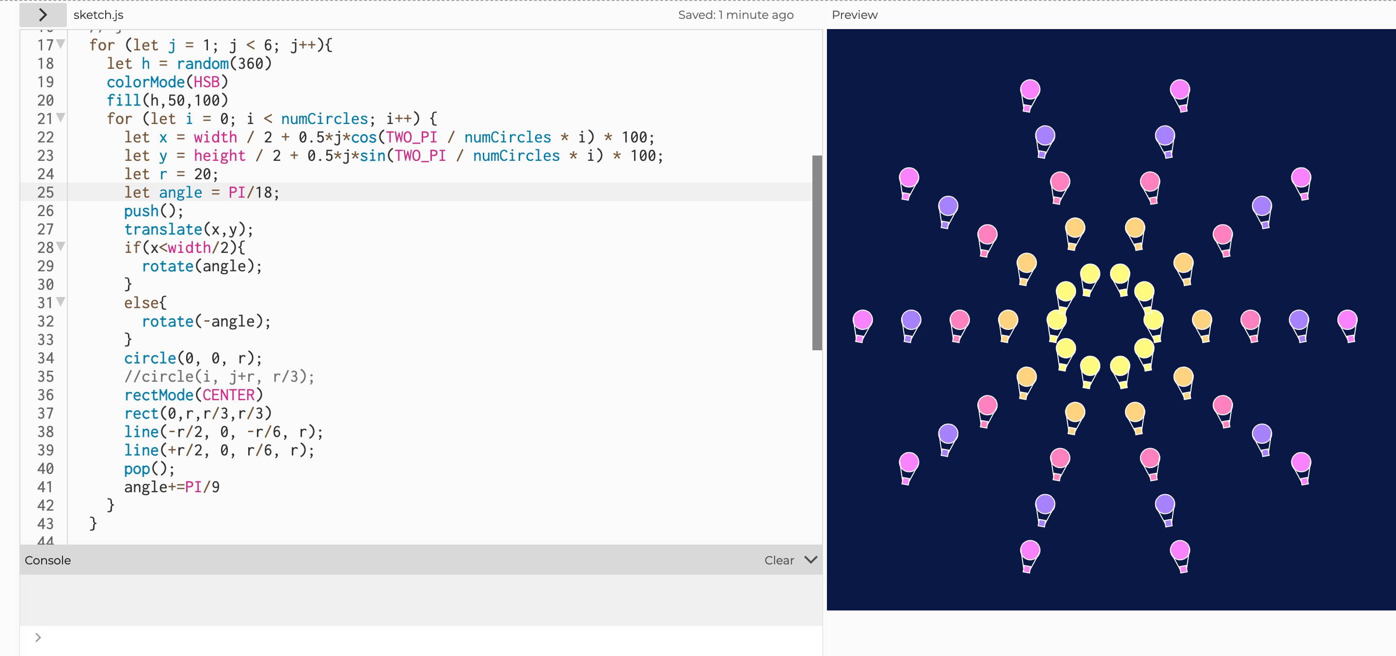
For the final three sketches, I utilized loops and mathematical functions like sin() and cos() to arrange the shapes into circular patterns. By changing the order of these loops, the shapes in the circles were able to be filled with different sets of colors. These images focus on a synthesis of code, symmetry, and mathematical elegance, providing a visually cohesive yet diverse set of patterns.

All in all, this project embodies the essence of exploratory programming, where variables and functionality blend seamlessly together to create nine static images, each proving a delicate balance between repetition and surprise.

Visual Output

01

02

03

04

05

06

07

08

09


Coding Snippet

The first screenshot below shows how I did the angle accumulation. 

angle accumulation                                                                                                 

This screenshot below shows how I used nested loop to arrange such a pattern. At first, I knew that I needed to change the radius of the circle arranged to get such a visual output, so I tried to add j to both x and y. It turned out, however, that the newly formed circle was not larger, but merely a translation of the original circle. Thus, I kept experimenting and figured the following code out at the end.

math functions and loop application

Reflection

  • Drawing by hand through observation and writing computer programs to draw are two distinct but interrelated creative processes. When drawing by hand, I am in direct contact with the physical medium, relying on my sensory perceptions and manual skills to bring my imagination to the paper. In contrast, drawing with computer programming introduces an abstract medium. I provide precise instructions in the form of code that defines shapes, patterns, and behaviors. While computerized execution lacks the inherent human touch, it provides a unique ability to create complex, scalable art. At the same time, because of the indirect nature of programming, I can sometimes get unexpected surprises.
  • Throughout the project, I experimented with a range of attributes in repetition, resulting in interesting visual effects. By manipulating variables that control shape type, position, size, and color, I observed how each adjustment produced a different image. Changing the position variable resulted in changes in spatial arrangement, sometimes symmetrical, sometimes asymmetrical. Modifying the size parameter introduced changes in scale, allowing me to play with depth and perspective. My exploration of color brought about different palettes and moods, effectively changing the emotional impact of the pattern. These observations emphasize the subtle and profound impact that parametric manipulation can have on the interplay between repetition and novelty, offering rich possibilities for creative expression.
  • In reflecting on what makes a good generative pattern, I came to appreciate a few basic characteristics. First, the pattern should skillfully combine repetition and novelty to ensure that it remains visually appealing. Second, it usually benefits from a sense of order or symmetry, providing the basis for visual coherence and appeal. Third, a clear and understandable structure is essential to allow the viewer to understand the pattern. This structure may derive from mathematical relationships, systematic variations, or well-defined rules. Finally, variations in color, scale, and shape should be used purposefully to add complexity and depth while maintaining visual harmony. In essence, a compelling generative pattern skillfully balances predictability and the element of surprise, allowing the viewer to delve into its complexity and beauty.

Project A Proposal: The Birth and Life of “BerlinCritter”

For Mini Project #3, I tried a fascinating concept: a ball moving gracefully across the canvas, using Berlin noise. This movement, a mixture of randomness and smoothness, gave me a sense of life and made me choose it as a starting point for my project A. Therefore, I want to delve deeper into this motion and turn it into a digital creature, perhaps called “BerlinCritter”. And here is the link to the presentation: https://docs.google.com/presentation/d/1yPQSb8w_dWoVvUA-ClOTed9kEBS8Ga8joDvnOJkrUQ8/edit#slide=id.g282be32b004_0_1.

Meet the PerlinCritter

The initial stage of a BerlinCritter is one that consists of two circles – a large one and a smaller one. The co-existence and movement of these two circles symbolizes the complete existence of one such creature. The life of this BerlinCritter is divided into two main stages.

In the first stage, the two circles move together harmoniously in the same direction, and they keep a certain distance between them. At the same time, the size of the smaller circle will gradually become larger.

When the circles are equal in size, the second stage begins. During this phase, the originally smaller circle will change its direction of motion so that the two move in opposite paths. This moment symbolizes the emergence of this creature’s personality and the different paths they take in life.

The Motion and What It Symbolizes

The movement of the implemented Perlin Critter will be controlled by a few key variables such as xNoiseOffset and yNoiseOffset for the movement of the larger circle and xMovement2 and yMovement2 for the distance between the circles in the first phase.

When Perlin Critter moves, it leaves an elegant trail, similar to the path of snail slime. This trail is a metaphor for its existence in abstract space. The canvas itself serves as a symbol of the enclosed environment necessary for its survival, reminiscent of a fish tank. In order to confine the Perlin Critter to the canvas, I will use the “constraint” function.

Narrative and Imaginary Creatures

PerlinCritter’s story will revolve around growth, unity, individuality and adaptation, a digital reflection of life’s journey. It embodies the beauty of divergence and the traces we leave behind in our raw goods.

In my project A, my goal was to expand on the story and visual representation of BerlinCritter I aspire to create an engaging experience that not only showcases its life cycle, but also prompts the viewer to reflect on the parallels between its digital existence and our own life journeys.

 Additional Features

In addition to the core actions and narratives, my project may contain several other features:

  • Interactive elements: Users will be able to interact with the PerlinCritter to influence their movements or change their environment. This will add an element of user-driven creativity and engagement to the experience, allowing viewers to become part of PerlinCritter’s digital world.
  • Dynamic color palette: To enhance the visual experience, the PerlinCritter’s appearance and surroundings will dynamically change color to reflect its emotional state and the passage of time. This feature can add depth to the narrative and visually enhances the journey, creating a more immersive experience.