ITP Winter Show Poster

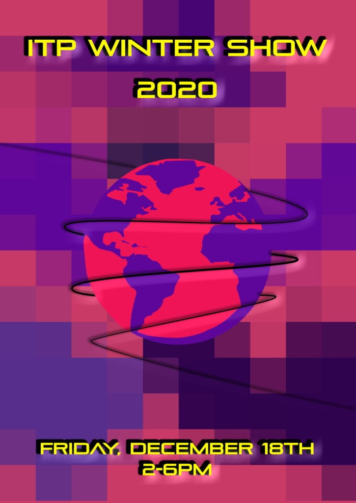
I had a great time designing this poster for the ITP Winter Show. My original sketches morphed significantly, but I embraced the shift and came up with something I’m really excited about. I also learned that taking a step back in the design process and relaxing can up you up for new ideas. I struggled with what to put in the center of the poster playing with images and shapes, but nothing worked for me. It wasn’t until I took a break to watch an episode of The Great British Bake Off that the globe and wire idea came to my mind. Without finishing the show, I headed to my computer to finish the design.

Design Breakdown: 

The background consists of random patterns that I drew and then pixelized. The primary purple color is the official NYU purple that I pulled from the school’s style guide. The other purples are variants on the NYU hue. 

The globe in the center is wrapped in a thin wire. I was thinking about our program’s diversity and how we all can’t be together to share our work. The work is literally coming from all corners of the world. Technology (represented by wire) is bringing and holding us together. 

I searched the Adobe font site for a futuristic style font that I think worked really well with the background pixelation. 


ITP Winter Show Poster Mock up

Color Of Me – The Secret Life of Color Review

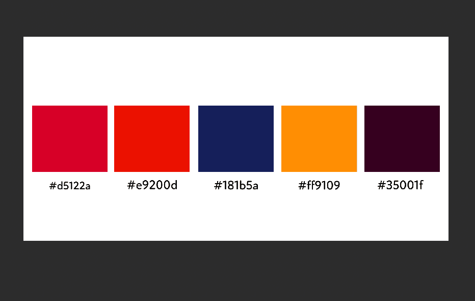
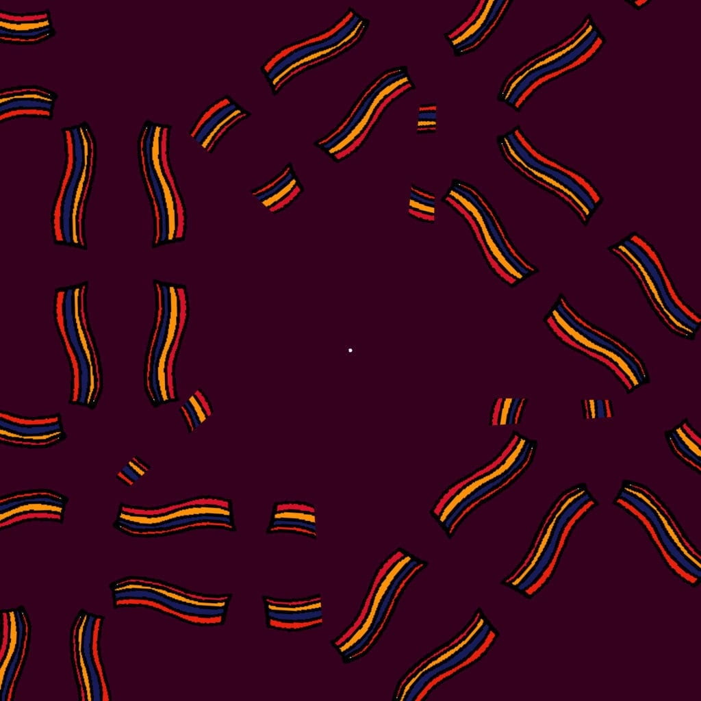
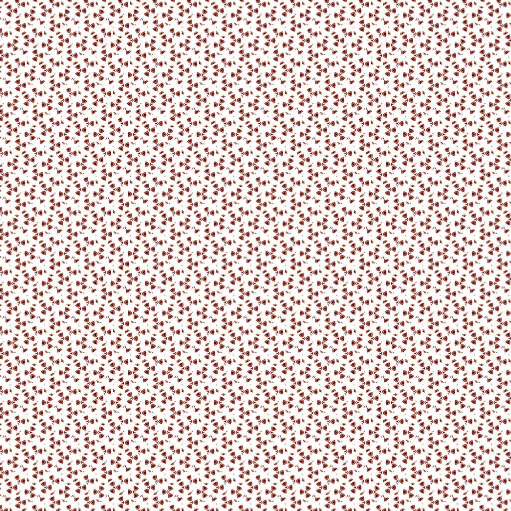
For the Color Of Me exercise, I was drawn to a color pallet that is a little all over the place. Two colors are surprisingly similar, while one is almost a complete outsider. The colors are primarily warm and bright, but all in all, I think they go really well together. 

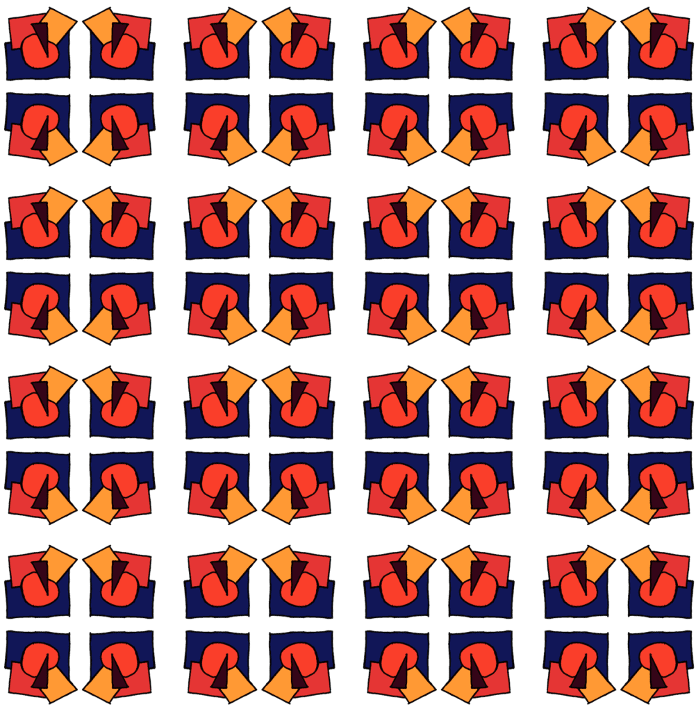
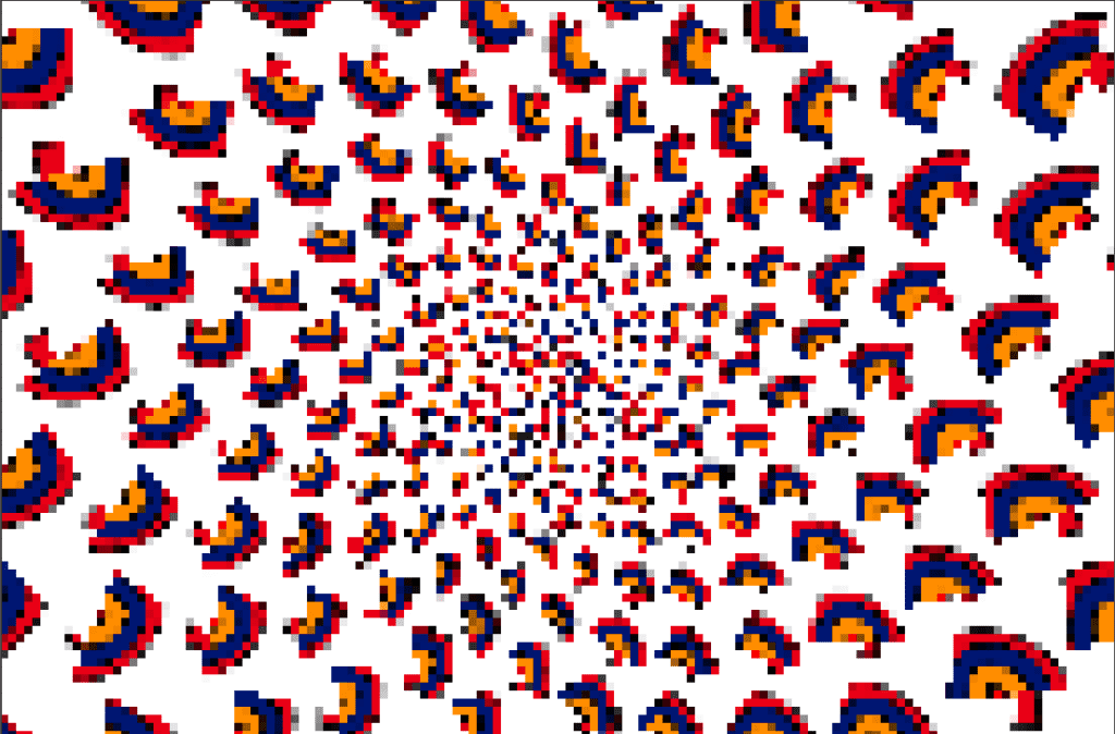
To make my patterns, I first made a hand-drawn sketch that I imported into Photoshop. I then turned that sketch into a pattern that I further manipulated in the pattern tool. Originally, I wanted to use sharp lines in Illustrator but quickly tossed those for a loose hand-drawn feel better with the colors. 

Color Theory - Pattern Sketch

Color Theory - Pattern Sketch

Color Theory - Pattern Sketch

Color Theory - Pattern Sketch

Color Theory - Pattern Sketch

The Secret Life of Color Review: 

I absolutely loved this podcast discussing the history of color. I personally take color for granted, whether it’s clicking on a color wheel or purchasing a tube of paint. I rarely do not have access to just the right shade of red, blue, or green. This, however, hasn’t always been the case, and this podcast playfully takes us down the vibrant history of our favorite pigments. To think if you weren’t in the right social class, you could be stripped of your lands if you wore the color purple.  Or how the significance of the color blue completely changed after artists started depicting the Virgin Mary wearing it. The one thing that has always excited me about color and color use seems true throughout time; it is a powerful tool to express ourselves. Humans will go to great lengths and, unfortunately, to the demise of other beings to express their individualism. After listening to this podcast, I am thankful that the cost of color has come down so that the most vibrant colors are not restricted to the most wealthy. 

One final thought that struck me was the comment that “Colors are culture creations.” We are constantly changing the meaning and representation of colors. In one generation, pink is considered the masculine color, and blue, the feminine color. Fast forward to another generation, and it’s the opposite. What this comment means to me is don’t feel obligated to follow the current culture of color. Create your own!

Response – Making a Mark: Visual Identity with Tom Geismar / IMA LOGO DESIGN


I was familiar with Tom Geismar’s work before listening to this podcast but not his design principles and approach. His incredible career brought some of the most iconic logos of our time and singlehandedly shifted the way institutions present themselves. Some of my key takeaways from this podcast include: 

  • People react to the institution and what it represents, not mark itself. He referenced that even though Enron had a great logo, not many people mention it when discussing the great logo design. They don’t have respect for the company, so the logo gets dismissed. 
  • Build on what there already is. I think this is an interesting and simple point. Why completely re-design a logo if components are already available. 
  • Offer options and explain the pros and cons of both. If an opportunity arises to share your favorite, do so but don’t start with that. As creatives, we often think our ideas are best and want to push them. At the end of the day, the client has to live with the work. Stop and listen. 
  • Try to do things that are clear and simple. I love the simplicity of this approach. 
    • Be appropriate
    • Be distinct
    • Make sure it works in all sizes and variations. 
  • Interview the client to try to understand the business and culture fully. Ideas often come from casual conversations and jokes. 

As I sit with my sketchbook trying to come up with ideas for my IMA logo mockup, I will, for sure, take the tips and tricks presented in this podcast. I’m glad I listened to it before diving too deep into the project. 


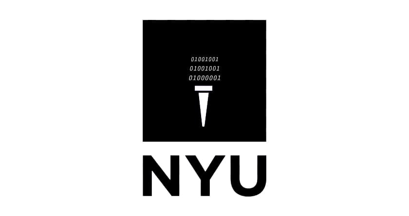
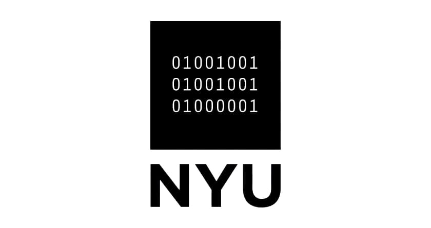
I started to explore the new NYU IMA logo designs this week. I landed on these two. The binary code spells out IMA, which I thought was a playful way to nod at the students’ work in the program. For the first logo, I piggybacked off the famous torch logo. For the second one, I leaned fully into the binary code, which I think is more successful. 

Expressive Words and Airline Ticket Redesign


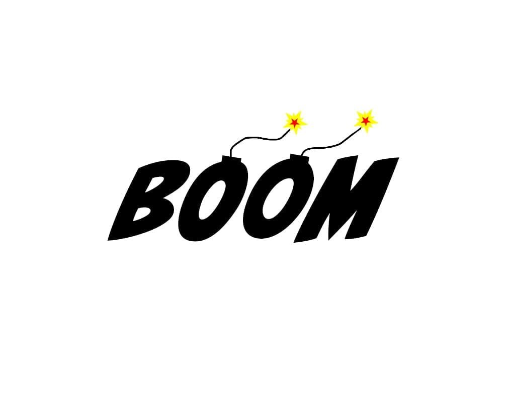
Word Art 1
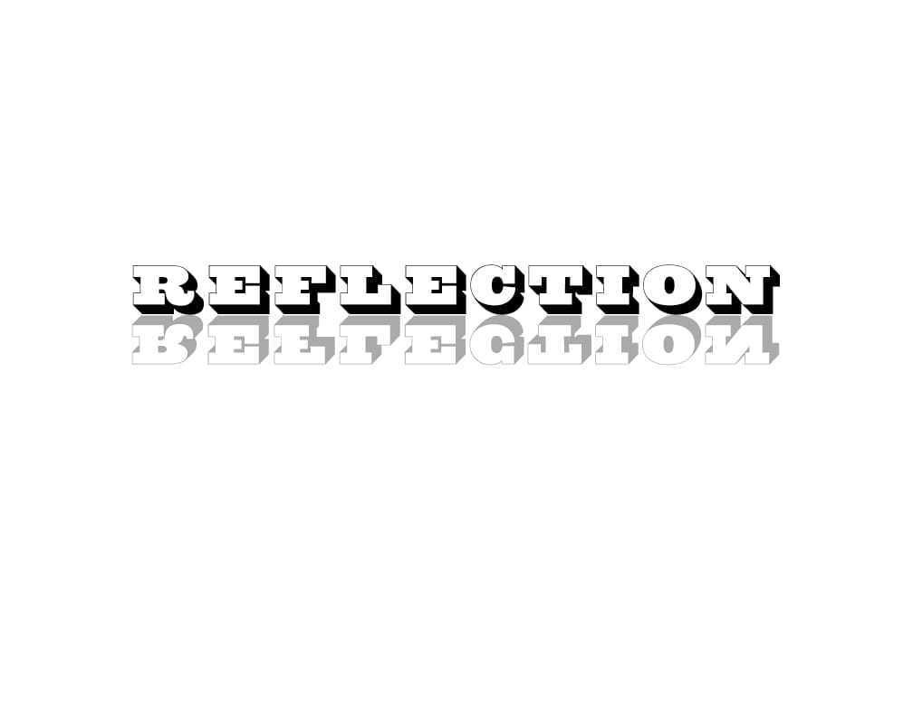
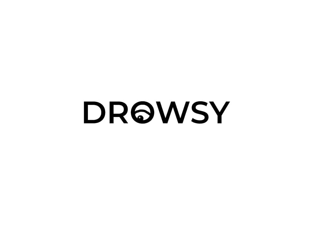
Word Art 2 Word Art 3

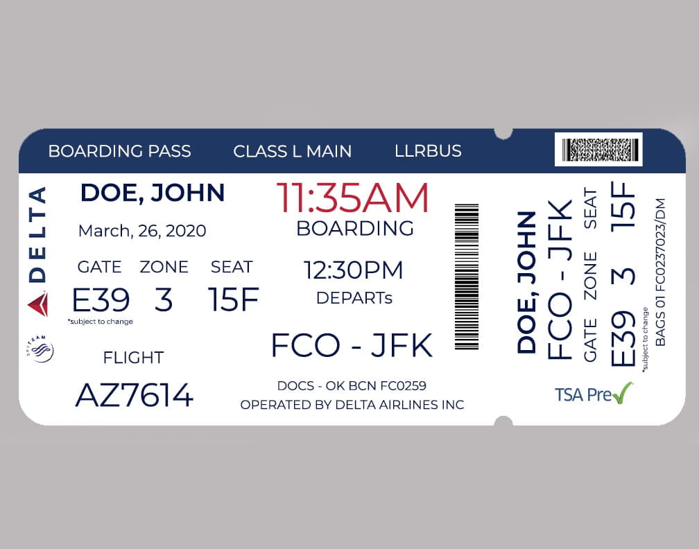
This week we worked on expressive words and re-designing an airline boarding pass. Both projects sound simple, but I quickly noticed how slight adjustments drastically affect the overall composition and feel once I started. For the expressive words assignment, I spent a long time finding a font that matched the word’s feeling; for the airline, ticket spacing became critical. I was constantly sacrificing space for one piece of information to make another bolder. I thought a lot about standing in an airport and looking at my ticket. What information do I need the most? Boarding time, gate, zone, and seat stuck out. With that in mind, I gave that information the most priority.

Board pass re-design

Design Analysis

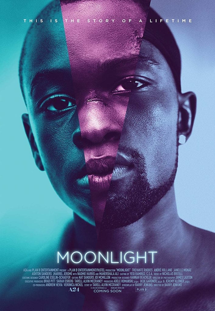
I remember being blown away when I first saw the Moonlight movie poster at my local subway station. So let’s jump into breaking down this (in my opinion) beautiful poster.

At first glance, I’m drawn to the design’s simplicity—the portraits dominating the majority of the frame and are almost seamlessly stitched together. At a glance, you might miss that the images depict a man in three life stages youth, adolescents, and adulthood.  This is confirmed with the small text at the top of the frame that reads, “This is the story of a lifetime.”

His eyes stare directly into the camera, almost encouraging the viewer to take his stare back. 

Moonlight movie poster

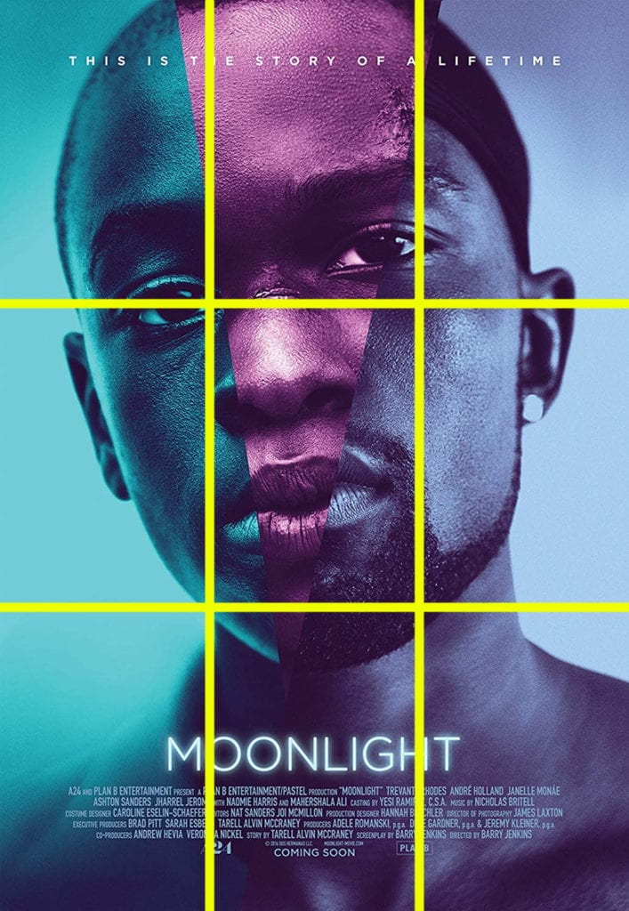
By breaking the poster down with a grid, we can see that it’s framed with the classic rule of thirds composition with the subject’s eyes placed on and near the converging lines. 


Moonlight movie poster with framing layout lines

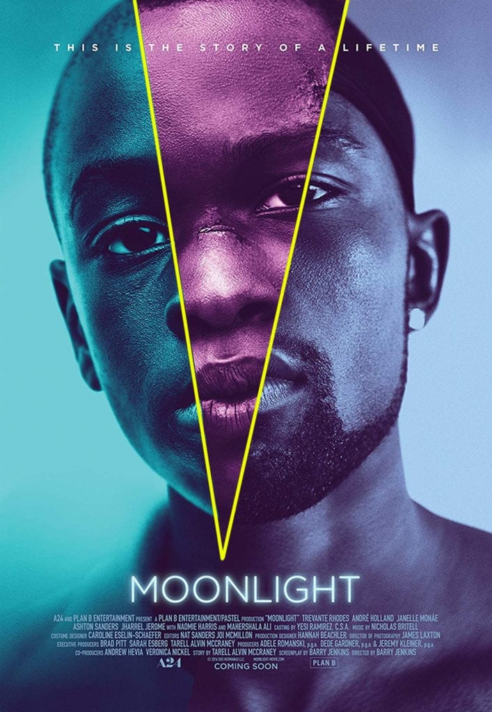
A second V-shaped grid breaks the portrait into thirds. The point of V emergences from the title and when drawn out resembles a light beam. Here too, the lines cut through the subjets eyes.


Moonlight movie poster with framing layout lines

The negative space further highlights that the designer wanted the viewers to focus solely on the portrait. By having nothing else to look at, I’m drawn back to the eyes of the subject. 

Moonlight movie poster with negative space cut out.

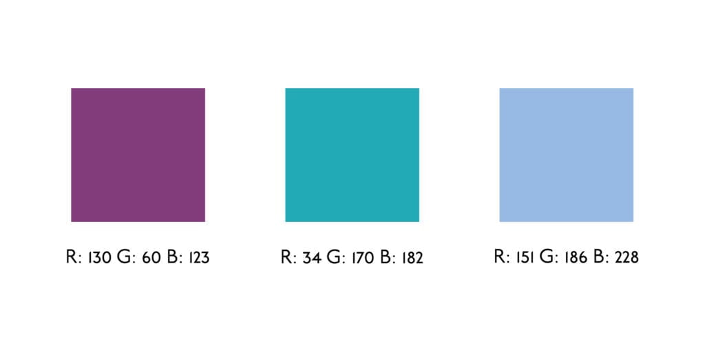
Three colors are used to distinguish the different life stages of the subject.  The colors are all cool and resemble the color grading in the different stages of the actual movie. Three color swatches representing the main colors in the moonlight movie poster

Simple, clean, and small. The Underground Book font is used only to convey necessary information like the title and single line. 

Font description used for the moonlight movie poster