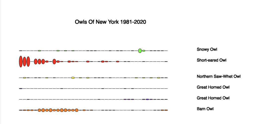
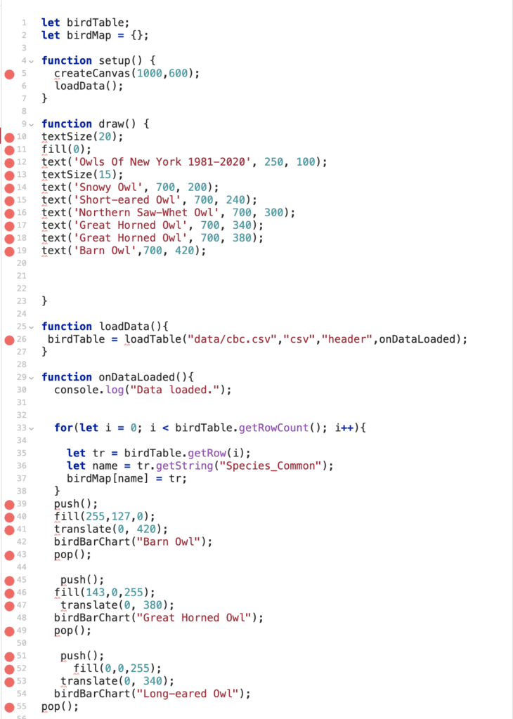
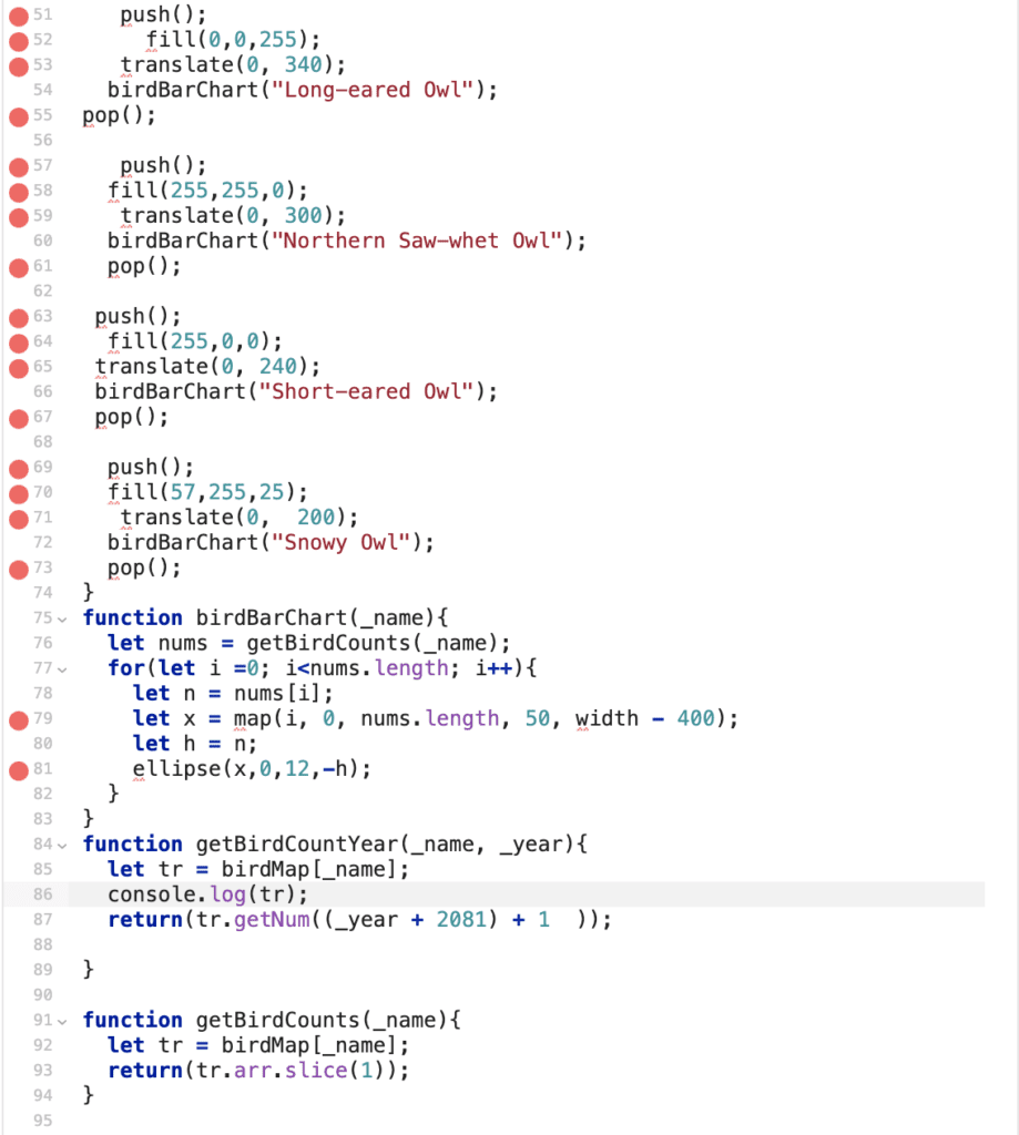
For this exercise, we had to make a simple data visualization from bird data. I chose to use the Audubon Christmas Bird Count as my resource. I was particularly interested in the six owls of New York. I searched the database to see if each species was spotted at least once from 1981 to 2020 – luckily, they had. Next, I used Glitch and P5 to make a simple script to plot an oval every year. The larger the oval, the more of that particular species were spotted. It’s interesting to see that most of the species had a higher count in the 1981’s. After a little research, I found one article stating the Barn Owl has had its population drop in half since the 1980s primarily due to the change in agricultural practices in the North East. I’ll have to look into the rest of the owls later. Below are the visualization and the code. 

