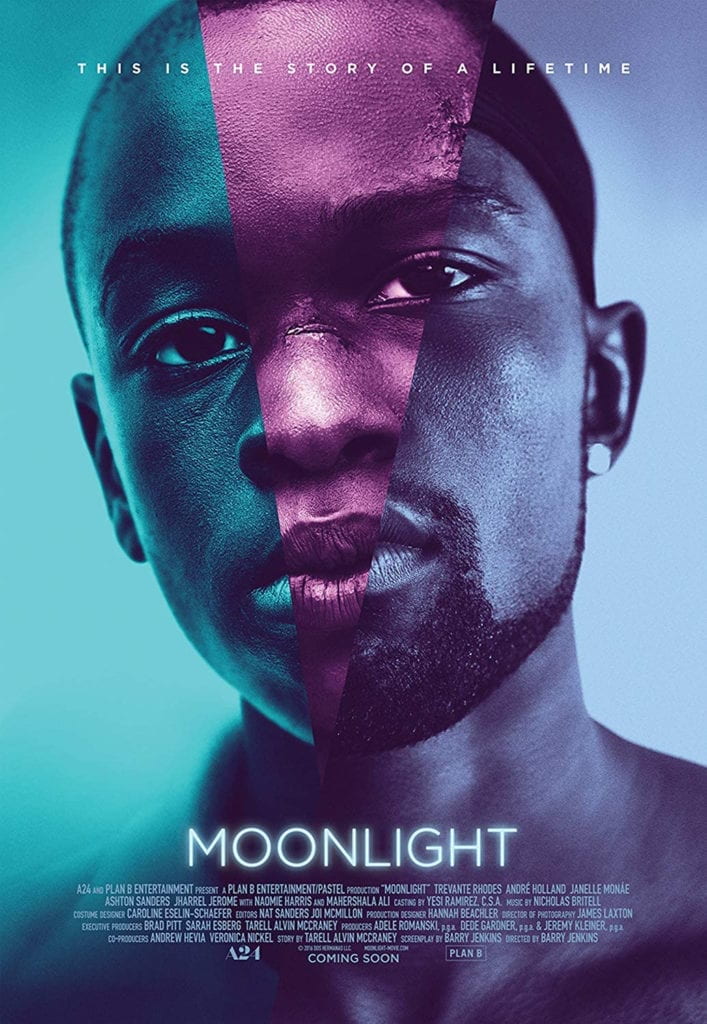
I remember being blown away when I first saw the Moonlight movie poster at my local subway station. So let’s jump into breaking down this (in my opinion) beautiful poster.
At first glance, I’m drawn to the design’s simplicity—the portraits dominating the majority of the frame and are almost seamlessly stitched together. At a glance, you might miss that the images depict a man in three life stages youth, adolescents, and adulthood. This is confirmed with the small text at the top of the frame that reads, “This is the story of a lifetime.”
His eyes stare directly into the camera, almost encouraging the viewer to take his stare back.
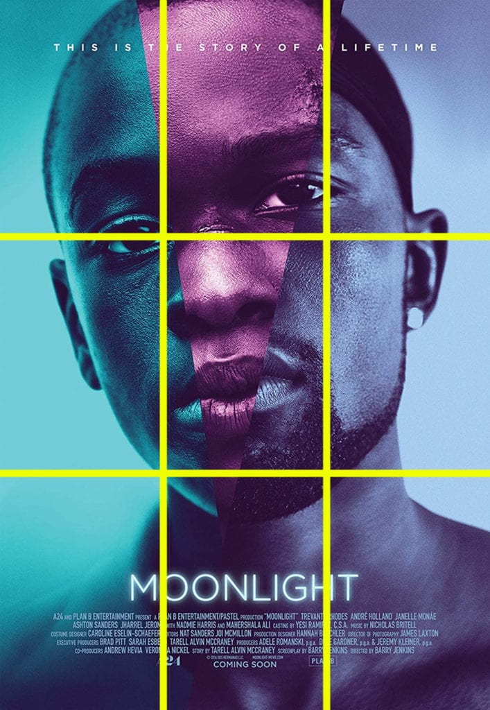
By breaking the poster down with a grid, we can see that it’s framed with the classic rule of thirds composition with the subject’s eyes placed on and near the converging lines.
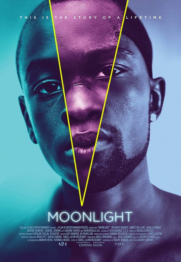
A second V-shaped grid breaks the portrait into thirds. The point of V emergences from the title and when drawn out resembles a light beam. Here too, the lines cut through the subjets eyes.
The negative space further highlights that the designer wanted the viewers to focus solely on the portrait. By having nothing else to look at, I’m drawn back to the eyes of the subject.
Three colors are used to distinguish the different life stages of the subject. The colors are all cool and resemble the color grading in the different stages of the actual movie. 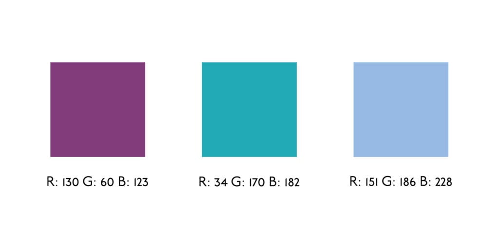
Simple, clean, and small. The Underground Book font is used only to convey necessary information like the title and single line.

