Extinction Clock presents a segment of threatened and endangered species data produced by the IUCN Red List, a non-profit organization founded in 1964 that makes a “comprehensive inventory of the global conservation status of biological species.” – IUCN.
For this piece, I am focusing on mammals data.
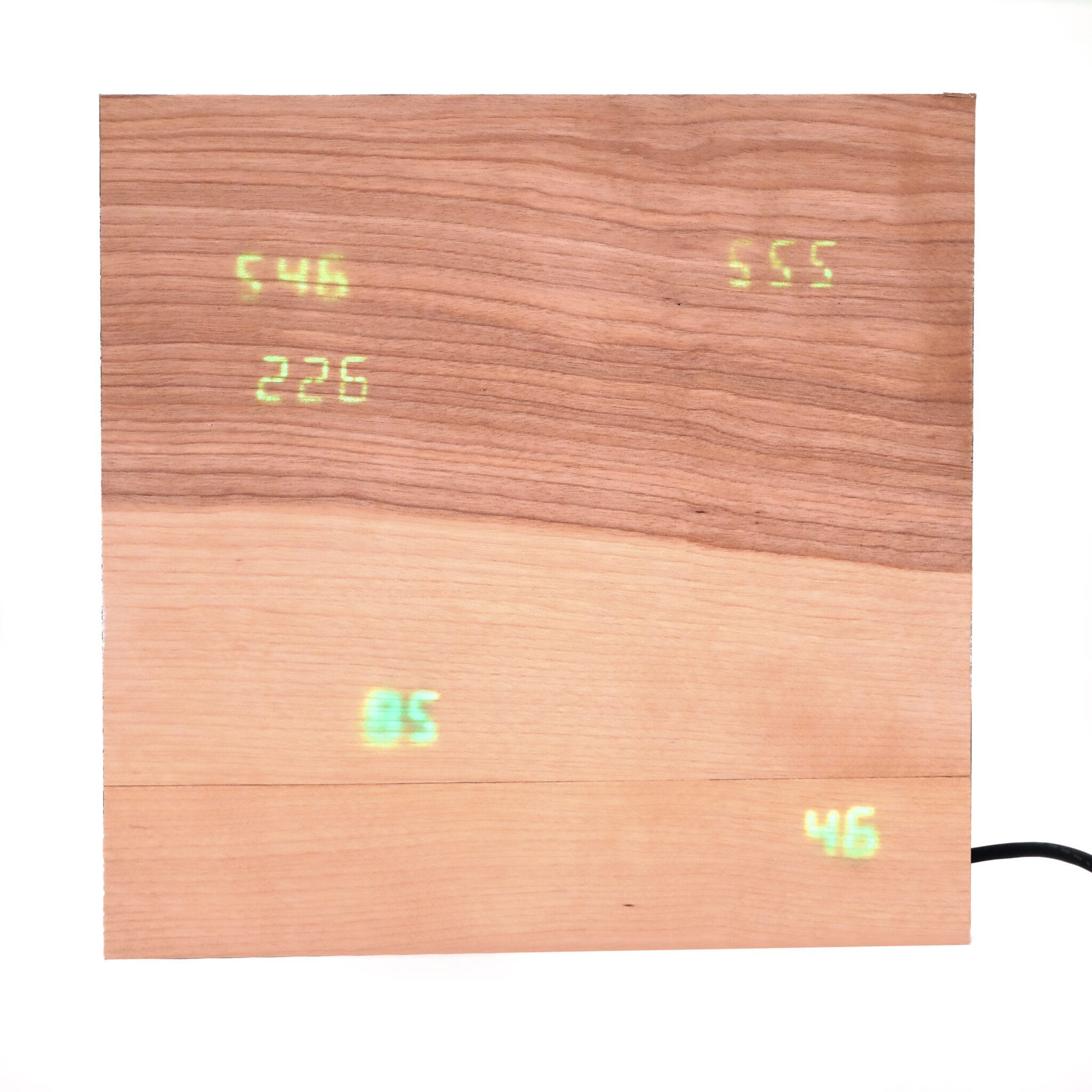
The clock is broken into five faces:
- Vulnerable Mammals
- Endangered Mammals
- Critically Endangered Mammals
- Extinct Mammals (since the last update)
- Days until the list is updated
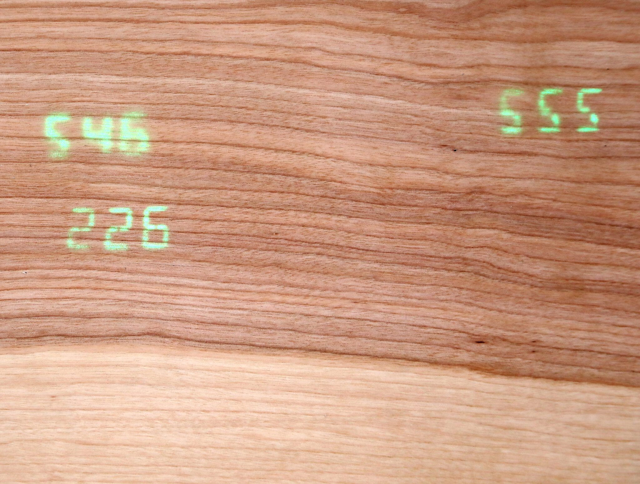
The combined surface area of the clock faces makes up 23% of the overall clock face. This represents a new study stating that only 23% of land remains “wild”, excluding Antarctica. According to the survey, this remaining wildland is primarily concentrated in Canada, the United States, Russia, Brazil, and Australia. The placement of the faces loosely represents the location of these countries on a flat map.
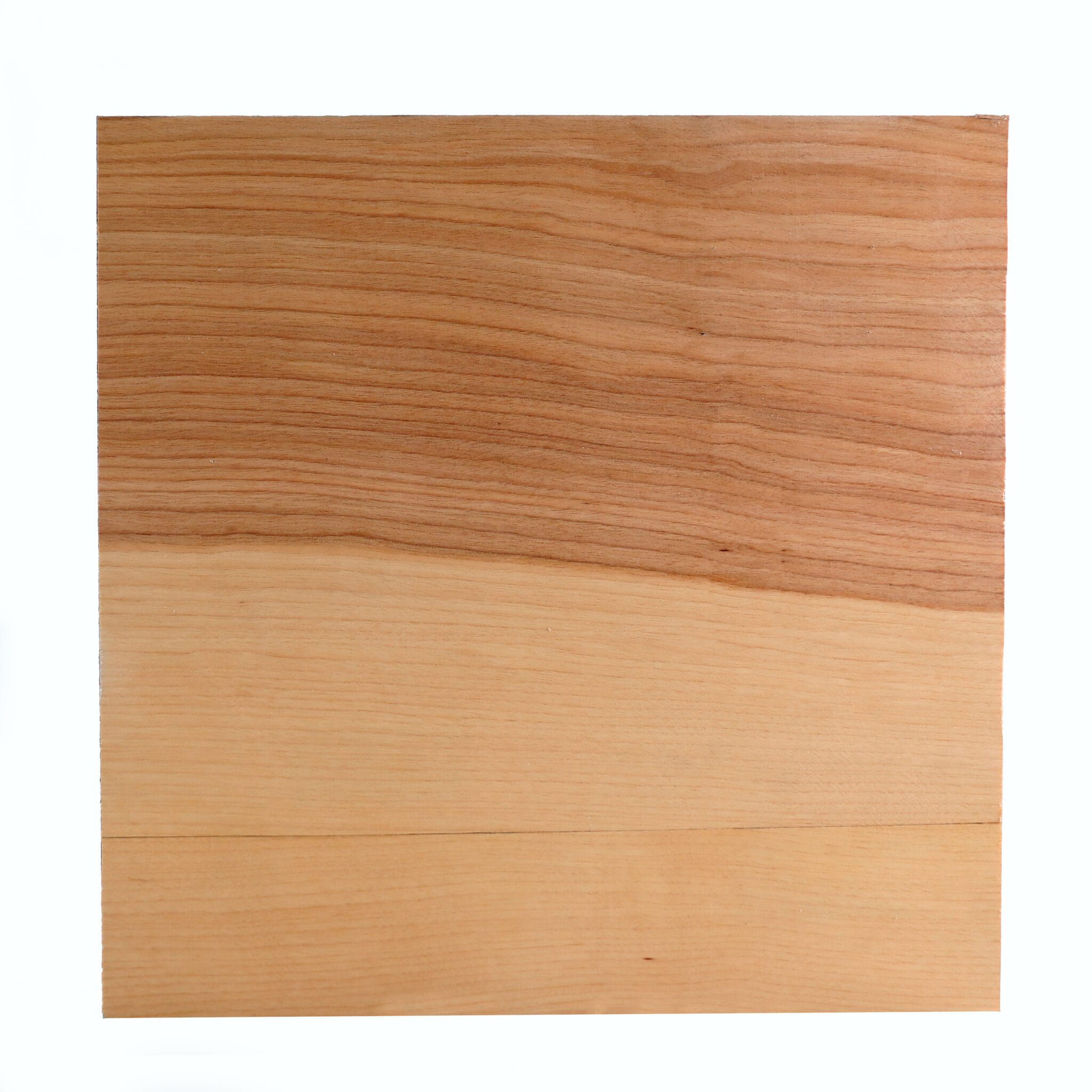
A thin layer of wood veneer obscures the digital faces. This was both an aesthetic decision and to explore the idea that humans can easily overlook the continued and rapidly increasing extinction of species without conscious actions.
The clock was intentionally left to be obscure to encourage viewers to read its documentation.


