Vagrant Birds in Manhattan

For our How to Count Birds final, Todd Whitney and I teamed up on a piece about vagrant birds and audio capture. 

First, what is vagrancy:  

  • Vagrancy is a phenomenon in biology whereby individual animals appear well outside their normal range;[1] individual animals which exhibit vagrancy are known as vagrants. The term accidental is sometimes also used. Several factors might cause an individual to become a vagrant—genetic factors and weather conditions are two—but the causes are poorly understood.[2] Vagrancy can be a precursor to colonization if individuals survive. – Wikipedia

Basically, it’s when a species is not within its normal range. Years ago, I experienced this when a Painted Bunting was discovered in Prospect Park. This wasn’t the first time it happened, but there is a great deal of excitement when it does. That excitement stuck with me, so I wanted to investigate how often this happens. 

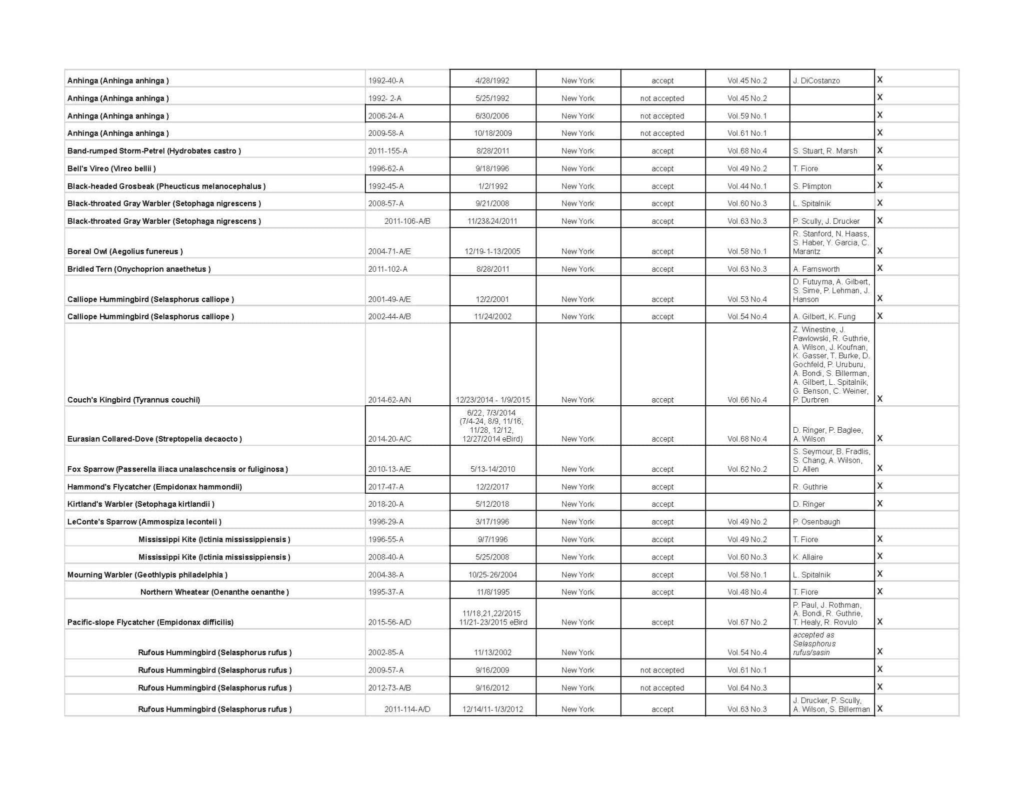
We sourced our data from the NYSARCNew York State Avian Records Committee. The committee has the list of vagrant species in New York dating from 1977 – 2018. We pulled the data set and filtered it to show only sightings in Manhattan. 


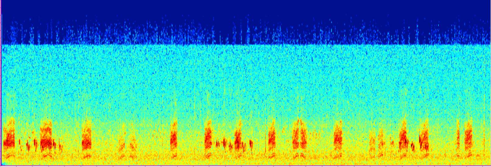
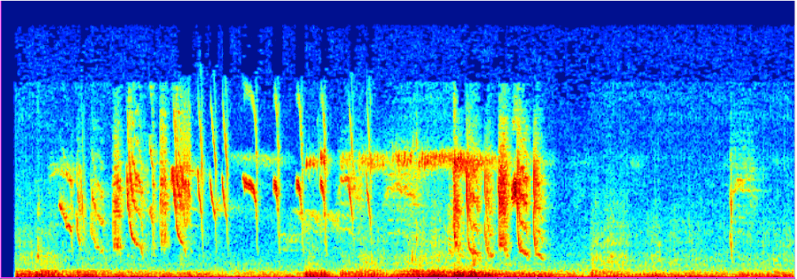
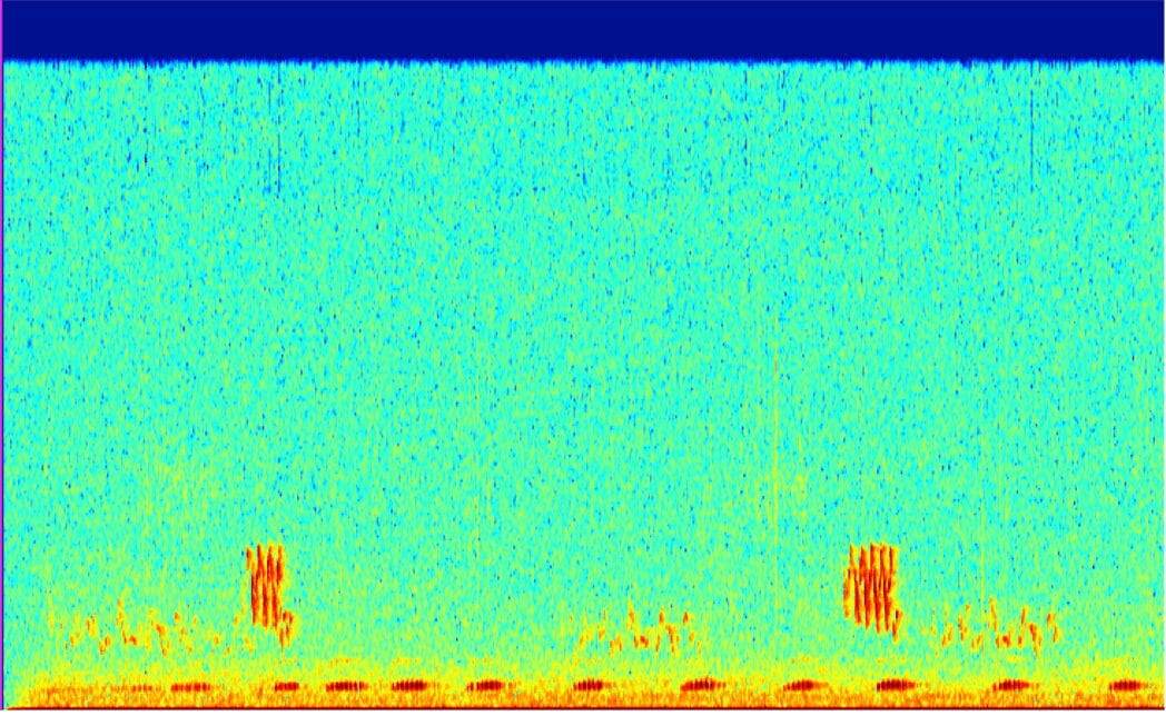
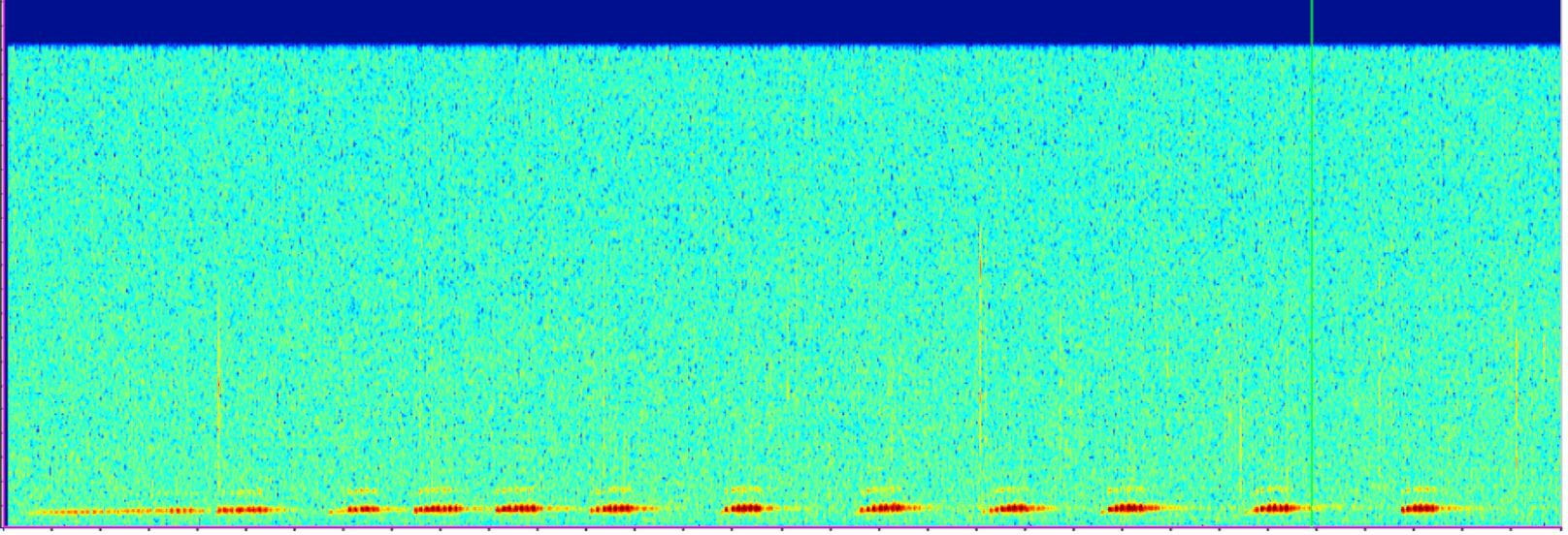
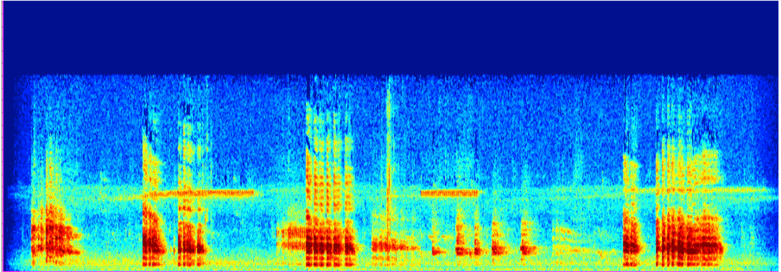
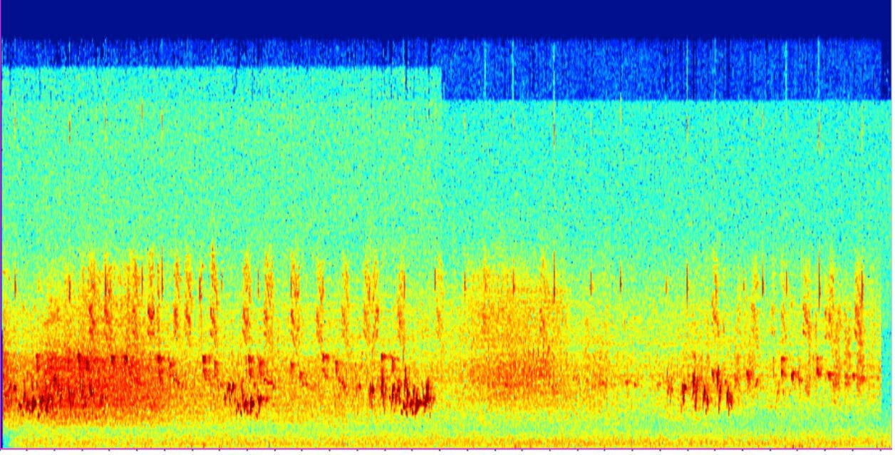
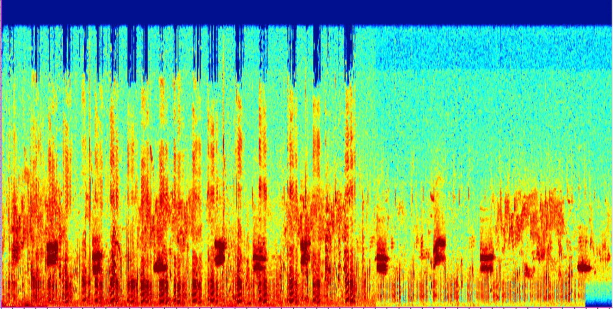
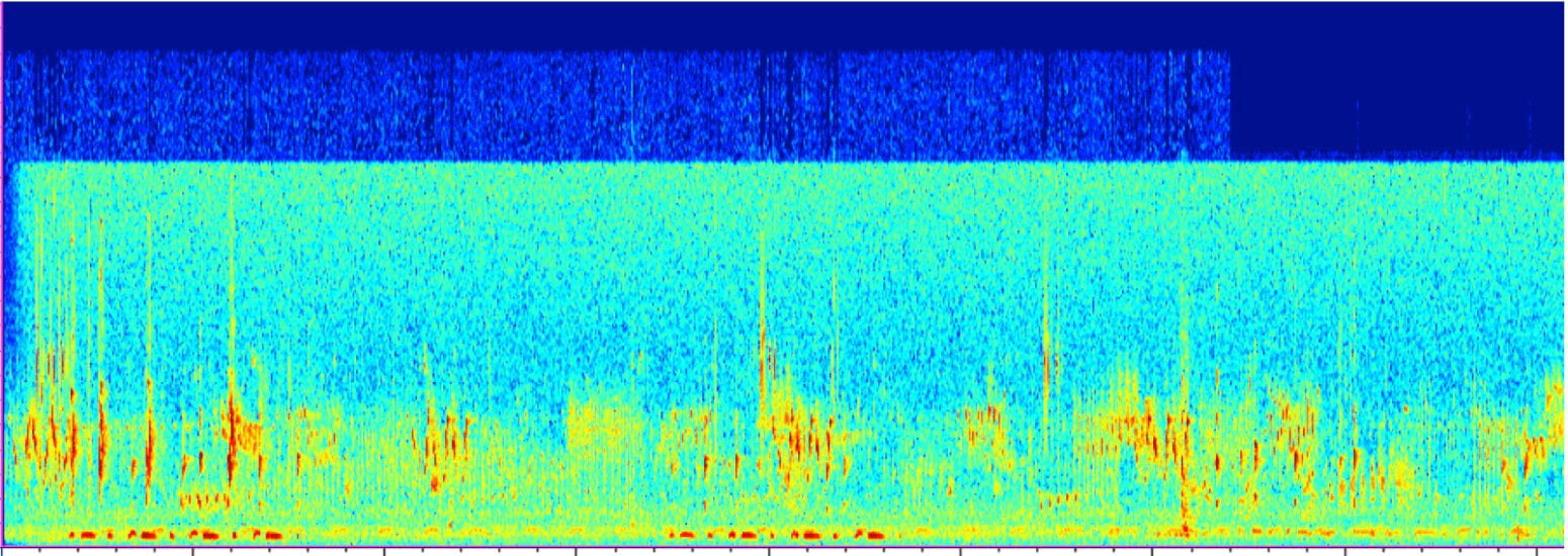
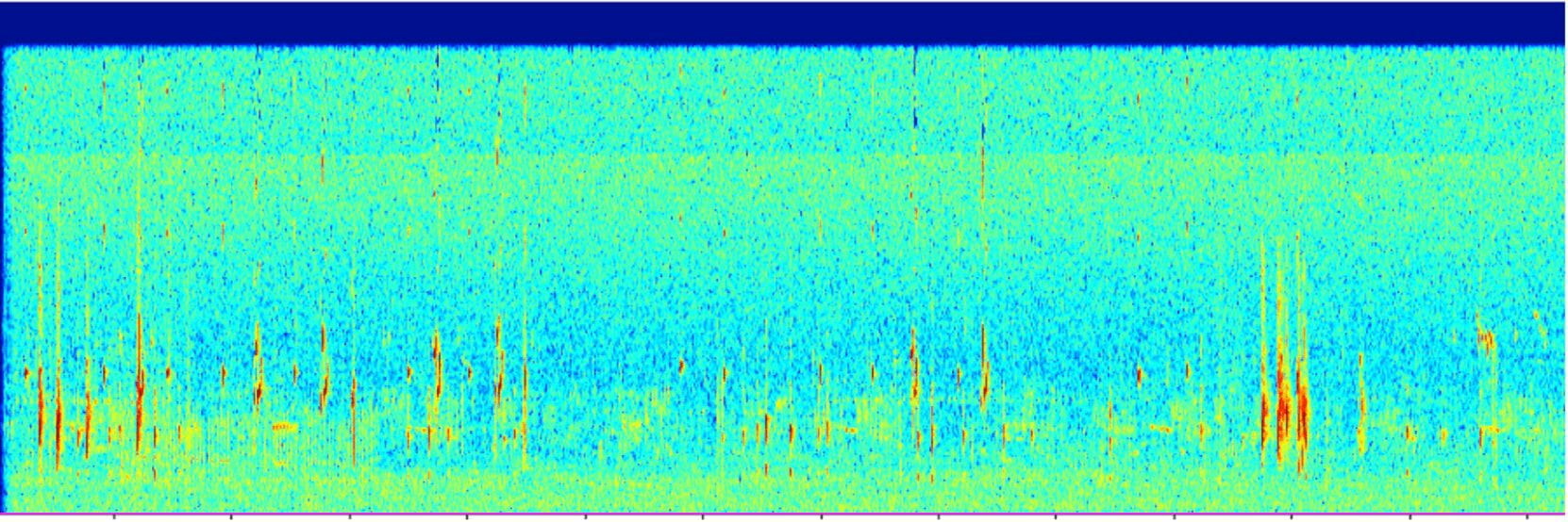
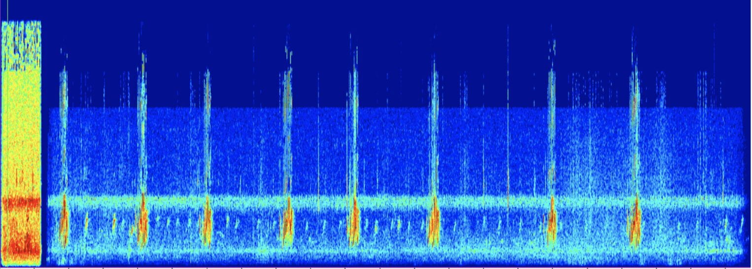
Next, we took audio recordings of each species and complied a cacophony of calls per year. Each year’s soundtrack is only made up of the species that were sighted that given year. We imported the audio clips into the Raven Lite software to extract the waveforms to have a visual component. 

We hope you enjoy it!

1992: 

Wave form of bird audio

1995: 

Wave form of bird audio

1996:

Wave form of bird audio

2000:

Wave form of bird audio

2001:

Wave form of bird audio

2002:

Wave form of bird audio

2004:

Wave form of bird audio

2005:

Wave form of bird audio

2006:

2008:

Wave form of bird audio

2009:

Wave form of bird audio

For years 2010-2018 please see part 2!


Vagrant Birds in Manhattan – Part 2

2010:

Wave form of bird audio

2011:

Wave form of bird audio

2012:

Wave form of bird audio

2014:

2015:

Wave form of bird audio

2017:

Wave form of bird audio

2018:

Wave form of bird audio

1st Data Visualization

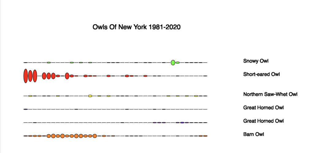
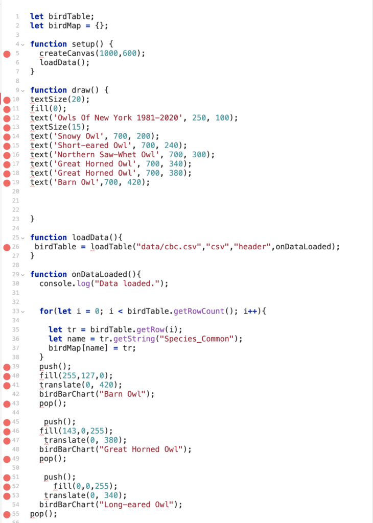
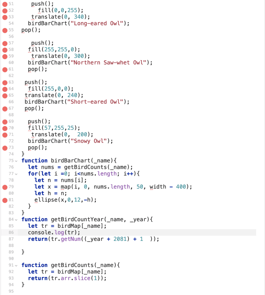
For this exercise, we had to make a simple data visualization from bird data. I chose to use the Audubon Christmas Bird Count as my resource. I was particularly interested in the six owls of New York. I searched the database to see if each species was spotted at least once from 1981 to 2020 – luckily, they had. Next, I used Glitch and P5 to make a simple script to plot an oval every year. The larger the oval, the more of that particular species were spotted. It’s interesting to see that most of the species had a higher count in the 1981’s. After a little research, I found one article stating the Barn Owl has had its population drop in half since the 1980s primarily due to the change in agricultural practices in the North East. I’ll have to look into the rest of the owls later. Below are the visualization and the code. Data Vis Data Vis code

Data Vis Code

Device to Database – Node Red

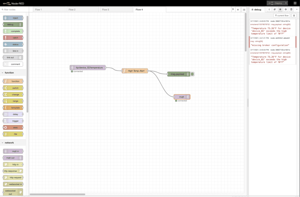
For our final assignment, we’re working in Node-Red to create a workflow with sensor data collected over the semester.

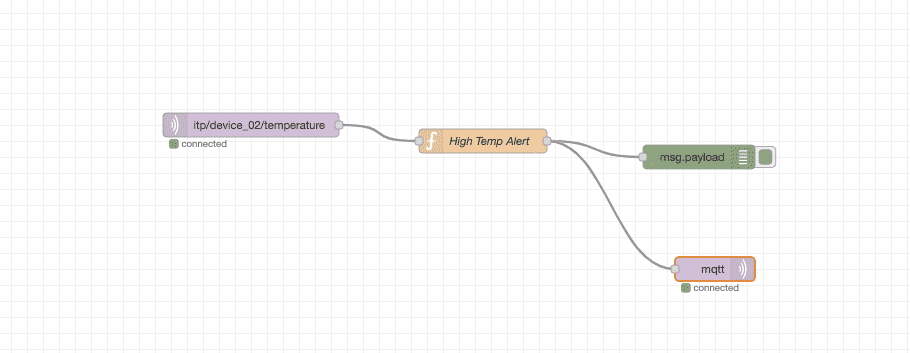
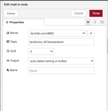
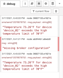
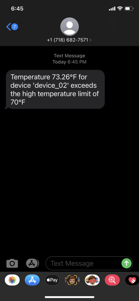
Earlier this semester, I set up a simple Arduino run device in my apartment that collects temperature and humidity throughout the day. This week in Node-Red, I created a workflow that sends a message alert using MQTT to get over 70 degrees. Below is a screenshot of my workflow and the text message I received notifying me. 

Node-Red and MQTTNode-Red and MQTT

Node-Red and MQTT

Node-Red and MQTT

I’m really excited to have gotten this system up and running. I can see these types of databases’ power and have started brainstorming new applications to implement them on. 


RGB Visualization

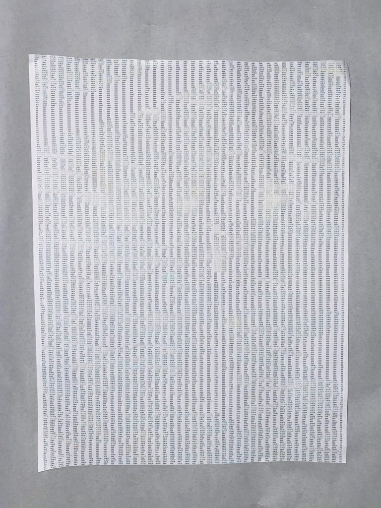
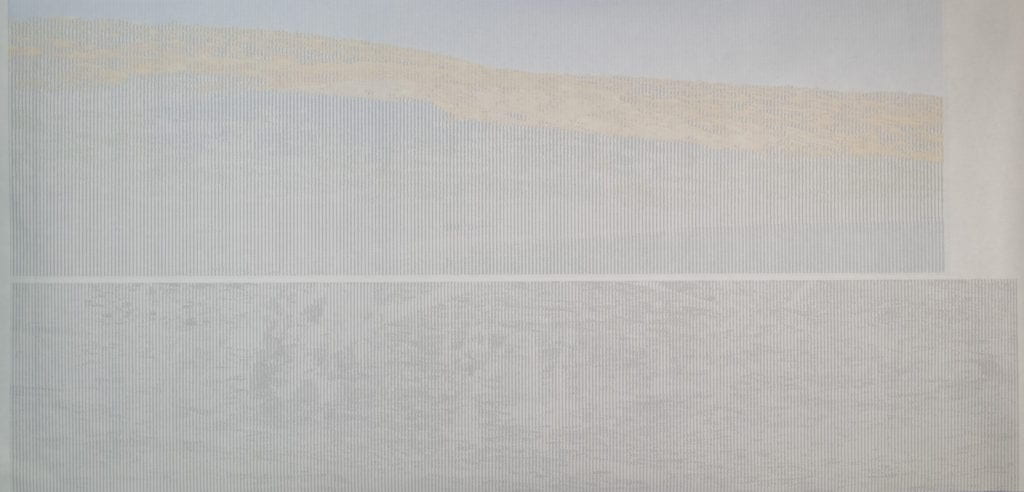
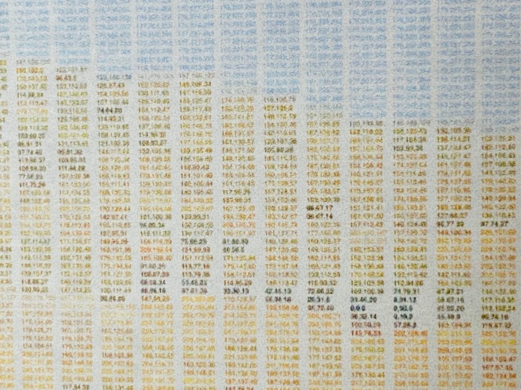
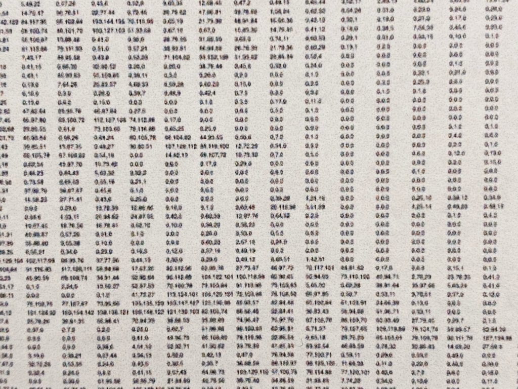
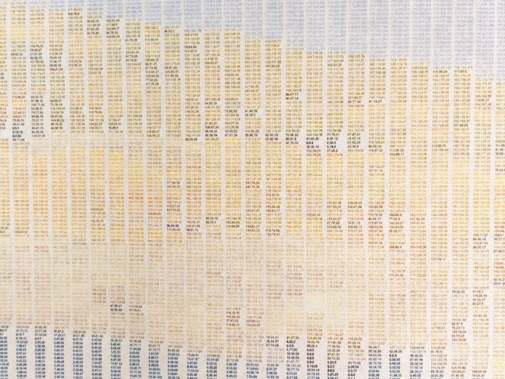
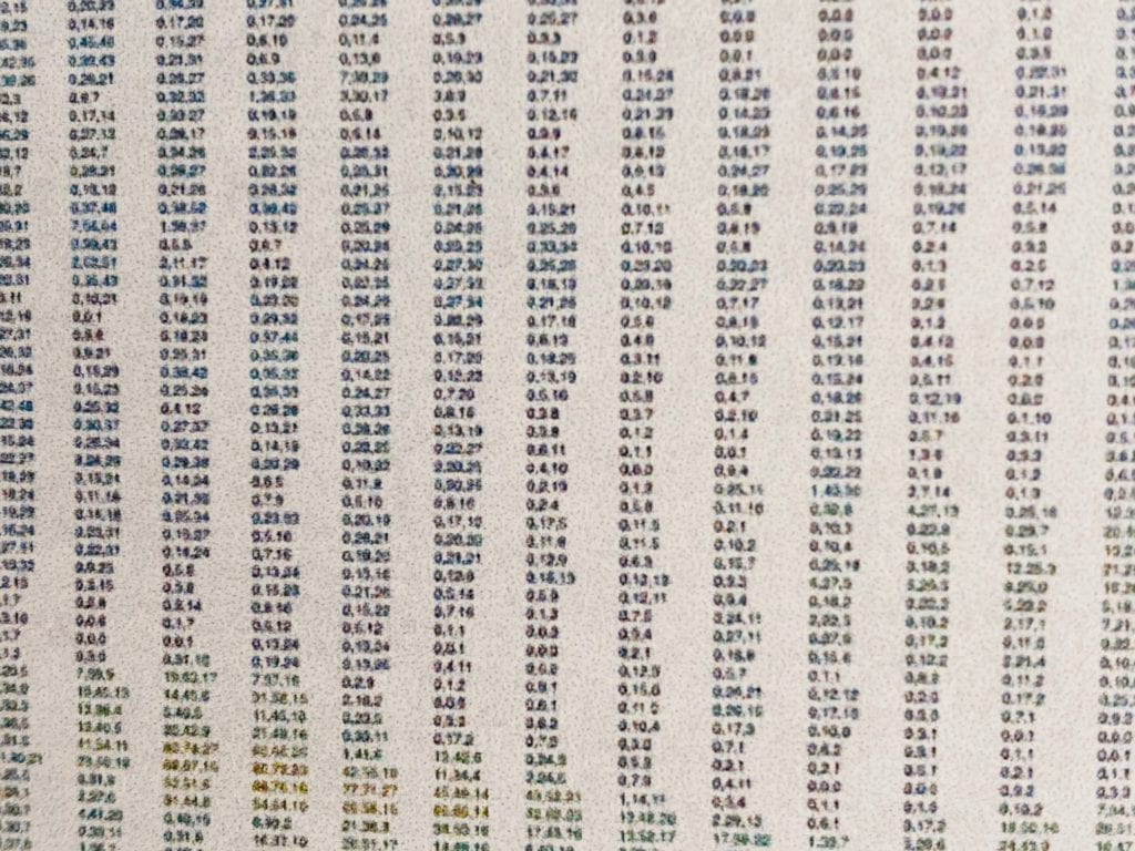
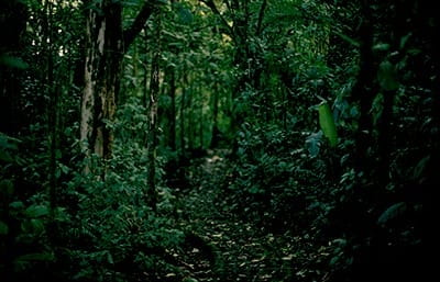
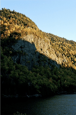
For this piece, I wanted to continue down the path of breaking down an image to the pixel level. I have been thinking about how society is inundated with imagery and wanted to find new beauty in scenes that I’ve seen over and over again. 

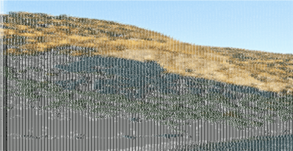
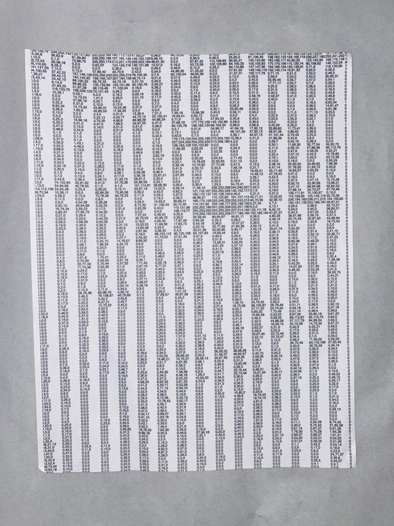
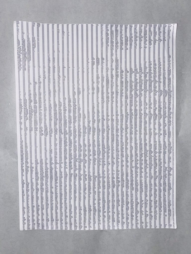
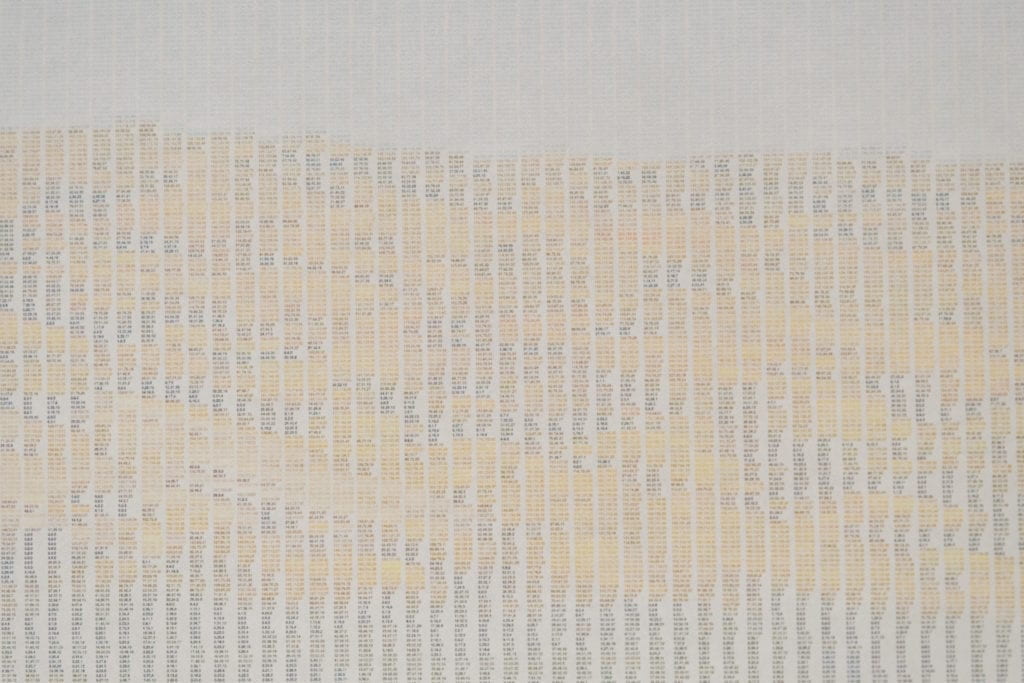
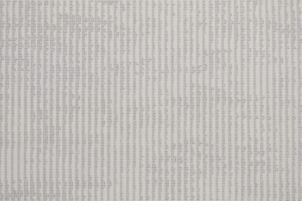
I import an image into the P5JS script that reads each pixel and prints its individual RGB color value, for example, 60,96, 76. The values will then be printed from left to right, top to bottom. The first iteration was in black and white and produced beautiful randomized patterns of data. 

To take the piece a step further, I wanted to add color to each pixel by applying the referenced RGB value to the written outnumber. 

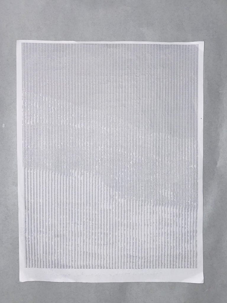
Finally, I wanted to take the piece to print. Making the text small enough to be invisible at normal viewing distances but legible at close up reminded me of grain in an image. 

Pixels broken into RGB values.Introducing color into the print. 

Font size 21 – Too big.

Font size 10 – Still too big.

Font size 8 – Perfect. 

After I sent the script to print at full size, which shook out to be roughly 10 x 45.

full size pixel print

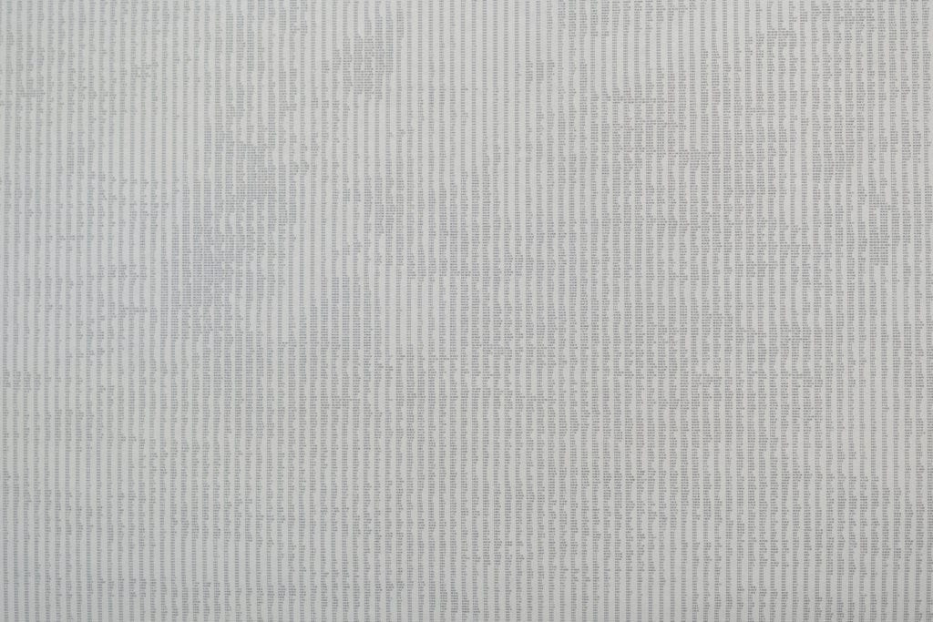
Below are a series of tighter views of the data. 

closeup view of RGB pixel sketch

closeup view of RGB pixel sketch

closeup view of RGB pixel sketch

closeup view of RGB pixel sketch

closeup view of RGB pixel sketch


closeup view of RGB pixel sketch

Below are the imported images.Image of forest in Costa Rica

Image of the Adirondack park

While experimenting with the text size, I noticed that if I did not adjust the canvas size, the pixel values’ blending would make an abstract image. To wrap this project up, I wanted to make a digital version that the viewer could make their own piece and save it. To do this, I added a slider that adjusts the text size and a save button that saves the current canvas and exports it. 

To see this piece click here.