BYOAD: New Templates and Sites: Weekly Updates
Project Overview
Week 10 (Due 5/6/21)
As we’re wrapping up the semester, we’ve finalized our final project deliverables this week. We’ve finished outlining our documentation piece, which consists of accessibility considerations and resources for implementing our templates in WordPress, including suggested plug-ins for accessibility. All of us have also been finalizing and organizing our Figma file prototypes. These changes mostly include adjustments for easier readability and accessibility. Our final presentation details these changes. We’ve also created annotated wireframes for all of our prototypes, viewable on Google Slides, and have exported our frames as pdf files for easier viewing. Links to all of our final deliverables will be viewable on our Project Overview page! We’ve updated our feedback form and welcome any additional feedback that we can use to make final adjustments to any of our deliverables before the end of the semester (next week). The form is linked below.
FEEDBACK FORM
Week 9 (Due 4/29/21)
This week Cathy and Cameron finished Louisiana State’s templates, which draws on the features for some of the other templates we’ve created for other sites. Cathy and Lilly also made some adjustments to Fort Ticonderoga’s and Brandywine’s templates respectively. We are continuing to outline the accompanying documentation. This week, Nelson outlined what each of us will write in each site’s personalized section of the documentation. By next week, we plan to have this completed and have annotated wireframes of our templates linked in the documentation.
FEEDBACK FORM
Week 8 (Due 4/22/21)
This week our team is working on building out our documentation and compiling the relevant information for each individual museum. We are currently focusing on providing clear information on common accessibility considerations (like high contrast, screen reader navigation, etc) and our WordPress guide. We are also building the first mockups for the Louisiana State Museum’s 1850’s House template. For the other sites, we have been continuing to make edits. We plan on continuing to communicate with our respective sites to receive ongoing feedback for our designs.
FEEDBACK FORM
Week 7 (Due 4/15/21)
This week our team is continuing to make progress on our individual sites’ mockups, and are continuing to hear feedback from our site representatives and modifying the designs accordingly. We are also moving as a group towards further developing our documentation deliverable piece, which will contain information on how to use the templates as well as common accessibility considerations and specific template information for each historic site.
FEEDBACK FORM
Week 6 (Due 4/8/21)
This week, our team continued working on our Figma files for each museum based on feedback that we received last week from our Midpoint evaluations. Most of the feedback that we received made it clear to us that we should prioritize each museum’s needs in the creation of their templates, in order to ensure that users are receiving an immersive and cohesive experience while they engage with the BYOAD templates. With this information in mind, we made some improvements to our existing designs, and made general plans for templates that have yet to be created. In addition to the iterative design work we completed, our team discussed what information should be included in our Accessibility Toolkit documentation. We are still viewing this documentation at a high level for the moment, as we work to complete the outstanding templates. After each of our clients has had a chance to view their templates and provide one round of feedback, we will begin working more closely with this deliverable as a team.
FEEDBACK FORM
Week 5 (Due 4/1/21)
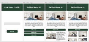
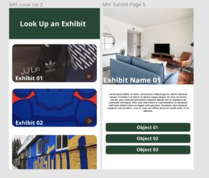
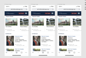
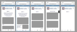
Linked above is our team’s Figma file. When you visit the page, there is a Pages panel on the upper left hand side. In that panel, you’ll see a separate page for each of the sites we are working with. Clicking on a specific site’s name will show the mockups we currently have for that site. A more detailed breakdown of each design can be found below: Fort Ticonderoga: Fort Ticonderoga is a historic site with large campus in multiple locations. The templates are looking to address places people can’t go due to the massive size of the site. The first screen in the mockup file is the home page/main navigation and it is separated into two sections. The top section is consists of several popular nodes that is a little bit far away. On the bottom section, it is organized by exhibitions in the main complex, the Mars Education Center. The second screen is the exhibit page. This will be where the audio guide, text description, videos, images, and information about the exhibition in the collections database go. Brandywine River Museum of Art: The templates we are developing for Brandywine are for a specific exhibit that they are opening later this year. It consists of images organized into 6 color-coded sections, which are meant to be experienced sequentially. The first screen in the mockup file is an idea of what the exhibit might look like integrated into the existing Exhibits page on the Brandywine website. Visitors can potentially access it through instructions given when they visit the museum, or possibly through a QR code that will link them straight to the exhibit page. The second screen is the main exhibit title page. Throughout the exhibit navigation there will be breadcrumbs near the top of the screen to give visitors an idea of where they are in the exhibit. Underneath, there is space for a blurb on the exhibit and then a button to start the tour – this will start the visitor at the page for the first section of the exhibit. If the visitor is looking to skip to a different section, they can also navigate the exhibit by section. Screens 3, 4, and 5 show what a section page might look like. The colored bar at the top of Screen 3 is meant to match the color code of the section to clearly identify the section. The other screens show what the section images will look like with their corresponding info, and room for curator comments. The very last screen is the bottom of a section page. There are two buttons, the left one will go back a section (in the case of this mockup, it will return to the main exhibit page since this is section 1), and the right one will move forward a section. Underneath is the section navigator. The current section is greyed out with ‘You are Here!’ text over it while the others are in color to give the reader a better idea of where they are in the exhibit. MacCulloch Hall Historical Museum: MacCulloch Hall is a small location with indoor and outdoor sections. Each ‘exhibit’ within the museum is a general location, containing either a few focus objects or a larger collection of smaller objects of interest. The templates shown on the Figma page reflect this organization, and give a few options for how each screen might be rendered. The “Look Up” Screens show a few options for how visitors of the museum might find an exhibit or location at the museum site. Users may be shown a drop down menu of exhibit options, or might be able to scroll through exhibit options represented as images. The “Exhibit” pages show different layouts for how the overall exhibit/item pages might be laid out. Exhibit Pages 1,2,3 and 5 show how an exhibit page might look, with drop down views of the exhibit’s focus items laid out on the page. Exhibit Pages 2 and 3 show how the interest items might be organized on the general exhibit page. Page 2 shows how objects would be organized on the exhibit page if there are only a few objects to be highlighted. Page 3, on the other hand, shows how an exhibit page would be organized if a larger collections of interest objects are available. Exhibit Page 4 shows how an object page might look for one of the objects from an exhibit collection. If an object is part of a larger collection, or has a large collection of media objects attributed to it, it can be explained in more detail using this page layout. Bainbridge Island Historical Museum: Bainbridge Island Historical Museum is a smaller campus with one exhibit and one location. The templates are looking to address the significant amount of smaller objects which will be grouped either by location of themes of some sort. The first screen in the mockup file is the group page (organized by theme or location) within the group page, it will feature all of the objects in that section. Depending on how many objects there are, we might have to adjust the navigation, as it could be as many as 20 (not sure) which would make it a pretty long page and hard to navigate. An alternative might be a dropdown menu where you’re able to select the object using some type of naming convention which would be indicated within the museum’s exhibit. The second and third screen features different variants of an object’s page. Again, depending on the necessary information needed to share, it could feature multiple photos, or one photo and text separated into subsections based on a predefined list of things relevant. This page could also feature external links, videos, etc, to be organized with a simple scroll up. The forth screen, which models, the first screen, would be a representation of the different groups (organized by theme or location), it would feature a photo of the location (perhaps), or a theme photo relevant to the objects within that section. Again, depending on how many groups there are, the navigation might need to be a scroll bar, or a few hyperlinks to that particular groups page.
FEEDBACK FORM
Week 3&4 (Due 3/25/21)
For the past two weeks, our team has made significant progress in thinking through the deliverables for the end of the term and meeting with most of the sites we are going to work with. Last week, we started with thinking through what some of the final deliverables are and decided to start developing an outline for the documentation that we would provide for each site. We noted that the documentation would be essential in ensuring that the site was able to maintain the template and ensure continued accessibility compliance after the course would end. So far, Nelson identified the following sections for including in the documentation for each site: overview, WordPress guide, accessibility needs (adequate color contrast, perceivable differences, keyboard navigation, screen reader navigation, semantic markups, text alternatives for non-textual content, resizable fonts, and interactive tools), projects needs, and any specific information related that that museum site. It is also important to note that while most of the documentation will remain the same between sites, there are a few specifics that might differ based on the site’s original needs and expectations. Additionally, we assigned each member of the team a site to work with throughout the semester that would serve as the contact and point person. This individual would be responsible for meeting with the site and developing the template and accompanying documentation for each site.
| Lilly Lin | Brandywine River Museum of Art |
| Nelson | Bainbridge Island Historical Museum |
| Cathy | Fort Ticonderoga |
| Cameron Womack | MacCulloch Hall Historical Museum |
| Pending | Lousiana State Museum |
| Group | Intrepid Museum |
Over the week, each of us started thinking through what needed to be developed for each individual site based on the guide from the Intrepid template. Cameron came up with some mock-ups on Figma taking into consideration their style guide and some of the specifics they needed regarding navigation. Here are some screenshots below of what she came up with: 
 Since the site they are working with has a different sort of navigation throughout the physical space, Cameron identified some changes needed to the Intrepid template to ensure that the site needs are met. Please note, this design is currently only for the mobile interface, we are still framing what the desktop interface would look like, mostly focusing on the mobile for now, since it is the dominant use.
Cathy also came up with some mock-ups that are specific to the site since they are framing their navigation through exhibits, and because it is a much larger site, required a rethinking of how to approach the design. There are some significant challenges with this site specifically, as we are currently thinking of how users will get access to the site, as in certain locations, there is no access to wi-fi.  Lilly also came up with some mockups for her site which modeled the Intrepid site, you can take a look at some of the mockups below.
  Nelson started working on some of the mock-ups but wanted to clarify with the site the framing of navigation since, unlike the other sites, this site doesn’t have multiple exhibits, instead, it has only one exhibit and a ton of mini-objects. The museum isn’t thrilled about the idea of using QR codes but is open to framing certain things like groups and developing the template that way. The site is also going to send some pictures to provide more context for what there looking for. But for now, here are some mock-ups developed.
  We are going to meet with another museum this week, we also discussed holding off on the mock-ups, as were noticing some similarities in terms of needs after meeting with each museum. We think it might be easier to narrow sort of the design approach so that the templates in WordPress are similar and do not require different documentation for each site entirely.
Week 2 (Due 3/11/21)
This week our team (Cameron, Cathy) were able to connect with all the sites and set up meeting times for each site to help us think about developing templates for their exhibits and/or sites. We (Cathy, Lilly) spent the majority of this week thinking about designing a design system within Figma. We started with looking at the Pegasus Design system as inspiration and pulling out the design system used for the Intrepid into Figma. We believe that by starting with designing the system, we will be able to take a better look at the overall UI and UX for the sites with the idea of cleaning up the look of the mobile site while keeping it accessible. We also spent time thinking about the UI for the mobile site (Lilly) started sketching out some examples of a more mobile-friendly version for varying sites. During our weekly meeting, we also discussed the site navigation, and (Lilly, Nelson) is going to take a look at what that could potentially look like in terms of UI. We (Nelson) also looked at more mobile sites accessible and looked at the design frameworks from those to see how they could influence our approach to the design. During our meeting (everyone), we also talked about as part of the template, including sort of a design style guide for the museum/sites, with best practices along with a template that’s easily accessible and changeable that includes notes like typography and font choice, colors, buttons, etc. We think this would be extremely helpful for sites that might be using different hosting sites other than WordPress. We spent time this week developing questions for the museums and sent them through email to understand what their framework at their sites looks like and the level of support they will need for developing the templates. We will meet with the two collaborating sites this week to get more information and talk about the next steps. Next week, we will spend some time developing the next steps and formalizing a plan to develop the wireframes. We will also think about formalizing a plan and connecting each museum with one representative from our team as a project manager.
This week our team (Cameron, Cathy) reached out to sites to see which ones were interested in working with us in developing templates for their exhibits and/or sites. Of the ones we have heard back from, we are scheduling a time for representatives from each site to come to class within the next few weeks. We’ve (everyone) also spent some time compiling examples of mobile friendly (and unfriendly) designs, looking at existing websites and apps. We’ve also reviewed the existing template for the Intrepid Museum and have discussed further directions for its features as well as the visual design. Next week we are expecting our first guest in class from one of our collaborating sites. In the next week we’d like to prepare questions to ask the site representative in order to gather information on what their goals are and see what existing information they have that they might prefer for us to work with (Nelson, Cathy). We’d also like to begin developing a style guide for the Intrepid’s template as well as propose some new interface designs for their search by exhibit number feature (Cameron, Lilly). Here are a few sites that we’ve complied that we think offers great mobile accessibility and follows the web accessibility standards while offering a clean and easy-to-use interface.
- The White House
- Typeform
- NSU Government
- Behance
All of the sites listed above follow the Web Accessibility Standards and provides a clean UI. We believe that we can use these sites as inspiration to modernize the existing templates while also ensuring that the site remains accessible. We have jotted down some features that we think would improve the overall UI. One feature that improved all the sites above dealt with the way they approached navigation. Additionally, they were able to have a successful balance between text, audio/images, interactive content, etc. We will take a deeper look at the existing content and see how we might reform the approach to navigation to be more user-friendly, accessible, and cleaner.