Angie Kim: Midterm Portfolio – #2 Tactile Graphics
Project Description:
This is a series of tactile visual making projects with swell form machine and two workshops that followed to explore more of its modality and potentials.
Documentation:
The project started from making an illustration into tactile graphic.
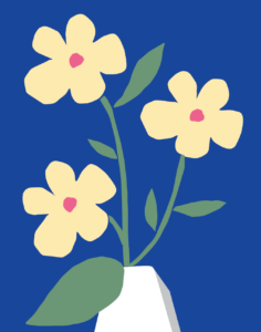
For the first prototype, I designed a simple graphic of three flowers in a vase with illustrator.
Those flowers have light yellow petals and pink stamens, with their green stems and leaves. They are put in a white vase.
The I started to translate those into tactile graphics. The technical method and mediums that I used was to print on swell form paper and make it tactile with swell form machine. The reason to use swell form machine is that It’s quite easy to use and good to create outline-based tactile graphics as I am using simple forms that has distinct outlines.
First graphic
I considered to design a flat, simple 2D shapes rather than having very detailed shapes and tones, as I was trying to make a tactile graphic informational and legible – and I wanted to start with easily manageable graphics first. Below is the image of the graphic.
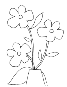
First I started with Adobe Illustrator’s vector tracing function to convert the image into an image with black outline only.
Below is the image. I found that the outlines are pretty solid but they had missing parts and were a bit wonky.
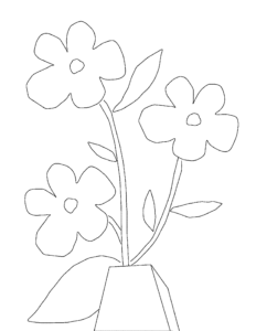
Then I started to make my own vector outlines with original image file.
With this attempt the outline was clear, but It was hard to feel it with tactile senses as the lines are very thin.
Also it was hard distinguish the priority between the graphic elements.
Below is the image.
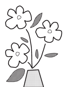
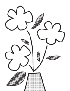
Then I made four different versions of graphics to give more information about the priority and differentiation to different graphical elements.
I started with making thicker outlines for three flowers and a vase, then I started to reduce the details to make it more legible and easy to be distinguished.
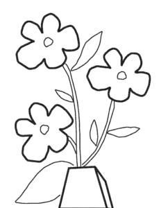
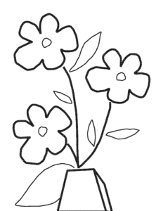
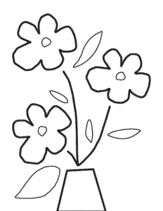
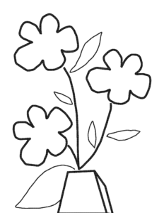
Then I started to add color cues with different textures. For the two final graphics, I added striped pattern to leaves to show the green color, and for the vase I simplified the form and filled it with dotted pattern to show its different color.
Second graphic
After exploring patterns associating with different colors, I made the second graphics.
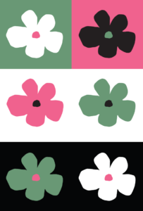
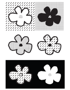
The second graphic is a series of 6 identically shaped flowers with different colors of themselves and the background.
The color combinations I made were with 4 colors – green, pink, white and black. Below is the graphic.
Then I started to assign each color to a pattern. For green, I made a pattern with diagonal lines. A dotted pattern associates with pink, while black color is filled black color and white color has empty space.
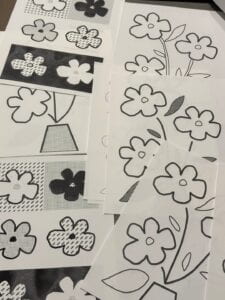
Then I printed them on the swell form paper and made it tactile with swell form machine.
People interacts with the graphics while touching the paper and feeling the puffed black lines and patterns.
Reflection questions:
What affordances do you gain by rendering an image tactile?
By rendering an image tactile, you gain the ability to physically sense and interact with the image. It allows people with any vision to perceive and understand the image through touch. This modality also adds a new sensory dimension to the experience of the image, opening up possibilities for a more immersive and engaging interaction.
For the creator perspective, I found that prioritizing between elements of graphic material was challenging. As a trained designer, I heavily rely on designs, with shape, colors, composition and details. Making tactile graphics was really helpful for me to think more about accessible color combinations, alongside with prioritizing elements for better readability.
Additional Modality:
While making this graphic I found it’s not very accessible to create those.
First, it was not easy to translate the graphic into outlines/patterns – I needed knowledge to use design software. In this case, it was Adobe Illustrators.
Secondly, not everyone has swell form machine. It is expensive (around 1600 dollars) and the papers are also expensive (100 for a package.)
So I tried to make an alternative web-based, open-source p5.js sketch to create those graphics easier, and did a workshop to explore lower-tech options to create tactile graphics.
You can try the sketch below!
About 12 people participated to my user testing and we generated the images with the sketch with black outlines (so that it can be used with swell form paper) and made tactile graphics.
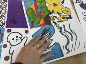
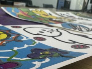
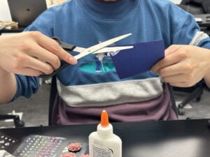
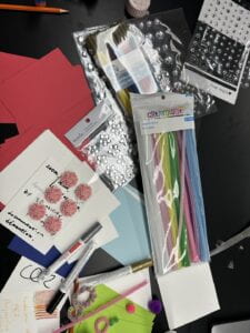
Then for the workshop, the participant was expected to be making tactile visuals with objects and coloring tools on paper.
They also had an option to draw on swell form paper directly with markers and Crayola.
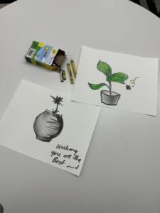
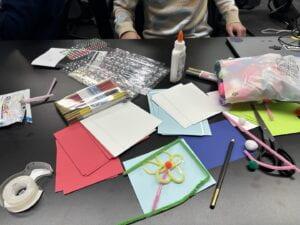
My curiosity toward the participants were:
-
- What did you considered the most when making a graphic
- What did you think the most when making the graphic tactile
- What is different between graphics that are tactile and that are not?
- What did you prioritized when making the graphic?
- ex. outlining… shapes… colors ….
- How does it feel? (to make and to feel the graphic)
The assigned time for the workshop was very short (7mins each for a person) so I couldn’t get all the answers.
But I found that people were exploring more of impromptu nature of creating materials based on touches, and they were more focusing on outlines that having a filled shape. Also they told me that although they were making tactile graphics, they cared about the color combinations and visual compositions as well. I think this can be a great design practice to quickly form shapes with care of shapes and readability – with personal preferences of visual elements as well.
