Seun Elemo: Midterm Portfolio – #6 Touch Object
Project Description:
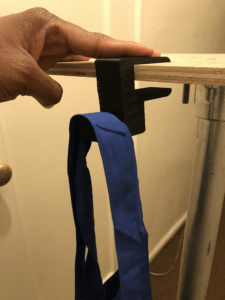
My creation for this assignment came about in a REALLY weird way. So I was thinking about my text/audio captions assignment in which I used the “Telephone” music video from Lady Gaga, and in the particular scene I chose there was a lot of food imagery. For some strange reason, I then started thinking about groceries and how many bags are needed to get some. Then I thought about how could I help make that activity more accessible, and that is how I ended up with my non stationary holder.
Documentation:
Visual Description:
Making this item took sooo long, but the process was so amazing because I learned so much about 3D Modeling and printing. I first modeled this in a 3D modeling application called Blender. Learning Blender took so long and while it probably would’ve been easier to ask for help, I wanted to push myself. Cutting down the objects, meshing it, making it the right size, etc. For such a simple thing, there was a lot to consider. See below for how it looked like in Blender:

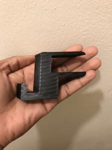
I then sent it to the 3D printer, in which I modeled the object to give it the ridges that you see on the final item. I also made the item a bit flattened because I knew that I wanted to make the final item to easily go into one’s pocket without it bulging out and making it obvious that something is inside. FYI – 3D printing took a long time. In total it took me about 5 hours to print both items.
Through the difficulties, I loved the final product because the ridges came out nicely. I want to add ridges so that the user can feel which side is the correct side since it is a bit of an ambiguous item and can easily be misused. I wanted to provide that signifier. I also loved how the flatness of the item came out because it lets the user know that this item is lightweight and can be easily mobile. The openings on the item makes it known that there isn’t a “right” way to use the product, and it’s totally up to the individual. Although, it is initially intended to be a item you clip on to a ledge to hold your stuff.
Reflection questions:
- What is the theme of the work? What is it you aim to express? For this specific work there wasn’t any particular theme per se to it. Rather, I wanted to push myself to make a usable product for this class that had accessibility in mind. It started out with being a work that allowed users to carry/hold groceries, then I realized you can put almost anything on it.
- How is that theme particularly expressed through the modality of the week? Being that this week’s modality was ‘touch’ I wanted to make something that really stands out physically. Without me telling you what it is, one’s natural inclination is to just touch my creation and kind of feel what it’s supposed to do. The ridges communicate to the user “maybe this is the correct side to use”, and the hooks on the item showcase that something could potentially be there.
- Which elements of the work are beautifully/wonderfully/perfectly expressed through the modality? I honestly think that the usefulness of the item really is expressed well with this modality, without much direction you just feel like “this thing is supposed to you be used for something.”
- Which elements are lost or inexpressible through the modality of the week? N/A
- Who does this project exclude? Who would not be able to interact with this work ? Who is this modality not accessible for? While I don’t think my project excludes anyone, it does however not currently hit every ledge. If I could continue further work on this, I would create multiple sizes or find a one to make it a one-size-fits-all type of item.

