Refletion of CCLab Project B: “Imaging”

Project Link: https://andyhyprillion.github.io/Project-B–Imaging/
Design & Composition
The initial idea for this project started with one of my friends. He asked me a question: Why are you so obsessed with photography and stick to the manual mode to control all the parameters? Through our conversation, I got the point that he didn’t realize what really attracted me to photography. Nowadays, more and more people use their smartphones to take pictures, but they seldom understand why there are so many people willing to carry a 1kg camera to photograph. Hence, I think it’s a great chance to let everyone experience the procedure of photography in this project.
Another reason is that I wanted to establish a personal website to post my photos there a long time ago. Most photography platforms will compress my photo and I cannot share every detail with my audience. In addition, I cannot determine the style of the website which means that I cannot put my photos properly with the background. So, the project is the combination of these two inspirations, and they’re connected closely.
When I got to design the website, the very start point is the Navigation bar. The navigation bar can be the element that goes through all of the pages, so it has to be simple and clear enough to adapt all the elements and pages. To achieve this target, I referred to the classical navigation bar design which is the logo along with several links. So I find a pixel art camera as the logo of this project and put the project name and about page link after it.
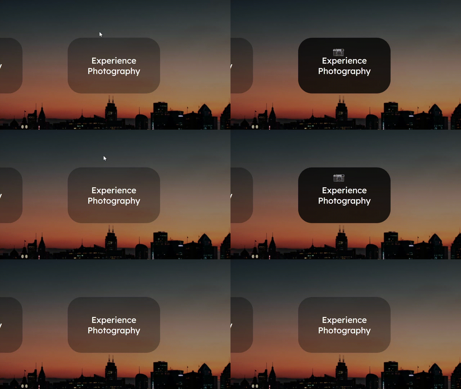
Then is the start page. My original thought is that the start page needs to be tidy and attractive. Not only because the audience will willing to experience my project, but also because photography is the art of composition. I want to let this notion throughout my project. So the start page only contains two buttons. To make the page attractive, I want to make my buttons different. So I designed this gradient effect when the mouse is on the button. In addition, I remembered that the web page can change the user’s cursor. So I change the cursor into cameras and photos to indicate different pages.

Then is the design for the gallery. At first, I wanted to design a map indicator, when the user clicks a specific area on the map, the page can provide all the pictures that I took there. However, this idea finally didn’t come true. The first reason is that it’s too hard to design a proper way to show the world map. Also, the motion is also quite complicated to code. More importantly, I don’t have that many pictures to fill the world map. The final effect will be hollow.
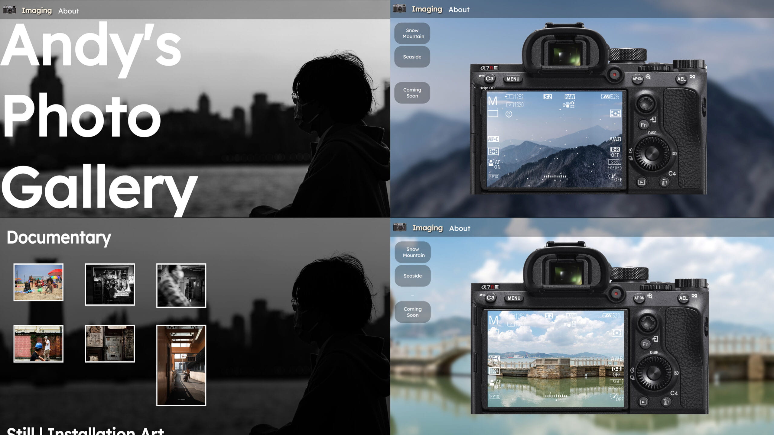
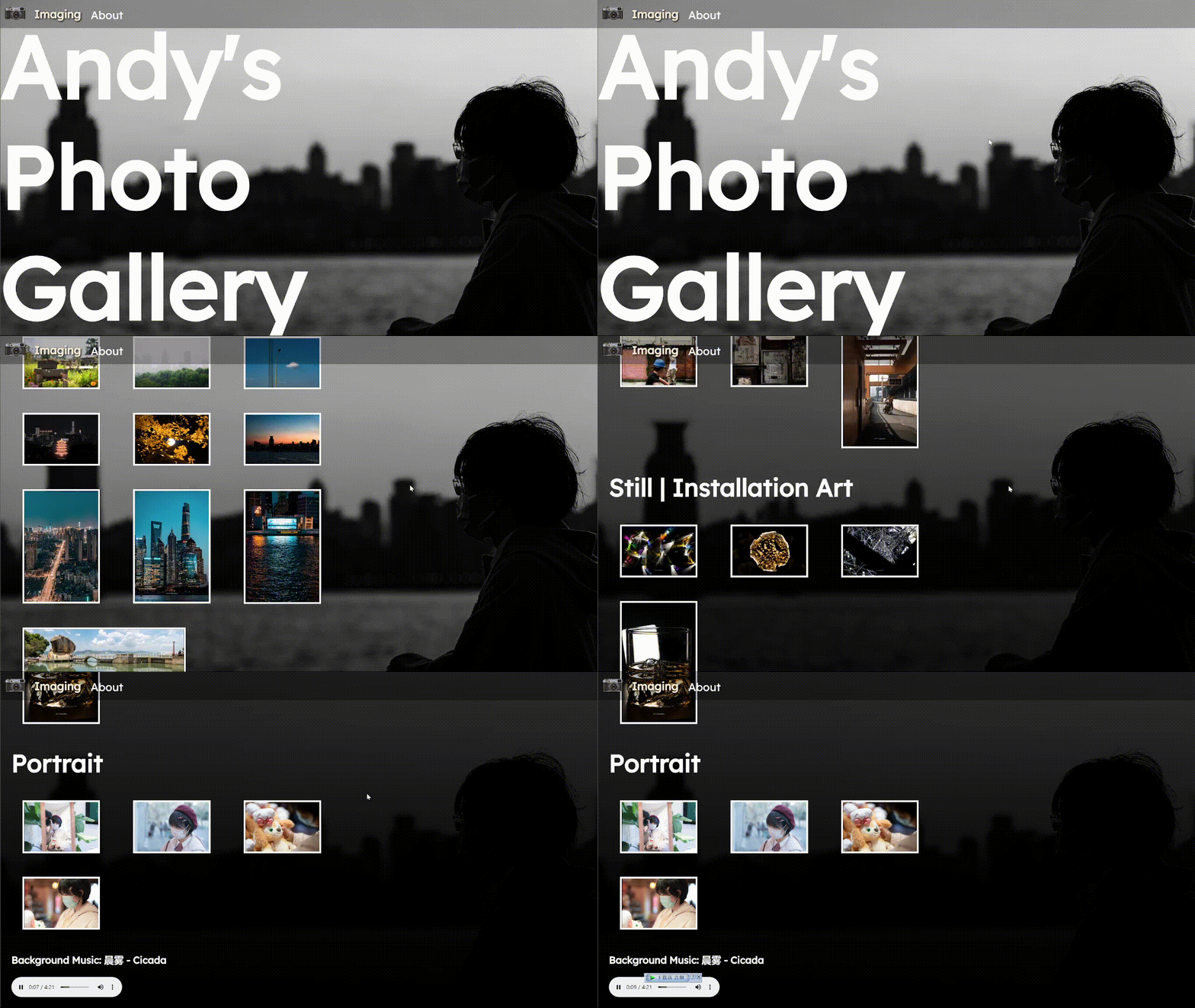
So I changed my mind. I categorized my photo with different subjects and themes. As for the background, I want my audience to communicate with my photo, which is another way to communicate with me. So I set my silhouette photo as the background and make the mask gradient. The top part shows the “Andy’s Photo Gallery” words and then when swiping down, my figure will become more and more invisible which provides a more immersive experience for the audience. In order to adapt my silhouette, I set the 30% of the right part as the empty zone, to form the effect that I’m looking at my photos on the right, and the photos will not overlap on me. I also choose one of my favorite songs to enhance the experience.

Then is the design for the camera part. In the beginning, Prof. Leon gave the inspiration that I can use the online cams to give my audience a sense of photography. However, I found it hard to import the webcam to my page, so I changed it into my panorama photos. To make the audience feel that the picture is different in their hands, I design the snow effect above the picture.
Then I find the image of the back of my camera and use PS to make the screen part transparent. I developed several functions of the camera: the swiping function, the display function, the focus function, and the exposure function.
The swiping function is to give the user ability to determine their composition. The display function is inspired by one of my friends(@j4ger) who once thought his camera was out of battery but actually it’s because he pressed the display button. The focus function is important for a camera and is also a significant difference with smartphones. The exposure value function is a result of the user survey. I planned to let the user change shutter speed, iso, and aperture value. However, most of my interviewees thought it was too complicated, so I simplify it into only exposure values.

I designed two different scenes for the experience, one is the snow mountain while the other is the seaside. With suitable ambient sound and music, I believe it can bring users a more immersive experience.
Technical
As for the technical analysis, there are too many details in this project that I can’t share all with you due to the space limitation. I’ll choose some codes which are interesting or hard for me to elaborate on here. If you’re interested in the rest of the codes or some specific effects, feel free to browse my source code or email me at any time!
Firstly I’d like to share with you the codes behind the gradient background of the gallery page.
At the very beginning, I don’t think it’s a tough effect since the only thing I need to know is the length of the page. However, when I was coding, I found that the div cannot change its length according to its content. In this case, the length of the gradient div is only the window height. So I tried to let the div adapt to my content. Finally, I found the flex layout. After reading the description document of flex, I tried to adapt the flex layout to my project. At the very beginning, it works perfectly. However, when I add the gradient div on it, it still only covered the window height. Then I realize that the parent div cannot adapt to the child one. So I define the gradient CSS code on the main content div. However, it still didn’t work. Finally, I accidentally input a code to restrict its width and it worked. I’m still confused about the reason at present.
HTML:
<div id="main"> <h1 class="pageTitle">Andy's<br>Photo<br>Gallery</h1> <h2 class="catagoryTitle"> Scenery</h2> <a class="picLink" href="assets/scenery/1.jpg" target="_blank"> <img class="pics" src="assets/thumbnail/scenery/1.jpg"> </a> ... </div>#main{ display: flex; background: linear-gradient(rgba(0, 0, 0, 0), rgb(0, 0, 0)); flex-wrap: wrap; align-items: flex-start; min-height: 100vh; z-index: 998; position: absolute; left: 0; width: 60%; padding-right: 40%;}In addition, I’d like to share with you the code behind the snowy effect.
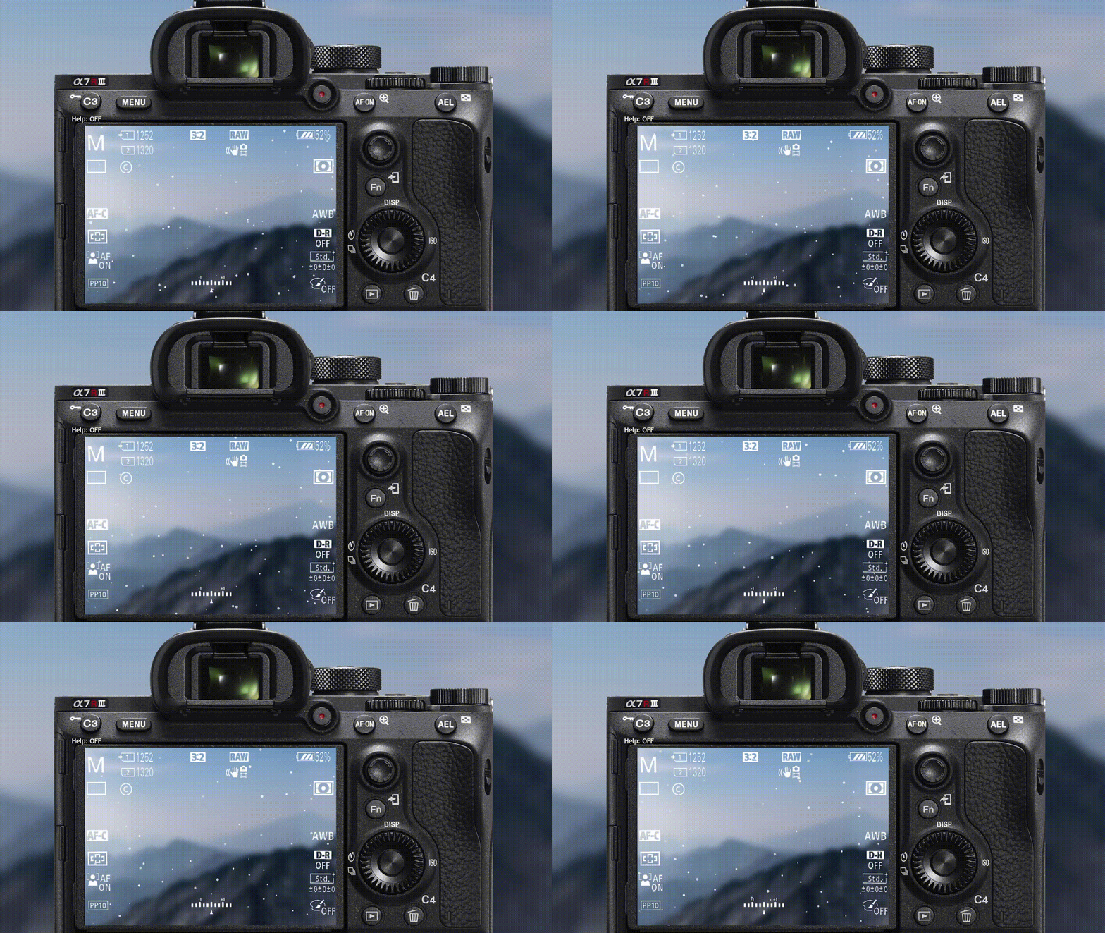
Firstly, I make a class containing all the snowflakes. Then I let them fall down from the top to the bottom at a fixed speed. After that, I use the noise function to change their y-axis value. Finally, change the size to random of the snowflakes and make the bigger one has a higher speed on the x-axis. It’s cool to have such a satisfying snowy effect.
Here’s the code:
class Snow { constructor() { this.diameter = random(1, 6); this.x = random(0, 3000); this.y = random(250, height); this.noise = noise(this.y); this.white = random(200,255) this.trans = random(200,255) } update() { this.y += this.diameter / 20; this.x += this.noise - 0.5; } display() { push() noStroke(); fill(this.white,this.trans) circle(this.x + imgX, this.y, this.diameter); pop() } turn() { if (this.y > height) { this.y = 250; } }}Also, the focus function is worth mentioning.
At first, I was trying to use the filter(BLUR) function in p5. However, my panorama picture is quite too large which has 40 million pixels. It a tough work for p5 which can only use a single thread to process. In this case, I use Photoshop to create a blurred picture instead of the original one.
The code is quite simple:
function autofocus() { if (dist(mouseX, mouseY, 700, 237.5) < 22.5) { cursor('pointer') push() textSize(40) fill(0) text("Focus",301,501) fill(255) text("Focus",300,500) pop() if (click == true) { buttonSound.play() focusSound.play() focus = !focus } }}As for the sounds, I think it’s quite too complicated to load too many sound files in p5. So I use Audition to mix the music with the ambient soundtrack and load them as a whole file in p5.
Finally is the way that I achieve the photograph effect in the camera.
I found that the capture function in p5.js can only capture the whole canvas. However, the photo taken by a real camera will never contain the interface and the buttons. In this case, I have to solve this problem. My thought was to make the picture overlap the camera when the user clicks the shutter button and captures the canvas. Since it’s only one frame, the user can hardly feel that. Then I calculate the proper scale index for the snow. I think the final effect is not bad.
function takePhoto() { if (mouseX > 700 && mouseX < 835 && mouseY > 165 && mouseY < 210) { cursor('pointer'); push() textSize(40) fill(0) text("SaveYourMemory",211,501) fill(255) text("SaveYourMemory",210,500) pop() if (click == true) { saveX = map(imgX, 20, -2180, 0, -4000); if (focus == true) { image(img, saveX, 0, 720 * 7, 720); } else { image(imgBlur, saveX, 0, 720 * 7, 720); } push() scale(1.5) translate(-40,-240) for (i = 0; i < amount; i++) { oneSnow[i].update(); oneSnow[i].display(); oneSnow[i].turn(); } pop() push() if (evValue > 0) { fill(255, evValue * 40) } else { fill(0, -evValue * 40) } rect(0, 0, width, height) pop() shutterSound.play(); saveCanvas('myPhoto', 'png'); erase(); rect(0, 0, width, height); noErase(); } }}Reflection & Future Development
After making this project, I taste the difficulties of CSS. From my perspective, the CSS isn’t hard in logic, but hard in complexity. There are too many functions in it and can always let you lose your direction. Furthermore, I realize that sometimes it’s hard to put every thought into practice. Sometimes it takes a lot of effort to come up with a solution and try it in your code. Although the process is frustrating and dull mostly, the final moment that your effort paid off really provide me a sense of victory and achievement. Also, I’ve used the blog website to collect user feedback for my project, it’s interesting to communicate with others like a website owner. In this project, I combine HTML, CSS, and p5.js(JavaScript). It’s such an amazing feeling after taming all of these languages. However, I’m still a very beginner at coding. I still need to work and study hard to rule them.
As for the future development of this project, I think it can become a frequently updated website for me. I’ll upload more pictures on it, and try my best to make a picture viewer for the website. In addition, I’ll add more functions and scenes for the camera and let my audiences have a more comprehensive photography experience!
Special Thanks
Appreciate the guidance from @Leon throughout the whole semester.
Appreciate the inspiration from @j4ger.
Appreciate the inspiration and feedback from @MaxAlex.

