Pre Critique:

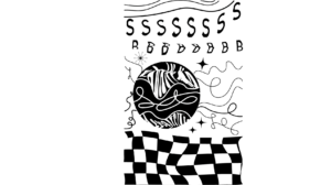
The song is a very uplifting but it is still very chill. That is why initially, my lines were wavy and the fonts did not have a lot of sharp corners. Instead, they were more bubbly. I liked how I used a lot of the space and there was a pretty good balance of the positive and negative space.
Final:

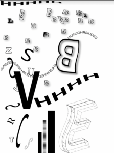
I had to change the checkerboard design on the bottom since we were not allowed to use shapes. I also decided to take the suggestion of changing the direction of some of the letters since the first one, most of the design seemed to flow from left to right. In addition, the small letters that seem to be floating in the top half of the page are supposed to depict a very relaxing type of feeling. The three bars on the bottom are supposed to represent the rap parts of the song since the beat during that section of the song is very consistent unlike the rest of the song. A lot of the letters are wavy to also show a ” chill vibe’. I also decided to not make the E on the bottom right of the paper black because I think if I did, there was too much negative space there.