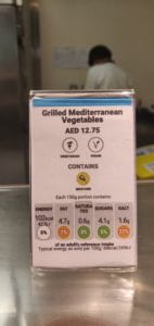
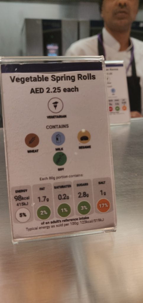
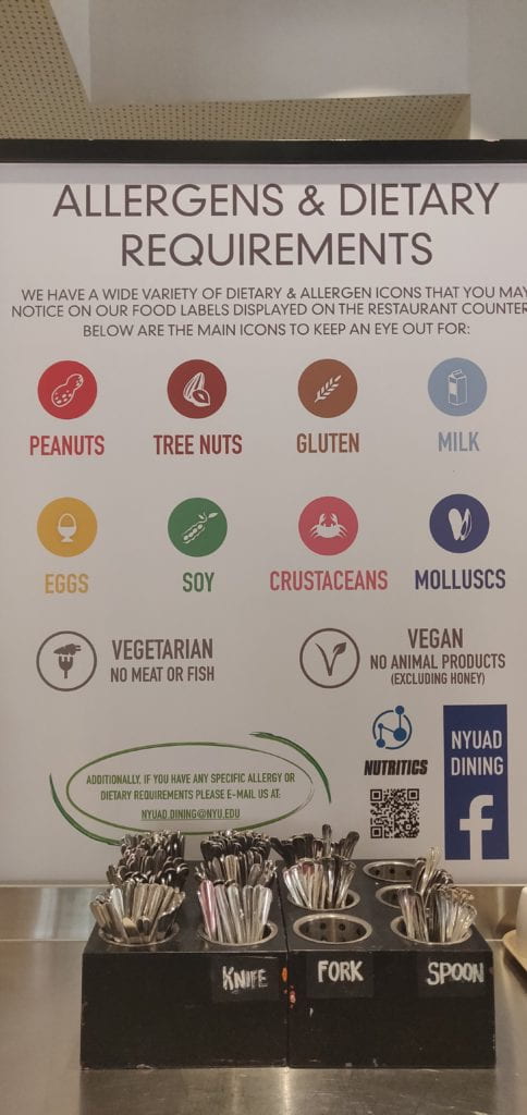
The East Dining Hall (D2) is a place where every NYUAD student goes at least once everyday during the semester. Therefore, it constantly sees a lot of traffic and there is a need for there to be many processes in place to streamline the process of getting food. While these processes have been successful, a major problem I still face is finding vegetarian food easily. Each food tag on the various counters has an icon that mentions whether the dish is vegetarian/vegan but they are extremely small and I need to look at the label very carefully to read the sign. Also, there is nothing majorly different in these signs that distinguishes them from other signs that represent soya, eggs, etc.
Something additional, however, that I recently noticed was blue, purple, and green lines on top of some labels. There is no sign in D2 that says what these lines stand for and nobody serving food in the dining hall knew what these stood for either. On asking five people about the reason for those lines on the labels, I learnt that they were repeating what had already been mentioned on the label by tiny icons. A blue line meant vegan food and a purple line meant vegetarian food.

Blue line on labels for vegan dishes

Purple line on labels for vegetarian dishes

Huge glossary of all other symbols being used. A similar thing can be introduced for the coloured lines
While I do understand that the idea behind this was to help people see if there are vegan or vegetarian options at that counter from a distance, I don’t think it has been able to do its job very well simply because nobody is aware of their meaning. While the lines are a good idea to reduce people leaning in on counters to read the small icons on the food labels, they are useless right now. The only constraint in the way of everyone using these indicator lines is a lack of knowledge which can be easily solved by an announcement on the student portal or putting up posters in D2 explaining their meaning. Additionally, since the information being conveyed by these lines is already there on the labels, nobody pays much attention to them even though they are doing the same thing in a much better way. This is so because once I get my information which is being conveyed more “clearly” by the small icons, I don’t think of what else is there on the label. However, once people know how to use these indicators, it would make it much easier to see what dishes are available from a distance. By using them for just a few days, I can feel that it has made my experience in D2 much better since I spend much less time going to every counter and reading each tag.
