By Rania Sakhi
I went to Abu Dhabi mall last week for the opening of Forever 21 and its Arabic logo immediately got me thinking about our class Yes Logo and our multiple discussions about the Arabization of brands in the Middle East.
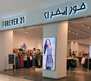
I understand that part of their marketing strategy through Arabization is to connect and relate with the Arab audience whether it is in the food, apparel, or beauty and cosmetics industry. Nevertheless, I believe it is truly essential that every brand takes time to figure out how to Arabize their logo to be effective in the region and appeal to the Arab customer. For someone whose Arabic is the first language, my mind froze for a minute trying to figure out what the Arabic logo said. Not only are the letters disproportionately made, but the font used is also very different from its English version. Hence, when attempting to Arabize, it is important that the logo or at least the name are done in a way that is both easy to read in Arabic and maintains the overall theme and colors that the brand has in English. In this post, I want to share my modest thoughts about the Arabization of some of my favorite brands and discuss whether they have done a great job at localizing their logos in an easy-to-read format or if their attempts went wrong.
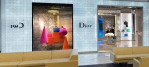
Let’s start with the not-so-good-looking logos. I have 2 examples: the first one is the famous Dior logo and the second one is the late-night fast food sponsor of all NYUAD students, KFC.
This is the Arabic #Dior logo. Who designs these? @arabictype #designFail #arabicLogos pic.twitter.com/QX6zixF6vk
— Rania Baltagi (@labolts) January 4, 2014
When looking at the Dior combination, it is clear that whoever designed the logo wanted to match the Arabic and English design layout and forced it too much. The Arabic letters “د” and “و” are literally just remodeled to match the “D” and the “o” from the English version. At first, I found the idea to be very creative and original. However, when actually thinking deeply about it, I feel like the aesthetic of the Arabic version lost its value because the letters ended up having weird oversized forms to try and reflect the original. The logo simply looks very cheap and not luxurious at all. In this case, the accurate Arabic letter shapes are simply sacrificed for the purpose of aesthetics, and aesthetics don’t even look that great.
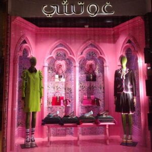

Similar to what Dior did, Gucci designed its Arabic logo to match its English version at the expense of the language. The Arabic wordmark is not even spelled correctly in itself as the ش is incomplete and the و looks dysmorphic.
The second example is KFC, which stands for “Kentucky Fried Chicken”. In Arabic, it should translate to “دجاج كنتاكي المقلي “. However, the Arabic logo only has دجاج كنتاكي (Kentucky Chicken) in it. This in itself is very problematic because not only is the translation not correct, but the Arabic logo includes the full two words and not just the abbreviation.
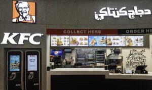
Keeping the full name is a wise decision as it appeals more and better to the Arabic reader, however, there is usually no balance between the two languages when it comes to space, whether it’s in their restaurants or products.
Now, I will move on to the successful Arabization of logos.
The first one is of the casual dining American Chinese restaurant, P. F. Chang’s. Its Arabic logo is in my opinion a great example of logo Arabization. With the same forms maintained, the adaptation of the Arabic logo is done fairly well as it doesn’t pose the same issues other logos mentioned above face such as changes in width or thickness, serifs, and calligraphic styles.
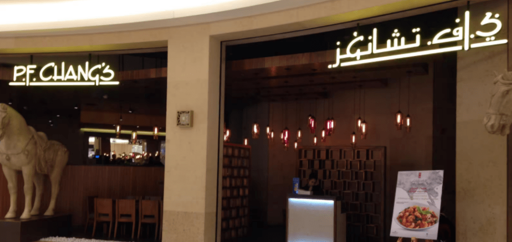
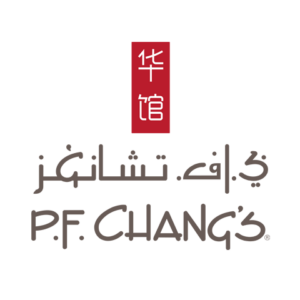
They did a particularly phenomenal job on getting the Arabic version of their logo just right. What I found cool and interesting is also the way they were able to get the G with غ and F with ا letters in respectively English and Arabic to look so similar. Furthermore, both logos are just awesome examples of what happens when 3 different cultures collide.
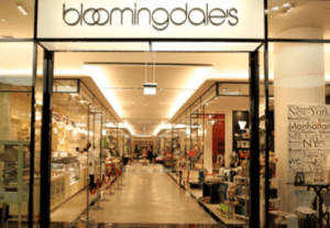
Another great example is Bloomingdale’s. Its logo simply shows how the Arabic calligraphy typeface is truly chosen to complement the English, making both versions work in beautiful harmony.
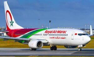
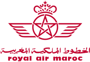
Last but not least is the logo of la RAM or Royal Air Maroc, the Moroccan national carrier. In my opinion, its design succeeded in merging Arabic and English/French where none are made to copy or mirror the other and yet work beautifully well together. I love how the bilingual logotype shows the elegance of both scripts individually, merging together in one unified shape.
To put it in a nutshell, Arabization should be more about context and comprehension so that the logos get localized based on the locals’ ideology to connect with them on a personal level. Yet, when adapting a brand to Arabic, legibility should be the first factor to look at. In other words, a logo must still be clearly readable to the local audience. Moreover, its stylistic approach should look and feel like Arabic, to native or Arabic speakers. Forever 21’s Arabic logo doesn’t feel familiar for instance as it is far too distorted to be seen as a natural counterpart to the original.
Hermann Zapf, the famous German type designer and calligrapher once said:
“Typography is two-dimensional architecture, based on experience and imagination, and guided by rules and readability. And this is the purpose of typography: The arrangement of design elements within a given structure should allow the reader to easily focus on the message, without slowing down the speed of his reading.”
Now my question to you is: What do you think about this Arabization of logos? Is it really necessary for big brands to invest in making a great logo in Arabic? Have you seen examples of poor adaptations of logos into Arabic or perhaps other languages?
I am now very excited to hear from you and particularly from Wissam Shawkat next week, especially when it comes to brand design development and Arabic logotypes.
PS: ضائعون translates to lost in English.