I have to say that making a logo is not a simple process but quite an enjoyable journey to follow. While studying away in New York, I designed more logos than I saw in Times Square. For one of my business classes, Experiential Learning Seminar: Fashion Industry: Creativity and Business, I had to come up with a business plan, design a brand and present it to investors at the end of the semester. Starting a brand from scratch was always an idea that excited me and was ready to do anything to hop on this new challenge. We were a group of 3 and my two teammates had no background knowledge in design at all. Thus, I had to do it all by myself.
The first step was to find a name for our brand. We chose “Plume Bloom”. Plume, French for feather, and symbol of strength and power. The business was a luxury shoe brand in which we create luxury fashion products targeted towards chic women and designed to empower them. These products included shoes and more specifically glamorous heels, exceptional bags, and high-end jewelry made essentially with feathers.
After understanding what the brand embodies and what our business’s goals are, we were able to know what kind of impression we want the brand to aim for and thus what the logo could look like. Because the brand is all about luxury, beauty, and passion, we wanted the logo to be simple yet elegant.
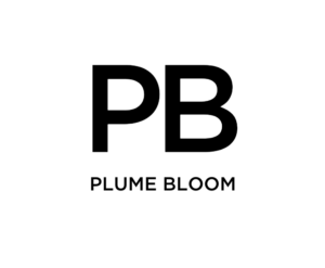
The next step was to start designing it. The first logo I worked on was a logo that consisted of text only, denoting the name of the brand, Plume Bloom.
Because we want the logo to be simple and chic, a wordmark logo seemed to be the perfect option. It only has our business name, no symbols, no slogan. However, when we thought about it, we felt like a monogram logo is a must. We are a luxury brand, and similarly to Louis Vuitton and Gucci, we would definitely need to have our monograms on our bags, jewelry, and probably heels as well. Thus, we created a monogram logo of plume bloom’s initials: PB.
Since Plume Bloom was going to be a new brand in the market, we needed the logo to be easily recognizable. To build name recognition, we opted for a combination logo: our wordmark and symbol logo. In fact, this type of logo is what allows the brand to be easily noticeable because it uses two design elements that represent the brand, together. Plus, they can be used separately when needed.
When it comes to color, black and white were our go-to considering that these colors are associated with power and sophistication, exactly what we wanted our brand’s vibe to evocate: elegance.
Okay, now that we’re done with designing the logo? What comes next? Market research? SWOT Analysis? Financial plan?
I personally couldn’t start working on anything else because I was not satisfied with the logo. I asked myself questions such as: what if one day we have to advertise the brand on a billboard in Times Square? Would it appeal to people? The answer was obviously a NO. The logo looked too basic and dull to me. Something was missing. The next step was hence redesigning the logo. I knew that the font we used was not the best. It is simple and elegant, but doesn’t match the brand’s vision. I played with shapes and fonts a lot and ended up choosing Gotham and positioned the P in the symbol logo upside down.
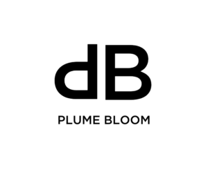
At this stage, I was quite satisfied with the outcome. Nevertheless, when presenting our first pitch deck in class, the professor thought that the P was a “d” and wanted us to change it. I did not pay attention to that at first and thought it was very obvious that it was a P, but it was actually only obvious to me and my teammates. Once mentioned by different people, I just couldn’t unsee it anymore. Next step: play with the logo again. Do we keep it simple and clear?
The first idea that came to mind was to keep the P and B initials and mirror them. And guess what? I loved it and we ended up choosing this option as our final logo.
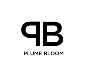
Now what I learned from this whole experience is to test, test and test. Designing a logo is not the simplest thing to do, but the most enjoyable part of designing a brand. It is also the most important aspect of the business. Next comes prototyping, designing the shoes, writing a business plan, and finally manufacturing the products.
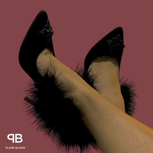
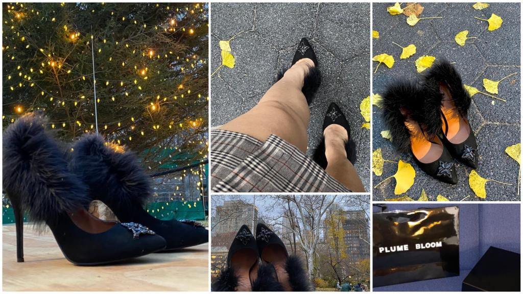
Similar to designing a logo, designing the shoe heel took some time. It took us months sketching and sketching. After multiple iterations, questions, and feedback from friends and family, we wanted to bring our own idea and vision to life. The shoe that we ended up designing was a black velvet feather heel with crystallized embellishment, glitter, and beaded details to appear across styles poised upon the brand’s signature feather-based heel.
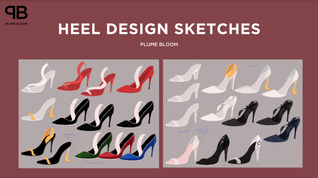
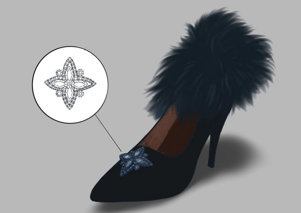
We were very fortunate to find a manufacturing studio in Brooklyn that brought our simple sketch to real life. We went on textile, feather, and crystal hunting and found all that we needed in a shop in Manhattan. The final result was outstanding.
When it comes to logo design, being our main focus in this class, I believe that each aspect of a logo can affect the kind of impression it makes on the viewer generally and the customers specifically in the context of business, including colors, shapes, fonts, sizes, shapes. Although at the end of the day my logo may not resonate with every single viewer, the whole logo design process helped me at least bring the brand’s vision to life.
What I have learned from this class other than designing a brand and writing a business plan is that whatever work I do in my life, whether it is personal, for a class, or for someone else, I have to do it with lots of love and passion. Working on this project taught me patience and determination. I have developed a strong visual eye for detail that I can’t wait to implement in different projects of the YES LOGO class.