Emaratiya Exposition

One of my most recent projects is co-curating an art exhibition in the Cube, The Arts Center with a good friend of mine, Fatema Al Romaithi. The exhibition we are creating aims to solidify and spotlight the intersection between the Emirati identity and feminine identity.  The exhibition analyzes works that reflect this sentiment in both contemporary and historical contexts. We would like to ask the question, “What does it mean to be an Emirati woman?” What does the ‘Emirati woman’, as an identity, represent, and what is she emblematic of?

Preparing for the exhibition not only requires a logo but a solid marketing and promotion plan. First, let’s start with the logo. Initially, we wanted to give it an intimate touch and perhaps have a handwriting and handmade element to it. So I started off sketching the word Emaratiya in Arabic, which turned out like this:

The purpose of this logo is for it to be vinyl on the Cube and on all our social media’s promotional content. But for us to easily achieve that easily and cohesively, we decided to have the logo digitally in Mishafi with the tracking increased:

The increased tracking is still readable and gives into one of the many notions the exhibition’s artworks tackle like tension connection. 

This is how our render looks like for the exterior of the Cube:

The Arabic and English boxes are intended to be the exposition’s curatorial texts that are going to be posters on the exterior of the cube instead of vinyl, since it will be easier to mount. With the help of my aunt, a Professor of Translation at UAEU, I was able to get the curatorial statement translated to Arabic. Then, I had both texts on Indesign, set on A1, in Gotham and Tajawal. They are planned to printed on heavyweight paper.


Now on to the promotional content for social media. We came up with a schedule that will be followed by the entire team, including the artists behind the Emaratiya exhibition and it entails:

May 1st: teaser instagram story
May 9th: promo video post
May 12th: exhibition opening


May 1st: The teaser instagram video that will only be uploaded on instagram stories will look like this:


May 10th: For the actual post that is planned to be posted onto the feed is a continued video:

Click to access the video   (Video is too long to an in-line attachment)

The names featured are the participating artist’s names in their own handwriting. This allows us to evoke that same intimate and handmade element we wanted to emulate in the beginning.


Now for the poster that is being planned to be posted around campus, we are planning to have a simple still from the promo video:


As for the artwork panels that are going to be attached by the artworks on the cube (describing the artwork’s title, size, medium) are planned to look like this. A mixture of Gotham and Times New Roman, the arabic is Tajawal. They were created on indesign and are planned to be printed on heavyweight paper.


Last but not least, we wanted a brochure that includes the information from the artwork panels + some information behind the concept of each piece written by the artists themselves.

Again, the concept of the girls including their names in their handwriting adds to that original element.

The exhibition is planned to be showcased from May 12th to June 9th, with an installation period from the 10th to the 12th of May, and a de-installation period from the 10th to the 12th of June. We believe it is a great idea to be joining the Pop-Up showcase in the Art Center as this will generate a lot more foot traffic for our show. This blog also acts as an open invitation to anyone reading this, as we would love to have you there. See you on the 12th at 5 pm!

A Beauty Salon Makeover

By Rania Sakhi 

A new beauty salon, NY Ladies Beauty Lounge, has recently opened its doors on campus.

In beauty and hairdressing, first impressions matter the most and I have to say that I am not a big fan of the salon’s logo nor its exterior facade design. In this last blog post, I will redesign their logo and walk you through the process.

People frequently believe that a good logo is one that conveys a lot about the brand or is simply attractive. I once had the same belief but after taking many design classes and watching Sagi Haviv’s interview with The Futur, I now have a better understanding of what makes a logo great and iconic. For more context, Sagi Haviv is a very well-known graphic designer and partner in the design firm Chermayeff & Geismar & Haviv and has designed some of the most iconic logos in the world such as Chase, Mobil, PBS, Showtime, and National Geographic, just to name a few. According to him, three fundamental design principles need to be present for a logo to be great: 

1. It should be appropriate or relevant to the client and industry in feeling, form, and concept but doesn’t necessarily need to say a whole lot. In the case of NY’s beauty lounge and since the salon is located in Saadiyat Island at NYU Abu Dhabi, it should be elegant and close to NYU’s brand system. While the logo might seem elegant to some, their exterior shop design is just not it being too bold, crowded, and dynamic. Plus, it doesn’t really match NYUAD’s aesthetic. 

NY Ladies Beauty Lounge, Saadiyat Island.

2. It needs to be simple or uncomplicated in form so it can work effectively and flexibly in a wide range of sizes and media. 

3. It needs to be memorable or distinctive enough to be easily remembered. In my opinion, this is the main principle that the NY logo is missing. It looks like any other salon logo you can find online. 

These three criteria are the questions I asked myself when I thought about redesigning NY’s logo since it is not only the centerpiece of all brand communication but also the reflection of the character, personality, and values of the salon. 

As the first step in my re-design process, I started with research. I mainly looked at how other competitors in the same area are presenting and marketing themselves. NY’s main competitors are: 

  • Tara Rose Hair and Beauty Salon 


  • Tips and Toes 

  • De Joie Beauty Lounge 


  • Ivy Beauty & Bubbles


  • Bellacure Beauty Lounge 


After the research, I tried to understand what can work and most importantly how I can differentiate NY Ladies Beauty Lounge from its competitors. I then started brainstorming ideas and created a clear mood board that is basically a collection of visuals that capture the salon’s essence and personality and customers, or perhaps how I would visualize it myself if I had to design their brand identity. 

When it comes to sketching, I started drawing symbols and anything that came into my mind by hand.

When the idea became clearer to me, I quickly switched to Illustrator and decided to simply go with a luxurious and distinctive typographic treatment of the salon’s name: NY or New York. I tested different colors, fonts, spacing, alignment, and so on and kept pink and red as my final color palette. For the font, I chose Pinyon Script that I found after 3 days of deep research. Finally, this is what I came up with. 

And here are the logo’s variations. 

Once the design was done, I wanted to test the viability of the logo concept by creating mockups on Photoshop relevant to the beauty salon to see how it will work in real life. For this, I chose to work on a business card, a brochure, a shop facade, a hanging poster and wall sign, a home service car, a cosmetics packaging, a mug and T-shirts for staff. 


Overall, as much as I enjoyed working on this little redesign, I strongly believe that great logos do not happen by accident. They are the result of strategic thinking, exploring, failing and designing again. Furthermore, each aspect of a logo, whether it is font, shape or colors influence people’s perception of the brand. In this blog post, I specifically focused on NY’s ladies beauty lounge. However, there are so many other logos out there that I think need a redesign. When a logo is too generic or too complicated, it is usually bad. Thus, the main rule that applies to all industries is that a strong logo design must be able to adapt in order to ensure a business can keep its best face forward as all manner of change inevitably takes place not only in the world of design but in society too.

No Copy-Paste, please !

By Rania Sakhi

This blog post’s topic is something we have been deeply discussing with my lovely teammates, Olivia and Soojin, when working on our logo proposals to make sure that we don’t fall into it. As a first step in understanding the project briefs, we started the creative process by researching and collecting visual references. Now once the work was done, with all the inspiration gathered in front of our eyes, we were blocked, for fear of falling into plagiarism. This is because, sometimes, the distinction between inspiration and plagiarism can be subtle. 

Hence, in this post, I want to draw the distinction between these two key concepts. 

According to the Merriam-Webster online dictionary, plagiarism is the infringement of the intellectual property of others (1). It usually occurs when people present a creation as their own when it is not. It is very simple: if I steal or copy someone else’s work and intentionally appropriate it to myself, I am committing plagiarism, and that is reprehensible. Plagiarism can take any form, but in the context of graphic design and our class Yes Logo, it is specifically about visual plagiarism whether it is drawing, painting, sculpture, photography, advertisements, logos, brand names, or any other visual imagery (2).

Inspiration on the other hand is a creative process that is both unconscious and natural. I believe that getting inspired by a work does not necessarily mean plagiarizing it as long as it is not a pure copy-paste of it. Inspiration is truly in human nature, whether we like it or not. After all, when thinking deeply about it, learning is nothing but copying.

Now while some instances of plagiarism are obvious, intentional, and indefensible, others are simply impossible to accuse since they are either riding on a popular trend or simply using a tried-and-true formula. This is especially important since a creator might easily “copy” unintentionally and without even realizing it by stealing ideas he believed were his but had seen someplace else, possibly years earlier.

One less obvious example is these two billboard advertisements that ran during the Ramadan season. The plates on the billboards seem empty throughout the day. When the sun goes down, the supper eaten by Muslims at the end of each day’s fast appears magically. It is the same innovative concept but the main difference here is that the second and most recent one is a digital billboard, whereas the first was created using special ink. 

THE CREATIVE                                      Isla Délice “Ramadan” – 2014        Eurobest Finalist, EFFIE Awards SILVER  Agency : Hérézie, Paris (France)
THE LESS CREATIVE
Tesco “Together this Ramadan”–2022
Agency: BBH London (United Kingdom)


Do you think this is a coincidence or a copy-paste? To me, it is a scary lookalike, to say the least.

An example that is too obvious is Pepsi’s logo and Obama’s campaign in 2008 which look very similar in terms of colors, shape, and design in a certain kind of way. Red, white and blue became Pepsi’s colors during World War 2, to show support for America. Yay. And the round shape, well that’s unchanged. It’s the design within the circle that’s an issue, seemingly. And, the sense I got was that Pepsi maybe wanted to follow this design approach to perhaps sell more sodas. 

Logo: Pepsi’s or Obama’s ?

When asked about the company’s position on the whole logo situation, Frank Cooper, Pepsi’s portfolio brands VP, shared that optimism, change, and hope are all part of the Pepsi mantra. Thus the resemblance between the logos (3). But at the end of the day, the happy coincidence might appear to be acceptable because Pepsi did admit that they share the same optimism as Obama. Yet, is there anything really wrong with that other than a lack of originality?

To put it in a nutshell, it is certainly feasible to be inspired without plagiarizing, as long as you agree that recycling an existing concept is not always plagiarism. The creator’s method is thus centered on recycling and mixing existing pieces to create something new, spotlighting an underutilized notion that is open to human evaluation and appropriate reinterpretation. Finally, inspiration is the approximate reworking of an idea, concept, or substance that we have reinterpreted in our own unique way. Sometimes, it is quite difficult to determine who even initiated something. Even if you do identify the source, how do you know they themselves weren’t influenced by something they were unaware of? Maybe they’re just concealing their source too which swiftly devolves us into a chicken-egg discussion. 

Now, what are your thoughts on this? Is anything original and creative anymore? I would love to hear your opinions on the topic of inspiration/plagiarism. 

References: 

  1. https://www.plagiarism.org/article/what-is-plagiarism 
  2. https://guides.library.msstate.edu/visualplagiarism#:~:text=Visual%20Plagiarism%20can%20also%20be,claiming%20it%20as%20one’s%20own.
  3. https://news.yahoo.com/it-looked-like-the-pepsi-logo-obama-was-initially-skeptical-of-campaign-symbol-205758742.html

Mexican Rótulos  

Mexican Rótulos  

Most of the local businesses in Mexico City don’t pay for a logo or a fancy brand identity, or at least they didn’t use to. Anywhere you look around in this city, you’ll see colorful handwritten words that announce something. It could be food, a cybercafe, an auto repair workshop, a dentist’s office, and any business you could have in mind. These handwritten signs are called rótulos. 

I wasn’t precisely a big fan of the rótulos, especially because when these words are painted on walls don’t receive the right maintenance, they start looking dirty and abandoned. However, one day I bumped into this post from a vintage clothes shop I follow: 

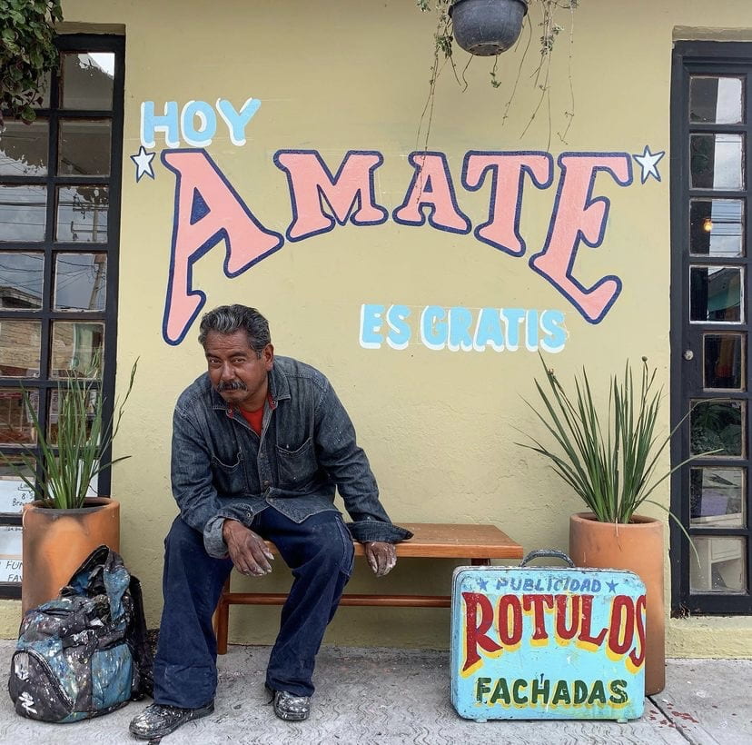
This rótulo reads “Love yourself today. It is for free.” /IG: @lupebaezvintage. The creator of this rótulo is the sir sitting in the picture. The suitcase with words written on is where he carries all of his materials. 

Probably it was the contrast between this trendy store owned by millennials who decided to give it a try to this old technique, and seeing the process behind these signs (the shop was posting the process on their Instagram stories) that made me value these works and think to myself “Hey, they are actually so cute!”.

Learning More About the Term

First of all, to write this entry I tried to find an appropriate translation for the term “rótulo”. These were: “signage” and “sign”. The word comes from the Latin rotulus which refers to a roll of parchment or papyrus on which something was written to have a permanent record, and it can also mean “sign’ or “label”. 

Lorsch Rotulus « Facsimile edition

A rotulus 

The words “sign” and “label” contain the essence of what a rótulo was for me in my mind before looking it up, but still, it didn’t convince me completely. I ended up finding out that a rótulo is simply something drawn on a surface that indicates something and if you google the word you can come up with things like this among the first results:

mateoRótulos - La casa más antigua de rótulos en Bizkaia.

Sign by “Mateo Rótulos” announced on their website as the oldest signage makers in Biscay

Today I learned that a rótulo is a word in Spanish that simply indicates any kind of sign or signage. Why didn’t I know this before? Because for me rótulos were specifically these hand-drawn colorful words accompanied by some cheerful and sometimes funny illustrations that a lot of businesses in Mexico use to indicate what they sell. 

El rotulismo en México: tradición e identidad | Domestika

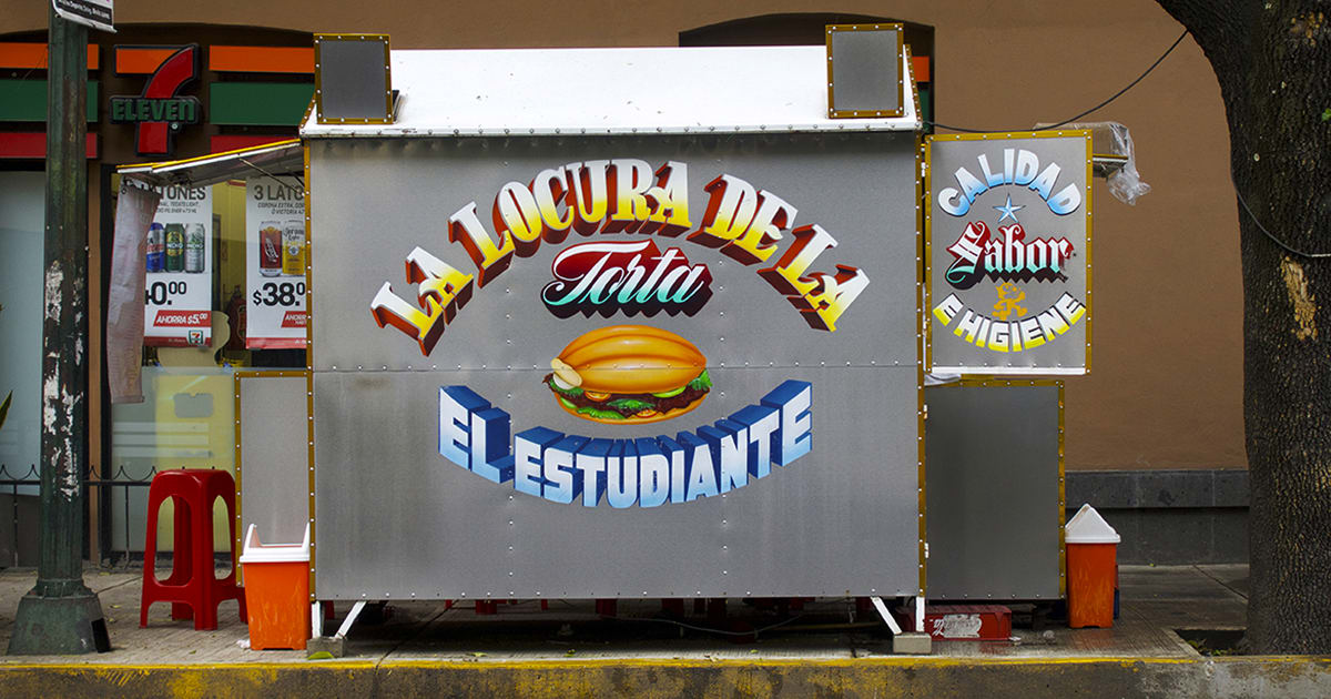
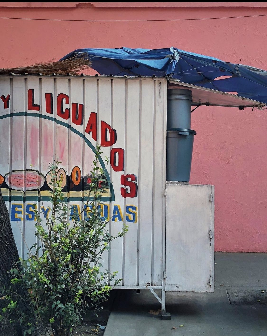
 Street Food Stand in Mexico City; It reads “The Torta’s (Sandwich) Madness” announcing the name of the place. 

As we can appreciate, there is a huge artistic and stylistic gap between the Coca-Cola Sign and this lovely sandwich business. This is why I decided to use this entry to learn more about them and to share with you the history of this colorful art called Rotulación that decorates my city. 

Its History and Its Beginnings in Mexico 

Rotulismo is the art of writing letters and numbers in a standard way or form. This art has as the main goal to get people’s attention and transmit a message. It started in the Middle Ages when the most used surfaces to make this kind of work were wood and metal.

My Vintage Journeys: THE HANGING SIGNS OF MEDIEVAL EUROPE

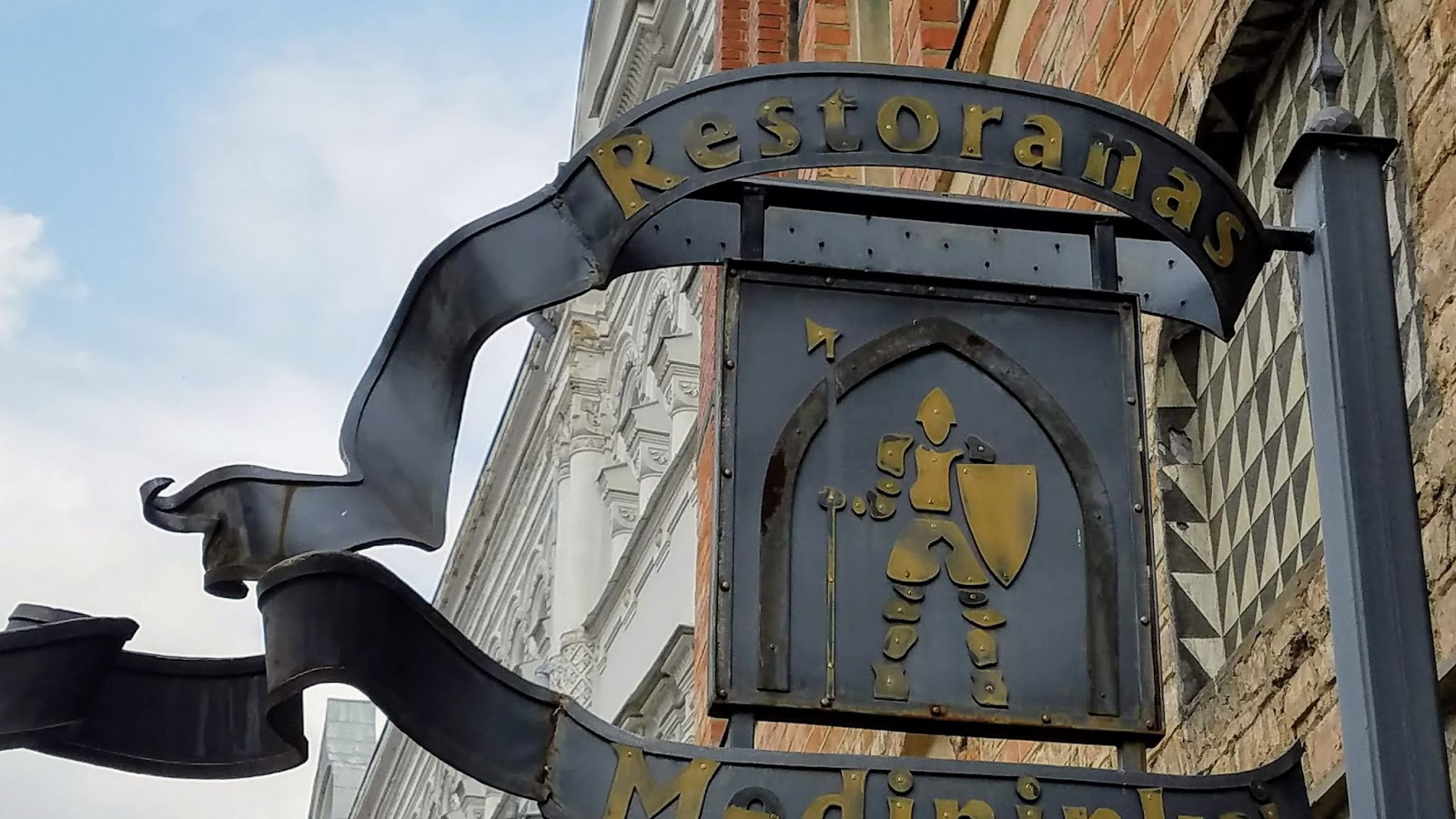
Example of a Medieval Sign 

The rotulismo tradition arrived in Mexico at the beginning of the 20th-Century, around the end of the Mexican Revolution (1917). Commerce started emerging after the war, and business owners wanted to boost their businesses’ visibility. Seeing this demand, a lot of people without truly artistic preparation, started dedicating their lives to makerótulos. They had more technical than artistic knowledge, and they developed a product that was simple and functional, but also attractive. 

marfilu on Twitter: "No les pasa que ✨✨✨✨✨✨✨✨RÓTULOS MEXICANOS✨✨✨✨✨✨✨✨✨ https://t.co/yGvjrZ7QN3" / Twitter

@marfilu on Twitter. A milkshake street stand in Mexico City. 

The rótulo makers started using typography, style, and type of stroke that was inherited from their families. They were mostly self-taught. Nonetheless, in some cases, their knowledge was improved by acquiring technical drawing and advertising design knowledge from whichever source they could. One of these resources was the Speedball Manual which is a lettering guide, published by a US manufacturing company of stationery and art products. You can check out a pdf of an old Speedball Manual here

Manual Speedball | PDF

Cover Page of the Speedball Manual 

speedball manual | Lettering fonts, Lettering, Typography

Page from the Speedball Manual 

The most common typographies used for rótulos are Futura, Open Sans, Helvetica, Fonseca, Garamond and Gothic. 
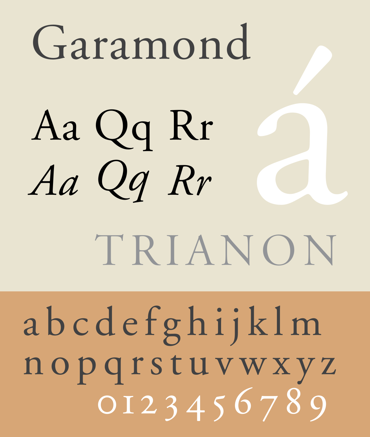
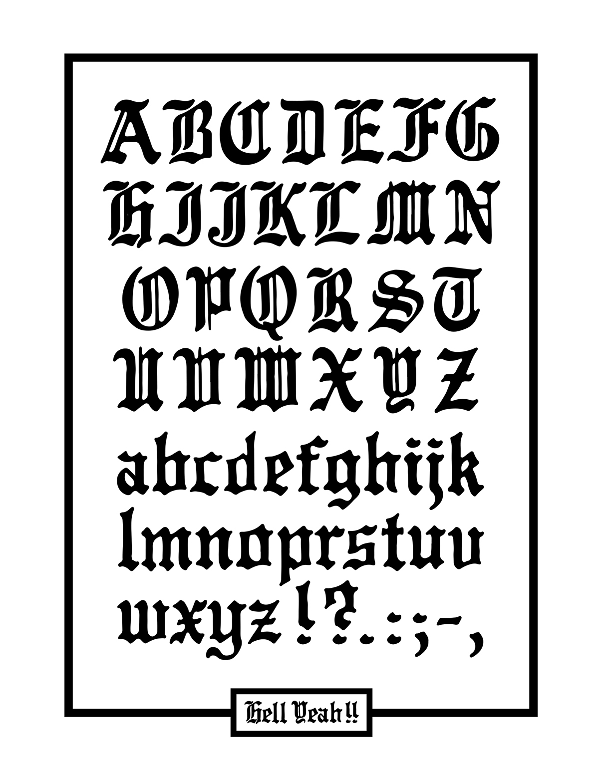
Open Sans sample.svgHelvetica - WikipediaFonseca Rounded Font - iFonts.xyzGaramond - WikipediaHELL - Gothic typeface by meka on Behance

Most Used Fonts

A Disappearing Art

The colors, typography, and everything that makes part of this iconic art has been part of the essence of Mexico City for the past century. Nevertheless, since they started as a fast solution for an increasing demand a hundred years ago, now the rótulos are slowly being replaced by more modern and refined options. The first graphic design school in Mexico opened in 1968, so the birth of graphic designers and the arrival of the digital impression, marked the beginning of the end. The rótulos business started declining and the people dedicated to this got adapted to these new changes or disappeared. This process of adaptation implied the end of the rotulismo art and its techniques. 

REVISTA ARTES DE MÉXICO | Rótulos, herencia visual en extinción - SinEmbargo MX

A rótulo with Woody Woodpecker that reads “fresh chicken” for a poultry shop

The Drawings 

Inspired by the Woody Woodpecker above, I want to share more of the drawings that sometimes make part of the rótulos. To me, they are hilarious if I think about how ironic they are, but I have also come to normalize them for how common they have been in my life. Is not only that sometimes they contain an animal killing another animal from the same species (as in the previous example), it is also the fact that these drawings are a lot of times bad copies of already existing cartoons. 

7 ideas de Rotulos mamalones | disenos de unas, carnitas, callejeros

Rótulo for a  establishment that sells a pork-meat based dish called “carnitas”

The example above is a low-key creepy drawing where three pigs are cooking the carnitas maker. The shades used here make the pigs look as if the only light they are receiving was coming from the fire, making them resemble evil witches with a cauldron. And yes, this is something that you could normally see painted on the wall of your favorite restaurant. 

Don Rótulos — Carnitas “El Gallo Giro” #rotulosCarnitas Y Huesitos. Michoacán - Posts | Facebook

Amazon.com: Looney Tunes Porky Pig Compact Pocket Purse Hand Cosmetic Makeup Mirror : Belleza y Cuidado Personal

Rótulos inspired by Porky from the Looney Tunes

These rótulos above with a smiley pig, are one of the most common within the carnitas industry. This smiley pig is a copy of Porky from the Looney-Tunes, and the most common version of this drawing is Porky smiling inside the saucepan where he is being cooked. Ironic and cruel. 

The Last Rótulo Maker

El último rotulista de la CDMX - Máspormás

Martín Hernández, known as “the last rótulo maker”

In a small shop in Mexico City’s downtown, specifically the number 58 on Perú Street, you can find Mr. Martín Hernández. This street was known for grouping a lot of rótulo makers. Today, Mr. Hernandez’s workshop is one of the few that are still working. 

ROTULISMO MEXICANO | cincontrol

“Tacos and Juices ‘Upside Down'”

He explained in an interview that there’s some psychology behind the rotulismo process. For example, specific colors would be used for the type of business they were doing it for. For a hair salon, they would use blue and red letters. For butcheries, they would use white walls and red letters because this color was associated with blood. He says that it is necessary to have a good sense of humor and that for some poultry shops he would draw some chickens riding a Ferris wheel. 

Rótulos Mexicanos

“Super Healing Juices”

Mr. Hernández also explains that before, the rótulos served for a bigger purpose since a big part of the population was illiterate and the drawings helped to interpret the message. 

Efforts to Preserve It  

Rótulos make part of Mexico City’s identity and recent history. They involve a style,  a kind of psychology of color, a specific sense of humor, and techniques that haven’t been registered in any kind of manual. All of this was transmitted from grandparents to their grandchildren and has evolved throughout time and it’s truly a shame that all these elements are getting lost with the decreasing use of this art. 

No hay ninguna descripción de la foto disponible.

Mexicana de Rotulación’s Facebook Profile Picture

In more recent years, groups like Mexicana de Rotulación have been trying to make an online archive for this art. They have created a series of videos where they interview rótulo makers who explain their techniques and an Instagram account where they immortalize rótulos that exist around the city. Museums and street art festivals are also trying to keep rótulos alive by dedicating exhibitions to them and giving spaces to rótulo makers. 

El MUCA Roma dedica exposición a los rótulos callejeros - Artes Proyecta

Exhibition at the MUCA (University’s Museum of Arts and Sciences) dedicated to rotulismo

It’s now up to us, millennials and gen-z’s to keep this art alive. To appreciate its value, beauty, and historical importance and keep doing efforts to use it, to continue giving it spaces, and make a register so it doesn’t die in nothingness.
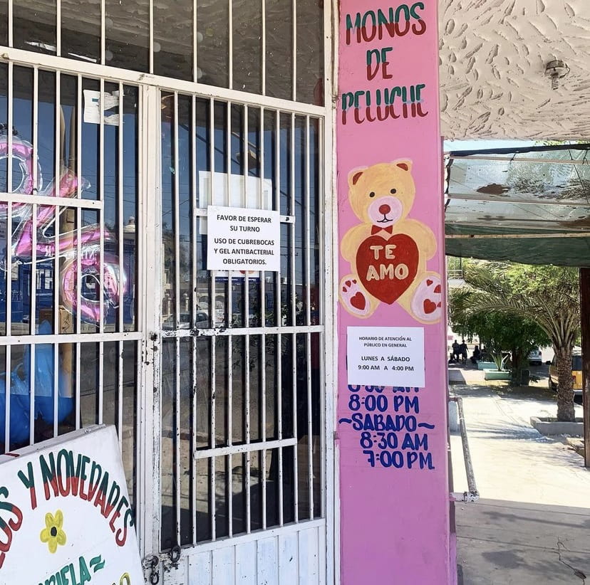
IG: @cafeinadulce

It made me smile opening my Instagram five minutes ago and seeing that an influencer that I follow posted the exterior of a stationery shop (here above) with some rotulismo work. The teddy bear reads: “I love you”.

By the way, local stationary shops in Mexico sell stuffed animals. 

References

Acuña, Carlos. “El último rotulista de la CDMX”. Más Por Más. 19 July 2018. https://www.maspormas.com/especiales/el-ultimo-rotulista-de-la-cdmx/ 

Cera, Diego.”Mexicana de Rotulación: el proyecto que rescata y registra la tradición del rótulo en la ciudad”. Local. 27 May 2019. https://local.mx/cultura/diseno/mexicana-de-rotulacion/

De Sal, Salomé.”La Gráfica Popular Mexicana: El Rótulo.” Tercera Vía. 16 April 2020. https://guanajuato.terceravia.mx/2020/04/la-grafica-popular-mexicana-el-rotulo/

MXCity.”La Fabulosa Historia De La Gráfica Popular Mexicana”. MXCity. https://mxcity.mx/2016/11/la-fabulosa-historia-la-grafica-popular-mexicana/ 

Vazquez, Martin Julio.”El rotulismo en México: tradición e identidad”. Domestic. 14 May 2019. https://www.domestika.org/es/blog/1975-el-rotulismo-en-mexico-tradicion-e-identidad 


Mexico 68 and the Designs That Never Left

Mexico 68 and the Designs That Never Left


Historical Background

In 1968, Mexico City was chosen to be the host city for the XIX Olympic Games in October. For Mexicans and people from all over the world, this event isn’t remembered for the superhuman abilities that the participant athletes showed during two weeks, nor for the joy that comes with a massive and international event like this one. Instead, if you mention “Mexico 68” the first thing that comes to the mind of thousands is the student massacre that took place just ten days before the opening ceremony. 

“Mexico 68, Year of Repression” 

In that year, social movements all over the world against the bureaucratic and military elites were erupting, like in the United States where people were protesting against the Vietnam War and participating in the Civil Rights Movement. Continuous protests started being organized in the capital of Mexico, and the government was nervous about the image of Mexico that was being distributed by the media just before the Olympics, especially since hundreds of journalists started arriving in the country during the months previous to the sports event. The image that the government, led by president Gustavo Díaz Ordaz, was trying to transmit was “peace and cordiality” which evidently wasn’t the case. 

Gustavo Díaz Ordaz greeting some athletes 

On October 2, 1968, over fifteen thousand people gathered at La Plaza de las Tres Culturas (Three Cultures Plaza) to protest peacefully asking to stop police brutality, among other things. Nonetheless, the government decided to send military forces. They opened fire without any warnings and shot indiscriminately at students, teachers, men, women, and children. The death toll was manipulated and hidden for years, but it’s said to be around 325 deaths. However, this event not only left scars but also, in a less evident way, it left some good things behind that until today are icons of Mexico City. One of these things is the visual identity developed for the Olympic Games that until today is present in Mexico City’s inhabitants’ daily lives. 


Lance Wyman: The Chosen One 

Lance Wyman in 1968

For the Olympic Games branding, Mexico organized an international competition to find a designer and Lance Wyman was the winner. Wyman, back then, was a 29-year-old designer born in New Jersey. He graduated with a degree in Industrial Design in 1960 from Pratt Institute in Brooklyn, New York. After that, he attended Yale for his graduate studies, where he met Paul Rand and became interested in logo design. 

Paul Rand’s logo design for IBM that someone presented in class during our second week of class (1981).

Lance Wyman first worked as a graphic designer for General Motors, and then, in 1962, he did the graphics for the 1962 USA Pavilion at the trade fair in Zagreb, Yugoslavia. The theme of the exhibition was “leisure time” and he designed a logo in the shape of an hourglass with a sun and moon image in the top half. The logo became a three-dimensional structure that was the gateway to the exhibit. 

Wyman’s Logotype for the US Pavilion 

Wyman went to Mexico City in 1966 for the Olympics graphic design competition with Peter Murdoch as his partner and about this he said that:  “It was the beginning of an adventure that has continued to influence my work and my life”. 


The Construction Process of “Mexico 68”

Mexico 68 Staff Uniform including the logo of “Mexico 68”

Wyman obtained inspiration by visiting the most famous museums in Mexico City, especially the museum of anthropology where numerous objects from the prehispanic cultures are preserved. From the pre-hispanic art he took the bold lines, geometric shapes, and the colorfulness he observed. To this, he added optical art he appreciated when he was in New York. 


Pre-Hispanic Art that inspired Wyman

His departing point for the logotype were the Olympic rings that he incorporated inside the number “68’ 

Then, he added the word “Mexico” next to the number. And finally, a pattern that follows the shapes of the letter and the numbers. 


The Rest of His Work

Weyman developed a whole typeface that was used everywhere in Mexico City to promote the games. From the names of the stadiums, to dresses, hats, and balloons. The typeface was there to indicate that something was associated with the sports event. 

Mexico 68’ Typeface and promotional products. 

In September 1968, Mexico City’s subway system was inaugurated and it also needed a branding.    To help the visitors move around the city, the branding team was also in charge of creating a navigation system organized by colors. The navigation system and the branding needed to be created in a way that was understandable for locals and for the thousands of tourists that were going to visit the city for the event. 

Color coded map of Mexico City with the main stadiums 

The STC (which is the system in charge of the metro in Mexico City) also wanted a logo and a representative icon for each metro station. The metro logo was designed by Wyman and the stations’ iconography was designed also by him and the Mexicans Arturo Quiñónez and Francisco Gallardo. 

Mexico City’s Metro Logotype

The three designers studied meticulously the history and what characterized the surrounding area of each one of the stations to come up with a representative symbol for them.  


Line 1 of Mexico City’s Metro System 

For example, in the picture above, the fifth station has a tree as an icon. This is because next to that metro station is “The Tree of The Sad Night” which is the tree where Hernan Cortés cried after he was defeated by the Aztecs. 

Conclusion

Mexico 68 is a wound in Mexico’s history, but it did me good to learn about these magnificent designs and the legacy they left behind. I grew up knowing that the nearest metro station to my house had a shrimp as an icon. I didn’t even know how to read, but I already knew how to use the metro (or sort of). In my personal opinion, Mexico City’s metro system is the easiest one to use compared to the one in NYC, Paris, and Dubai. No matter the language you speak or if you don’t know how to read. You can use the metro in Mexico City thanks to the power of graphic design. 

Camarones” (shrimps) Metro Station Icon

Consulted Websites

Wyman, Lance. “Lance Wyman” Webesteem Art & Design Magazine.  http://art.webesteem.pl/9/wyman_en.php. 2004. 

Wooldrage, Chloe. “Mexico Olympics 1968”. Medium. https://medium.com/fgd1-the-archive/mexico-olympics-1968-32fc8d7e0e45 17 October 2017. 

Redacción ADN 40. “Esta es la historia de los íconos de las estaciones del Metro CDMX”. ADN 40. https://www.adn40.mx/ciudad/metro-cdmx-iconos-estaciones-mva-especial 11 May 2021.


The Life and Legacy of the Chelsea FC Logo

Chelsea FC, a Premier League football club based in London, England, was founded in 1905 by Gus and Joesph Mears. After acquiring the Stamford Bridge athletics stadium, the pair decided they would form a football team to play in it. In their early stages of branding, they threw around names including “Stamford Bridge FC”, “Kensington FC”, and “London FC”. However, in the end they decided on now widely recognized “Chelsea FC”. It is interesting to contemplate how a branding decision like the selection of a different name could have affected the life of the club. For example, should the Mears chosen “London FC”, it comes with an even larger weight on the shoulders of the club, the staff, and the players to outshine the other clubs in the city (Fansided – The Pride of London). 

The next step in branding the team was deciding on a logo and official colors. After the club found its way to the top division in English football in 1907, the club presented it’s players celebratory badges in the shape of a lion, the symbol of the house of Lord Cadogan, the club’s president. However, this did not become the club’s inaugural logo. Rather, the circular crest seen below featured a Chelsea Pensioner (a former member of the British Army and a resident of a special retirement home in Chelsea (Chelsea Pensioner – Wikipedia)). This design lasted almost half a century before it was dramatically changed to a shield with a CFC letter mark/initial aberration (Per Mollerup 112 and 121). 

(Logo-World.net)

While the letter mark/initial aberration returns in the late 90s before disappearing again, it is still seen on today’s kit featured on the back neck of the top and the socks. 

(AmStadion and LittlewoodsIreland)

Included in these designs is the signature color, the royal Chelsea Blue. Today, these colors are still the official hues of the football club. 


Notice that the first three colors are rich jewel tones, suggesting the regality of the club (2115 C is only used to shade objects in 7687). In fact, Chelsea Blue became such a prominent part of the culture that the team’s nickname changed from “the Pensioners” to “the Blues”. This underlying theme of club royalty extends past just paints. Inspired by the symbol of the clubs first president previously mentioned, Lord Cadogan, the lion became a central fixture beginning in 1953. The lion symbol is often referred to as the “king of the jungle”. Thus, it could be inferred that the club’s use of the lion declares themself to be the king of the Premier League.

(Historicalkits.co)

The 1953 crest was the first to be included on the team’s jerseys. The rebranding was central to rid themselves of the “jokes about the Pensioners” (What is the Story Behind Chelsea’s Badge – Youtube). The presence of the lion remains through its current logo, although it bounced to an modified silhouette between 1986 – 2005. 


The below logos came as a great joy to the fans as they were not pleased with the reign of the ones above. So, for the club’s 100th anniversary it launched the new logo in time with an increase in spending on talented players and managers. The 2005 logo was announced the fall after they were crowned champions of the Premier League, for only the second time in the clubs history. Then, during their first season of playing under this crest, they won the Premier League for a second year in a row. Thus, this symbol became associated with an era of success and trophies for the team. 

(Logo-World.net)

In today’s logo we still see strong resemblance to that which debuted in 1953. The prominent lion is joined by a staff, footballs, and Tudor roses. These flowers represent England, and thus the crest demonstrates the “kingdom” of Chelsea FC to be of football and country. 


Sources: 

Marks of Excellence, Per Mollerup

https://www.pantone.com

http://www.historicalkits.co.uk/Chelsea/Chelsea.htm

https://logos-world.net/chelsea-logo/

https://theprideoflondon.com/history-chelsea-football-club/

https://www.worldfootball.net/winner/eng-premier-league/