Petition for NYUAD flags to be planted

Our understanding of the world is built on abstractions. Complex systems are understood and stored in our minds as abstractions. It is impossible to understand anything in its entirety. Learning is really the continual act of unmasking abstractions to see what lays underneath  — there is no end to it. When we remember something, we are just recalling the abstractions of this ~something we have stored in our heads.

For the average person, the understanding of a computer, for example, is really limited to what we interact with and have abstracted away. I study computer science and have no clue what happens down at the hardware transistor level. People’s identities are similarly configured in our brains in the form of some abstractions — be it words, their face, actions, scent etc. When I say the word Mariët, something about the vice chancellor will come to your mind, some abstraction of our vice chancellor that you have stored in your head. I say all of this to explain my response to a question that was posed in our Yes Logo  class a while ago.

Why are we taking this class? Why learn about logos? Why attempt to master branding?

What we are really learning is the art of building great abstractions. The hardware layer of a computer has been abstracted away for me by smarter people that converted it into code I can understand. [In fact, I don’t actually understand this first level ‘binary’ code and rather understand, again, an abstraction on top of that in some programming language.] The phrase ‘a picture tells a thousand words’ is a cliche by now but it speaks to the same notion. By branding, we’re narrowing down a company/product to an abstraction that is easy to grasp.

When we discuss branding, our audience by default is some end user, perhaps a customer, whom we are trying to communicate an abstraction to. But we’re leaving out one common and often overlooked target audience. The people behind the company/product/service/movement brand itself! A brand is one layer above the cause that brought people together. Given that it’s a higher level abstraction, a brand’s ability to communicate the cause is as strong. A great brand is perhaps one of the greatest community building tools we have at our disposal.

Flags. What is a flag but a waving logo? We talk of branding and its utility in representing ourselves outwards. A flag is possibly the best manifestation of how that same energy stands if redirected inwards.

La Liberté guidant le peuple (English: Liberty Leading the People) is a painting by Eugène Delacroix commemorating the July Revolution of 1830, which toppled King Charles X of France. You’ve probably seen this painting a lot. A woman leads a group of people forward over a barricade and the bodies of the fallen, holding the flag of the French Revolution – the tricolour, which later became France’s national flag. [1] What is the most prominent thing in this picture? I couldn’t remember the name of this painting when writing this and I had to Google *Revolution Flag Painting*, that’s all it took. The flag is powerful, symbolic. You feel the force of the revolution through the woman pushing forward with the flag. The flag represents belonging, pride.
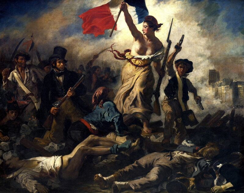
La Liberté guidant le peuple (Liberty Leading the People), 1830 | Oil on canvas | artsy.net 

What’s great about flags in particular is that if we try to judge them with the typical metrics of a great logo (i.e. how well they represent a brand to outsiders) they likely fall short. Viewed from within the country they are trying to represent however, they are perhaps the best logo mankind has yet produced.

FAQ: Why flags and not any other branding medium?

      • Yes exactly, that’s the point. Build a metal torch with fake fire and have it lit the whole year round on both sides of the entrance. A brand typically expresses itself through its logo, typeface, color scheme etc. Interesting forms of expression come out when we pay attention to how we can use it *inward*.

Goes without saying that so much of *inward* expression is also *outward* expression: a flag waving denotes territory to the outsider as much as it signifies home to the insider.

P.S. Please don’t make me write an essay on why the NYUAD flag should not be accompanied by any country’s flags.
 

The birth of a great logo

What is the mark of a great logo? Given that I posed this question while taking a logo design class, let me rephrase this question by asking, how does one make a great logo? 

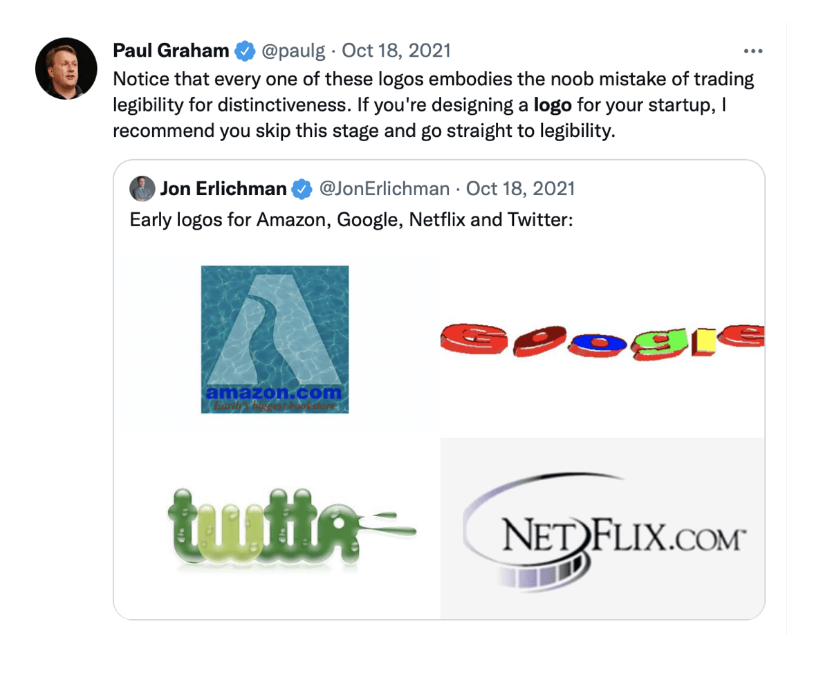
A while back, I came across a tweet by Paul Graham where he remarks on the early logos of Amazon, Google, Twitter, and Netflix. He writes: “Notice that every one of these logos embodies the noob mistake of trading legibility for distinctiveness…”

This remark aligns with what I’ve been thinking about: the mark of a great logo is not the logo itself, but mostly the product/company behind it. (spoiler alert: I changed my mind a bit) I strongly think what makes the Apple logo great is not the logo itself but the great product behind it.  

Let’s think of a great product/company but a bland, boring logo. First example that comes to mind is Berkshire Hathaway. Berkshire Hathaway is an American holding company known for its control and leadership by Warren Buffet, who serves as chairman and chief executive. Buffet is a legend in the business and investing world with Berkshire Hathway averaging a more than 20% consistent return for decades. 

Image credit: Berkshire Hathaway Inc.

[Okay small big caveat, maybe Berkshire Hathaway is a great logo! I’m investing my dear dollars hoping to get a risk-free return on my investment. I’m looking for a boring process that takes in my money and churns back out more money. Nothing fancy – I don’t want to worry about my investment. Shiny logo says volatility. I think startups. I think risk. I don’t want my money anywhere near risk. So then, there is likely merit in Buffet’s boring, bland logo choice. Take a look at the firm’s website, straight out of web 1.0.]

Let’s do the opposite and think of a great logo but a terrible product/company. I’m blanking. 

Since starting to write this blog post, I’ve changed my mind on what it takes to produce a great logo. Nike had a great product; but so did dozens of other companies. Nike stood out by building a brand empowered by the swish. In this case, the great logo is the product. In a sea of similar products/services, these logos help the one item standout. 

To an extent, it seems one could get away with a mediocre logo if they are producing a sufficiently unique product or service. The company selling the first preventative cancer medication doesn’t need to think much about its logo. The new athletic wear startup popping up on my twitter feed on the other hand needs to have an equally great logo/brand to stand out. 

A parallel question I was asking myself is: does a great logo (and think of super great top 10 logo ever here) have to be popular? The intuitive answer is yes, of course. All the great logos that come to mind are so ingrained in our heads, we would recognize them in a flash.

Image credit: Bored Panda

I argue that a great logo does not have to be popular. Our first criterion for a great logo from earlier is that it has to be behind (infront?) of a great product. But, there are supposedly great products we have around us but we don’t know the brands of. Even on the NYUAD campus: the faucets, door handles, etc are great products as evidenced by how well they are surviving student abuse. They also have the manufacturer’s logo on them but we barely pay attention to it, if any. The logos of these products are far from popular.    

But I think they are still great logos. We are perhaps making a mistake by the way we are decoupling the brand of a company and its product. I am not the target user of the water faucet per se, the purchasing manager at NYUAD is. They are the ones who have a say in what product to purchase. I see this with one of my family friends who is a contractor. He would come over to visit and recognize random brands from the house (ceramics, water heater, door handles etc.) In fact I still remember the logo of a (supposedly) great door lock brand (KALE), after being tasked with changing the lock of a few doors in my parent’s house. These logos help a great product stand out and be recognizable. They are popular in their target audience. Hence a great logo is not the logo known by the most people in the world, it’s the one known by most of the people it’s trying to reach.