A Beauty Salon Makeover

By Rania Sakhi 

A new beauty salon, NY Ladies Beauty Lounge, has recently opened its doors on campus.

In beauty and hairdressing, first impressions matter the most and I have to say that I am not a big fan of the salon’s logo nor its exterior facade design. In this last blog post, I will redesign their logo and walk you through the process.

People frequently believe that a good logo is one that conveys a lot about the brand or is simply attractive. I once had the same belief but after taking many design classes and watching Sagi Haviv’s interview with The Futur, I now have a better understanding of what makes a logo great and iconic. For more context, Sagi Haviv is a very well-known graphic designer and partner in the design firm Chermayeff & Geismar & Haviv and has designed some of the most iconic logos in the world such as Chase, Mobil, PBS, Showtime, and National Geographic, just to name a few. According to him, three fundamental design principles need to be present for a logo to be great: 

1. It should be appropriate or relevant to the client and industry in feeling, form, and concept but doesn’t necessarily need to say a whole lot. In the case of NY’s beauty lounge and since the salon is located in Saadiyat Island at NYU Abu Dhabi, it should be elegant and close to NYU’s brand system. While the logo might seem elegant to some, their exterior shop design is just not it being too bold, crowded, and dynamic. Plus, it doesn’t really match NYUAD’s aesthetic. 
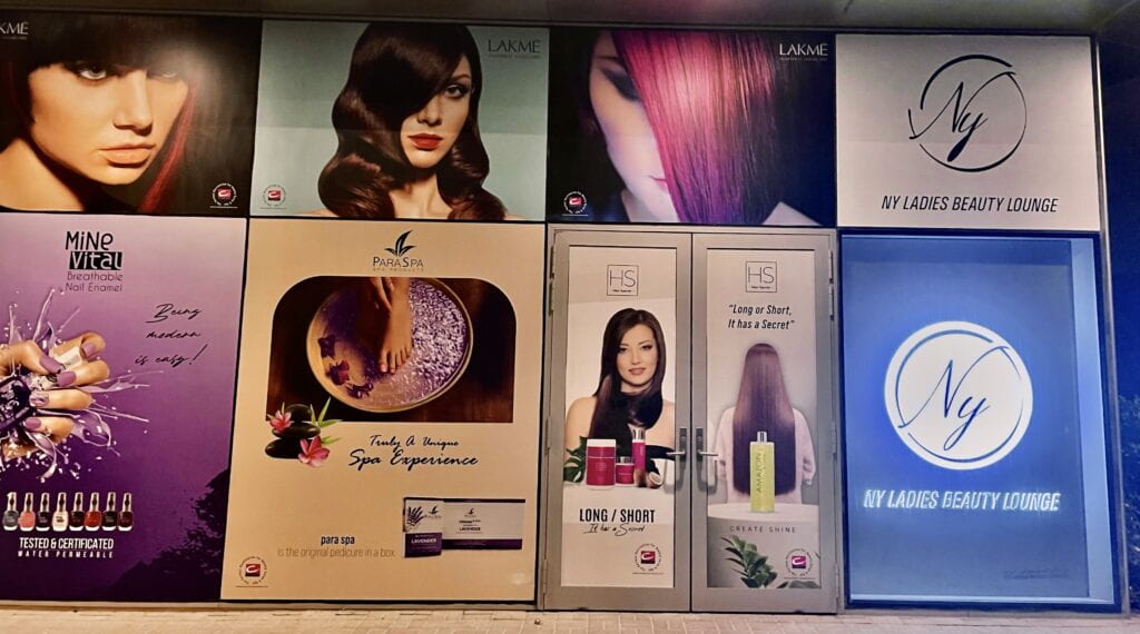
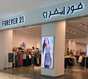
NY Ladies Beauty Lounge, Saadiyat Island.

2. It needs to be simple or uncomplicated in form so it can work effectively and flexibly in a wide range of sizes and media. 

3. It needs to be memorable or distinctive enough to be easily remembered. In my opinion, this is the main principle that the NY logo is missing. It looks like any other salon logo you can find online. 

These three criteria are the questions I asked myself when I thought about redesigning NY’s logo since it is not only the centerpiece of all brand communication but also the reflection of the character, personality, and values of the salon. 

As the first step in my re-design process, I started with research. I mainly looked at how other competitors in the same area are presenting and marketing themselves. NY’s main competitors are: 

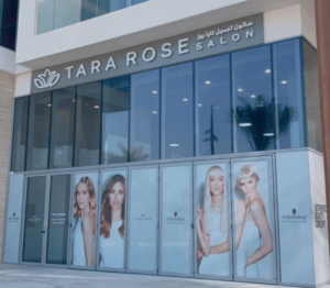
  • Tara Rose Hair and Beauty Salon 


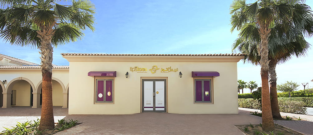
  • Tips and Toes 

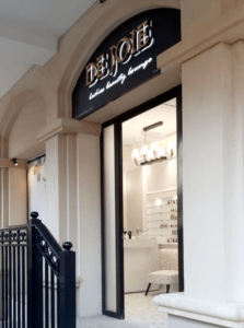
  • De Joie Beauty Lounge 


  • Ivy Beauty & Bubbles


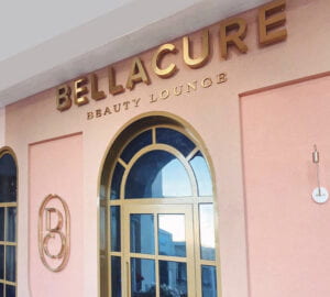
  • Bellacure Beauty Lounge 


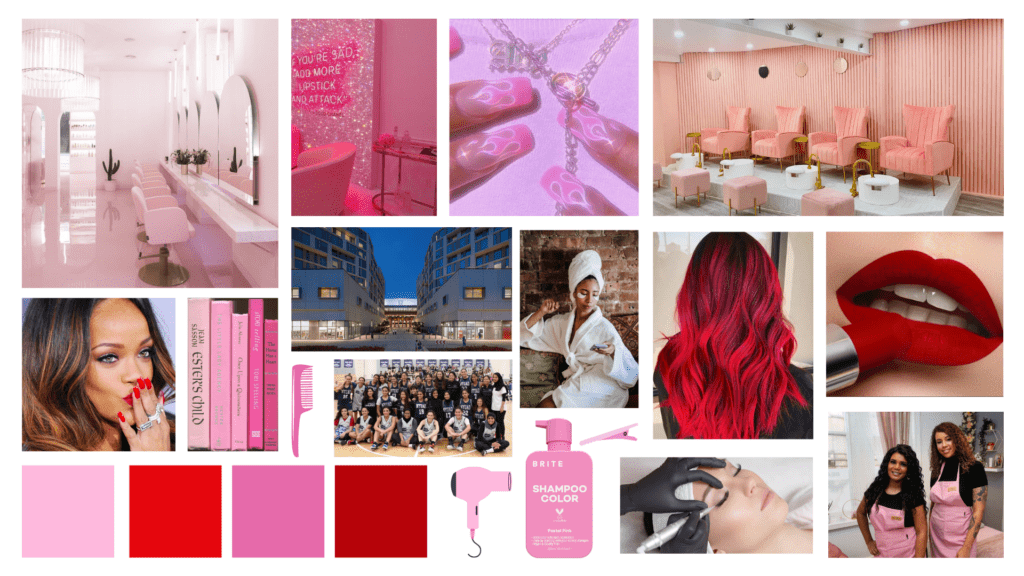
After the research, I tried to understand what can work and most importantly how I can differentiate NY Ladies Beauty Lounge from its competitors. I then started brainstorming ideas and created a clear mood board that is basically a collection of visuals that capture the salon’s essence and personality and customers, or perhaps how I would visualize it myself if I had to design their brand identity. 
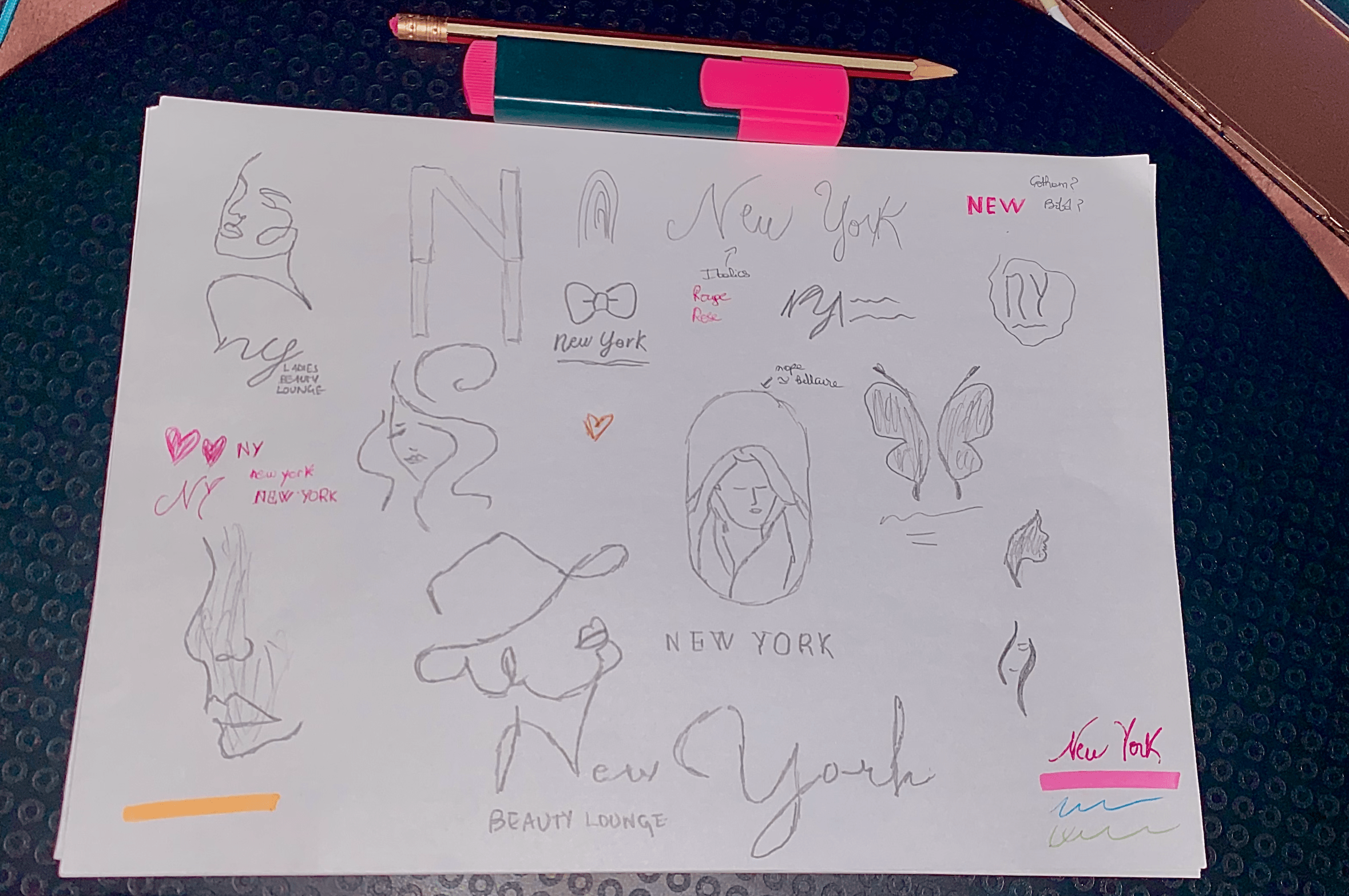
When it comes to sketching, I started drawing symbols and anything that came into my mind by hand.
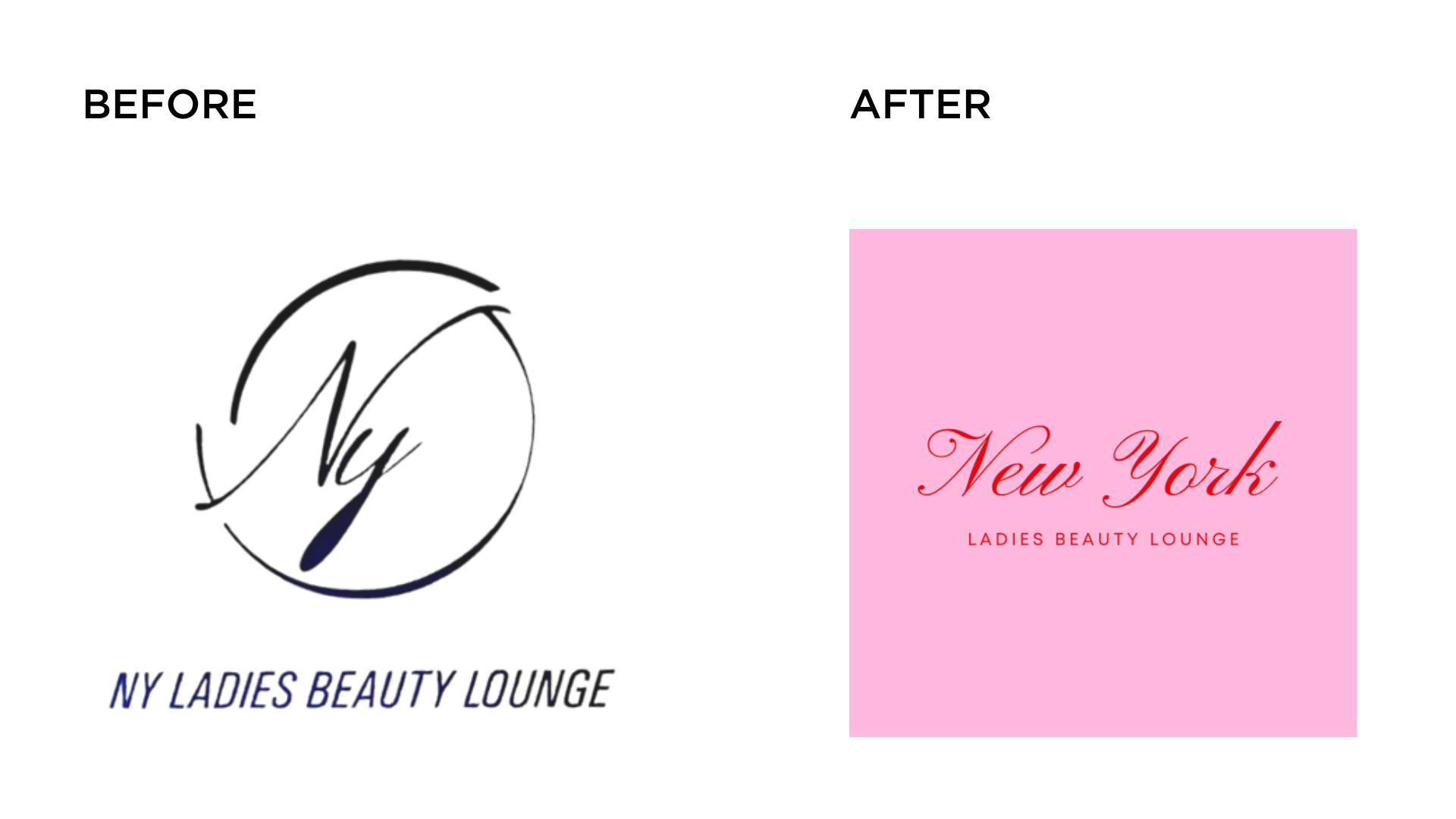
When the idea became clearer to me, I quickly switched to Illustrator and decided to simply go with a luxurious and distinctive typographic treatment of the salon’s name: NY or New York. I tested different colors, fonts, spacing, alignment, and so on and kept pink and red as my final color palette. For the font, I chose Pinyon Script that I found after 3 days of deep research. Finally, this is what I came up with. 
And here are the logo’s variations. 

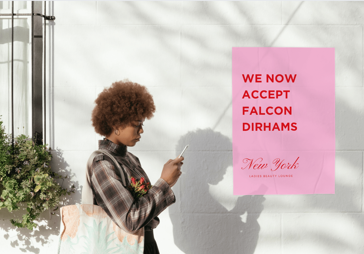
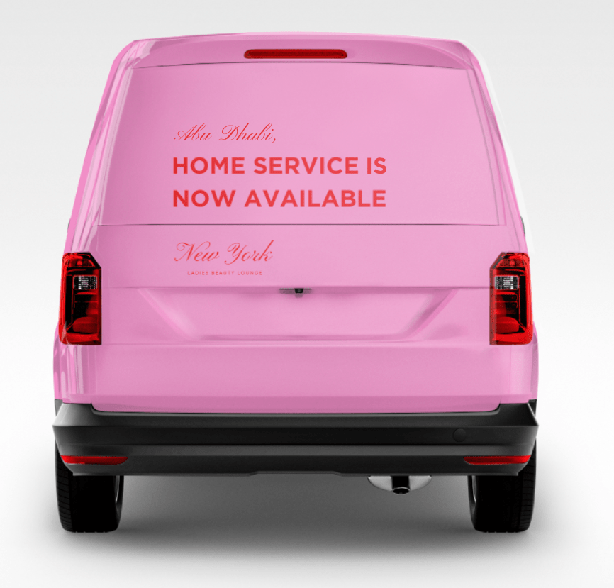
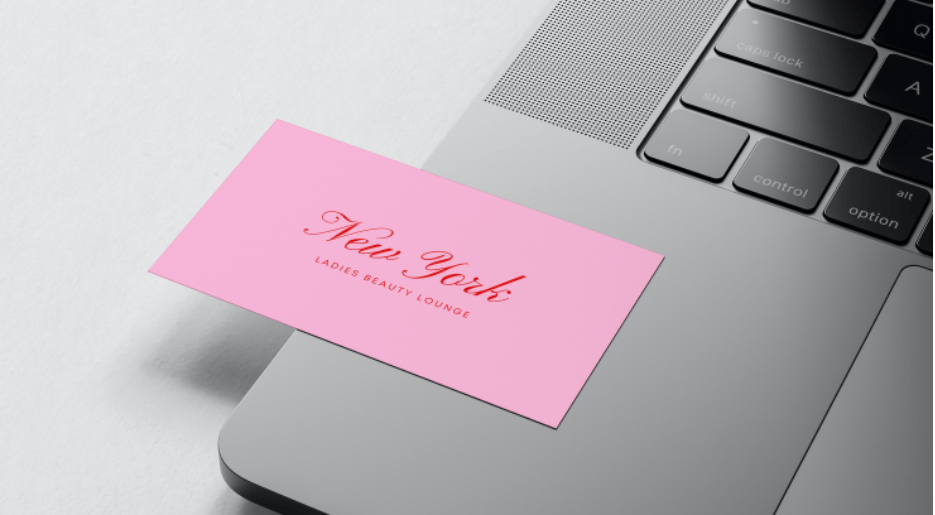
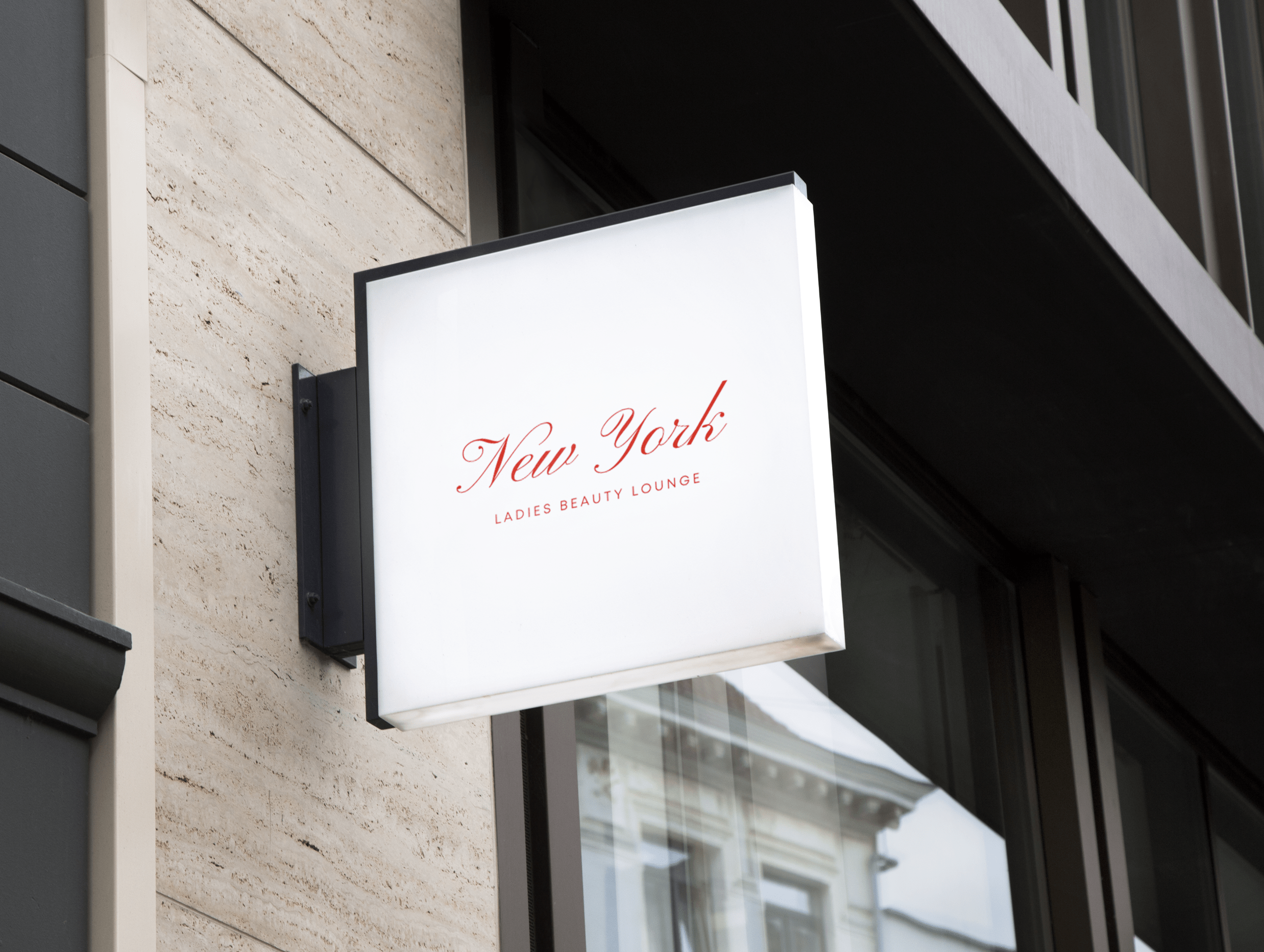
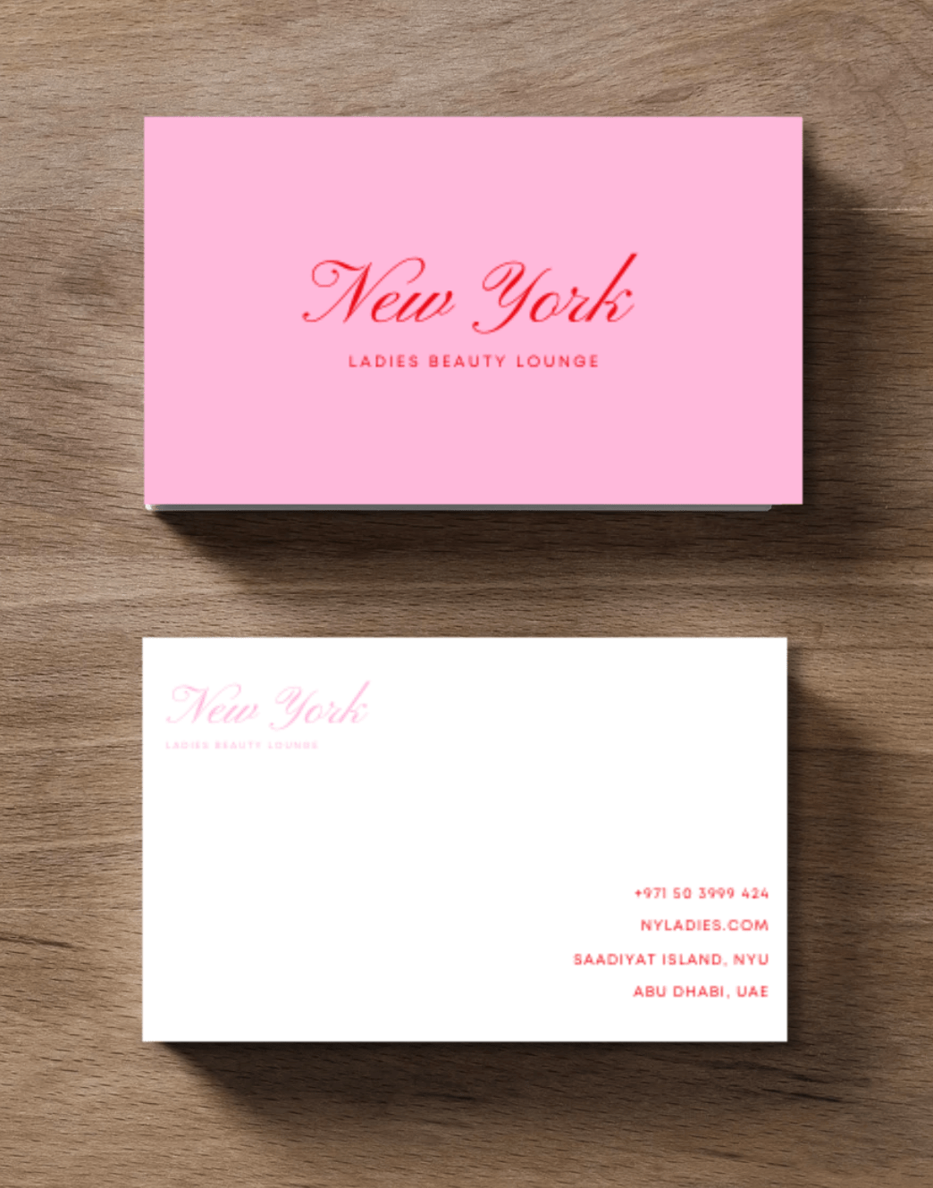
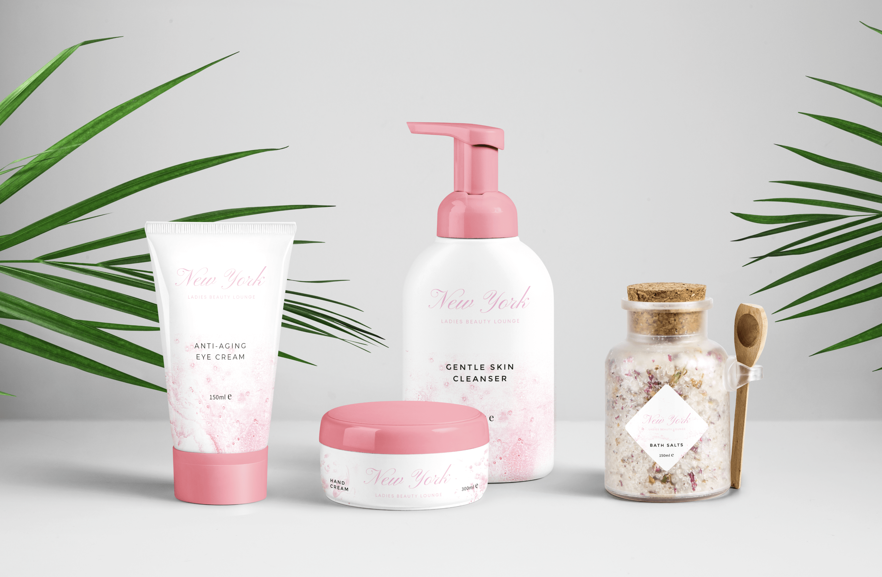
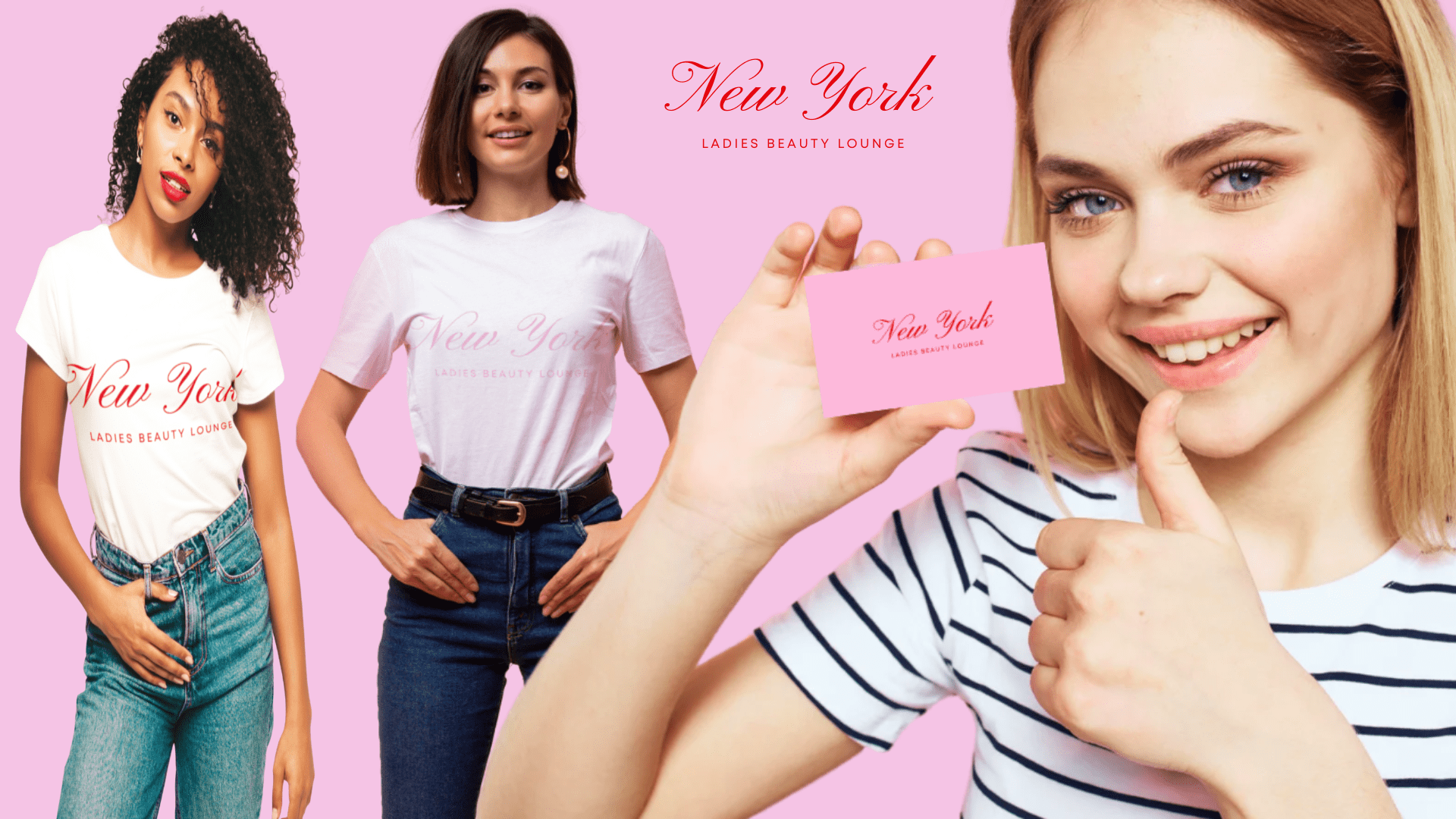
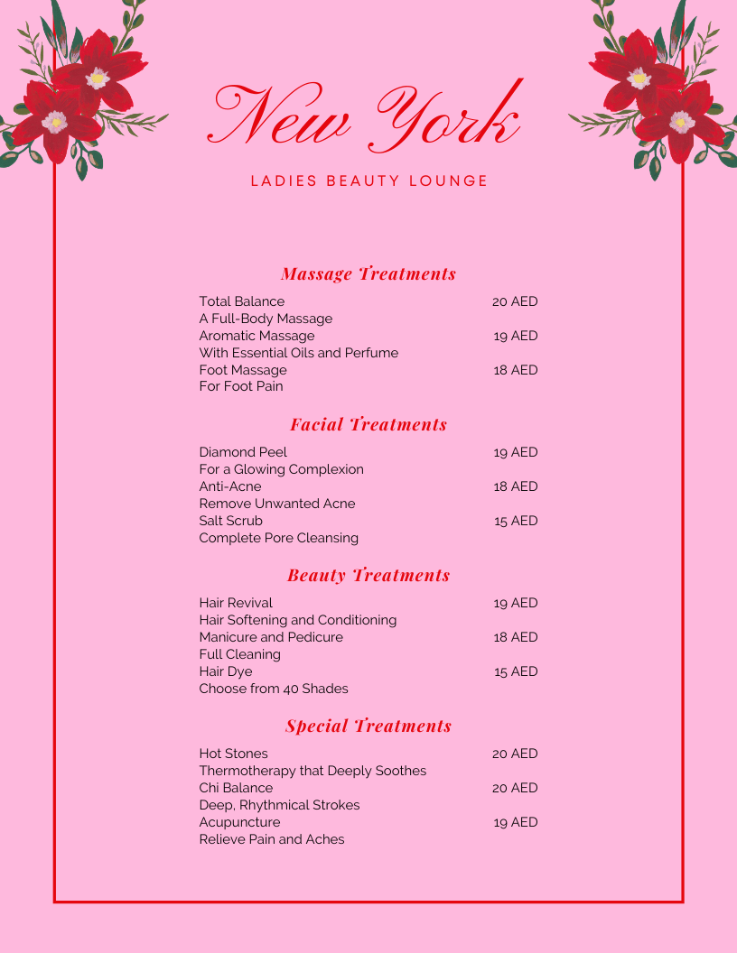
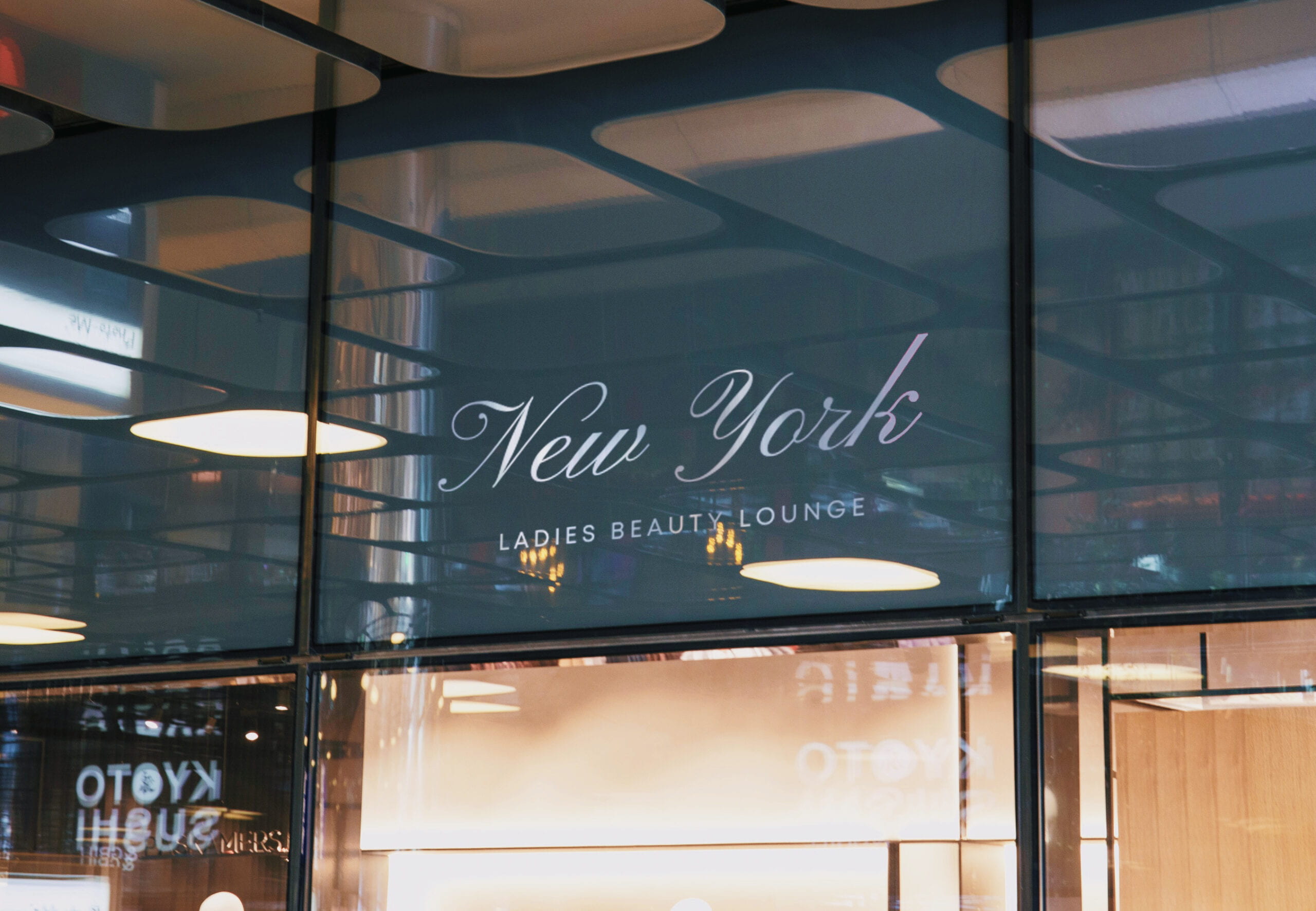
Once the design was done, I wanted to test the viability of the logo concept by creating mockups on Photoshop relevant to the beauty salon to see how it will work in real life. For this, I chose to work on a business card, a brochure, a shop facade, a hanging poster and wall sign, a home service car, a cosmetics packaging, a mug and T-shirts for staff. 


Overall, as much as I enjoyed working on this little redesign, I strongly believe that great logos do not happen by accident. They are the result of strategic thinking, exploring, failing and designing again. Furthermore, each aspect of a logo, whether it is font, shape or colors influence people’s perception of the brand. In this blog post, I specifically focused on NY’s ladies beauty lounge. However, there are so many other logos out there that I think need a redesign. When a logo is too generic or too complicated, it is usually bad. Thus, the main rule that applies to all industries is that a strong logo design must be able to adapt in order to ensure a business can keep its best face forward as all manner of change inevitably takes place not only in the world of design but in society too.
No Copy-Paste, please !

By Rania Sakhi

This blog post’s topic is something we have been deeply discussing with my lovely teammates, Olivia and Soojin, when working on our logo proposals to make sure that we don’t fall into it. As a first step in understanding the project briefs, we started the creative process by researching and collecting visual references. Now once the work was done, with all the inspiration gathered in front of our eyes, we were blocked, for fear of falling into plagiarism. This is because, sometimes, the distinction between inspiration and plagiarism can be subtle. 

Hence, in this post, I want to draw the distinction between these two key concepts. 

According to the Merriam-Webster online dictionary, plagiarism is the infringement of the intellectual property of others (1). It usually occurs when people present a creation as their own when it is not. It is very simple: if I steal or copy someone else’s work and intentionally appropriate it to myself, I am committing plagiarism, and that is reprehensible. Plagiarism can take any form, but in the context of graphic design and our class Yes Logo, it is specifically about visual plagiarism whether it is drawing, painting, sculpture, photography, advertisements, logos, brand names, or any other visual imagery (2).

Inspiration on the other hand is a creative process that is both unconscious and natural. I believe that getting inspired by a work does not necessarily mean plagiarizing it as long as it is not a pure copy-paste of it. Inspiration is truly in human nature, whether we like it or not. After all, when thinking deeply about it, learning is nothing but copying.

Now while some instances of plagiarism are obvious, intentional, and indefensible, others are simply impossible to accuse since they are either riding on a popular trend or simply using a tried-and-true formula. This is especially important since a creator might easily “copy” unintentionally and without even realizing it by stealing ideas he believed were his but had seen someplace else, possibly years earlier.

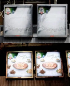
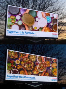
One less obvious example is these two billboard advertisements that ran during the Ramadan season. The plates on the billboards seem empty throughout the day. When the sun goes down, the supper eaten by Muslims at the end of each day’s fast appears magically. It is the same innovative concept but the main difference here is that the second and most recent one is a digital billboard, whereas the first was created using special ink. 

THE CREATIVE                                      Isla Délice “Ramadan” – 2014        Eurobest Finalist, EFFIE Awards SILVER  Agency : Hérézie, Paris (France)
THE LESS CREATIVE
Tesco “Together this Ramadan”–2022
Agency: BBH London (United Kingdom)


Do you think this is a coincidence or a copy-paste? To me, it is a scary lookalike, to say the least.

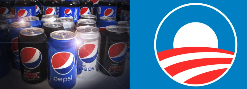
An example that is too obvious is Pepsi’s logo and Obama’s campaign in 2008 which look very similar in terms of colors, shape, and design in a certain kind of way. Red, white and blue became Pepsi’s colors during World War 2, to show support for America. Yay. And the round shape, well that’s unchanged. It’s the design within the circle that’s an issue, seemingly. And, the sense I got was that Pepsi maybe wanted to follow this design approach to perhaps sell more sodas. 

Logo: Pepsi’s or Obama’s ?

When asked about the company’s position on the whole logo situation, Frank Cooper, Pepsi’s portfolio brands VP, shared that optimism, change, and hope are all part of the Pepsi mantra. Thus the resemblance between the logos (3). But at the end of the day, the happy coincidence might appear to be acceptable because Pepsi did admit that they share the same optimism as Obama. Yet, is there anything really wrong with that other than a lack of originality?

To put it in a nutshell, it is certainly feasible to be inspired without plagiarizing, as long as you agree that recycling an existing concept is not always plagiarism. The creator’s method is thus centered on recycling and mixing existing pieces to create something new, spotlighting an underutilized notion that is open to human evaluation and appropriate reinterpretation. Finally, inspiration is the approximate reworking of an idea, concept, or substance that we have reinterpreted in our own unique way. Sometimes, it is quite difficult to determine who even initiated something. Even if you do identify the source, how do you know they themselves weren’t influenced by something they were unaware of? Maybe they’re just concealing their source too which swiftly devolves us into a chicken-egg discussion. 

Now, what are your thoughts on this? Is anything original and creative anymore? I would love to hear your opinions on the topic of inspiration/plagiarism. 

References: 

  1. https://www.plagiarism.org/article/what-is-plagiarism 
  2. https://guides.library.msstate.edu/visualplagiarism#:~:text=Visual%20Plagiarism%20can%20also%20be,claiming%20it%20as%20one’s%20own.
  3. https://news.yahoo.com/it-looked-like-the-pepsi-logo-obama-was-initially-skeptical-of-campaign-symbol-205758742.html