Every time I plug my laptop into a socket in the UAE, I am pleasantly reminded that I do not need to use an adapter. That is because when I do, it is always annoying – not just the fact of using one, but how most of my plugs are too big to go into an extension cable next to each other and I always need to leave an empty socket between two that I am using because a part of the plug covers the neighbouring one.

This was a random thought, but it made me think of examples of bad design in our daily lives that we don’t necessarily think about because we are so used to it.
- Toothpaste tubes

In terms of marketing, the tube gets more visually unappealing the more product is used. It is also harder to get to the remaining product. And yet, toothpaste has always come in tubes. It seems to be the case that this just works – manufacturers are aware that there will be product wastage no matter what packaging the toothpaste is in and that toothpaste is kind of a necessity so they don’t particularly care what the tube looks like in your bathroom after you have purchased it. However, an additional point here that never made sense to me is why does toothpaste come in a cardboard box if it is already held in a tube? This seems a little like if shampoo bottles come in cardboard boxes too and yet they do not, so why? It seems like the only answer I found is just that the aligned cardboard boxes are easier to put and make look good on a shelf and also easier to transport since they are the same size, but honestly, that just seems incredibly silly.
After thinking about this one, I started more consciously looking around for examples of bad design. I am aware of some very obvious ones that the Professor pointed out in this class and in the previous class that I took with him, but I wanted to see if I can encounter some without diverging from my normal routine. And that’s how I found
2. This light switch at my friend’s apartment

It doesn’t look like too big of a deal, until you actually go into the bathroom and instead of hitting the lights on autopilot as you want in, you hit the mirror. I have done it every time I was over at her place and when I expressed my frustrations, she told me that she still does it after nearly 10 months of living there. It seems like a very small thing – the mirror is narrow and the switch is not too far away, but it makes a big difference in the user experience. If already made this close, why not make it just a little bit closer?
3. This giant empty space (with a window) at the end of the hallway in A1B.
At first, I thought the hallway curved because there was a lounge or an emergency exit staircase down that way but there wasn’t. The hallway just opens up into a nice open space the size of a room that is completely useless. While I was standing there and thinking about it, a girl who lives right next to it started a conversation with me and because I brought up this empty space, she told me that her room is so tiny that she and her roommate have to share a closet normally meant for one person…. while all this empty space just exists on the other side of the wall and could have been built to be a part of their room. Make it make sense.
Now, before anyone says that I am getting lost in wayfinding territory or that this has more to do with architecture, the ideas behind wayfinding, architecture and also logo design are very closely related – it could be said to be the ability to utilize space (physical space or space on a paper when talking about logo design) in the most efficient way possible. It is knowing how to make something both aesthetic and functional. The bad design could at best be funny or embarrassing, but at worst it could be dangerous like:
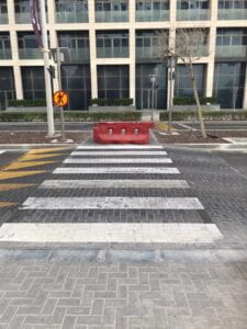
4) This pedestrian crossing.

Look, I am sure that there is a perfectly reasonable explanation for it. I just don’t know what it is.
Perhaps the consequences of bad logo design aren’t as bad as the consequences of bad wayfinding, spatial or user experience design (unless it is what makes your company go bankrupt, then it is also bad bad). A famous example of a “bad” logo is the 2012 London Summer Olympics logo:

While some people claimed that it looks too much like a distorted swastika and others said that it spells out “Zion”, others went as far as saying that it looks like the Simpsons performing lewd acts. I bring this up because one might not necessarily see something in an image and once you are told to look for something it is hard to unsee it however far off the comparison might be, and this means that when it comes to logos and branding “bad design” is somewhat subjected to taste unlike in some other forms of design where “bad design” is blatantly obvious (like say, conflicting signage). We get better at spotting bad design the more we know and look around at things, and the more we know the easier it becomes to spot bad design in our everyday lives. I think that spotting bad design is one of the best methods of improving our own designs – a very good way of improving is learning what not to do.
EDIT: Fixed the typos that Megan pointed out!


