How to Sell a Story

As if Friday the thirteenth wasn’t already an ominous day enough, we have our final presentation this Friday, May 13, 2022. We have had a little bit of practice in  presenting our ideas before Erin in class, but now it is the real deal. Therefore, in preparation for this event, I’d like to focus this blog post on the most important part: selling the story. 
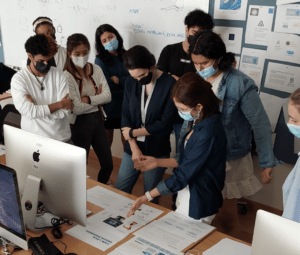
Why should we go about telling a story for the presentation? Stories are what bring people together. Just think of the news, the movies, or a really good series (book or tv) – these different storytelling forms are what bring people from all different backgrounds and give them something in common to discuss. Stories don’t necessarily have to be shared in such a formal medium, but can simply can be when you recount to your friend what happened to you the other day. We should bring this notion of storytelling into our presentation so that we engage with our audience members and speak to them in a manner that makes sense to them. 

Hence, it is important to know who we are presenting to and what they wish to take away from this presentation–a logo that best conveys their center and its goals. Unless an individual has a design background, they may not follow our train of thought should we speak of only design techniques and decisions. For example, if we were to show and explain why we choose a specific line thickness because it is more aesthetically pleasing, our audience members might not understand or simply care about this seemingly minute detail. Instead we should cater to how the target audience of the logo will receive this certain design decision. As in, this thicker, bold-like line thickness conveys elegance and trust. 
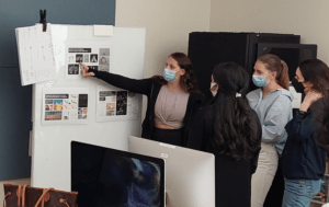

Remember how we had to rush the last couple of groups when we went around the class presenting our design concepts to Erin? If we lingered on every single detail and choice made in each of the nine logos we have designed, the Friday 13th presentation will take a very long time. And so, it is best to keep our pitches, at the end of the day, short, clear, and succinct. We should share the story behind the production of the design and how it addresses our client’s needs. By explaining these points, we will show them more about the process and how the final product works, in addition to how the logo engages certain emotions and responses in viewers.

The renderings which we will be finishing up this week are very critical as they show our audience members what success will look like as a result of using our product. It can even be a moment to put them into the picture itself so-to-speak and make them engage with the logo if there were perhaps to be a photo of the director in a meeting room with fellow colleagues and they have mugs, bags, or papers that have our design on them. This would force them to connect with our work and relate to it, making the connection that they need it in their lives.
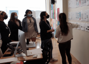
Most importantly, we need to be confident when telling our stories. We should use strong and definitive phrases like “it will” rather than “hopefully” or “the goal is…”. If you’re someone who gets anxious when speaking to large groups of people, it helps to think of giving a presentation as putting on another persona or act, to either show off an exuberant or charming personality, or seem calm and dignified. Another useful tip is to dress the part! By putting on formal attire, this sometimes helps you get into the mood and feeling of professionalism, and overall confidence because you are so well put together.

Having a story that is true, or as close to the truth as possible, also helps a speaker recollect their spiel and believe in it. It will come naturally. To speak from the heart and not the head as in robotic recitation of a speech means a lot more to an audience member. You create more of a connection when you tell them a story. By exhibiting that we understand their center, their research, brand, and position, we show them that we have conveyed who they are, their story, in our design.


References:

https://www.inc.com/charles-edge/how-to-pitch-your-product-in-6-easy-steps.html

https://www.superoffice.com/blog/sales-pitch/

https://blog.hubspot.com/sales/sales-pitch-examples

How Graphic Designers Tell Stories With Design


Photo Credits to Professor Goffredo Puccetti


Connecting the Centers

I have been mulling over what Professor Goffredo has mentioned as a passing comment on multiple occasions in class about us possibly creating a collective visual identity amongst the research centers here at NYUAD. At the moment, they are all quite distinct and that is what makes them feel disparate from one another. 

al Mawrid Arab Center for the Study of Art

Center for Astro, Particle, and Planetary Physics

Center for Behavioral Institutional Design (C-BID)

Center for Cyber Security

Center for Genomics and Systems Biology

Center for Global Sea Level Change

Center for Interacting Urban Networks

Center for Prototype Climate Modeling

Center for Space Science

Center for Stability, Instability, and Turbulence

Global TIES for Children(no official logo)  Public Health Research Center(no official logo)
Water Research Center

Library of Arabic Literature

Neuroscience of Language Lab(no official logo) Humanities Research Fellowships for the Study of the Arab World(no official logo)
Center for Quantum and Topological Systems(no official logo) Arabian Center for Climate and Environmental ScienceS (ACCESS)(official logo in the making)
Center for Artificial Intelligence and Robotics(official logo in the making) Center for Smart Engineering Materials(official logo in the making)

Before tackling how we could possibly unite the unique images of these centers, I would first like to bring into the discussion other collections of logos that fall under a single overarching label and analyze how they are brought together. 

As a university student, I often turn to–what is now called–Google Workspace for my general note taking with Google Drive and email on Gmail. It struck me one day in Design class when I was going to Google Drive that Google has put forward icons that all are in conversation with one another in the last couple of years. They have achieved this by using a main motif of four colors for their icons: green, yellow, blue, and white (exception with Google Forms in purple). In addition to this distinctly Google color palette, the icons include round corners that look like folded edges of paper, but all have their own individual shape and image. When this new design was pushed forward in late 2020, there was a bit of backlash. One individual commented that, “Google sees uniformity. I see confusion.” With all the icons looking quite similar, it is difficult to recognize the individual apps solely based on their shapes. Color made it easier to identify an app at first glance rather than their shapes. (Take a look at their promotion video for the new design here: https://www.youtube.com/watch?v=uZXa0N0-Zu0&t=33s)

Another platform that has a collection of subcategories is Adobe. Unlike Google Workspace though, the Adobe Cloud kept their iconography simple with the use of two letter abbreviations in a vibrant color atop a darker shade from the same hue scheme. It seems that the purple shaded icons are for the apps that have to do with motion graphics and film while blue is for editing photos and pink for developing websites and other shared user experiences. The greens deal with 3D materials, stage and renderings. Orange for illustration and red for productive collaboration. In all honesty, it’s a lot. There are so many different programs that it is hard for even professionals to know what each icon and program is used for. It reminds me a lot of the periodic table which I found tricky to use in Chemistry until I got the hang of some of the elements since I used them so often. I feel like this applies to all the programs that Adobe has to offer. Despite having variations in color, it is difficult for a user to distinguish what each application is used for because there is no visual cue other than the combination of letters on the square tiles to distinguish them from each other. 

Personally, if it’s not already obvious enough, I prefer the approach that Google Workspace has taken with creating a collective visual identity amongst their different programs. Now, looking at our Research Institute Centers here at NYUAD, I believe that we could have all of the logos be either square or circular emblems with a simple signature design that plays on negative space and corresponds to the center’s purpose. An excellent model of this is The Center for Astro, Particle, and Planetary Physics. 


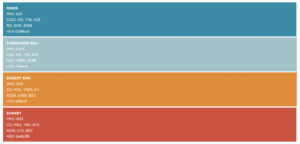
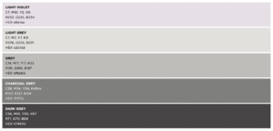
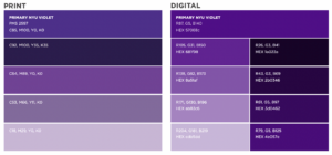
To further tie them all together under the torches of NYUAD, we can refer to the color palettes in the Brand Guidelines. Despite them stating the accent palette is meant to work alongside the primary and neutral palettes, and always be used sparingly and never as the dominant color in a project, I think we might want to revisit this prohibition as it would be in NYUAD’s best interest to have a core set of colors, including these dynamic colors, the signature purple/violet and neutral colors, for their research centers/branches to use. 

This is just an idea that I had when observing the Google Workspace and Adobe Cloud applications. I really do think the research centers of NYUAD could use a little revamping to seem more connected, but this is just one person’s point of view. I’m not the sole student at NYUAD. Please, let me know what you think. How else could we make our research centers more unified if not in shape and color? How can we make sure they do not come across as the same, and thus confusing to recognize?

——————————-
Reference Links:

https://nyuad.nyu.edu/en/research/research-institute-centers.html 

https://arstechnica.com/gadgets/2020/10/google-rebrands-g-suite-as-google-workplace-ships-new-multi-colored-icons/  

https://www.youtube.com/watch?v=7W0ISI3yqwo 

https://www.thecompassforsbc.org/sites/default/files/project_examples/corporate_brand_guidelines%20adobe.pdf 

https://nyuad.nyu.edu/content/dam/nyuad/news/documents/nyuad-brand-guidelines.pdf

A Digression on the Impossible & Memorability

Time has flown by since the last blog post and now spring break is just around the corner. We have reached the halfway point of the semester and so I have found myself reflecting on all that we have done so far. We covered the fundamentals of branding, learned about the Halo Effect, the Principle of Familiarity, had an introduction to Adobe’s Illustrator workshop, received all three of our briefs, and even had a surprise “impossible brief” just last class! 

From our impossible brief exercise, I had a few take-aways. One which I think we all would benefit from is that although it may seem far off–or perhaps very close, depending where one is at in terms of the semester so far– I propose that for our final presentations we perhaps give a separate presentation for the research that we have all put together first. And then, follow it with the group presentations on the concepts we have come up with so far or (in the end) our final logo and branding designs. I propose this simply because we all repeat the same opening details, discussing the brief’s main points and take-aways, only to deviate when we discuss the thought process behind what we have come up with. 

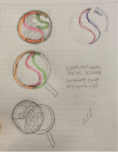
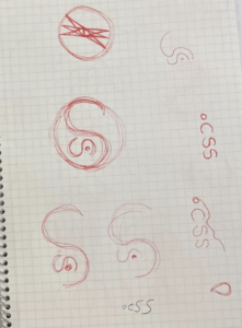
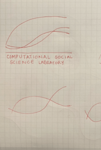
Otherwise, it was incredibly impressive and inspiring to see all the different designs we came up with in under two hours. I believe that my creative process was challenged during this real-life scenario exercise as I had to wrap my head around the practice of going abstract when brainstorming designs for the logo. This was tricky because of a few comments that it would be nice if the logo was informative as to what the Computational Social Science (Laboratory/Cluster) does. The response they would like their audience to have is “Woah, this is really cool. What you do is incredible.” Hence, my group and I were first attempting to try and encapsulate all the areas that the Computational Social Science covers using an assemblage of symbols for the different social science subjects within a globe and magnifying glass. We kept sketching and brainstorming when we received the feedback that we should try to take it a step further and move away from the literal. Thinking about how the social sciences, in general, are conveyed we came to a similar conclusion as another group that they use graphs, like the demographic transition model which demonstrates population changes over time. The other group took inspiration from the bell curve that depicts normal distribution. 

Personally, their final product using the bell curve and negative space really struck me (and I’d like to commend them for coming up with this design).

Image
Photo credits to Adam Ramey

This very act of being impressed reminded me of a quote from our textbook, Marks of Excellence that says, “A place in the mind means a place in the market”. I have always been drawn to the use of negative space in art and design. It’s quite engaging and gripping as it makes viewers pause and reassess what they are looking at. It is pointed out in the textbook that a trademark holds power over its viewer when it makes them look longer than a split second. “Double takes, illusions, puns, puzzles and twisted images are some ingredients that facilitate identification by holding power” – and using negative space is one such example. 

No photo description available.    FedEx Logo design and its hidden message – Pixellogo

Another quality to heighten a logo’s identification is its uniqueness. It should distinguish itself from other similar products and companies. This was the only downfall from having two hours to do research, brainstorming, and designing a logo as there was little time to do due diligence and make sure that there were no other potential competitors/similar brands in the field that were like our creations. Although there may be a place for this brand in your mind, it does still share the market space with other brands. 

Lastly, the “impossible brief” exercise made me realize that time management and planning is really important and something that should be taken into account. Even though I may be very well-versed in my project and work, I find it difficult to improvise when speaking and sharing my ideas/process in a presentation. And so, moving forward with our three briefs I’m going to make sure to plan with my group when we should have our logo and branding ideas done and when we should practice/go over our presentation of our work in the end since it is one of the most important parts: selling your product to the client and convincing them that this design should occupy a space in their mind.

Love-Branding is in the air…

With Valentine’s day quickly approaching, many individuals may find themselves drawn to a particular retailer for some last minute shopping for a romantic date night this February 14th. It was brought to my attention by a close friend that Zara was featuring a clever advertising campaign video on the first page of their website.

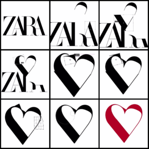
Curious to see, I searched the fast fashion company up and found much to my surprise a recording of the fast fashion company’s logo being transformed into a heart. It is simple photoshop editing: cutting off parts of the simple serif logo and manipulating the shapes of these pieces slightly in order to form an outline of a heart. The promotion video is a sped-up screen recording of this process that produces a captivating advertisement. When it seems like the end of the video with the transfigured heart being covered up with declarations of love in multiple languages, it then reverses, playing backwards and putting back together the company’s logo. 

Zara was created originally in 1975 by Amancio Ortega and Rosalía Mera, and called Zorba for a brief moment. It was changed to the name we know it as today, Zara because another store was using the initial name. Its first logo was a clean serif typeface print of its character in all capital letters. The founder rejected the idea of creating a symbol or logo as any product typically has if it is a high quality product. Zara’s four Latin letters hence went on to be known worldwide as the brand’s symbol. Over the years it expanded its empire and now has close to 6500 stores across 88 countries around the world. The logo was changed for the first time in 2008. The letters were spaced out and shortened, seeming flatter and more serious and confident. 

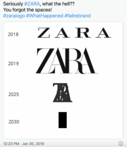
No more than ten years later, the logo changed yet again in 2019 catching many customers off-guard. It now features more elongated letters that are superimposed on each other. A very different look in comparison to the previous wide and shortened characters. The letters and leg of the “R” were a bit more curvy. Overall, this new change attempted to make the company appear parallel to top luxury fashion houses in the world with its bold, all-caps logo. It’s typeface is similar to the brand’s artistic director, Fabien Baron’s signature typography. In fact, Baron is also the creative director for the luxury brands, Dior, Burberry, and Maison Margiela. This only affirms that Zara is trying to establish itself with other fashion houses by rebranding. 

And yet, it all seems in vain as at around the same time, Yves Saint Laurent, Balenciaga, Balmain, Berluti, and Burberry changed their logos to similar, sans serif characters that can be deemed more versatile and easier to reproduce on different objects and screens. There is no risk of incorrectly scaling the logo and its lettering. They do risk looking very similar, no longer being distinctive and memorable. 

Meanwhile, the main criticism of Zara’s new look was its compactness. Several memes and jokes revolved around the concern that its characters would overlap and get closer together over time.

This year’s Valentine’s day promotion video, however, exemplifies how the new logo can be malleable. In addition, it’s a brilliant marketing ploy as it makes viewers pause on their website and want to watch the recording multiple times in order to understand the process of the logo being transformed into a Valentine’s day heart. By replaying it, viewers unconsciously are becoming more and more familiar with the brand’s name and image, practically memorizing it. This is a form of the concept that we covered in class: the Principle of Familiarity. People tend to remember and develop a preference for products or ideas that they are more familiar with. Basically, “We covet what we see” as Hannibal Lecter claims in Silence of the Lambs. One can do a lot with typography–and a little bit of photoshop.

—–

References:

https://www.zara.com/xe/ 

https://1000logos.net/zara-logo/

https://designbro.com/blog/industry-thoughts/zara-iconic-logo-evolution/

https://www.today.com/style/zara-has-brand-new-logo-it-s-causing-big-commotion-t147819