Time for a Reflection

We are now approaching the final week of a very challenging, yet intriguing, semester and it is safe to say that we have come a long way. Looking back at the first class that we had (on zoom unfortunately), I was intimidated by the idea of being able to design full-fledged brands for real clients over the course of just 14 weeks. However, it was also one of the reasons that I decided to enroll in this course: to challenge myself. As a CS major, I barely had any prior experience in design, so I was looking forward to learning a new skill, and boy was this the right course for that. We have learned a lot, not just about design, but about being great professionals as well. Through this blog post, I seek to reflect and recall some of the most important lessons that I’ve learned through both the lectures and the roller-coaster like experience of designing logos with my classmates.

Deadlines exist… and they’re not negotiable in the real world

Starting off with one of the things that Professor Goffredo made sure that we understood early on in the semester, is the importance of meeting deadlines. We encounter new deadlines almost every day, and in college they’re sometimes flexible. Some professors give extensions here and there but what about life after college? What happens when your boss assigns a major case study, and you fail to complete it on time because you’re used to ‘flexible’ deadlines? Well, the conversation between you and your boss might look something like this:

Boss – “So you didn’t get it done? This was due yesterday…”

You – “Yeah, I’m sorry, my cat had to get her deworming done and there was a really long queue at the vet. Is it okay if I complete it by tomorrow?”

Boss – “But the client meeting is today! I’ll make sure they know you were busy at the vet. You can also leave your resignation letter on your way out!”

Ouch. It doesn’t get any simpler than that. When you know you have a deadline, make sure you manage your time properly and get the task done on time. You won’t always be given second chances in the real world!

Brands are a lot more than just fancy symbols: The Halo effect and the Familiarity Principle

Logos and brand symbols are all around us, literally. Hence we often take for granted the effect that they have on us and how they influence the choices we make in our daily lives. Why do we prefer Adidas Superstars over another pair of shoes that look nearly identical, albeit the inclusion of an extra stripe along the sides? Surely it’s because we know that the second pair isn’t manufactured by Adidas. But why does that bother us? Why are we so keen on being associated with the “three-stripes” brand, or any brand in general? Well, it’s because of the familiarity principle.

We prefer things that we’re familiar with and companies really try their best to make themselves familiar to us. That’s how advertising works! The logos or brands that we see more often (and also associate positive emotions with) are the ones that we are comfortable picking over other brands. Maybe it is a beautiful childhood memory or a touching commercial that got you interested, brands that you are familiar with greatly impact your choices, from the clothes you wear to the food you eat. Brands are everywhere.

Another thing that companies use to their advantage is the ‘halo’ effect. In a nutshell, we put our trust in things that appear trustworthy (I know that sounds trivial). But what do we find trustworthy? Beauty! Hence the inclusion of good-looking celebrities in TV adverts or billboard posters. We trust the celebrities; therefore, we support the brands that they support. There is no other reason as to why companies use this strategy. It’s simply because we are attracted to beauty and they use that fact to their advantage!

The Halo effect

The Importance of following the rules of Arabic calligraphy when designing bilingual identities

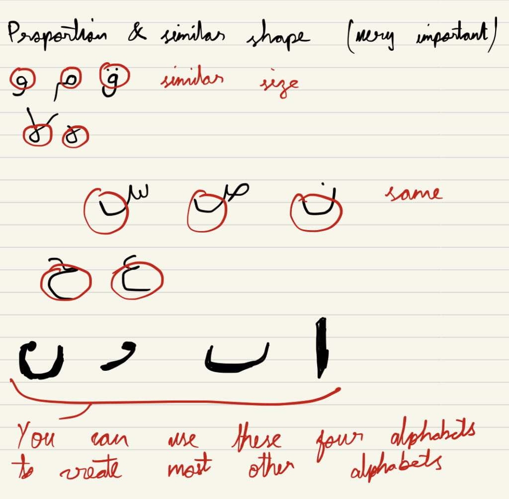
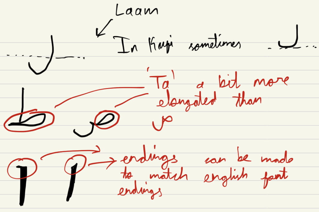
Very often, we see designers who are not familiar with Arabic typography completely ignore the rules of the language in order to prioritize aesthetic value or match the Arabic letters with the English counterparts. During the two lectures that we had with Mr. Wissam Shawkat, we learned that this is a very, very bad design practice and should be avoided.

Whenever designing bilingual identities, in this case in Arabic, you need to ensure that the choices you make in your design don’t go against the rules of Arabic Calligraphy. Below I am sharing a few of my notes from the lectures that I think really help when designing logos with Arabic typography.
 

Sketch, Sketch, SKETCH… and sometimes Google is not your best-friend

The importance of sketching by hand is something that Professor Goffredo has always iterated throughout the semester. After the bumpy journey of designing logos myself, I realized that sketching is indeed the key to unlocking our creative side. Only after spending hours and hours drawing the same shape with slight variations will we ever come up with the perfect version of our idea. We need to experiment. Our first sketch will never be our final logo. More importantly, we need to go through a rigorous sketching period because it leads to the development of new, and sometimes superior, ideas that might completely change the direction we take when designing our logo. This happened multiple times when my team was working on the ‘gecko’ idea for SMART. Our first and final designs don’t look alike at all!

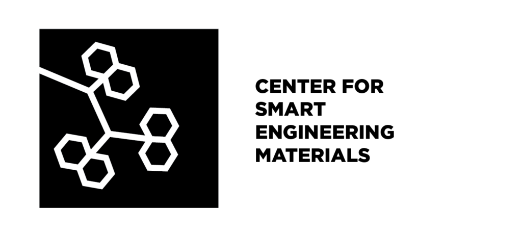
What we started with
What we ended up with

Furthermore, relying on Google as a source of inspiration is not a good idea. Firstly, because it provides us with very generic designs that have been overused. Second, it can lead us to plagiarizing someone else’s work which is something you need to be very cautious about as a designer. Also, I feel like using Google hinders your ability of coming up with unique ideas yourself because you become too dependent on using other visuals for inspiration.

The client is king, but it’s your job to impress 

A lesson that I’ve learned through the course of the semester as well as through the readings is that we as designers are almost completely dependent on the client’s choice. Notice that I said ‘almost completely’. That’s because although the client will have the final say on what direction they want to choose for their brand design, it is our responsibility to show them other possible alternatives or routes that might be better overall. We are smart, living, breathing designers, not  random logo generators. Sometimes the creative path that we might see fit for a brand identity might not match exactly what the client wants, but we need to shed light on the fact that what the client wants could possibly be very generic or overused in the market. We must make an effort to convince the client that an approach they deem ‘unorthodox’ is actually the correct way forward. In the end if they still say no, then once again, ‘the client is king’. But at least you tried!

Learn from the failures. And by failures I mean ‘BIG’ failures.

When learning about what makes a great brand or logo, we often look for the best success stories like Nike, or Adidas, or Coca-Cola. However, sometimes by looking at what doesn’t work and why some major brand redesigns failed dramatically, can tell us a lot about the decisions we need to make while designing our own logos. With less than a month left till we reveal the final designs to our clients, let’s take a look at some of the worst brand redesigns that didn’t end well for the companies involved.

1) Gap

Gap is a retail clothing store that used its square blue logo mark for most of the company’s history. The serif-font, on top of the dark blue background was (and still is) the heart of the company’s brand identity. Unfortunately, they decided to have a rebrand in 2010 to follow the more minimalist, simplistic design trend that is all the rage at the moment.

The first thing that really bothers me in the redesigned logo is the change in font, and the change from an all uppercase logotype to a standard ‘Gap’. The large blue square that made the logo standout was now a tiny, less vibrant square at the corner of the logo. Furthermore, the company’s attempt at embracing a minimalist design failed as well with the use of a dull gradient in the square. The vibrance was gone, the iconic logotype was gone. The company’s brand identity went from being ‘GAP’ to just another generic ‘gap’. Most importantly, the essence of the brand was lost- the biggest mistake you can make when redesigning your logo.

2) Yahoo!

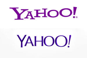
Yahoo is an online search engine and news-provider that once used to be the go-to-browsing location before Google took over the world. Its original funky logo resonated with the company’s ambitious goals of covering everything from web browsing to news. The misaligned text and font also went well with the brand name: ‘Yahoo!’.

However, when the company decided to boost their market image and went for a rebrand in 2013, the designers responsible for the new logo went in all the wrong directions. The silly, fun vibe associated with the original logo was gone and in came a more generic, rounded, aligned sans-serif font. In addition to that, during a period where brand redesigns went for flat, minimal designs, Yahoo! went for chiseled alphabets with a darker gradient purple to replace their original, flat ‘Yahoo!’ violet. This redesign would’ve worked in the skeuomorphism era, but it was a total failure for the time it did happen.

It is fair to note that Yahoo! did realize their mistake and opted for another brand redesign in 2019. This newer logo is more aesthetic and minimal, but I still think it lacks the silliness of the original logo that made it standout.

3) Juventus

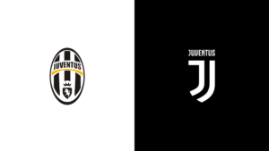
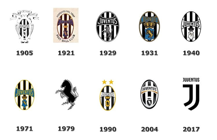
Juventus is an Italian football club that plays in the top division called Serie A. It has cemented its reputation as one of the top teams in Italy and Europe, and the iconic black and white stripes that are present in its original ‘badges’ are still present on today’s kits. However, the club decided to go for a complete rebrand in 2017 and in my opinion, Juventus became unrecognizable.

Coming from a person who does personally enjoy watching football and supporting football clubs, the latest Juventus logo completely missed the mark. When I first saw it, I couldn’t even tell that ‘oh, that’s Juventus!’ The black and white stripes inside an oval badge had become an embodiment of what stands for Juventus (from 1905 to 2017). Therefore, the sudden removal of such a key element of the logo made it lose the essence of the club’s image. There are also other problems with the redesign. The capital ‘J’ that makes up most of the new logo is designed in such a way that makes it look like there are two ‘J’s in the name (even though there aren’t). Maybe this was an attempt at preserving some form of the black and white stripes, but in my opinion it doesn’t really work. Sadly, this is what the club’s brand identity has become, and it doesn’t look like it is about to change anytime soon.

The Evolution of Logo Design Trends – From Realism to Skeuomorphism to Super-Simplicity

By Shawn Nassabi

Logo design trends, or design trends in general, are always changing to cater to the keen eyes of the ‘modern’ consumer. The definition of ‘modern’ design back in 1980 was very different from what it is now. Gone are the gradient shadows and intricate details of the 80s, which are now replaced by simplicity and flat design.  It is interesting to think about what influences these major evolutions in logo design trends. Is it technological development? Is it pop culture? Is it the media? Through this blog post, we will take a look at the evolution of some of the most iconic logos from different industries and analyze how and why logo design trends change over time.

The Extra Detail Era

   https://www.google.ae/url?sa=i&url=https%3A%2F%2Fwww.globalyoungvoices.com%2Ffast-news-blog%2F2015%2F12%2F1%2Fsir-isaac-newton-in-apples-very-first-logo&psig=AOvVaw2CrwbUKhp2yOqgARU-EnDR&ust=1646582378122000&source=images&cd=vfe&ved=0CAgQjRxqFwoTCMDXn8mrr_YCFQAAAAAdAAAAABAz
https://www.google.ae/url?sa=i&url=https%3A%2F%2Fwww.quora.com%2FWhat-is-the-meaning-and-story-behind-the-Starbucks-logo&psig=AOvVaw2FyfHpHdEUcUwBP0n03zKX&ust=1646509119040000&source=images&cd=vfe&ved=0CAgQjRxqFwoTCJDplMyarfYCFQAAAAAdAAAAABAR


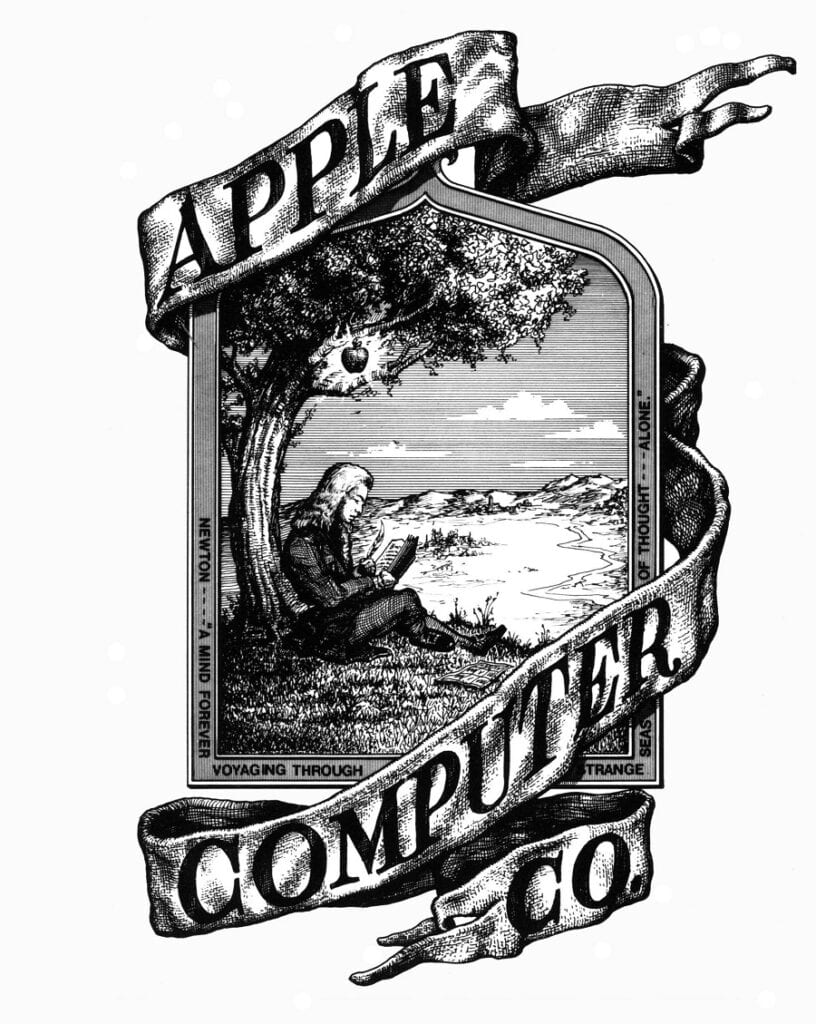
What you see above is the original Apple logo, designed in 1976, and the first Starbucks logo, designed in 1971. Clearly, there are very detailed illustrations embedded within the logos, especially the Apple logo, which features a drawing of Isaac Newton underneath an apple tree – linking it to the discovery of gravity. In other words, the Apple logo is trying to convey the message of ‘innovative technology’, albeit through a very realistic, detailed illustration. Similarly, the Starbucks logo features a two-tailed mermaid with very minute scales and features. The design trends during this period of time are quite the opposite of today’s trends. The idea of beautiful design during the 70s seems to be linked to realistic detail. Although it is fair to mention that not all logos during the 70s followed the same pattern. A distinct example is the Nike Swoosh logo which was designed in 1971.

https://www.google.ae/url?sa=i&url=https%3A%2F%2Finkbotdesign.com%2Fnike-logo-design%2F&psig=AOvVaw227zdStmaAmR-926FEjcHA&ust=1646568917803000&source=images&cd=vfe&ved=0CAgQjRxqFwoTCJCMgLH5rvYCFQAAAAAdAAAAABAO


Clearly there aren’t any fancy details in this logo! However, you can still contend that the current Nike logo is even simpler, since it only contains a sole ‘swoosh’, without the ‘Nike’ logotype.

The Skeuomorphism Era

“Skeuomorphism refers to a design principle in which design cues are taken from the physical world” (link 1). In other words, skeuomorphism design tries to mimic the texture and feel of real-world materials/objects.

https://www.soydemac.com/en/walk-through-history-apple-logo-98765/
 
https://www.google.ae/url?sa=i&url=https%3A%2F%2Fwww.kindpng.com%2Fimgv%2FhJbxhTo_pepsi-old-logo-png-transparent-png%2F&psig=AOvVaw2T_7H410aUOPjlFTnZhuMK&ust=1646569021394000&source=images&cd=vfe&ved=0CAgQjRxqFwoTCNCh0eD5rvYCFQAAAAAdAAAAABAJ
https://www.google.ae/url?sa=i&url=https%3A%2F%2Flogos-download.com%2F404-nissan-logo-download.html&psig=AOvVaw3QDSw0UFwCT5YpzllsUjbg&ust=1646568995157000&source=images&cd=vfe&ved=0CAgQjRxqFwoTCMDo89L5rvYCFQAAAAAdAAAAABAD


The logos above are the 2001 Apple logo, the 2001 Nissan logo, and the 1996 Pepsi logo. An element of all three of these logos that stands out to me is the reflective or shine effect created with the use of gradient colors and shading. The apple logo tries to replicate the feel of glass or shiny plastic, the Nissan logo resembles the metal chrome texture of an actual physical emblem, and the Pepsi logo tries to replicate the feel of a real can of soda – the tiny droplets of water around the edges of the logo’s curves truly accentuates this effect.

https://www.google.ae/url?sa=i&url=https%3A%2F%2Fen.wikipedia.org%2Fwiki%2FIOS_5&psig=AOvVaw15P34yjGKy8Pek95HyEEF6&ust=1646583422129000&source=images&cd=vfe&ved=0CAgQjRxqFwoTCLDQ0rKvr_YCFQAAAAAdAAAAABAD


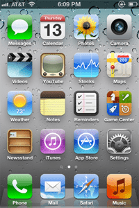
The rise of skeuomorphism was partly due to its use in computer software logos and design. Take, for instance, the screenshots from Apple iPhones in 2010. The logos or icons used for the applications follow the same principles of skeuomorphism that were mentioned above. The inclusion of shadows, gradients, and other realistic detail, makes the designs resemble their real-life counterparts. The logo for ‘Notes’ looks like a real notebook for example. Skeuomorphism dominated design trends during this era because it allowed people who used computer devices for the first time to be able to recognize an application for its use and conveniently navigate within the UI.  However, as people got more familiar with using computers and mobile devices, skeuomorphism slowly began to fade, and simplistic, flat design became the new norm.

The Super-Simplicity Era

https://www.google.ae/url?sa=i&url=https%3A%2F%2Fwww.reddit.com%2Fr%2FDesign%2Fcomments%2F1g458z%2Fios_7_icons_vs_ios_6_icons%2F&psig=AOvVaw098ODegq_qQB0BoomfP8V5&ust=1646506985476000&source=images&cd=vfe&ved=0CAgQjRxqFwoTCIj94NKSrfYCFQAAAAAdAAAAABAO

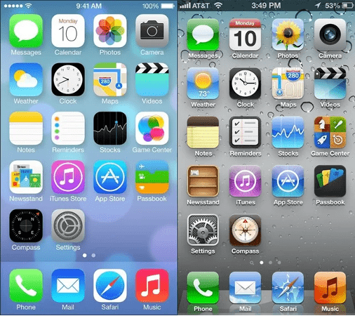
The picture above is, in my opinion, the perfect example of the transition to a simple, flat design. The photo on the left is from the Apple iOS 7 operating system (released in 2013), compared to an older version of the software. As you can see, the use of gradients has become very subtle or in some instances, is completely avoided. The shadows underneath the logos have disappeared, ‘extra’ detail is removed, and the designs no longer resonate with realism. At the same time, it is still very easy to recognize that the camera logo is for the camera app, and the notes logo is used for notetaking, without the use of skeuomorphism. This is known as the flat design trend, which aims for designs to convey their message in the simplest way possible.

https://www.google.ae/url?sa=i&url=https%3A%2F%2F1000logos.net%2Fpepsi-logo%2F&psig=AOvVaw0WV15KIqjfM4ytmt7MNxC5&ust=1646569203452000&source=images&cd=vfe&ved=0CAgQjRxqFwoTCMDe7rb6rvYCFQAAAAAdAAAAABAD
https://www.google.ae/url?sa=i&url=https%3A%2F%2Fwww.caranddriver.com%2Fnews%2Fa33326179%2Fnissan-logo-change-revealed%2F&psig=AOvVaw04xiVVT9QiR4pQGQsJTNIC&ust=1646569188960000&source=images&cd=vfe&ved=0CAgQjRxqFwoTCNDE_676rvYCFQAAAAAdAAAAABAD
https://www.google.ae/url?sa=i&url=https%3A%2F%2F1000logos.net%2Fapple-logo%2F&psig=AOvVaw20vEaiaPCGO66ygQ5iutvh&ust=1646566399839000&source=images&cd=vfe&ved=0CAgQjRxqFwoTCJicy_7vrvYCFQAAAAAdAAAAABA0

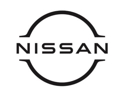
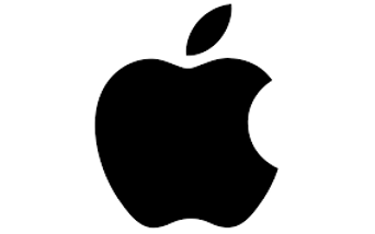
As you can see, the current logos for Pepsi, Nissan, and Apple also follow the same trend. A major influence that has led to the rise of this ‘simplicity’ trend is the need for efficient, and elegant digital communication. Almost all companies or brands now have their online websites, and the use of flat, simple design allows their logos to easily be integrated into digital environments.

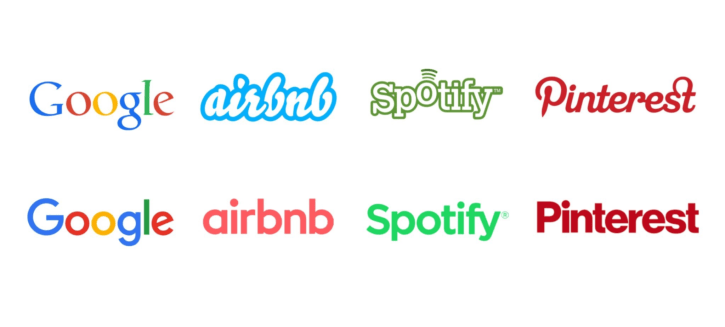
However, it isn’t true to say that flat design doesn’t have its flaws. Many people argue that the ‘over-simplification’ of certain logos can ruin elements that made the original logos unique. This can lead to logos that look quite similar to each other and lack their own personality. As you can see in the image below, the current logos for Google, Airbnb, Spotify, and Pinterest all use a sans-serif typeface with very minor differences between them. It can, however, be stated that the reason why simplified logos are still effective for many companies is because they are already well known by most people. Being a brand that millions of people are already ‘familiar’ with makes it easier for logos to be effectively simplified and still be recognizable.

https://thirdside.co/logo-design-trends-making-brands-less-unique/


Links Cited:

link 1 – https://www.techopedia.com/definition/28955/skeuomorphism 

Logo Design Jam: A Beginner’s Guide to Adobe Illustrator and Designing Your First Logo!

Have you ever been interested in graphic design but never figured out where to start? Or you thought about giving Adobe Illustrator a try but felt overwhelmed as soon as you opened your first artboard? If you’ve been in any of those situations, then you’re not alone. Learning how to design (logos) can be extremely intimidating, especially when you don’t come from a background in art or design. All you need is a little guidance, inspiration, motivation, and of course, this blog post to help you begin your logo design journey!

What is a ‘Design Jam’?

I come from the world of programming and game development where we usually participate in events called game jams. A ‘game jam’ is when you develop a full video game from scratch, over a few days or a week. It involves a lot of research, learning, and effort, but once you complete your project, it is the most satisfying feeling ever. I took my experience with game jams and decided to apply it to learning logo design, and ‘voila’: you get the “Logo Design Jam”!

Trying to learn a new skill requires you to follow a certain structure or flow, without which you get lost in an endless rabbit hole called the internet, trying to figure out where to start. Taking part in a design jam is a great way to begin your journey because it allows you to set a target and a deadline, which is a good source of motivation. Last weekend, I decided to have my very own design jam, in which I started learning the fundamentals of graphic design and logo design, eventually applying what I learned to create my very own logo in around two days. Through the course of this article, I will guide you through the steps I followed that helped me take my designing skills to the next level.

Step One: Be a Sponge

In the first phase of your design jam journey, you need to gain as much knowledge as you can. Pick a form of media that you enjoy. It can be books, videos, images, or ideally a combination of them all, and use it to learn the basics of logo design and Adobe Illustrator. I found it best to use video tutorials from Youtube for Illustrator, and books for the fundamentals of logo design.

Here is a video that I used to get a head start in Adobe Illustrator:

Your goal in this stage is to read and watch. Spend at least two to three hours just to gain and process all the new information. When using Youtube as a tool, I like to create a playlist containing all the videos that I have watched, or am looking forward to watching, so I can refer to them later when I need to recall certain pieces of information. I will leave a list of videos and books that I used for reference at the end of this blog post.

Step Two: Getting Your Hands Dirty

This is the part you have been waiting for. It’s time to use the information you have been absorbing like a sponge and practice. Do not worry about your final project yet, just try to get familiar with the basics. Following along with videos is a great way to do so. What’s even better is to watch a video and then try to do exactly what you learned on your own. You can spend as much time as you want in this stage – it is the key to building a strong foundation before working on your final project.

I followed along with several Illustrator tutorials and personalized my work while doing so. You shouldn’t be doing exactly what you’re shown in the videos, but rather try to experiment as well. You might end up making mistakes but that is a part of the learning process. When working with Illustrator, I found it useful to have the software’s documentation page open for whenever I have a doubt or get myself into a hurdle. For example, I was facing a problem with the ‘outline stroke’ command and the ‘compound path’ settings in illustrator. Thankfully, we have the power of Google in our hands, which makes it easy to deal with such difficulties.

Redesigning the Apple Logo

The first mini-project I worked on was redesigning the famous Apple logo (which I failed quite miserably). I began by starting a new artboard in Illustrator and inserting the original logo for reference. I then used the ‘pen tool’ to try and replicate the shape of the original ‘Apple’, and I have got to say, it was not easy.

Initial attempt
After making adjustments

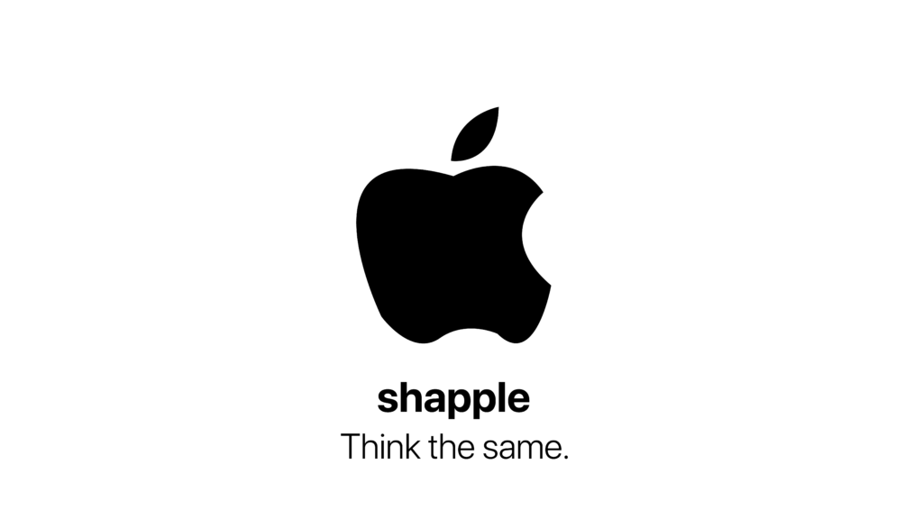
Although the logo seems very simple, trying to replicate the same curves and dimensions is a very tedious task. I had to adjust the shape in countless ways to make it look somewhat like the original photograph. After a few attempts, I finished off with a parody design that I was pretty satisfied with.

Final parody design

Here are a few of the other mini-projects I worked on, along with the videos that I used for reference.

Guide – https://www.youtube.com/watch?v=TQUrVwzMWXE&list=PLVwDkns0i3aRafmLiMA79iqDZl4BY_Laf&index=14
Guide – https://www.youtube.com/watch?v=CJ6-EiL2lb0&list=PLVwDkns0i3aRafmLiMA79iqDZl4BY_Laf&index=15
Guide – https://www.youtube.com/watch?v=u6QyJ4wlge0

Final Project: Design Your Own Logo

Now that you’re fairly comfortable with using Illustrator and have a basic idea about logo design, it is time to work on your final project. In this case, we are designing a logo to represent ourselves! The logo should give the viewer/intended audience an idea about who you are, making it perfect for online portfolios and websites. 
 
After reading several chapters of Marks of Excellence (by Per Mollerup) and Logo Design Love: A Guide to Creating Iconic Brand Identities (by David Airey), here are a few key points to note when designing your logo:
– You need to present your identity through your logo (brand identity is a sender concept)
– Focus on visibility and simplicity
– Your design needs to be adaptable. i.e., usable in different sizes, applications, print colors, etc.
– Don’t base your design on ‘trends’. Instead, try to incorporate timeless design frameworks to allow your logo to remain usable for longer periods
– Try to use negative space to your advantage
– Brainstorming is extremely important
 
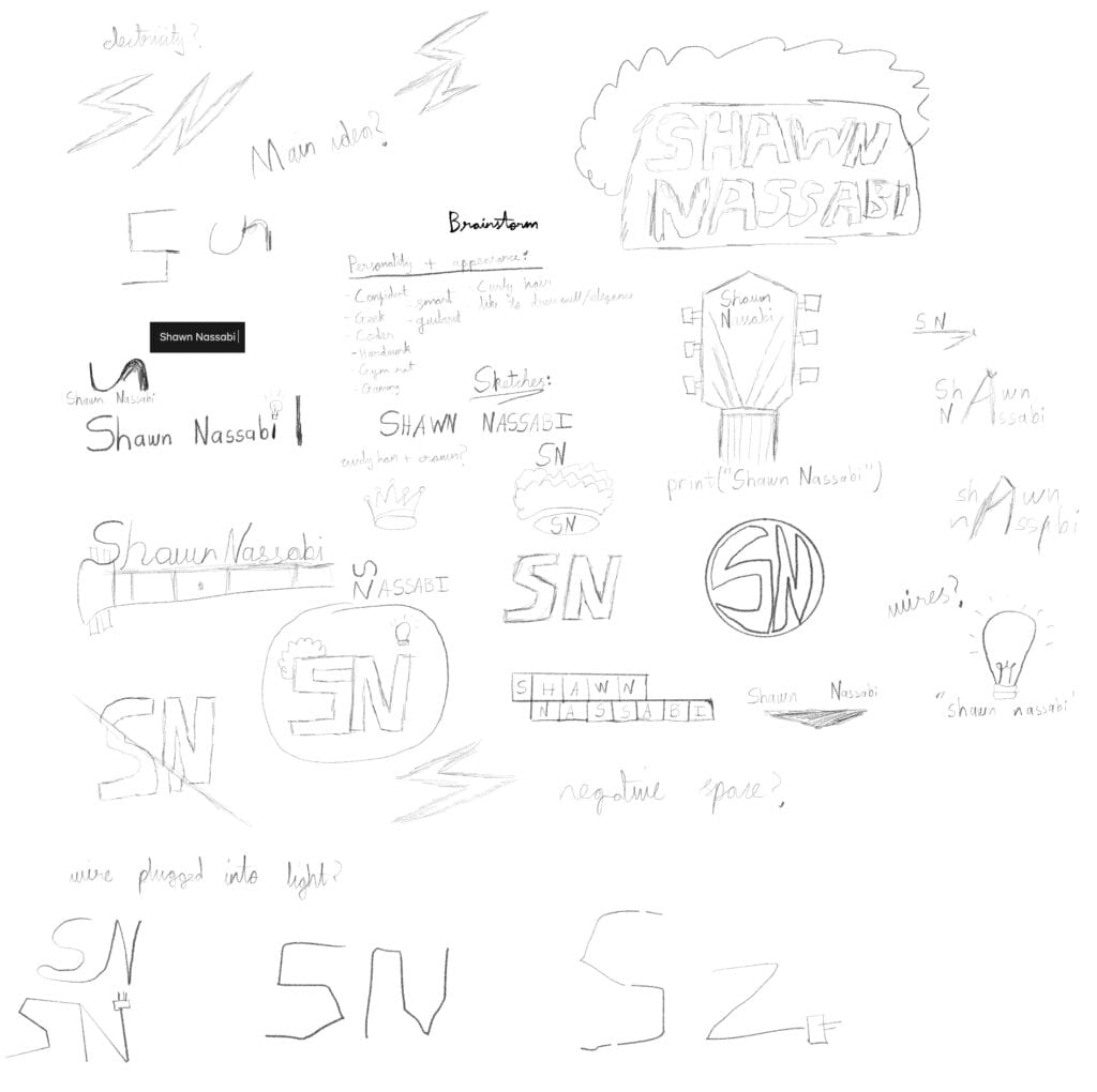
I need to repeat the last point. Brainstorming is crucial. You cannot dive right into Illustrator and come up with a great logo if you don’t have a proper idea in place. Using a pencil, sketch down as many ideas that come to your mind. I started by listing down the personality traits that are a part of my identity. Then I began sketching different designs till I ran out of ideas.
 
Here is what my brainstorming session looked like:
Brainstorming ideas
 
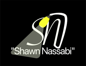
Once you have a rough idea about where you’re headed, it is time to work in Illustrator. You are still in an experimentation phase, the first design you come up with will not be your last. I tried to incorporate some elements of the way I look along with my personality into one logo. I used a light bulb as a metaphor for intelligence and innovation, along with a sense of elegance in the design, with smooth curves and edges.
First design attempt

After a few more tries, I think I found what I was looking for. The design focuses around a light bulb with curly hair, which when put together looks a bit like a face. The font used in the initial design did not fit well with the idea, so I went for something simpler and more readable in the final design. As always, you can never have a perfect logo. I might make a few more adjustments in the future, or come up with a completely different design entirely, but for now, I am happy to settle with this.

Initial attempts at a new design

Just like that, my rollercoaster-like design jam came to an end. It was a great way to transition from being an absolute beginner to being capable of designing simple logos in less than two days. Of course, this is only the start of our journey in the world of design. Next, we should aim to learn more advanced techniques in Illustrator, and further our skills in the art of logo design. We have only surfaced the tip of the iceberg!

Links to useful videos:

           Illustrator Beginner Tutorial: Simple Letter Logos         

           10 MUST-KNOW Tools for LOGO DESIGN in Illustrator         

           Illustrator Beginner Tutorial: Loop Logo Text         

           Wrap text into Shapes – Adobe Illustrator         

           Wrap Text Around A Circle with Adobe Illustrator | Beginner Tutorial