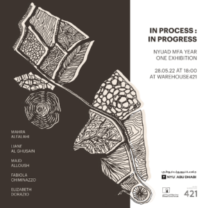
MFA Year One Exhibition Poster

This semester I had a wonderful opportunity to support branding for NYUAD’s MFA in Arts and Media program. Although, in the beginning, I was supposed to help with the marketing and promotion of MFA events and activities, over time my function changed and I suddenly found myself responsible for preparing promotional materials for the upcoming exhibition at Warehouse421. The exhibition is to celebrate the first year of work of the inaugural NYUAD MFA cohort.


Ideation

While I was excited to do something big and prepare a visual identity for the exhibition, I felt a bit unprepared. It was only after some time that I realized that posters serve are the main identifier of exhibitions and thus entail a similar function to logos. With the knowledge of branding and logotypes I have acquired over the last semester, I felt a bit more confident.

I must admit it was quite challenging to come up with an identifier that would combine all the works of the MFA artists in an interesting way. Unfortunately, unlike many art exhibitions, I couldn’t simply use the artist’s most popular work as the main design. There are five students at the MFA, each working in a very characteristic style in a unique medium – from video, to sound, painting, pyrography, textile, print, and soft sculpture. Artists’ works examine the instability of the physical world, such as space, country, gender, and the body. Unfortunately, that’s quite a broad range of topics. Moreover, one could argue that the exhibition itself has no universal theme as it serves more as a collection of artists’ work.
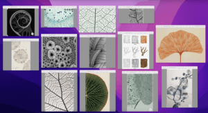
Moodboard. AKA my messy desktop


Brainstorming

With my team, we came up with a couple of creative avenues I could delve into. The idea of growth truly resonated with us. Moreover, we have found themes related to Botanics quite relevant, as they either permeate the medium artists’ have chosen, such as wood, or the subject of the works. With this in mind, I started to create a mood board and look for inspiration to represent structures, nature, or wood. Bearing in mind the fact that two artists work with fabrics, I also looked into some microscopic photographs of fabrics or cotton.


Sketching

Then I opened my sketchbook and started drawing whatever came to my mind. It really worked like magic. After a while, I settled on the idea of filling some boxes with little drawings relating to the various mediums – botanical elements, wood, fabrics, and cotton.
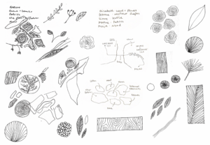
Primary sketches. One can see the “eureka” moment on paper when I draw the path form NYAUD to Warehouse 412


I figured I could arrange these elements in a more systematic order, one that resembles the path from NYUAD to Warehouse421 and contains outlines of Saadiyat and Mina Zayed. This hidden message would allude to the transition of the place of development, New York University Abu Dhabi, to the place of future affiliation, Warehouse 421, the Art Gallery.
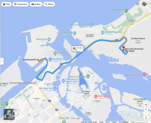
Path from NYUAD to Warehouse421


After a bit of sketching I have created a final drawing with black pen on paper.
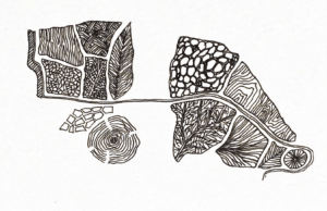
Final drawing


Later on, I scanned the sketch, removed background and played with the shape of  it in Photoshop. I have changed the color and added some shadows.
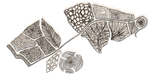
Visual Element for the MFA Year One Exhibition 


We have decided to use it as a main identifier for the exhibition, one that will be placed on the cover of the zine and used in external communication.
 

Revisions

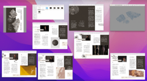
My first proposal for the MFA Exhibition identity involved the choice of blue colour. I liked the contrast it created with beige. In addition to the poster design, I was also asked to prepare the zine, program booklet that will highlight artists, their work, bios and statements. It was only after seeing artists’ work and receiving their portairt photographs, I have decided to change the primary color to brown. Thanks to this change, the booklet looks more cohesive as brown matches the color palate of photographs.
 

Playing with type!

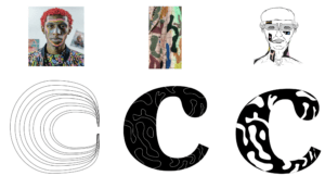
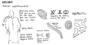
When designing logos for the Arab Climate and Environmental Sciences Center and the Center for Intelligent Engineering Materials, we are asked to come up with an abstract representation of a complex idea that will subtly refer to the center’s activities. In turn, when designing the logo for the Cosmo brand, I completely skipped the process of looking for allusions and immediately started experimenting with shapes that would depict the letter “C” in an interesting way. I wanted the character of the letter to refer to the company’s personality, the user should get the coferent feeling of the brand, both from the product itself as from its communication. Here are some of my sketches.


So often, especially among fashion brands, I come across logos consisting only of minimal lettering. This probably led me to subconsciously imagine the cosmo logo as the letter “C”. Logotypes of fashion brands tend to be very minimalistic. This makes sense as they are usually displayed on t-shirts, bags, t-shirts, and must remain relatively indistinctive so as not to clash with other patterns. This does not mean, however, that the logotypes do not represent anything interesting. Every year there are new typographic trends that allow brands to stand out from the competition.

Blurred logos
One of the trends featured in the 99designs review are the blurry logos. It is expected that Designers, rather than focusing solely on readability, will be increasingly experimenting with blur effects to emphasize fluidity and movement.

Source: Pentagram

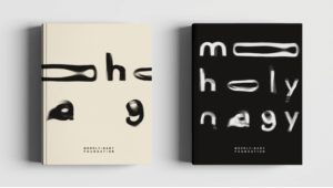
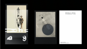
A great example of a brand that took this trend to its greatest advantage is the Moholy-Nagy Foundation, which fosters and shares knowledge about Moholy-Nagy’s art and life. When designing this expressive identity, the Pentagram studio followed the mindset and methods used by Moholy-Nagy himself in his work. – experimental photographs with light, known as photograms.

Source: Pentagram

Inspired by the artist’s experimental approach, Marina Willer and her team created a set of typographic forms using a series of projections using light and water. It is these intriguing letterforms that form the basis of the brand’s fluid identity. Pentagram managed to create a “striking and sympathetic identity which, without mimicking his groundbreaking work, perfectly honors his amazing legacy” (Pentagram).

Scribbles and sketches
Another trend that has been listed among “11 innovative logo design trends for 2022” by 99 designs has been scribbling. While some designers are striving to achieve cleanest and minimalism, some are going into a totally contarctic approach following a childish, shaky nostalgia.

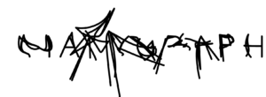
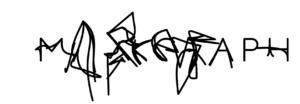
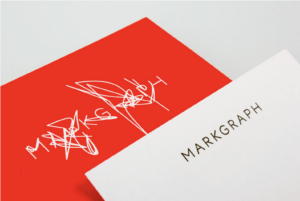
I was especially intrigued by the dynamic logo design for Atelier Markgraph, a studio for brand and theme experiences. The studio believes that its employees are its strength and has decided to embed one of the most personal means of expression in its logo, the voice. 

Source: Schultzschultz

First, they recorded their employees saying the company name, Markgraf, then decoded the sounds and represented them through the lines. The result is a dynamically changing Logo, blurred by random looking scribbling, yet having an interesting story behind it. The Specially designed font not only fits into contemporary minimalism, but also allows you to play with these different states of letters.


Source: Schultzschultz

Vintage

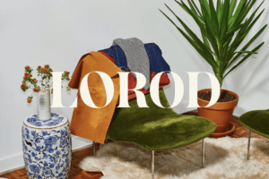
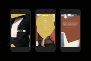
Another emerging trend is the modern twist to vintage to the 70s inspired designs. I was personally drawn to the logotype of the LOROD, the fashion brand of Lauren Rodriguez and Michael Freels, which redefines timeless basics with modern, distinctive fabrics and vintage-inspired chic. The logotype was adapted from Austin Bold, “a modern 1970s serif font (Pentagram).” The first “O” in the name is slightly tilted, which is meant to allude to the unexpected details in the clothes that make each piece seem like a one-of-a-kind find.

In addition, the brand’s website shows “cut-out graphic shapes, a reference to the construction of the garments, which uses alternative pattern-making techniques”(Pentagram). This is a very unique solution that makes the brand appear less corporate and more fun and quirky.

Source: Pentagram

Street art scene. The Sticker Culture

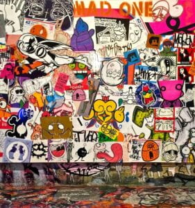
For several decades now, skateboard stickers have been an inseparable element of street art and urban expression of the youths. In the times of rebellion and postmodern imagery of the new generation one could spot them wherever – on the sidewalks, skateboards, snowboards and surfboards. At the turn of the 1980s and 1990s, stickers served as both a part of the art movement and a means of advertising for underground clothing companies.

Tattooed Mom on South Street; Source: Street Art NYC


Going viral in the analogue world

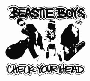
In the analogue world, prior to the advent of the internet, comic book artists, often skilled in illustration, came up with an incredibly affordable way to reach a wide audience. They used paper with a little glue on one side as a mini canvas, and began spreading their art through the streets of California and other cities dominated by hip-hop and street culture fans. Artists massively printed their works on stickers, which they later placed in various corners of their cities. Some shared them with friends and asked for stickers to be placed in their cities, while others preferred to individually leave their artistic footprint wherever they went (Stick To It).

Beastie Boys by Eric Haze; Source: StickerArt

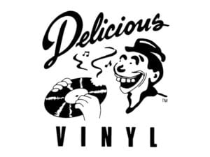
Visual artist, 14 Bolt, in the interview for the first episode of Alexis Deforges’s Stick To It,  reflects that such popularization of art has greatly “cut the distance between you and the artists you admire”. 14 Bolt goes on to say that with this kind of collaboration aimed at bringing a fresh character to skate cities, he felt “part of the family, part of the community and part of the art.” Eric Haze, on the other hand, emphasizes how stickers and the hype around them facilitated the development of underground clothing companies. Distributing and handing out the stickers to the desired streetwear audience was an inexpensive way to bring the brand to the streets. People not only exchanged ideas and influenced local art, but also exchanged products and advertised newly created micro-companies.

Hip-hop logo by Eric Haze; Source: PlasticCircles


Layer of protection

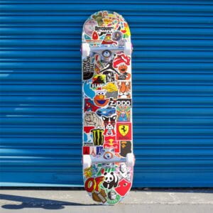
While some companies only created and distributed stickers with their own logos, some developed visually intriguing illustrations that don’t necessarily focus on increasing brand recognition. Some designers just want skateboarders to feel one with the culture and in the center of the buzz. A deck full with stickers for a skateboarder serves as an identifier suggesting what kind of music someone listens to, what brands they like and support, and what type of person they are. In addition to the impressionistic value, the stickers are also quite functional. They are usually glued on the scratched decks, and the high quality, water resistant vinyl on which they tend to be printed can prevent further damage and extend the life of the deck by months, if not years (Surfertoday).

Stickers on a skateboard; Source: Desertcart

In the drawer of my desk back home, I still have stickers collected at Absolut Park in Flachauwinkl, Austria. It was in that winter that together with my older brothers I started collecting stickers (they actually used my sweet little girl charm to expand their collection!)


The Screaming hand

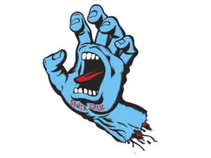
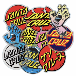
Perhaps the most recognizable graphic in the skateboarding community is “Screaming Hand”, designed by Jim Phillips in 1985. Shortly after its release, it became the official logo of Santa Cruz Skateboards, the world’s oldest skateboarding company, for which Jim had also designed the lettering. As a person who grew up in Santa Cruz spending his free time surfing, in his art, Jim has always tried to channel the surroundings into his sketches and drawings. The Screaming Hand serves as “a timeless skateboarding symbol that stuck through generations of old and new school skateboarders” (Surfertoday).

“Screaming Hand” designed by Jim Phillips in 1985; Source: AlfalfaStudio

It can be found everywhere in the world of skateboarding, it is very expressive, impactful and works well on its own – it does not need additional lettering, shapes or background (Studio Visit with Jim Phillips). One can spot it everywhere in the skateboarding world, it’s highly expressive, impactful and works well on its own – it doesn’t need extra lettering, shapes, backgrounds. It thus fulfils its sole purpose – it looks cool.

Santa Cruz’s vintage stickers; Source: NHSFunFactory


Stüssy

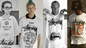
The late ‘80s and early’90s also brought a shift in the ideology of casual-wear. Stüssy, a brand founded by Southern California surfer Shawn Stüssy, grew organically out of youth movements and inadvertently revolutionized the apparel industry (Stüssy). Shawn used to shape his own boards for friends and locals and to promote his services decided to scribble his name on the boards. Stüssy later began selling t-shirts and shorts along with surfboards, and a bold graffiti-inspired hand-style signature became the company’s logo. By 1988, the brand had expanded to other locations in the US and Europe, joining the high-priced “California lifestyle” clothing market.

Stüssy’s Collection; Source: MarieClaire


Polish Poster Art movement

The Polish Poster School is a well-established term in art used to describe a phenomenon that began in the late 1950s, when several Polish artists introduced a completely new style of poster design. It did not emerge from a specific program, but rather describes the organic contribution of several prominent artists who almost accidentally met at the same time, in the same place and influenced each other through rivalry (Culture.pl on YouTube).

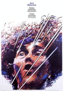
Polish Chamber Orchestra

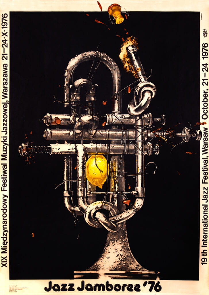
“Jazz Jamboree”, designed by Waldemar Świerzy in 1976; Source: Polish Poster Shop

Polish posters of those times were characterized by a wide use of painting techniques, bold spirt and use of color and sophisticated imaginary. At that time, the pursuit of a unified graphic style with rigorous compositions that gained popularity in the West was replaced by euphoric, expressionist designs.The founding fathers, Henryk Tomaszewski and Józef Mroszczak, developed a visual culture that became a source of artistic expression in the times of Soviet propaganda.

Jerzy Maksymiuk’s “Polish Chamber Orchestra” designed by Waldemar Swierzy in 1982; Source: Polish Poster

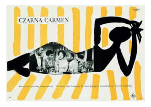
“Czarna Carmen” Movie Poster, designed by Wojciech Fangor in 1959, Grafmag

The Political scene

The 1950s were one of the darkest moments of Polish history. After the Second World War and the defeat of Germany, Polish socialist state subordinated to the Soviet Union was created. With the establishment of People’s Republic of Poland cultural activities were constrained by censorship and a monopoly of state-controlled cultural institutions. Artists were unable to express themselves freely, and the refined works of “high art” lost their function. Everything was supposed to speak to ordinary workers, hence the intellectual spheres were opt to be disband. The promotion of cultural events such as opera, theater, films and exhibitions, became virtually the only context in which artists could express themselves. These posters’ images frequently carried powerful, inexplicit commentaries on the designers’ political surroundings which did not directly refer to the event that was promoted. “The Communist state maintained a strict censorship policy and monopolized the commissioning and distribution of all printed media in that period, yet bureaucratic patrons colluded in turning a blind eye to the oblique but powerful critical commentaries contained in many of the posters.” (MoMA)

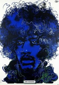
“Jimi Hendrix” designed by Waldemar Świerzy in 1974; Polski Plakat


International exposure

This artistic movement commonly known as Polish Poster School, has made quite an appearance in the Western artistic communities. It was assumed that Easter Europe was a very bureaucratic and dark place completely controlled by politics. Meanwhile the posters have been very colourful, lyrical, often had an allegorical undertone and fundamentally didn’t match the expectations of the Eastern Block culture (Culture.pl on YouTube).

Perhaps the greatest exposure to the distinctiveness of Polish poster art was given by the International Poster Biennale, which took place in Warsaw in 1966. Józef Mroszczak organized an event dedicated to highlighting the finest achievements in poster design. The Zachęta Gallery has become a meeting place for artists from all over the world, even Andy Warhol took part in it.

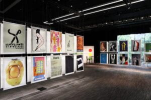
“Warsaw International Poster Biennale in Hong Kong” exhibition; Source: Culture.pl


Beyond “Banana” idea

Of all the countries of the Eastern bloc, Poland sustained the most consistent resistance towards the Soviet regime. Polish designers through mass produced poster art expressed their opposition to the state apparatus and hostility towards the communist party.

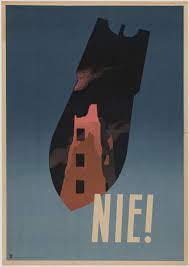
Tadeusz Trepkowski’s Lithograph “captured the memory of the devastation wrought in World War II—just one in four buildings remained standing in Warsaw” (MoMA). In the 1950s, the communist central state created a utopian, anti-fascist narrative focused on promoting peace against “capitalist aggression.”

Tadeusz Trepkowski, “Nie! (No!) designed in 1952; Source: MoMA.


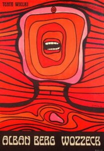
Jan Lenica designed the Wozzeck poster in 1964 for Warsaw production of the “Alban Berg’s avant-garde opera about ordinary people striving for dignity in the face of abuse and brutality” (MoMA). The theme as well as the aesthetic resonated with the atmosphere of escalating tension within the Communist Bloc. The poster has been awarded a Gold Medal at the first Warsaw International Poster Biennale.


Poster for Alban Berg’s “Wozzeck” opera, designed by Jan Lenica in 1964; Source: MoMA


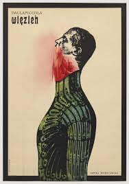
Roman Cieślewicz’s Wiezien (The Prisoner) (1962) created a poster for the Warsaw production of the 1944 opera by Luigi Dallapiccoli, in which a Spanish prisoner, after avoiding punishment, find himself in the arms of the Grand Inquisitor and is burned at the stake.“Both poster and opera conveyed the pessimism and sense of deception and entrapment prevalent in Cold War Europe” (MoMA).

Roman Cieślewicz’s Wiezien (The Prisoner) (1962); Source: MoMA