Branding in Sports

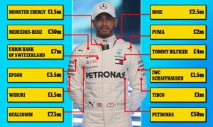
As we have seen over the course of this class, branding is everywhere. Whether we realize it or not we are constantly confronted with brands throughout the duration of our day, from when we wake up to when we fall asleep. For example, now just sitting at my desk, I can easily count 20+ logos in my immediate field of vision. For my last blog post I wanted to focus on something I am passionate about: sports. As soon as I started thinking about this I wasn’t sure how to narrow it down. There is so much branding in sports from jersey deals, team sponsorships, individual sponsorships, etc. 

First, there are the obvious partnerships that deal with naming of buildings and logos placed on the front of shirts and the sides of lightning-fast race cars. In Formula 1 we are almost so overwhelmed with branding that you lose the color of the race suit. However, as abundant as these smaller contracts are, the most impressive come from the top teams’ leading sponsors. It is reported that Red Bull pays over $200 million per year for the team to carry the name “Red Bull Racing”. Mercedes is rumored to pay a similar amount for the equivalent naming rights.
    

These numbers are quite staggering considering that U.S. Bank paid $220 million total for the naming rights of the new U.S. Bank Stadium in Minneapolis, MN (home of the NFL team Minnesota Vikings). Nevertheless, the rationale behind these sponsorships is quite obvious: brand awareness and increasing familiarity. 

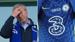
Building off of this same branding methodology, we see high prices paid for advertising on the front of football team’s kits. For example, in the Premier League Nike has a £900 million deal with Chelsea to provide them with kits for the next 15 years. As far as the sponsorship on the front of the jerseys, telecommunications company Three out of Hong Kong also partnered with Chelsea to feature a 3 on their shirts, tallying a £40 million sticker price. However, as we have seen recently with Chelsea F.C., it can be risky for a brand to attach their name to an athlete or team whose performance and behavior is out of their control. In light of Roman Abramovich’s Russian funding during the war with Ukraine, Three requested Chelsea remove the 3 from their kit and stadium. They did not want to be associated with Abramovich’s ill-behavior. 
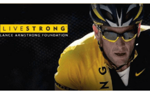
This is not the only instance of branding mishaps in the sports world, as we have seen with former professional cyclist Lance Armstrong. Armstrong won seven consecutive Tour de France biking races in the early 2000s, all while being a cancer survivor. This launched his brand collaboration with Nike through the Livestrong Foundation. However, when it was finally discovered that he had illegally enhanced his athletic performance through doping, all of his sponsorships were dropped. This is a way for a brand to protect itself from the damaged reputation and image of an athlete. It also highlights the downsides to participating in sponsorships and collaborations in sports and other industries. 
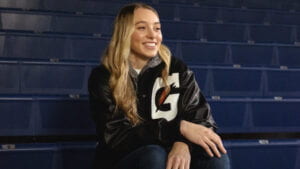
Nevertheless, sports still present a big opportunity for companies to grow their brand recognition and emphasize their brand values. Recently, this has become a big topic of discussion particularly in the NCAA. In the new ruling, Name, Image, Likeness (NIL), allows college athletes to monetize their right to publicity. Essentially, in the past they were not allowed to be individually sponsored or having partnerships with brands. This would all be done at a team level, operated by and collected by the universities. However, the recent rule overturn changed this, allowing athletes to begin to build their own brand name and collect signings with companies. An example of this is when Paige Bueckers, a women’s basketball player out of Minnesota, USA, became the first athlete to be sponsored by the popular sports drink company Gatorade. The Wall Street Journal reported that between Gatorade and another sponsorship with StockX, she could make up to $1 million. Why would Gatorade pay her? Publicity. While Gatorade is already a well-established company with a strong logo and product, it lacks the public’s awareness of their brand values. As NIL was a huge discussion in the news, fans of the sports world eagerly awaited big companies to reach out to athletes. When Gatorade announced this, it not only made headlines because of its relevance and timeliness, but because of who they were sponsoring. Paige Bueckers was an extremely popular athlete in her field, but is still a big statement Gatorade made about women’s sports when they chose their first ever college-athlete sponsorship to be with her. 
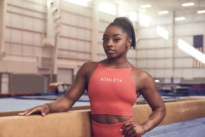
Building on this, we have seen a recent brand collaboration between Olympic gymnast Simone Biles and GAP’s female sportswear brand, Athleta. Biles ended her deal with Nike which had been in place for six years in favor of a new collaboration with Athleta. She did so because she felt she aligned more with the brand values at the womenswear company. Athleta’s slogan “Power to the She” really resonated with Biles as she saw a company built on lifting women and girls up through sport. This proved to be a valuable switch for both Biles and GAP when the gymnast experienced the “twisties” during the Tokyo Summer Olympics. After pulling out of several events mid-competition, Simone Biles said she needed to do so to focus on her mental health. Sticking by her side, Athleta then became associated with mental health, not only an important health condition, but one gaining much attention in recent years. This allows GAP to gain positive publicity surrounding their brand and their values/ethics as a result of their partnership with Biles. 
Overall, we see an immense amount of branding in all athletic spaces. While it may be a risk to companies to associate themselves with an identity outside of their control, the benefits are often worth it. I believe that over the coming years we will continue to see sponsorships, especially in the new NCAA space, flourish and grow monetarily exponentially. One example of this is the continual growth of prices to advertise during the NFL Super Bowl, as this year 30-seconds of advertisement space was sold to companies at a whopping $6.5 million to reach its 112.3 million viewers. 


https://onestopracing.com/how-much-does-it-cost-to-sponsor-an-f1-team/

https://sportsnaut.com/super-bowl-lvi-commercials-cost-6-5-million-per-ad/

https://www.nfl.com/news/super-bowl-lvi-total-viewing-audience-estimated-at-over-208-million

https://en.wikipedia.org/wiki/U.S._Bank_Stadium
https://www.goal.com/en-ae/news/why-chelsea-still-have-three-shirts-sponsorship-deal/blt812b8301ff2ef05e

https://www.livestrong.org/content/lance-armstrong

https://www.reuters.com/lifestyle/sports/athleta-sponsor-us-olympic-gymnast-simone-biles-says-it-stands-by-her-2021-07-27/

https://www.reuters.com/lifestyle/sports/american-gymnast-simon-biles-ends-partnership-with-nike-join-gaps-athleta-wsj-2021-04-23/

Fitegy Branding – Initial Steps

I am currently working on a start-up with a couple other students on campus. It is a social fitness app called ‘Fitegy’ which allows members to track, share, and challenge each other in the world of fitness and wellness. At the first meeting I wanted to establish that right off the bat: is this app just for fitness, or for overall wellness? We decided as a group that it would be both fitness and wellness based, providing rewards for a run or a needed rest day. I believe this said a lot about where the branding of this product was headed, as it was more than just producing performance numbers. 

When I first joined the team I wasn’t completely sold on the name. “Fitegy”, a combination of fitness and strategy to me left out the social aspect of the application. Thus, I tried to propose a way to both emphasize the community aspect, and also generate interest. I wanted to create branding that produced a feeling of “in group/out group”. I don’t mean this in a way that the app would be exclusionary, but more so in the way that if someone didn’t have the app, they would feel like they weren’t part of the “circle”. Thus, they would be psychologically incentivized to download the app and give it a try. As this product is subject to the network effect (where its services become more attractive as more people participate), this would mean progress for us. 

Thus, I started to brainstorm words that dealt with fitness:

    • core, sore, lat, push, curl, crunch, jog, fit, rows, form, sweat, kcal, press, Darwin, survival of the fittest

Then I tried to name acronyms using fitness words and terms I thought would create an “in group” feeling (ex: team, group, club, etc.) such as: 

    • CORE (club of recorded exercise)
    • SORE (society of recorded exercise)
    • FORM (foundation of recorded movement)
    • SWEAT (social wellness, exercise, and athletics team)
    • kCAL (kinetic club of athletic lifestyles)
    • PRESS (public recorded exercise social society)

Unfortunately, in my opinion, none of these wowed the founder enough to stray from his original “Fitegy” branding idea. Thus, it was up to me to move on and focus on the branding with this constraint. I began by asking what kind of feeling he wanted the app to portray to its users. Tying into the wellness idea, he didn’t want this app to feel like fitness was do or die. I was specifically to avoid harsh colors like black and red, instead focusing on earth tones and smooth lines. This was aiming at giving the client a feeling that workouts aren’t daunting and that there is no pressure to do anything they don’t feel comfortable with. The motivation should come from the social/fun aspect of wellness instead of fear or pressure. 

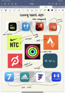
The next step for me was to study our competitors through due diligence to see if there was any obvious branding trends the existing apps followed. As you can see below, there is quite a spread. Nothing particularly jumped out to me from the market as a whole, but I did notice a few trends to stay mindful of. 

    • acronyms
    • running-specific apps
    • using existing brands (app is just a spin-off)


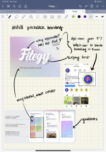
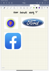
Next I received a copy of our initial pitch-deck. This is where I really saw the branding begin to take shape. The founder pivoted from earth tones and dove into colorful gradients. He selected a scripty, soft-lined font that in my opinion worked really well to convey the feelings he was going for. The visual felt fun and flirty without losing its maturity. However, I did note that the “F” looked a bit like the “F” in the Ford logo (shown below). Also, if we wanted to use just the F in our branding, we had to be careful with existing brands who do this such as Facebook and Frich (a social money app out of NYUAD). 


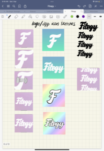
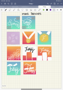
So, then I began with some initial sketches on my iPad. 

I presented this to the group and it was taken really well. The two favorites from this were both of the blue and green gradient images. This was very exciting. At this point I felt very confident and comfortable using the script as the logo, but I wanted to push myself to think of potential image based marks. So, the next step was creating a mood board. 

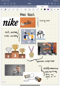
The themes I wanted to highlight were the scripty font, teamwork collaboration, achievements, and the social aspect. You can see what I came up with below. 

Then, I translated these to some very rough sketches on my iPad. I particularly like the top design (using the string on the can to spell out Fitegy) and the bottom design (incorporating the tape runners break when they cross the finish line and win the race). 

Even after all of these sketches, I still feel like the word-mark holds the most potential. Nevertheless, I presented the newest sketches to my group. 

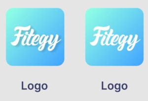
When I presented, they too found the word-mark to be most pleasing for the logo. Thus, after changing the gradient a bit, we decided on two final versions: one with a shadow and one without a shadow. We prefer the one without, but the shadow increased readability. We are still deciding. 


No Logo/Yes Logo: Focusing on the Halo Effect

I watched the film “No Logo: Brands Globalization Resistance”, a spin-off of Naomi Klein’s book No Logo. In it she shares with us how people are upset about how branding has taken over the way we interact with and perceive the world and our surroundings.

(https://nyu.kanopy.com/video/no-logo)

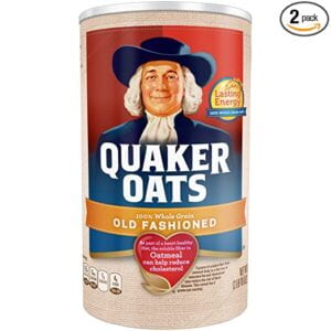
Interestingly, when companies began to shift to larger producers and warehouses, they were concerned they would lose the personal touch and relationship the shop owners had with their customers. They were worried a person’s loyalty that was linked to the relationship they had with the owner would stop without in-person connection. “So the original brands were comforting logos that were often people, like Quaker Oats or Aunt Jemima, that were essentially surrogate relationships” Klein says. “It’s like, okay, you’re not buying it from the local shopkeeper. You’re not buying it from the local farmer. But here is this image that you can relate to. You can form a personal relationship, albeit a fake personal relationship, but the message was you can trust it as much as you would trust [a real shopkeeper]”. In the film she highlights the Jolly Green Giant in addition the Quaker man and Aunt Jemima.


Do we still see this method today? By searching for “brands with people in the logo” I found the following (by no means exhaustive list): 

However, there was much less of these examples than there were logos without people as the prominent feature. Interestingly, Gerber uses their Gerber baby as a source of marketing beyond just marking their products. Each year they select a “spokesbaby”, a child who’s application and photo is submitted by their parents to represent the brand for an entire year. This act of reaching out to the customers and engaging families with the branding is, in my opinion, quite brilliant. In addition to being awarded a $25k check, the family “(i) serve[s] as official Chief Taste Tester to taste and review new baby food products to help inform future innovations to foster nutritious product growth and highlight product quality; (ii) support the next generation of children through Gerber’s sustainability commitment of planting 1M trees in 2021; (iii) support the next generation of children and the world they inherit through Gerber’s larger brand act; and (iv) guest star as Gerber CEO for day where he/she will formally announce his/her 5-year plan and host a Gerber social media takeover to document this very important day-in-the-life as CEO” (Gerber.com). This platform really shows that Gerber baby food and products are for every baby. 

Later in the film, Klein goes on to explain that the most successful brands have recognized that they are selling more than the physical item. “In a global marketplace they had to understand that their true product was not a product i.e. sneakers, movies, lattes, computers. It was an idea, a lifestyle. It was meaning itself” she says.

Thus, companies with successful branding strategies figured out how to intrigue us psychologically. Klein says “they understood that they could sell ideas, that they could sell lifestyles […and] became powerful precisely because they understood that they were selling ideas instead of products”. 

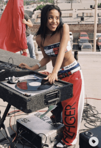
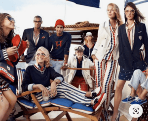
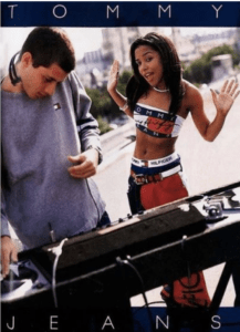
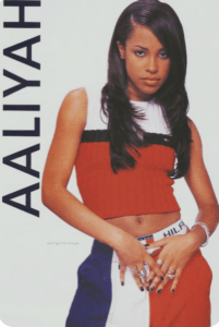
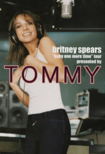
“[Tommy Hilfiger was not the first] to put the logo on the outside of the clothing as opposed to on the inside of the collar. Lacoste and Polo had been doing that for a couple of decades, but there was a difference in scale, because it wasn’t the little alligator in the corner. [It was] almost like a walking talking, Tommy Hilfiger doll” (Klein). 


In addition to this, the film also highlights how they focused on dressing pop stars to draw further attention to their values and interests as a brand. 


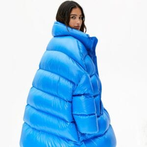
So, how does this branding halo effect apply to today? Take this as an example. A giant blue puffer coat. Would you purchase this? For 550 aed?

What if I told you this was crafted from the “creators and purveyors of Everyday Luxury, [Aritzia]. Home to an extensive portfolio of exclusive brands for every function and individual aesthetic” (Aritzia.com). Is it more appealing now? 

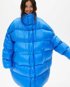
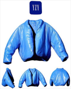
Maybe you need more convincing. Would you purchase it if you knew it was Kanye’s YZY x GAP collaboration? This blue puffer jacket sold out in a matter of hours for 735 aed a piece. 


Still, to me this is not enough to pull out my credit card and make the purchase. However, I am intrigued by this one. 


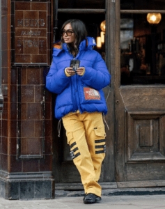
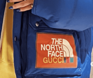
This is British stylist Carlotta Constant rocking The North Face x Gucci’s blue puffer at day three of London Fashion Week, February 2022. Now this is something that I would buy. Is it because she’s a style icon of mine? Is it because of the prominent branding on the side? I can’t pin down the precise reason, but it makes me feel something that the others did not. Ms. Constant paid whopping 9200 aed to “look like a cute little blueberry” (Constant via Instagram). 

When contemplate buying such a jacket, whether it be Aritzia, YZY x GAP, The North Face x Gucci, etc., are we really purchasing them for their quality? Is that what we are paying a premium for? Rather, we are purchasing them because their branded identity emblazoned on the side. It is because we believe consciously or subconsciously this mark conveys a message about us. That our association with the mark can tell others something about us as a person, about our values or our qualities. It is the classic tale of halo effect. 
Sources:

https://nyu.kanopy.com/video/no-logo

https://www.instagram.com/p/Caen8-VNHDi/

https://www.aritzia.com/us/en/aritzia/about-aritzia/about-us.html

https://selectabisso.com/en/kanye-west-yeezy-x-gap/

https://www.farfetch.com/ae/shopping/women/gucci-x-the-north-face-padded-jacket-item-17695490.aspx?size=23&storeid=10524&utm_source=google&utm_medium=cpc&utm_keywordid=33895608&utm_shoppingproductid=17695490-8876&pid=google_search&af_channel=Search&c=807410390&af_c_id=807410390&af_siteid=&af_keywords=aud-360016540289%3Apla-297226412379&af_adset_id=40241116445&af_ad_id=191626448585&af_sub1=33895608&af_sub5=17695490-8876&is_retargeting=true&shopping=yes&gclid=EAIaIQobChMIy8vZkOym9gIVmOvtCh1wSwUAEAQYBSABEgI_O_D_BwE

https://www.campaignlive.com/article/jolly-green-giant-goes-deutsch-ny-reinvention/1381328

https://www.pinterest.com/search/pins/?q=tommy%20hilfiger%20ads%2090s&rs=typed&term_meta[]=tommy%7Ctyped&term_meta[]=hilfiger%7Ctyped&term_meta[]=ads%7Ctyped&term_meta[]=90s%7Ctyped

https://sco.wikipedia.org/wiki/File:KFC_logo.svg

https://www.gerber.com/photosearch-contest-rules

https://www.nydailynews.com/news/national/wendy-logo-time-1983-article-1.1180587  

https://www.rollingstone.com/culture/culture-news/quaker-oats-ends-aunt-jemima-brand-1016380/

The Life and Legacy of the Chelsea FC Logo

Chelsea FC, a Premier League football club based in London, England, was founded in 1905 by Gus and Joesph Mears. After acquiring the Stamford Bridge athletics stadium, the pair decided they would form a football team to play in it. In their early stages of branding, they threw around names including “Stamford Bridge FC”, “Kensington FC”, and “London FC”. However, in the end they decided on now widely recognized “Chelsea FC”. It is interesting to contemplate how a branding decision like the selection of a different name could have affected the life of the club. For example, should the Mears chosen “London FC”, it comes with an even larger weight on the shoulders of the club, the staff, and the players to outshine the other clubs in the city (Fansided – The Pride of London). 

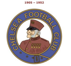
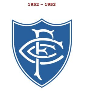
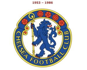
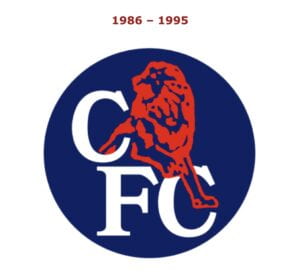
The next step in branding the team was deciding on a logo and official colors. After the club found its way to the top division in English football in 1907, the club presented it’s players celebratory badges in the shape of a lion, the symbol of the house of Lord Cadogan, the club’s president. However, this did not become the club’s inaugural logo. Rather, the circular crest seen below featured a Chelsea Pensioner (a former member of the British Army and a resident of a special retirement home in Chelsea (Chelsea Pensioner – Wikipedia)). This design lasted almost half a century before it was dramatically changed to a shield with a CFC letter mark/initial aberration (Per Mollerup 112 and 121). 

(Logo-World.net)

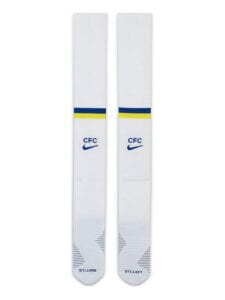
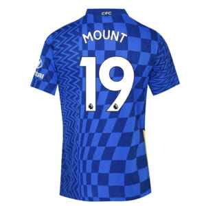
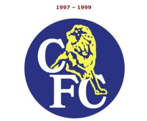
While the letter mark/initial aberration returns in the late 90s before disappearing again, it is still seen on today’s kit featured on the back neck of the top and the socks. 

(AmStadion and LittlewoodsIreland)

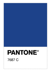
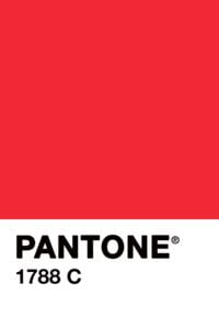
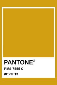
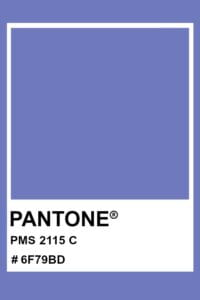
Included in these designs is the signature color, the royal Chelsea Blue. Today, these colors are still the official hues of the football club. 


Notice that the first three colors are rich jewel tones, suggesting the regality of the club (2115 C is only used to shade objects in 7687). In fact, Chelsea Blue became such a prominent part of the culture that the team’s nickname changed from “the Pensioners” to “the Blues”. This underlying theme of club royalty extends past just paints. Inspired by the symbol of the clubs first president previously mentioned, Lord Cadogan, the lion became a central fixture beginning in 1953. The lion symbol is often referred to as the “king of the jungle”. Thus, it could be inferred that the club’s use of the lion declares themself to be the king of the Premier League.

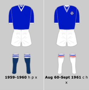
(Historicalkits.co)

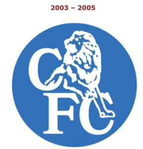
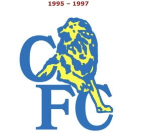
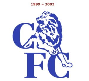
The 1953 crest was the first to be included on the team’s jerseys. The rebranding was central to rid themselves of the “jokes about the Pensioners” (What is the Story Behind Chelsea’s Badge – Youtube). The presence of the lion remains through its current logo, although it bounced to an modified silhouette between 1986 – 2005. 


The below logos came as a great joy to the fans as they were not pleased with the reign of the ones above. So, for the club’s 100th anniversary it launched the new logo in time with an increase in spending on talented players and managers. The 2005 logo was announced the fall after they were crowned champions of the Premier League, for only the second time in the clubs history. Then, during their first season of playing under this crest, they won the Premier League for a second year in a row. Thus, this symbol became associated with an era of success and trophies for the team. 

(Logo-World.net)

In today’s logo we still see strong resemblance to that which debuted in 1953. The prominent lion is joined by a staff, footballs, and Tudor roses. These flowers represent England, and thus the crest demonstrates the “kingdom” of Chelsea FC to be of football and country. 


Sources: 

Marks of Excellence, Per Mollerup

https://www.pantone.com

http://www.historicalkits.co.uk/Chelsea/Chelsea.htm

https://logos-world.net/chelsea-logo/

https://theprideoflondon.com/history-chelsea-football-club/

https://www.worldfootball.net/winner/eng-premier-league/