Creativity

Introduction

If one day I suddenly ask you what would be the first thing that comes to your mind that you think is the most important, crucial, necessary, a must-have tool for anyone who is trying to get into the artistic world and trying to do art-related projects such as designing logos? Some of you guys would maybe immediately think of drawing skills or painting skills or even technical skills such as knowing how to use Adobe programs like Illustrator and Photoshop like the back of your hand. Even though all these answers are indeed correct and I do agree as well that having these types of skills are important in the artistic world, but I think there is another thing that all of these skills stem from… Creativity.


I have always felt that whenever someone asks me what is the one and most important skill to have when doing arts, the word “creativity” immediately pops into my mind. This does not come as a big surprise to me as artists literally uses this word on a day to day basis with their colleagues and friends like “I think we can make this logo more creative or unique… No, this isn’t creative enough… Let’s put maximum creativity into this logo!” Though the word “creativity” has always been one of the most commonly used words in the art world, it has always been a question for me as to what exactly do people mean when they say to “have creativity” or to “be creative”.


To me, perhaps the reason why I’ve never been able to fully understand what people meant by being creative or having creativity was because the word itself was extremely vague and that it could be applied to all the little things that we do in our lives.

Inspired by this train of curiosity, I decided to research a bit more about creativity such as what exactly is creativity? How do you improve it? Is there a way to measure or dictate whether you have enough creativity to be a designer or artist?

Creativity…
Business creativity: Truths and myths with Dr Marc Stierand

So I first started off by looking up the most basic question on the internet to start my search about creativity itself… “What exactly is creativity?”.  At first, I immediately got a search result from Oxford languages about the definition of creativity and it was defined by the website as “the use of imagination or original ideas to create something” Even though this definition may be correct, but I felt that this definition was not really encapsulated, or something was missing as it did not encompass how creativity can be also utilized. Hence, I kept on searching. After a while, I came across an article about creativity as well that was written by the American Psychological Association. The article immediately starts off by stating that “Not all creative people are alike, which makes defining creativity a challenge and assessing it a monumental undertaking.”  I would like to ask you all which definition or statement do you agree with more about creativity? Even though the latter did not exactly provide a concrete definition of what creativity was, I prefer this one as it acknowledges the fact that creativity is not a standardized thing that applies the same to everyone, but instead it varies between people due to different personalities and personal experiences. 

Another point about creativity that was mentionedwithin the same section about what exactly creativity is was also extremely valid and fitting for me. It was a statement by the psychologist Dean Keith Simonton, PhD, of the University of California, Davis, that read: “You can’t be creative unless you come up with something that hasn’t been done before… The idea also has to work, or be adaptive or be functional in some way; it has to meet some criteria of usefulness.” Again, this adds another layer of definition to the word “creativity” where this layer involves not only originality but now also the aspect of usefulness. To me, this makes sense as well because anyone can be creative and imagine many impractical fantasies and visions about something that we’ve never seen before, but at the same time it has to be practical in the sense that this creativeness is able to be produced into the real world, or tangible. 


“Little-C” & “Big-C”

History of Creativity Art Science Technology . Class Website or Google  Brent Strong. - ppt download

As I further read through the same article about creativity, I came across another piece of information about creativity that fascinated me… Little C and the Big C. According to what Simonton says within the article, there is a distinction to be made between two forms of creativity: Little-C and Big-C, which means little-c creativity and big-c creativity. Within the article, Simonton states that little-c creativity implies more of basic functionality such as everyday problem-solving and the ability to adapt to change. I think what this means is that whenever we encounter little problems within our daily lives, such as trying to get past someone that is blocking your path, we have to use a bit of creativity and imagination to work our way around that problem, which in the example of the person blocking our path we would innately think of walking around them. Even though this may seem as if it is an involuntary thing to us, this action is still considered a form of problem-solving and the ability for us to adapt to our surroundings. On the other hand, big-c creativity is far more rare as it only occurs when a person solves a problem or creates something that has a major impact on how other people think and feel. Or in Simonton’s words: “…it’s something that we give Pulitzer and Noble prizes for.”


Paula Scher on Creativity 

After finding out all those interesting information about information such as the “little-c” and the “big-C” of creativity, I remembered something that Goffredo had recommended us all to do that was also related to the topic of creativity but I was not so sure what exactly was it, so I went back searching through my notes on anything that had caught my eye before that was pointed out by Goffredo but I did not have the time to delve into.

After a while, I was able to find the thing that Goffredo had recommended us to do a while back, and that was to watch a short video about one of the most legendary designers of our world, Paula Scher. Specifically, Goffredo wanted us to watch one video of an interview with her talking about creativity and after watching the video, I found various points to be really impactful to me and that had made me really reflect a lot about myself and for the world of designers.

“I don’t think success leads you anywhere…When you’re successful, you tend to repeat those things you already know how to do and they become terrible grudges. Nothing like a good sloppy failure to wake you up”- Paula Scher

When I first heard Scher talk about success in this way, it really changed my entire perspective on how I view success now for at least the art world. Before, probably like everyone else, I always viewed success as the only way to go for my future career because essentially who doesn’t like a bit of success in your career right? I feel that there is a lot to reflect upon what Scher said about success because I feel that our minds are all fixated within the mindset that we all have to always aim for success and to make money so that we can have a good life and even a future family. Though this may be completely fine for other fields of expertise in the world such as Economics, Business, or Computer Science as most of the people who are within this line of work are solely aiming for success so they can earn more money and success. However, I think this is not the case for people like me who are in the art world as I think we don’t view success the same way as economists or businessmen do. Just like what Scher said, I think for artists, we can’t afford to simply stop at success and feel content. We have to learn to treat success as not our ultimate goal but rather a turning point within our career where we try to do something completely new and strange to us in order to be creative again. If we don’t, just like what Scher said, and we get attached to success, we would slowly lose sense of why we first started this path of ours and maybe even start to get less and less creative over time. What do you guys think about Scher’s view of success for artists? Is it valid and is success different for people? 

“It’s part of maintaining a viable design practice is that you are always looking to grow and to change…[If] you’re not growing and changing with your time and not looking for the next best way to be expressive, you’ll be out of business…”

– Paula Scher

Upon hearing the sentence by Scher about how a viable part of design practice is to always look to grow and change with the times to constantly look for the next best way to be expressive, I immediately thought about Soojin’s post about staying relevant with your time. Just like how Soojin mentioned in her blog about how Goffredo taught us to always be up to date with every new technology, trend or practice within the field of design so we can change with the times. Just like what Scher mentioned before, if we don’t keep up with the times, we will slowly be irrelevant, and I think being irrelevant with the world is the worst thing that can ever happen to anyone working within the art world, whether it being a contemporary artist or a logo designer. Do you guys also agree that being irrelevant is probably one of the worst things that can happen to anyone within the art world, such as a logo designer? 

References:

Kersting, Karen. “Considering Creativity–What Exactly Is Creativity?” Monitor on Psychology, American Psychological Association, Nov. 2003, https://www.apa.org/monitor/nov03/creativity.

Oncreativity, director. OnCreativity: Paula Scher Interview, Part 1, YouTube, 6 Dec. 2018, https://www.youtube.com/watch?v=foeV4ZML55s. Accessed 7 May 2022.


Logo Globalization

Introduction

Throughout this class, evidently since this is a logo design class, we have for sure already seen countless logos with varying designs, color palettes, typography, shapes, and many more features. We can all agree that these are all vital features that all play a big role in creating a visual identity or a logo for a company, brand, research center, whatever you name it as long as it has a visual identity, it has a logo.

Aside from all those important features of what constitute a logo, another important thing that I have learned with logo designs is that logos either include or do not include their brand names. Some famous examples where the company’s logos do not include their brand names include Nike, Apple, McDonalds, Starbucks, Target, Dominos, LG, Mercedes Benz, and many more logos. The most important thing with these logos is that whenever we see these logos, we’re still able to immediately associate these logos to the brand without the brand names written out in the logo.

Target emblem

Apple LogoNike Logo

However, there are also effective logos at the other side of the spectrum that do include brand names within their logos, such as: Pizza Hut, Ford, Coca Cola, IKEA, Lego, Intel, Lays, and many more.

Coca-Cola logo

Lays Logo

Pizza Hut logo

Naturally, especially for those types of logos where the brand name is a representative element, these international companies and brands will make sure include the brand names within the logo design or else it would not stand out as much. Or people would just not be able to immediately associate the logo to the brand or company without the inclusion of the brand name. 

As I was wondering about these logos rely heavily on the brand names, a question suddenly popped into my mind: What would happen if these logos, originally written in whatever language like English or Spanish, wanted to expand into other countries that speaks an entirely different language? Would these companies still choose to use the same language for their brand names within their logos or would they change it?

The reason why I came up with this question was because in China, the national language is Chinese. I remembered that sometimes whenever I was walking down the city streets in China, I would see that a few foreign companies or brands with logos with their brand names translated completely from their original language into entirely Chinese.

However, the interesting thing that I also noticed was that there were different methods of translating or adapting their brand names within their logos in order to fit with Chinese. Therefore, this sparked my curiosity and inspiration for today’s blog, which is about why and how do international franchises or brand companies choose to change or alter their logo designs in Chinese or Mandarin speaking countries?

Generally why do companies change the brand names of their logos in different countries?

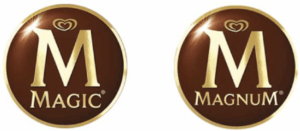
After doing a bit of research, I was able to find a couple of main reasons as to why companies would choose to change their brand names of their logos in other countries: The first reason is because perhaps there was a word within the brand name that had already been recorded or taken by other local companies. In some instances, these foreign companies when trying to move into another country’s local market, their brand names might have already been taken or registered by another similar local brand in that country. Therefore, this forces the foreign brand or company to have to change their brand name within their logos. But, an important thing to note here is that the new logo still has to retain other representative elements of the original logo, such as its colors or typography or others. A few examples of this first reason could be seen from companies and brands such as “Dunkin Donuts” and “Magnum”. In the case of “Dunkin Donuts”, when the company wanted to expand into Spain, it was not able to use its original brand name as the word “Donut” was already registered by another local company in Spain called Panrico. Therefore, the company decided to change the name to “Dunkin Coffee” while keeping the logo in order to make it more recognizable. A similar case happened to the famous ice cream brand “Magnum” where the company had to change its name to “Magic” in order to not lose its essence because the word “Magnum” had already been registered by a competing brand in Greece. 

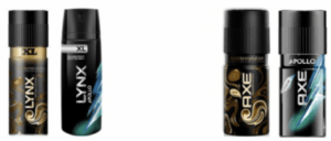
The second reason as to why companies would choose to change their brand names from their logos in other countries was because particular words within the brand name could have a negative double meaning in the original language. In other words, it is when the original brand name could be perceived as inappropriate or unconventional in other countries. An example of this would be the body deodorant brand, “Axe”. The word “Axe” was originally created in France and the word “Axe” might have meant something pleasant or at least fitting in the French language. However, when it was expanding into the English-speaking market, it had to change its name to “Lynx” as the word “Axe” could be too violent for a deodorant brand. 

The last but not least reason for changing its brand name within their logos is the reason which I want to focus on, and that is because of the language barrier. For example, China is now one of the world’s largest markets for literally anything so large companies would definitely want to expand their markets into here. However, as China’s home language is Chinese, these companies would sometimes even translate or change their brand names that fits with the Chinese language. 

Brand Names in Chinese (for 2021) ⭐️ 36 Big Name BrandsHow do foreign companies with English brand names change their brand names in Chinese or Mandarin speaking countries?

According to an article called “Translation of Western Brand Names in Chinese as a Marketing Strategy” by Denise De Salvo, she identifies three main strategies of changing English brand names into Chinese. 

The first strategy is “Phonetic Translation”, which refers to reproduction of the sound of the brand name with Chinese words. In other words, using Chinese words that sounds the most similar to the English name. For example, the famous Italian car brand, Ferrari, is written as 法拉利 (Fǎlālì), which sounds similar to how we pronounce Ferrari in the English language. However, the downside of this strategy is that there is no meaning at all in Chinese so it might lose its essence as a product. 

How Do The Chinese Pronounce The Names Of Car Brands? | Carscoops

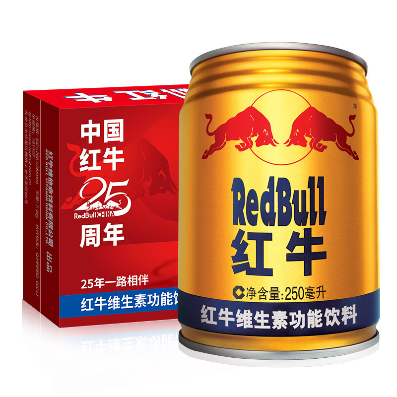
The second strategy is “Literal Translation”, which is basically a literal translation of the English words as the name itself indicates. With this strategy, it helps to preserve the meaning unlike the “Phonetic Translation” but then it loses the phonetic component of sounding similar to the brand name. An example of this strategy is the Austrian brand Red Bull, where it was translated to 紅牛Hóngniúwhich literally means “Red Bull”. 
红牛(RedBull)功能饮料红牛维生素功能饮料(原味型)250ml*24罐【价格图片品牌报价】-苏宁易购苏宁自营
The third and final strategy is usually considered the most effective and best way to translate a brand name, which is the “Symbolic Strategy”. This strategy is considered the best as it not only captures the essence of the product but also the balance between the sound (phonetics) and meaning. An example of this strategy would be IKEA and Mercedes Benz. In Chinese, Mercedes Benz was translated as  奔驰Bēnchíwhich not only has a similar sound to “Benz” but the two Chinese characters also means “to run quickly”, which also goes along with the company itself as it produces fast cars. As for IKEA, the Chinese translation of it was 宜家
Yí​jiā, which also again not only sounds the same to the brand name but it also has a suitable meaning, which is “suitable for home”. These examples once again shows how the Chinese version not only captures the essence of the company’s products but it also sounds similar to the brand name. 

Final Thoughts

Overall, it was really interesting and an educational experience for me, especially when I found out the different reasons why companies would choose to change their brand names and how English brand names are strategically translated into Chinese for Chinese speaking countries.

 
Even though this blog wasn’t really focused on logos itself, just like what I mentioned earlier, the brand name is an essential element in order for logos to be the most effective, so the changing or translating of the brand names are also extremely important and should be strategically planned out. Also, another important thing I also realized that companies needs to retain in their refined logos with their new brand names is other elements that would immediately remind the audience of what the original brand is.
 
I would like to end my blog with an interesting question that I would want to hear from the rest of the class: If you are ever the boss of a internationally famous brand or company and you wish to expand your company into another country but your team informs you that you would have to completely change your logo for your company, everything including the color, design, typography, etc.. Would you choose to completely redesign your logo in order to expand into the foreign market or choose not to expand in order to retain your company’s visual identity?
 

References: 

Hong, F. C. (Frank), Pecotich, A. and Shultz, C. J. (2002) ‘Brand Name Translation: Language Constraints, Product Attributes, and Consumer Perceptions in East and Southeast Asia’, Journal of International Marketing, 10(2), pp. 29–45. doi: 10.1509/jimk.10.2.29.19534.

Veronica ValenzuelaI draw, paint and sometimes even colour at SiloCreativo. I have always wanted to be a writer. “5 Reasons to Change Your Logo in Other Countries • Silo Creativo.” Silo Creativo, 28 June 2021, https://www.silocreativo.com/en/5-reasons-change-logo-countries/.


Yes! Cool Logos!

For this week’s post I wanted to share some of my own thoughts and observations about a few logos that I saw when I was in different malls in Abu Dhabi such as Galleria, Abu Dhabi Mall or Yas Mall as well as providing some information on why those logos were designed the way they are.

Our Favorite Ice Cream Brand 

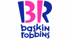
Whenever I would go to the Marketplace to either get my dinner from Amishi Amishi or Escape From New York, I would always pass by this logo and I would immediately feel drawn and compelled to buy a small ball of ice cream from the stall as that is just like my tiny ball of happiness. I can still remember like it was yesterday, it was right after my first Yes Logo class and I wanted to buy a ball of ice cream from Baskin Robbins to perfectly end my day of back-to-back classes. After I ordered my ice cream and was waiting, I looked at the logo again and I was immediately curious as to why this little ice cream brand logo has now become one of the most iconic logos in the ice cream world, so I took a picture of it. Looking at it by myself first before doing any research, I notice a few simple things: Firstly, I definitely thought that the parts highlighted in pink meant something as there are no other reasons why only those parts are in a different color. However, I wasn’t able to immediately figure out what it meant or even if it was done on purpose to mean something else. If it was intentional though, I had a few initial guesses as to what it may mean. I thought that it looked like the numbers “3” and “1” so maybe the number “31” meant something deep to the founders of Baskin Robbins. Other than that, the only other possibility for me was another cool thing that could be done with  the pink and blue highlighted parts was where the two letters could be separated and reformed to create the letters “BR” again but with the pink parts on one side and the blue parts on one side.

After making my own hypotheses about why the logo was designed the way it was, I went online to do some research to fact check.

History of Baskin Robbins

First Logo 

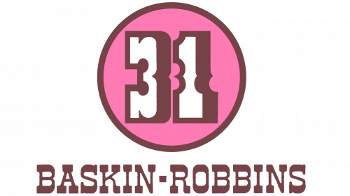
To give a brief history of Basking Robbins, this ice cream company could trace its roots all the way back to 1945 where  the two brother-in-law founders, Burt Baskin and Irv Robbins, first started off by owning both of their own separate ice cream brand. Burt Baskin opened his own ice cream shop called “Burton’s Ice Cream Shop” in Glendale, California. Two years later, the brothers-in-law joined forces and founded Baskin Robbins.

In 1953, they developed their first uniform brand identity (attached below). It was explained that the number “31” was indeed important within their brand identity as the number represented their slogan “31 flavors”, where it means that Baskin Robbins will be providing a new flavor every single day of the month, hence 31 as there are 31 days in a month, not all months though evidently.

Baskin Robbins Logo 1947

Second Logo

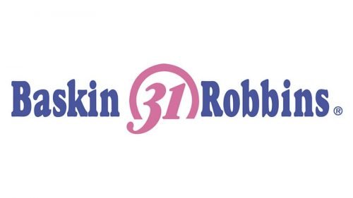
In 1991, the company adopted a second emblem where they still preserved the number “31” within their logo as its core but instead they now merged it more effectively with the word by placing the words “Baskin Robbins” to the left and to the right of the number respectively. Another significant change that was made was the color scheme, where they only included two simple colors: Pink and Blue. Personally, I think that the usage of the colors pink and blue is a good representation of their company as the color blue symbolizes the cool, chilly and cold feeling that we all get from ice cream. The color pink can be associated to feelings of love and sweetness, representing the sweetness from their ice cream. A fun fact that I had found about the usage of pink in their logo was because bubblegum was actually invented a few decades before Baskin and Robbins opened their first store in 1945 and the famous pink color came about because it was the only color available in the factory where it was invented. 

Baskin Robbins Logo 1991

Third Logo 

Moving onto the year 2006, an entirely new logo is introduced again as a part of an entirely refreshed brand. Though the brand no longer maintains the “31 flavor” concept as the company has already produced over 1,000 ice cream flavors since 1945, they still decided to include the number “31” within their logo as it is an integral part of their brand identity. Therefore, they placed the numbers “3” and “1” at the center of the logo but made it less visible. They also decided to make the words “baskin robbin” in lowercase and placed it underneath the “B” and the “R”.

Baskin Robbins Logo 2006

Fourth Logo

Lastly, starting from 2020, the logo did not change much but they just made the color scheme more saturated and slightly darker, which I’m guessing was for the reason of trying to make the logo seem more vibrant or “alive” as the previous version made it looked a bit dull and less “alive”. The last thing I also wanted to comment on is the changing of the font from 1991 to 2006 and onwards. I personally felt that the change of font for not only the words but also for “B” and “R” to an unusual zig-zag letter with uneven edges on the outline is a good change as it conveys this casual, playful and happy mood to the audience, which is what the company stands for.

Baskin Robbins logo

Other Logos I saw 

Aside from the Baskin Robbins logo, I also noticed a few other logos while I was in the city as well as one in particular on campus that caught my eye.

On Campus Logo

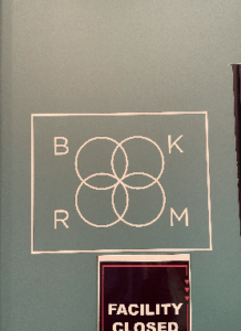
Honestly, I did not even realize that this logo even existed somewhere on our campus until someone pointed it out to me. This logo was found on a door near the PCR testing center’s exit at the far back in C2 West forum. When I first walked up and saw this logo, I was not able to immediately make out what it was saying until a few seconds where I realized that the four circles mixed up in the middle was actually two “o” for “book” and “room”. Personally, I did not like this logo design at all, but my friend that found it really liked it as she thought it looked cool.  For me, I did not like the design of this logo at all because of various reasons: Firstly, the size of the four “O” is a terrible idea for me because it makes it really confusing for the audience to make out what it is trying to say as I believe that our human minds do not immediately make out the circular shapes to be letters “O”.  Secondly, adding onto the previous point, the merging of those two “O” makes it even harder to make out the word “Book Room” because it creates an entirely new shape that draws away the attention of the audience to “Book” and “Room”. Instead, it makes the audience think about what the shape possibly means as they don’t immediately take not of the other four letters: “B”, “K”, “R”, “M”. Thirdly, the lack of color variety within this logo makes it extremely hard to notice for anyone that is just walking pass. Everything within this logo was just white with a white rectangle and no other colors at all whatsoever. I think that a huge improvement to this is by simply adding a background color or even adding some colors to the circles or letters in order to capture the attention of people passing by or else it would just be ignored like the way I did. I would also love to see what do other people think about this logo?

Off Campus Logos

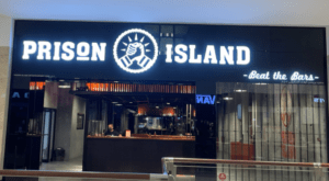
As for this logo that I found in a mall during the weekends, I initially thought that it was a fashion brand of some sort because of the simplicity within its design and color scheme, where it’s just a symbol of two hands holding each other with just a simple black and white color scheme. For me, this was a typical design for fashion brands such as Vans, Chanel, Louis Vuitton, Burberry. However, I later found out that it was not a fashion brand but instead it was an escape room franchise where people have to work together as a team to solve tricky challenges across unique cells. It is only after I found out what this brand is really about that I found out what their logo truly represented. I thought it was pretty interesting of how this logo was designed because it does not represent any of the words within its brand: “Prison” nor “Island”. We don’t see any images associated with prison or an island but instead the logo represents a deeper core message of their brand, which is teamwork. Since teamwork is a vital part of their brand as it is what is required for people to play, they had decided to make a logo representing this spirt of teamwork through showing two hands holding each other like a team.

Another logo that I found that was really interesting was the logo for this sunglass hut brand. Initially, I didn’t even realize that that circular shape was its logo as I thought it was just there for no reason. I remember I asked my friend who was with me why is that circular thing there and that friend said casually: “That’s a sun.” I was so shocked that I did not realize and make that connection immediately, and this just shows to me how logos can have very polarizing effects where it ranges from someone like me not even knowing it was a logo to someone like my friend immediately understanding that it was a sun as it is a sunglass brand. Is there some other way to improve this logo so there would be less people like me where I don’t even realize that that circular shape is actually its logo?

References: 

https://news.baskinrobbins.com/news/baskin-robbins-pink-bubblegum-ice-cream-pops-with-flavor

Baskin Robbins logo

The Prison

Ryan’s First Blog Post

For my first blog entry within this class, I wanted to talk about various topics including my overall reflections, thoughts and ideas  that I had as I recalled all of the things we have discussed within our classes so far.

Logo, Brand, Emblem 

Before taking this class, I was completely oblivious and  had zero clue about what logos “truly” meant and what kind of complex meanings and symbol they entailed. Now looking back at this, it is really ironic as logos are literally everywhere around we us and it will always appear in our sight no matter where we turn to look. For example, I now realize just how amazing this phenomenon of logos truly is as we can see logos everywhere. Whether it being outdoors walking in a random street in the city or even indoors when we’re just studying or relaxing, we can see logos everywhere on our everyday objects that we don’t normally pay much attention to their logos such as water bottles, laptops, chargers, phones, etc.

Another fascinating piece of information that I learned from our class when we were researching about the deeper meanings and symbolisms behind various famous brands within their logos. It  was that there were in fact other “forms” of logos: brands, emblems, and markers. Though we did not exactly go over the difference between all of them, I was immediately curious about what each of them meant and what were their differences.

Logo?

Firstly, what is a logo? Essentially, a logo is a symbol that is made up of texts and images that accurately identifies a business. A good logo in this case will be able to show what a company does and what the brand values. From what we learned in class, a logo should also be able to make your own brand stand out from the other competitions. For example, I found this interesting logo (Figure.1) of the Cactus Dental company where the logo perfectly distinct itself and its company that it is representing with something that not only is unique but perfectly represents the key attributes of their company. What I personally loved about this logo, though it was hard to understand immediately what the brand was about, was that not only did they incorporate a vital attribute of their company name (cactus) into their logo but they were also able to turn parts of the cactus into toothbrushes, helping us to immediately make the connection that they are a dental company. Therefore, from my own understanding, a logo is a symbol that includes texts and images that identifies a business or company.

Unique Logo Design of Cactus Dental
(Figure 1) Unique Logo Design of Cactus Dental

Brand?

Secondly, moving on, what is a brand? A brand refers to a business and marketing CONCEPT that helps people identify a particular company, product, or individual. The most important aspect of this definition that I want to point out is that “brand” is just a concept, an intangible idea. I personally felt that this definition is important to me as I always catch myself being confused about what exactly was the difference between brands and logos when talking about it on a day-to-day basis. Interestingly, according to Investopedia, in contrast to a tangible or visible thing such as logos, a brand is essentially “…the collective impact or lasting impression from all that is seen, heard, or experience by customers who come into contact with a company and its products and services.” 


After learning about the real definition of what a brand is, I was able to truly realize what this “intangible concept” of a brand meant. For example, whenever I think of a brand such as McDonalds, I immediately associate it to my previous experiences that I had with it, such as fast foods and their fast-paced working environment. Though on the other hand, when I think of other luxurious brands such as Wolfgang’s Steakhouse, I immediately associate it to an entirely different experience where it is more luxurious, formal, waiters wearing suits and gloves, people being all dressed up and just overall a totally different atmosphere and experience for its customers there. Interestingly, this difference in customer experiences can also be reflected through the two brands’ logos (as seen below). For example, the typography used for the two logos is very different, where McDonald’s typography (Figure 2) gives off more of a casual feeling, whereas Wolfgang steakhouse’s logo (Figure 3) immediately has a more formal typography and its full name of the company being listed out as well in its logo just emphasizes on its professionalism. 

(Figure 3) Wolfgang’s SteakHouse Logo
(Figure 2) McDonald’s Logo

Emblem?

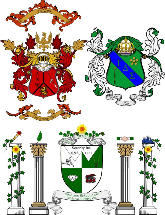
Thirdly, I then moved on and wondered what exactly is an emblem then? Apparently, an emblem is a badge or symbol with a picture and words that are a motto, essentially. Common examples of emblems are normally ones that represent a larger whole. The most common example of an emblem could be the Girl Scout symbol (Figure 4) or the symbol of a fraternity in college (Figure 5). In these two examples, these emblems are representing a larger whole, such as the girl scouts and the whole fraternity. 

(Figure 4) Girl Scout Emblem


(Figure 5) Fraternity and Sorority Emblems


Taiwan Graphic/Logo Design History 

After searching and learning about the deeper meanings and differences between a logo, emblem and brand, I got to thinking even more about interesting stories of graphic and logo design. Therefore, I landed on wanting to know more about the graphic design history of my own country, Taiwan, as I have no heard anything or anyone mention my home country’s history in graphic design throughout my whole life. There were large amounts of information explaining the entire history of graphic design in Taiwan, but I will only include parts that I found to be really interesting and notable.


In the article “Researching Taiwanese Design History in the Context of World Design History” by Dr. Wen Huei Chou, it started off by briefly stating the fact that Taiwan was a hybrid of different cultures such as Chinese, Japanese, and Western cultures such as the United States. Therefore , this will act as the largest influencing factor for the changes in Taiwan’s historical timeline for graphic design. A research that was conducted by Tsuen-Shiung Yau in 2005 found out how the model of industrial production that started to spread widely in Taiwan was later adapted from other external cultures such as from Japan and also later from the United States. This was done by Shiung Yau’s  research on the form and style of  Taiwanese graphic design  and sorting them into typologies like packaging design or labels for various goods. 

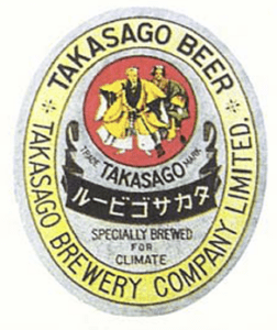
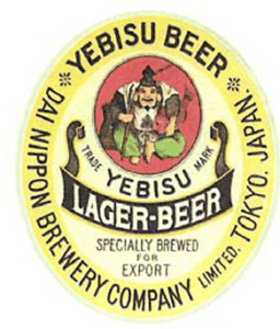
One example of these graphic and logo designs for various goods that I found intriguing were the beer and sake logo design history that showed the influence of external cultures on Taiwan’s local graphic and logo design culture. Basically, there was a beer label design, called Takasoga beer, that was designed in 1920 in Taiwan. The Takasoga beer label design (Figure 6) in Taiwan was later found out that  it was actually imitated from the design of another beer label, called Yebisu, (Figure 7) in Japan.

(Figure 6) Takasoga beer label design in Taiwan,1920
(Figure 7) Yebisu beer label design in Japan, 1920

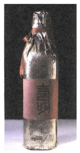
Another example is another series of label designs that were produced for “Longevous Liquor” in Taiwan in historical times. The “Longveous Liquor” was produced during the Taiwan Restoration times and were particularly made for Chiang Kai-shek’s birthdays. Due to some political and historical reasons, the Chiang Kai-shek government had a strong liking to Chinese tradition. As a result, the graphic and logo design culture during this period of time were mostly focused on showing nostalgia for the Chinese cultures and traditions as well as political propaganda. Therefore, as seen in the picture below, one of the “Longevous Liquor” (Figure 8) made in 1969 had its label and packaging designed in red and gold, where the gold color was used to signify supremeness and honorableness in Chinese culture, and the red indicated auspiciousness and joyousness.

(Figure 8) Longevous Liquor for Chiang Kai-shek’s birthday, 1969.

From these two examples of beer brands at the time, it just shows the large influence of external cultures (Japanese and Chinese)  that were caused by colonization had a strong influence in Taiwan’s local logo and graphic design culture at the time.

Restoration of Taiwan’s Graphic & Logo Design Culture 

Even though Taiwan’s graphic design culture was heavily influenced by external cultures, there are now numerous Taiwan-based design organizations and centers being formed that aims to slowly restore Taiwan’s graphic design culture by incorporating Taiwan’s own unique culture into more of these graphic and logo design. For example, a design research that  has  derived  from  the  Taiwan Design Center  is called “L’  Beautiful Chaos”. This  project  invited the ‘Design Together’  (Figure 9) design association, which was  formed  by  seven young independent designers,  to  incorporate  features  from  current Taiwanese society  into  their design. By doing more of this, hopefully one day Taiwan will be able to retain and form its own unique local graphic design culture.

(Figure 9) Taiwan “Design Together” Design Association