Blink Abu Dhabi

          This course has been a very insightful course, it truly was both thrilling and visionary. This course made me remember my big brother’s coffee shop, and made me realize and look at it differently. I did not realize how much something graphic and sometimes simple can hold a lot of thinking and story behind it. That is basically me now looking at my brother’s brand. 
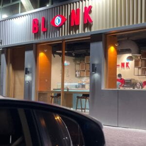
          I reached out to him to discuss how was he able get this design? Who did he work with? How was he able to find them? My brother sent me this website link telling me how it is where many kind of designers and photographers gather to display their work, he described it to be similar to instagram but specific for designers, photographers, digital artists, branding, packaging, etc.  

https://www.behance.net/

           He was able to find someone from there, where he reached to them through email. He scheduled a meeting with them to discuss the matter specifically and explain the details. He was not able to remember the person exactly, telling me its been more than 3 years. That is how they came up with this design.
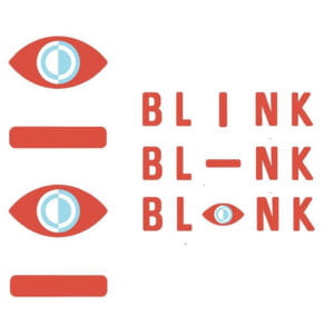
          The design is for a specialty coffee shop so the idea of “blink” is using the eye as a main indicator to whether someone requires coffee or not. For example, when someone eye get sleepy and seem tired a person tell him to go drink coffee to get up. You start with the word blink and flip the I so it looks like a blinking eye, and after getting the caffeine it is able to open its eyes.
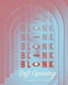
          The color choice of the logo consisted of the red and blue mainly. The red was chosen to depict the color of the coffee seed, and the blue is to communicate that water is the basis of farming, which by that bring up the preparation or farming of coffee.Frosts in Brazil - How Climate Change is Affecting Your Coffee — Best Coffee        I adore also have they included lots of their brand and design in their interior design of the shop. You can spot the hint of red and blue in the shop and is a very important aspect of the brand.
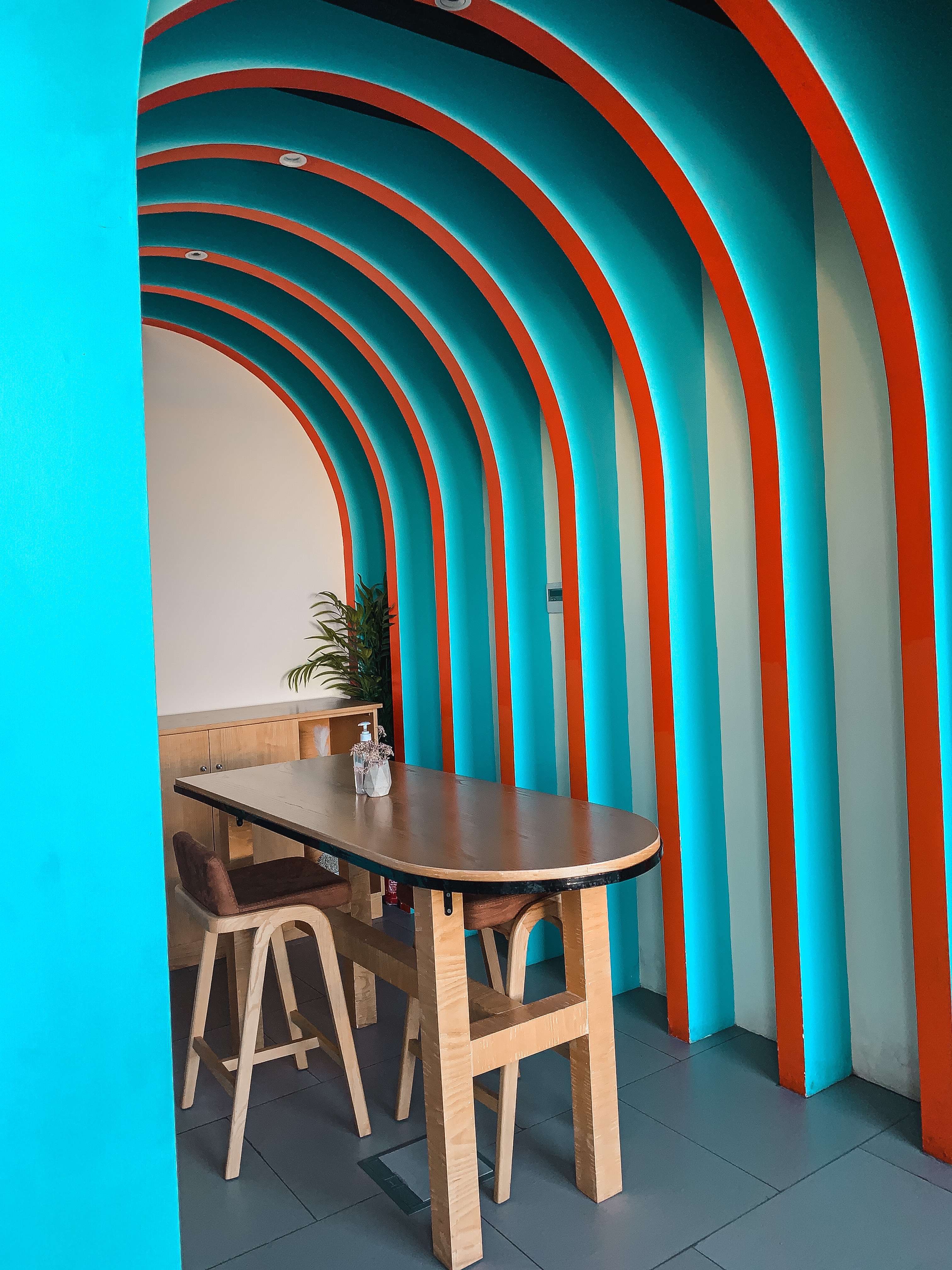
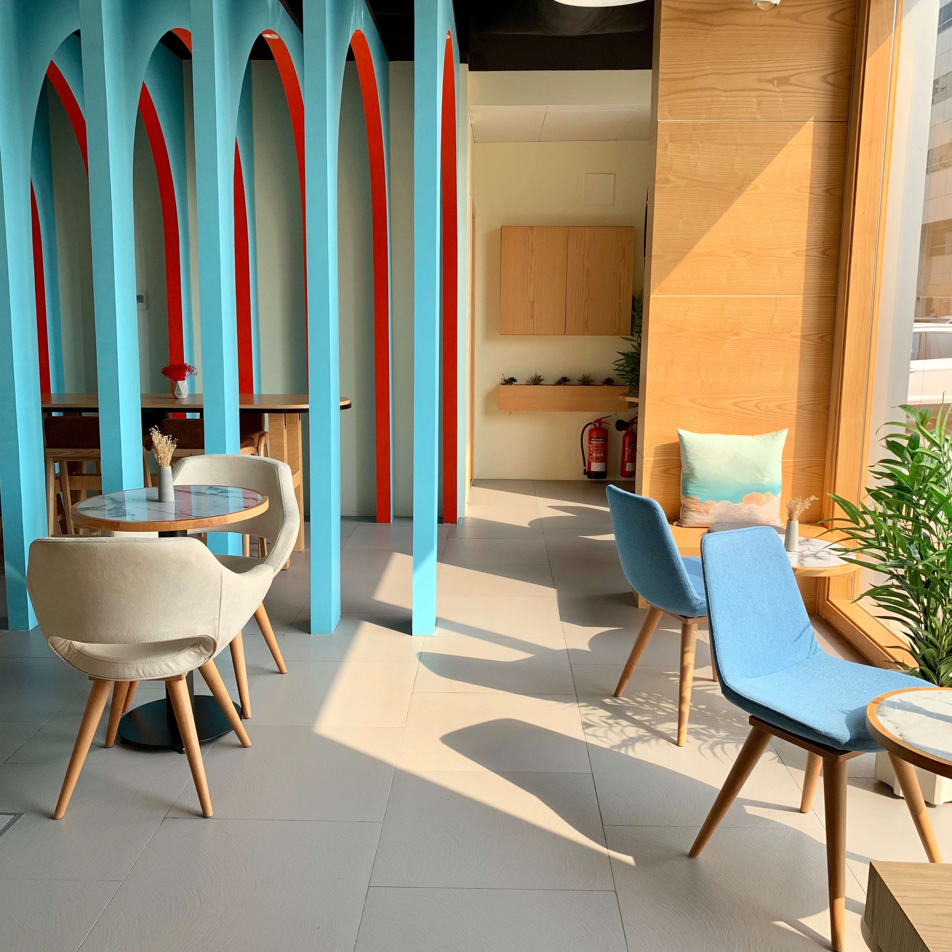
BLINK, Al Nahyan, Abu DhabiBLINK, Al Nahyan, Abu Dhabi

          I remember the first time seeing the logo for Blink, and I did not think much of it as I thought it was kind of dumb and too simple. This course has really given me an insight of the world of branding and how much the process can be complicated. When you see a visual identity at first, you might not see much and you are not always supposed to see much, as it is just a way for the brand to be memorable and distinguished. However, when you look up the reason for such a visual identity or the process you can see how much effort, consideration, and thought was put in such a logo. Some people do not realize that all these sophisticated logos out there, they all hold a story, they did not pop out in the spot. There was a process a method coming up with a logo. There is also a lot to consider and keep in mind during the process, not to mention toning things which can be sometimes harder. That is why I feel like designers got a lot of skills for them to become one, they work with all disciplines and have to adapt to different environments, not to mention huge communication and team work skills. My art professor explained how she started off from a design background and started art school, but she said she was able to utilize her design skills in art school so it was much easier and smoother. Design has so much to it from research to communication that a lot of its required skills can be utilized in many different disciplines.

         To be a designer I feel you have to be an explorer as there is just endless amount of knowledge out there you can explore to implement in design. To be an explorer is to be open to your environment, which you have to do as you are working with others and open to critique and feedback. There is just I feel like endless amount of skills can be utilized in design that it is a good thing that it is a team effort, as the more brains working on a design the better. Every idea, every discipline, every skills is required to come up with an excellent design. I have witnessed the power of intelligent and talented minds working together coming up with designs around me in class, and it was a learning and thoughtful experience to go through.


Baskin Robbins Redesign

           I was surprised to see Baskin Robbins redesigning their brand as I loved the iconic blue and pink logo with the playful typography. However, I am even more adore the change that they made. 

          I was downhearted at first to see a distinguished thing I grew up with change. I am glad a new and amazing rebrand for them and believe it was a necessary change. Change is one of my worst fears and something to avoid but other times it is something I crave and desire. Even though they have new design does not mean that the old one is forgotten, as it will still be documented in the history of the brand. The new logo is far more sophisticated and elegant, and the infamous hidden 31 in the design refers back to its origins. The old logo was a charm but it does look outdated so a change was a necessity, and the new logo looks more modern. 

          I cannot express how clever the new design is when you consider all the aspects that led to this specific design. Primarily, Dunkin’ is part of Baskin Robbins’ brand, and the new design works great and more in sync with each other. Notice by the color palette and the bold and curvy font.Download Baskin-Robbins Logo in SVG Vector or PNG File Format - Logo.wine

          The agency ChangeUp was responsible for the new design, and they managed to make the design minimalistic and simpler, but still distinctive and can be traced back to its original 1947 logo. That logo was remarkable by its circus inspired typography in pink and brown, and it really does feel like they combined both old logos to come up with this new and modern design.Baskin-Robbins Debuts a Majorly Sweet Brand Relaunch – PRINT Magazine

          Due to the design’s simplicity and refined look it look beautiful in attire. So the company now is selling its brand in merchandise such as clothing and more.Baskin-Robbins Redesign: Photos of Logo, Packaging, Merch

          Even the products are presented in new packaging and more ice cream flavors. It is even done in a smart and innovative way as the packaging when placed next to each other they can show a hidden message by playing with the design. While maintaining its formal and modern look, it is bestow playfulness and fun.

          The only aspect of the identity that has changed is the visual, but the brands beliefs and objectives are still the same. Even when the brand has adopted a new tagline, it still goes with they stand for which is to appreciate every moment whether small or big. “For more than 75 years, Baskin-Robbins has been the destination for celebrating the moments that matter most. Our new look and manifesto recognize the extraordinary role ice cream has played in our customers’ lives, along with our continued commitment to innovation and creating someone’s next favorite flavor,” said Jerid Grandinetti, Vice President of Marketing and Culinary at Baskin-Robbins. “Small moments that spark joy often get taken for granted. We’re encouraging people to pause and celebrate any moment that brings happiness with Baskin-Robbins,”(Gordon, 2022). The new tagline expresses just that with “seize the yay”, it is simple and encourages people to always aim for the fantastic.

          ChangeUp did such an amazing job with the new design, and they show in the video the different phases of the Baskin Robbins logos. You can see where and what is started from, and every step of the process until where it still now. It was done so perfectly it could have not been done any better.“Baskin-Robbins is one of those brands with the unique potential to transcend generations. They wanted the branding to deliver the quality and creativity they’ve always offered but weren’t getting credit for,” explained Ryan Brazelton, ChangeUp CCO. “They needed to create a visual identity system that was exciting for people who grew up with them and future audiences as well”(Sanchez, 2022). The new design seems to be catered for Gen Z and the upcoming generations appeal. “Revolutionizing the brand meant we had to take a step back to understand its founding principles and earliest expressions,” Brazelton said. “Leaning into their circus roots, the path to a younger yet more sophisticated identity became abundantly clear. With its mid-century vibes, the new identity system is fun and bold, retaining the ‘31’ built into the BR monogram. With a new iconic color palette as the foundation, every touchpoint, from digital to packaging to in-store, received a modern makeover. At the heart of the new system is the crave-able, Instaworthy photography of the ice cream. Everyone loves ice cream, and we wanted to set the stage to allow Baskin Robbins’ delicious ice cream to really pop right off the screen and page!”(Sanchez, 2022). 

          These are the words of the Chief Creative Officer of ChangeUp explaining the reasoning behind coming up with the design. I was fascinated by the creativity of the agency and how it states boldly in their page their endeavour,  “At ChangeUp, we drive change for fast moving brands. To us it’s about creating experiences that make people feel, think, and act differently. We believe change is not a risk, it is the answer“(2022).


References

About changeup: Retail brand experience agency. ChangeUp. (2022, March 25). Retrieved May 11, 2022, from https://changeupinc.com/about/


Gordon, C. (2022, April 8). Baskin-Robbins debuts a majorly sweet brand relaunch. PRINT Magazine. Retrieved May 11, 2022, from https://www.printmag.com/branding-identity-design/baskin-robbins-debuts-a-majorly-sweet-brand-relaunch/


Sanchez, R. (2022, April 11). Baskin-Robbins unveils new logo and visual identity from Changeup. Dieline. Retrieved May 11, 2022, from https://thedieline.com/blog/2022/4/11/baskin-robbins-unveils-new-logo-and-visual-identity-from-changeup


Reflection

           Design is to create, to execute, to implement. I have learned that design is a very integrated process. Design and the process of design has so many aspects to it, and for every design there is a story. Design is everywhere, look anywhere and you will see it, either with the chair you are sitting on or the table you are working on. We live in a world of design, and there are lots of different kinds of design. 

          I have always been interested in different kinds of design as it always grabbed my attention easily, but not enough for me to push further into its world. Even here is New York University of Abu Dhabi, design can be appreciated more as there is only a minor path to design. That is why here in the course of Yes Logo we can find people coming from different majors and interests, and lots of us come from the Art major track. I took this course as an art elective and knew what I was getting into but still did not expect what came. Reflecting on this course for the past weeks I became very interested in design, whether it came to branding, typography, or graphic design. I think it is thanks to having a skilled professor and a passionate class environment from the classmates. However, I am writing this to reflect on where I came from and where I am now, as in this moment I am considering to learn more on design and I will explain further what happened and why.

          I consider myself an aspiring Artist, and I have been into Art my whole life and drawing and expressing was with me every step of the way. I have learned a lot all these years when it comes to it, such as art principles, techniques, and methodology. Art was always there with me, and helped with allowing me to create, and I am afraid that making a career choice of it can pressure me out and take away the joy, which then opened my eyes again to design as I saw that I get the same satisfaction of creation from both of them. I know that this is not a good enough of a reason and cowardliness should not be the answer but there is more to it to explain. When going through making art I typically go through the same thinking process but not always, I would usually find a theme, figure out the composition, lastly find a way to portray everything together, and I found the same pattern in design but more and better. Basically the process to design is the same generally but more detailed, as in design there is the aspect of communication which makes the process much complicated. This aspect of communication and working as a team is what made design seem more like a rational choice of career than art, which can be a very individualistic job. 

          Both art and design share the same fundamental principles as they both communicate visually. Principles and elements such as line, shape, color, contrast, and balance can be spotted in them. Mainly of all is that they both have stories behind them, there is always a lot to discuss when it comes to a design or an art piece as take the concrete and make it abstract. The relationship of art and design can confuse people, some would say one is the other, or the other is one, but they are actually really different. I would say though that they both affect each other, and we can see that throughout the years, and in modernism.

          What was freeing about art is that it is highly subjective and perceptual, unlike design. Design is more rational as practicality is more important, and self expression is not the objective of your project. Designers get a brief from their client and have restrictive requirements, as in the end the client’s opinions comes before their own, as the client is the decision maker. With the limitations creativity is essential, also design involve lots of research, meetings, and communication which really makes you go all out and what makes it more exciting. What I found is I can still pursue my joy of art without being afraid of the pressure it can bring, while also being able to implement what I learned from it in design making. Designing gives you an experience with every design whether you made it or someone else, and it seems to be a pathway full of fun and excitement. I am clearly very new to this as I am a first year university student and been honored to have been able to meet with such skilled designers and wish to know how they all began through their journey to be able to know how it starts,


Logos and Design Trends when it come to Branding

Logos are supposed to attract and give information to the specific audience to the brand. Brands like hotel brands, restaurants, libraries, museums, amusement parks, art centers must communicate to the people to attract them to choose their brand. Its amusing how depending on what the brand is about each logo is still unique and represents their own identity. The brands kind of give off similar feeling depending on their products but remain to be completely different.  I have looked at different brands that share the same aspect and tried to look at trends and elements that is shared and if there were any noticeable patterns between them. Hotel logos would convey a sense of fanciness, elegance, and comfortability and cafe place logos would convey a sense of coziness and chillness.

(16 et al., 2020)

Hotel logos usually use a special font that are very  long to give some feeling of bougie and class to attract the people to stay with them. Class and elegance can make the customers feel more trust towards the hotel and safe to use their services and have a feeling of being guaranteed that they are gonna be treated the best. Hotel logos do not seem to use many colors if they ever use, they often use just black and white and sometimes purple which is associated with class and royalty, as this color used to be rare to find in nature before they discovered that purple can be made by mixing the primary colors blue and red.

 (Neel)

Restaurants logo trends differ depending on their type of restaurants. I noticed a trend in colors where lots of logos use red, yellow, and orange in their logos which are warm colors. Also lots of logos would include adding elements such as a fork, chef hat, knives, spoons, and ever food items like pizza and burger. These things definitely attract the hungry customer with their warm colors and the little elemental details.

(2013)

Art center logos would mostly be very abstract to give this artistic and open interpretations to the viewer, as lots of art pieces are for the viewer to interpret in his own way. The logos would be colorful and use lots of different colors, and their font would be usually bold.

(2016)

Amusement park logos are usually very fun with their color choices and include lots of fun and silly elements to them to attract the people and give them the info that they are going to have a blast going to them. Elements included here such as the ferris wheel, booths, roller coasters, dinosaurs, and water splashes. 

(2013)

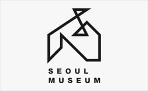
I really enjoy museum logos and amazed with their unique and fabulous design. Museum logos would mostly be very abstract and usually have the logo symbolize the architecture of the place, as museum architecture are all very unique and exciting. The symbolism of the architecture could be viewed as the use of elements.

(99designs)

Park logos use symbols of nature such as trees, animals, or the sun as elements in their logos. Same to go to lots of libraries as they use books as their main symbol for the element in the logo. Even engineering centers have elements such as hexagons, mechanical gears, charts, and even wrenches to describe what they stand for. Lots of logos share some kind of trend and pattern depending on their brand and what they stand for, but still it is important for a logo to be able to stand out from other brands“` and be unique and memorable. There are cliches to avoid but it is not bad to notice these trends and find a creative and genius way to incorporate your research to create something new and fresh that would be the logo for a brand.  

References:

15 Oxide Gallery logo assignment ideas: ? Logo, gallery, Art Gallery. Pinterest. (2013, October 2). Retrieved March 4, 2022, from https://www.pinterest.com/toifactory89/oxide-gallery-logo-assignment/


  16, N., Share Share the link Copy URL, Share, Share the link Copy URL, Fredericks, L., Laura Fredericks Laura brings a decade of insight to improving marketing, Laura brings a decade of insight to improving marketing, & Guest, C. (2020, November 16). The Ultimate Guide to Hotel Logos. Hotel Logos: 10 Must-Know Ideas, Tips, and Examples | Cvent Blog. Retrieved March 4, 2022, from https://www.cvent.com/en/blog/hospitality/hotel-logos


  9 theme park ideas: Theme Park, Logo Design, park. Pinterest. (2016, October 28). Retrieved March 4, 2022, from https://www.pinterest.com/dearmonn/theme-park/


  99designs. (n.d.). Park logos: The Best Park Logo Images. 99designs. Retrieved March 4, 2022, from https://en.99designs.pt/inspiration/logos/park


  Logo Design for seoul museum. Logo Designer. (2013, November 7). Retrieved March 4, 2022, from http://www.logo-designer.co/logo-design-for-seoul-museum/


  Neel. (n.d.). 70 creative restaurant logo design inspiration for you. Webneel.com. Retrieved March 4, 2022, from https://webneel.com/logo-design-ideas-restaurant

Logo’s Design Influence and Progression

              I have always been curious and wondering on the significance of the design of a logo. What makes it so important? As I thought that it did not matter that much, and that the company’s reputation mattered only. Learning the process of coming up with a logo design, and how serious and extensive the process is made me realize what a logo really is. 

              To some, logo design decisions may appear insignificant. However, there are several reasons why getting the design right is critical. Brands can benefit significantly from a well-designed logo. It can be used to pique consumer attention, distinguish brands from competitors, improve brand recognition, influence investor decisions, and communicate what a brand is all about. A logo is a common communication tool that can be found on your company’s products, website, annual report, entranceway, and even business cards. As a result, it is a brand element that stakeholders, notably consumers, see regularly.

             We have also learned some terms and tactics brans use, and how logos came to being. We learned what branding really is, and how familiarization is important. Furthermore, logo design elements can have a significant impact on consumer behavior and brand performance. “Simplicity makes a logo easily recognizable, versatile and memorable”(Edwards, 2021). Research on logos has found that their simplicity or complexity can impact investment decisions, and that their symmetry or asymmetry can improve brand equity.

          A recognizable logo is at the heart of each successful brand. “Think of Apple, Nike or McDonald’s and without hesitation you can visualize a fruit, a swoosh or golden arches, respectively”(Goldstein, 2022). These legendary logos, however, did not become famous overnight. These companies gradually built significant relationships with their consumers and within their sectors. They effectively catch our attention, stir our emotions, and eventually convince us to purchase their items again and again, through and thorough and intelligent branding selections and great logo designs. 

          The goal of any advertising is to first establish brand awareness, then, ideally, affection and loyalty. This may be accomplished in a variety of ways, but perhaps the finest example is found in a 113-year-old instantly recognizable symbol: the Michelin Man.

            The Michelin Man, or Bibendum as he is officially known, is a unique logo design character. He’s more of a mascot for the brand, a happy person made of tyres, lighthearted and jolly. According to design historian and curator Alain Weill, he is a product of his time in this regard. The tendency was to use certain characters, he explains. For Menier chocolate, the tiny girl, Pierrot for Cointreau, and so on…. The beautiful thing about the chubby little man made of tyres is that he may be shown in a variety of circumstances — my favorite aspect of him is the multiple conceivable forms.

               Because of the public’s fondness for Michelin Man, he has occasionally ventured beyond the world of advertising and into popular culture. Michelin recognized this early on, and in 1911, he was placed in the center of their flagship Bibendum Building in London. He appears as a chariot wheel merchant in several versions of Asterix in Switzerland (including the English translation), and he also had a significant role in the Oscar-winning animated short Logorama, in which two Michelin Cops track down a malicious Ronald McDonald.

               Aside from his inherent huggability, his continuing presence and success for the brand is largely down to his ancestors. You don’t have to consider whether a figure is good or evil once it becomes a popular symbol, Alain Weill argues. Michelin stopped using him at different times, but he always came back to him.” He’s survived for so long because of his brand, which isn’t the case for many other excellent logo creators.

                The finest logos achieve a timeless design that is more than the sum of its parts. Combining all of the elements of a strong logo—colors, typefaces, and shapes—can result in a final design that conveys your brand’s personality and values while also making an impact on anybody who sees it. Selecting the appropriate forms for your logo design is an important stage in the creative process since it establishes the basis for your brand’s statement. Determine how these forms will fit into your logo and, as a result, you’ll be able to assist your brand reach its full potential.


References:

Edwards, J. (2021, December 3). 5 key principles of logo design: Simplicity. Brand Hero. Retrieved February 13, 2022, from https://brandhero.com.au/5-key-principles-of-logo-design-simplicity/

Goldstein, K. (2022, February 12). The psychology of Logo Design: The impact of colors, shapes and fonts. Wix Blog. Retrieved February 13, 2022, from https://www.wix.com/blog/2021/10/logo-psychology/