Making logos accessible: colorblindness friendly palettes

Color is tricky. I have been wary of how some color combinations/ hues/ shades may not work in certain settings and for certain groups of people since the very beginning of this course. In my experience, the choice of the color palette is frequently left for the very end of the process. It may be easy for some people to settle on one color palette after a short deliberation, however for me, this matter can take hours (though I would love for it not to). The logo proposal that I am focused on currently is the handshake idea for the Center for Artificial Intelligence and Robotics. The handshake idea (figurative title) focuses on the product of collaboration between the machine and the human. The message is conveyed through the two intersecting abstract shapes, where the region of intersection is highlighted. As the shapes in this design are abstract and minimal, the color scheme plays an essential role in highlighting the intersection of two hands and hence is key to the successful communication of its idea. 

In this blog post, I want to focus on discussing color blindness-friendly color palettes. Color vision deficiency, more commonly color blindness, is a group of conditions that affect the perception of color. Red-green color blindness is its most common form, causing difficulties distinguishing between shades of red, yellow, and green. Blue-yellow color blindness is significantly rarer and it causes problems with differentiating dark blue from black. Color blindness is an inherited condition that affects 1 in 12 men (8%) and 1 in 200 women (0.5%). It is approximated that around 300 million people (a bit less than the population of the USA) all over the world have some form of color blindness. Since it is quite common, I think that it is important that we accommodate the visual elements of the brands that we are working on in this class accordingly. 

CAIR Handshake Idea, Proposed Logo Iterations

Above you can see the iterations of the CAIR logo proposal that I have worked on recently. Getting a bit more sense of colorblind I may guess which ones of those iterations wouldn’t work for colorblind people. I found this website that discusses color blindness in more detail and features a tool that shows what certain palettes would look like for people with different forms of colorblindness (protanopia, deuteranopia, and tritanopia). I have used this tool to test the color palette used in the final design. Below you can see the results of the testing.
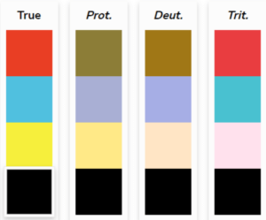
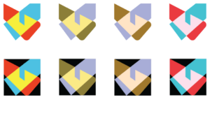
Final Proposed Design Palette Tested

Final Color Palette in Color Blind Variations

I actually think that this color palette works well for these three forms of colorblindness. Both the contrast between the three colors (red, blue, yellow) and the highlighting quality of the region of intersection are well maintained, which is the criteria by which the color scheme for this logo design was chosen. I am going to test other iterations of this design to see if other color palettes work as well as this one.
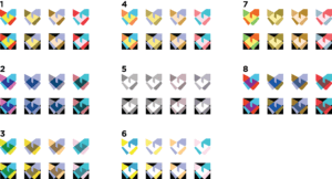
Cair Iterations Colorblind

Based on testing, I need to consider some other colors for 2nd and 8th iterations. I need more high-contrast color schemes. While blue holds well for most types of colorblindness when paired with colors close to red in hue (ex. pink and purple) there isn’t enough contrast. So, I am going to try using green and orange instead. As a result, I ended up having an updated list of iterations that you can see below.
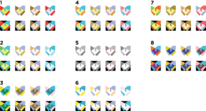
Updated colorblind iterations

As of right now, I am happy with these iterations and how well they hold for people with colorblindness. I think that taking accessibility into account is important and must be one of the things that designer keeps in mind when doing their job. I am glad that I finally looked deeper into the color perception differences that people with colorblindness experience. Since color is an important part of my design proposal I consider this to be one of the due diligence tasks. This has reminded me to check if the shades that I am picking on my computer will look differently on Mac and in print, just in case.

Below you can see some high-contrast color pairing examples to get inspiration.
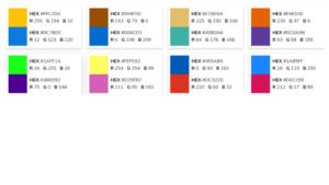
References:

https://www.tableau.com/about/blog/examining-data-viz-rules-dont-use-red-green-together#:~:text=For%20example%2C%20blue%2Forange%20is,palette%20designed%20by%20Maureen%20Stone.

https://davidmathlogic.com/colorblind/#%23FEFE62-%237DF39D

https://personal.sron.nl/~pault/

https://medlineplus.gov/genetics/condition/color-vision-deficiency/#causes
Cosimo Logo: My Second Attempt

On Wednesday we had our last impossible brief given to us by Massimiliano Sagrati and Serena Ciriello. We were given about an hour and a half to create a visual identity for Cosimo, a clothing brand by Cosimo Ippolito based in London with a DNA of Italian craftsmanship. This brief was communicated in great details, which allowed for some immediate ideas and thoughts to pop up in my head. The concepts and words that I have found important for the visual identity to include were: circularity and uniqueness. Those two stood out to me the most as Cosimo positions itself in a circular way, “stories beyond design, design beyond stories”, and through its mission and values tries to stand out from the other brands. 

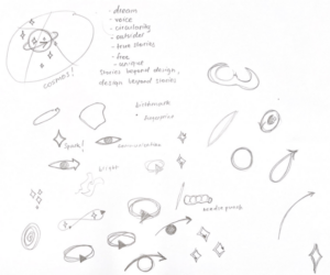
When sketching, I first write out the key words and phrases, so that I don’t lose my focus in the process and end up making a logo that is loosely connected to the brand. I was drawing lots of circles as I was thinking of circularity and it made me subsequently think of planets, eye iris, and sparks. Fast forward to the end of the second half of the workshop, I have ended up presenting this:

Initially, what I wanted to communicate with this design was the circularity of the brand. I was imagining circularity to be strictly of a circular shape, but then I have realized that it can be any continuous shape. So I have chosen a shape of a spark, which in a way is a symbol of uniqueness. It’s only after that that I have started thinking of adding something more to the design because it was just a single plain spark. I have realized that it’s outline looks like yarn or a thread and that’s when I have recalled that this brand is unique for its special Italian sawing technique, aguglia. I decided to add this little mirrored detail that looks like a needle at the inner end of the spark. By this point I have run out of time, so I had to present my design as it is. I was quite upset with the outcome because it barely looks like a logo, more like a sketch. I liked this brief quite a lot and wanted to give it some more time, which is what I am using this blog post for. 

Few things that I want to work on in my second attempt at proposing a logo for Cosimo:

  • focus on the concepts of sewing, and aguglia;
  • keep in mind that Cosimo is a clothing brand, so the final design must look like nice, clear, and recognizable on the clothes.

After some thinking and sketching on Illustrator, I came up with a few possible designs. All of them are tightly connected to the aguglia as a fish, the shape of the needle, and the letter ‘C’ (the first letter in the brand’s name). This time around, I was more confident and less lost while sketching. Getting some feedback from professor, seeing my classmates’ ideas, and settling on one idea as opposed to trying to cover multiple aspects at once contributed to this positive change. You can see my sketches below.

In all of my designs, I have used the long and sleek shape of the aguglia fish to make a letter ‘C’. I then played with the angles and the widths to create some variations of this design. As you can see, the two designs in the left column have an additional detail to make them resemble the needle eye. This way I am communicating both concepts: aguglia, and sewing.

The two designs on their right, on the other hand, only communicate the aguglia fish and have the upper part of their edge split into two to make it look like its mouth. I don’t favor these two variations, because they are too abstract and resemble a snake more than a fish. On the good side, they made me think of brands like Lacoste, PUMA, and Polo Ralph Lauren. These clothing brands have various animals illustrated in their logos and I have realized that I can do the same. For some reason, I keep forgetting that minimalism and abstraction are not the only ways to go for in a design. With this in mind, I have drawn aguglia on illustrator. You can see the image below.

I actually like this design the most out of the ones I have done so far. If I were to present my logo design again, I’d present this one and the first one in the left column from the four variations shown above.

Learning from TikTok: tips, tricks, and exercises for logo design


Watch trending videos for you | TikTok
TikTok App Logo

TikTok is a video-sharing and streaming platform, the initial primary content of which was short dancing routines. The app became available worldwide in 2018 and its popularity exploded during the COVID pandemic, which has expanded its target audience and diversified its content. With over a billion active users (Backlinko, 2022), TikTok is currently taking 6th place in the ranking of the most popular social media platforms for marketing (Statista, 2022). The wide outreach, the opportunity to interact with other users, and the freely given content creator tools make it great for the promotion of small businesses and freelance workers. Big companies enter the platform and create a completely new and refreshing image for themselves by following the app’s viral trends.

Results of “logo design” Phrase Search in TikTok App

Long before enrolling in the Yes Logo class I have stumbled upon a minute-long video in which a creator shows how they would redesign some big brand’s logo. I took a look into a few more videos by the same creator and got a misleading impression that logo design is something fast and simple. Perhaps, the artist that did these logos was skilled enough to make it look easy. I don’t remember the username of the creator, however, if you type “logo” into the search bar of TikTok, you can find lots of similar videos. The app provides its users with interesting statistics: the videos with the hashtag “logo” have a total of 4.8 billion views. Similarly, videos with the hashtag “logodesign” have 1.5 billion views cumulative. This great amount of views shows the popularity and the active presence of logo design-related content on TikTok. Out of curiosity, I have also looked up the hashtag “dog” and it has 224.8 billion views, which is a crazy but very understandable number.

In this blog post, I would like to take a look into the logo design content present on TikTok, namely the educational aspect of it. I have made a compilation of tricks, tips, and exercises that I found interesting and potentially useful. 

    1. Black & White – always work in black & white. This will make it easier for you to focus on the important aspects of the logo, such as hierarchy, contrast, and legibility. 
    2. Prioritize Legibility – as you work on your logo, your focus may shift on the little decisions. It’s easy to get carried away to the point where it’s no longer easy to read your logo. To avoid this, ask yourself at every point of your process “is it legible? does it read well?”.  
    3. Avoid The Trends – logo must be timeless, which is the exact opposite of what following trends provide. 
    4. Simplicity – don’t add an excessive amount of details that would make the logo overwhelming and difficult to memorize. 
    5. Flexible, Adjustable, Scalable – make sure that you can make it horizontal, vertical, fit in a square. It must be visible in any (reasonable) size. There are many ways in which a logo may be applied nowadays and it’s our responsibility as a designer to think those details through.
    6. Think About The Brand’s Message – make design decisions that reflect the brand’s message, values, and goals.
    7. Word Brainstorm – before drawing the logo, pick up a piece of paper, a pen, and make a list of words that associate with the business that you are designing for. Some of them may end up inspiring you.

The points above are what I have learned from watching over 10 logos design-related TikToks. I have combined some of them if they were similar in message. Overall, I think these ideas are not new to me and I have heard most of them in class. However, I haven’t compiled them into a list before, so I feel like I did not make the most use out of them when we did extreme deadline exercises in class. It’s important to organize information properly in order to retain it and possibly use it to its max potential. Relying on your memory is never a good idea, at least for me.  

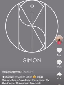
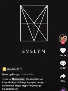
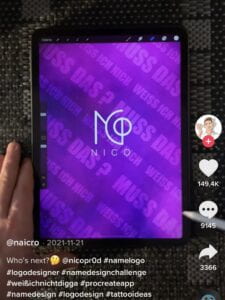
While looking for the tips and tricks, I have also noticed that there is a very popular logo design challenge, which I personally find somewhat boring. In this challenge, logo designers are asked to design logos for names suggested by the users. It is an activity similar to the one that we have done in the class. The difference is that in this case, the artist is creating a visual identity for a complete stranger and the only thing they know about them is their name, which is quite challenging. Consequently, the end product looks generic and in my opinion doesn’t communicate anything. To my surprise, this content is very well received and popular among TikTok users, which makes me think that we shouldn’t rely on the public’s eye very strongly, after all, they are not the experts of the field. On the other hand, it could be that I am missing some piece of context which makes me misjudge this type of art. I will attach some examples below so you can judge them for yourself.

To conclude my blog post, I want to say that even though platforms like TikTok may provide one with some unique insights, global perspectives, and educational information that you wouldn’t expect to find there, as not modern as it may sound, it would be more effective to read a book about the field of your interest if you are seeking to become an outstanding professional. This is something that I have realized midway through my blogpost production process. 

References:

Most popular social networks worldwide as of January 2022, ranked by number of monthly active users. https://www.statista.com/statistics/272014/global-social-networks-ranked-by-number-of-users/

TikTok User Statistics (2022). https://backlinko.com/tiktok-users

TikTok Logo. https://lf16-tiktok-common.ibytedtos.com/obj/tiktok-web-common-sg/mtact/static/images/share_img.png

Things to Consider When Making Your Logo. https://vm.tiktok.com/ZSeKvswC1/

Logo Design Tips. https://vm.tiktok.com/ZSeKc86WS/

3 Top Tips: Logo Design. https://vm.tiktok.com/ZSeKTEPBG/

Good Logo Design Tips. https://vm.tiktok.com/ZSeKTXctN/

Making a Great Logo. https://vm.tiktok.com/ZSeKTEABE/

How to Make a Logo For Your Business. https://vm.tiktok.com/ZSeKTXJkm/

Logo: Nico (screenshot taken from the video linked). https://vm.tiktok.com/ZSeKTqGkH/

Logo: Simon (screenshot taken from the video linked). https://vm.tiktok.com/ZSeKT3u1d/

Logo: Evelyn (screenshot taken from the video linked). https://vm.tiktok.com/ZSeKTnYTy/


How Long Can Logo Live: Oldest Commercial Logo

Just like people do, companies have a tendency to change over time. Some companies may be looking to develop a new brand identity, while others may want to fit in with new times and standards. Either way it is, companies, motivated by the desire to grow further and stay relevant for longer, ultimately come to rethink their visual identity. Consequent tangible modifications in their logos, mark a new chapter in the life of their products. This course of events feels natural and even rather customary, but do all of the companies take the path of change?

Both to my surprise and not, there are some brands that did not change their logos from the time they were first established. In this blog entry, I would like to talk about the oldest commercial logo in continuous use. Would you like to take a guess at what brand is it?

[SCROLL PAST THIS LINE AFTER TAKING A GUESS]


The brand that has been continuously using a logo designed in 1787 without modifying it is the British tea brand Twinings. It was founded by Thomas Twining in 1706 and is historically a tea brand that played a significant role in turning Britain into a tea-drinking country as opposed to the coffee-drinking country that it was. It took a bit more than 80 years for the brand to come up with a visual identity, which is still identifying it 235 years after.

Twinings Tea - Brand Identity - Mari Retief
On the left: enlarged picture of the Twining logo crest. On the right: Twining original logo

Twinings brand logo consists of two components: the crest and the brand name underneath. Its main goal is to communicate the respectable status of Twinings tea and to hint at a heartfelt appeal that it has as a family-owned business. The first goal is achieved through the choice of the all capitals serif font for the brand name, which gives an impression of royalness, respectability, and authority. The lion figure on the crest also communicates power and respect because of its popular image of the king of the animal world. The logo also includes a picture of a hand that is holding two serpents, which can be seen at the top of the crest. This component of the logo is subtly accomplishing the second goal of this logo as it happens to be a key element of the original crest belonging to the Twining family (The Hatchwise, 2020). Another interesting element of the crest is the writing in Latin, “fortiter ac firmiter“, which translates as “strongly and firmly”. This oxymoron intriguingly and beautifully delivers the core of the experience that the Twining tea succeeds in serving for centuries. This phrase is currently trademarked as Twinings tagline. 

Brand: Twinings & PG Tips – Compare & Contrast | CYNTHIA NEWMAN (Cece)
Twinings brand logo

Though I personally find the crest component of the logo beautiful, it is rare to see it on Twinings products nowadays. It is exchanged by the Royal Coat of Arms, the arms of the dominion of the British monarch. In 1838, the Twinings company was granted royal permission by Queen Victoria to display it in connection with their business (The Hatchwise, 2020). Displaying the Royal Coat of Arms on top of their products plays a sort of halo effect as it adds a sense of trust to this product. It’s approved by Her Majesty! The Queen of the United Kingdom and the Commonwealth! How can it not be trustworthy?

Though it is quite upsetting that the original crest is not as used anymore, I honestly didn’t notice it until I looked closely because of how both the crest and the Royal Coat of Arms are small and their details are rather hard to define unless looked at very closely. 

Twinings Teashop Coupon Code, Promo Code, Discount Code & Voucher Code for February 2022
Twinings brand logotype

One of the reasons for which companies are changing their visual identities is the clarity and legibility of the logotype. Both aspects are important for successful advertisement and digital use, as serif fonts tend to be more challenging to read from a distance or devices of different sizes (smartwatches, phones, tablets, laptops). Many luxury clothing brands and tech brands chose reading legibility over the uniqueness of visual identity.

Though Twinings is neither a clothing brand nor a tech brand, it is one of the best-selling tea brands in the world, making it important for them to adapt to the needs and tendencies of the current times to keep its position at the top. However, understandably Twinings brand chose to stick to the image that it has preserved for centuries and counting. Twinings has a stable image of a high-quality tea brand, which is proven by time. A change in the logo may make its clients assume that there was a change in its recipe and production methods as well, which is not a positive thing when the brand image is deeply intertwined with the product quality. It is also not advertised as a product for younger people, which makes it even less relevant for Twinings to follow current trends. To fulfill the needs of adapting the logo to different display formats, Twinings alternate between an arched logotype and a straight logotype. 

Twinings is a brand that celebrates its heritage through its untouched visual identity. Though changing the logo may be a risk worth taking for the younger and less established companies whose main audience is relatively young and caring of trends, I find brands who cherish their history, roots, and unique identity very charming.


References:

https://www.hatchwise.com/blog/2020/04/17/the-worlds-oldest-recorded-logos-2-twinings-tea

https://trickle.app/drip/15755-its-hard-to-pinpoint-the-worlds-oldest-brands-but-logos-and-trademarks-are-much-easier/

https://en.wikipedia.org/wiki/Royal_coat_of_arms_of_the_United_Kingdom

https://cecedesigns.files.wordpress.com/2013/03/twinings-logo.jpg

http://mariretief.co.za/wp-content/uploads/2018/03/Twinnings.jpg

https://www.justgrabdeals.com/wp-content/uploads/2019/06/twinings-aside01.png