I am currently working on a start-up with a couple other students on campus. It is a social fitness app called ‘Fitegy’ which allows members to track, share, and challenge each other in the world of fitness and wellness. At the first meeting I wanted to establish that right off the bat: is this app just for fitness, or for overall wellness? We decided as a group that it would be both fitness and wellness based, providing rewards for a run or a needed rest day. I believe this said a lot about where the branding of this product was headed, as it was more than just producing performance numbers.
When I first joined the team I wasn’t completely sold on the name. “Fitegy”, a combination of fitness and strategy to me left out the social aspect of the application. Thus, I tried to propose a way to both emphasize the community aspect, and also generate interest. I wanted to create branding that produced a feeling of “in group/out group”. I don’t mean this in a way that the app would be exclusionary, but more so in the way that if someone didn’t have the app, they would feel like they weren’t part of the “circle”. Thus, they would be psychologically incentivized to download the app and give it a try. As this product is subject to the network effect (where its services become more attractive as more people participate), this would mean progress for us.
Thus, I started to brainstorm words that dealt with fitness:
-
- core, sore, lat, push, curl, crunch, jog, fit, rows, form, sweat, kcal, press, Darwin, survival of the fittest
Then I tried to name acronyms using fitness words and terms I thought would create an “in group” feeling (ex: team, group, club, etc.) such as:
-
- CORE (club of recorded exercise)
- SORE (society of recorded exercise)
- FORM (foundation of recorded movement)
- SWEAT (social wellness, exercise, and athletics team)
- kCAL (kinetic club of athletic lifestyles)
- PRESS (public recorded exercise social society)
Unfortunately, in my opinion, none of these wowed the founder enough to stray from his original “Fitegy” branding idea. Thus, it was up to me to move on and focus on the branding with this constraint. I began by asking what kind of feeling he wanted the app to portray to its users. Tying into the wellness idea, he didn’t want this app to feel like fitness was do or die. I was specifically to avoid harsh colors like black and red, instead focusing on earth tones and smooth lines. This was aiming at giving the client a feeling that workouts aren’t daunting and that there is no pressure to do anything they don’t feel comfortable with. The motivation should come from the social/fun aspect of wellness instead of fear or pressure.
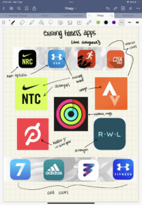
The next step for me was to study our competitors through due diligence to see if there was any obvious branding trends the existing apps followed. As you can see below, there is quite a spread. Nothing particularly jumped out to me from the market as a whole, but I did notice a few trends to stay mindful of.
-
- acronyms
- running-specific apps
- using existing brands (app is just a spin-off)
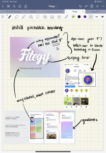
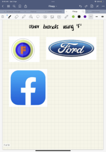
Next I received a copy of our initial pitch-deck. This is where I really saw the branding begin to take shape. The founder pivoted from earth tones and dove into colorful gradients. He selected a scripty, soft-lined font that in my opinion worked really well to convey the feelings he was going for. The visual felt fun and flirty without losing its maturity. However, I did note that the “F” looked a bit like the “F” in the Ford logo (shown below). Also, if we wanted to use just the F in our branding, we had to be careful with existing brands who do this such as Facebook and Frich (a social money app out of NYUAD).
So, then I began with some initial sketches on my iPad.
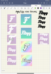
I presented this to the group and it was taken really well. The two favorites from this were both of the blue and green gradient images. This was very exciting. At this point I felt very confident and comfortable using the script as the logo, but I wanted to push myself to think of potential image based marks. So, the next step was creating a mood board.
The themes I wanted to highlight were the scripty font, teamwork collaboration, achievements, and the social aspect. You can see what I came up with below.
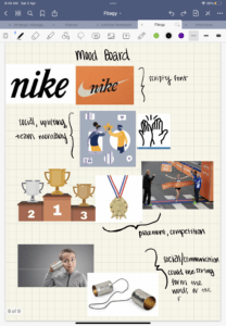
Then, I translated these to some very rough sketches on my iPad. I particularly like the top design (using the string on the can to spell out Fitegy) and the bottom design (incorporating the tape runners break when they cross the finish line and win the race).
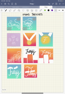
Even after all of these sketches, I still feel like the word-mark holds the most potential. Nevertheless, I presented the newest sketches to my group.
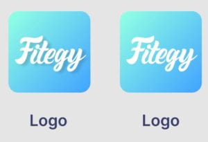
When I presented, they too found the word-mark to be most pleasing for the logo. Thus, after changing the gradient a bit, we decided on two final versions: one with a shadow and one without a shadow. We prefer the one without, but the shadow increased readability. We are still deciding.
Thank you so much for your very insightful post. Let me just say how much I appreciate and really like seeing my peers create something from scratch like a start-up they are really passionate about. The hard work and the intense thought-process behind this is very clear. In my opinion, I like the logo with the drop shadow, as it looks more refined.
Well done! I love watching your sketches and learning about the whole story of the logo creation. I will add one point to your due diligence, it reminds me a bit of the canva logo.
Oooh I didn’t even think about Canva. Good catch! I will discuss with my team
Your design is really beautiful and thank you for sharing your work process it was really insightful. Your process showed consideration and lots of steps on how you went through it. All the ideas you presented were awesome and the way you handled the feedback from the client is amazing and shows adaptation, great qualities of a designer, great job Megan.
Thank you for sharing your brand deisgn work outside of the class. I appreciate how you think carefully about how the core function of the app and how users would be interacting with this app, rather than making something “pretty” or on “trendy”.
Fitegy logo’s gradation also reminds me of Instagram Logo and this fits well to the purpose because Fitigy is at one hand health application but also a social media platform with its focus on “community”. I am excited to try out the app and see the overall look and feel of this app. Great work, really impressive!
This is so impressive, Megan! I loved reading about your design process and think that the final logo along with the colors and shapes you chose work very well together to convey the app’s initial purpose. Similar to Marta, I also think that it looks a lit bit like the Canva logo. Maybe try changing the background color? Good job on this!