Logos are supposed to attract and give information to the specific audience to the brand. Brands like hotel brands, restaurants, libraries, museums, amusement parks, art centers must communicate to the people to attract them to choose their brand. Its amusing how depending on what the brand is about each logo is still unique and represents their own identity. The brands kind of give off similar feeling depending on their products but remain to be completely different. I have looked at different brands that share the same aspect and tried to look at trends and elements that is shared and if there were any noticeable patterns between them. Hotel logos would convey a sense of fanciness, elegance, and comfortability and cafe place logos would convey a sense of coziness and chillness. 
(16 et al., 2020)
Hotel logos usually use a special font that are very long to give some feeling of bougie and class to attract the people to stay with them. Class and elegance can make the customers feel more trust towards the hotel and safe to use their services and have a feeling of being guaranteed that they are gonna be treated the best. Hotel logos do not seem to use many colors if they ever use, they often use just black and white and sometimes purple which is associated with class and royalty, as this color used to be rare to find in nature before they discovered that purple can be made by mixing the primary colors blue and red.
 (Neel)
Restaurants logo trends differ depending on their type of restaurants. I noticed a trend in colors where lots of logos use red, yellow, and orange in their logos which are warm colors. Also lots of logos would include adding elements such as a fork, chef hat, knives, spoons, and ever food items like pizza and burger. These things definitely attract the hungry customer with their warm colors and the little elemental details. 
(2013)
Art center logos would mostly be very abstract to give this artistic and open interpretations to the viewer, as lots of art pieces are for the viewer to interpret in his own way. The logos would be colorful and use lots of different colors, and their font would be usually bold. 
(2016)
Amusement park logos are usually very fun with their color choices and include lots of fun and silly elements to them to attract the people and give them the info that they are going to have a blast going to them. Elements included here such as the ferris wheel, booths, roller coasters, dinosaurs, and water splashes. 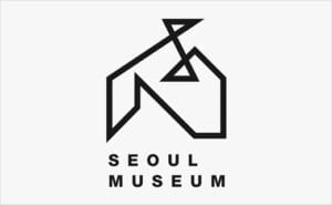
(2013)
I really enjoy museum logos and amazed with their unique and fabulous design. Museum logos would mostly be very abstract and usually have the logo symbolize the architecture of the place, as museum architecture are all very unique and exciting. The symbolism of the architecture could be viewed as the use of elements. 
(99designs)
Park logos use symbols of nature such as trees, animals, or the sun as elements in their logos. Same to go to lots of libraries as they use books as their main symbol for the element in the logo. Even engineering centers have elements such as hexagons, mechanical gears, charts, and even wrenches to describe what they stand for. Lots of logos share some kind of trend and pattern depending on their brand and what they stand for, but still it is important for a logo to be able to stand out from other brands“` and be unique and memorable. There are cliches to avoid but it is not bad to notice these trends and find a creative and genius way to incorporate your research to create something new and fresh that would be the logo for a brand.
References:
15 Oxide Gallery logo assignment ideas: ? Logo, gallery, Art Gallery. Pinterest. (2013, October 2). Retrieved March 4, 2022, from https://www.pinterest.com/toifactory89/oxide-gallery-logo-assignment/
16, N., Share Share the link Copy URL, Share, Share the link Copy URL, Fredericks, L., Laura Fredericks Laura brings a decade of insight to improving marketing, Laura brings a decade of insight to improving marketing, & Guest, C. (2020, November 16). The Ultimate Guide to Hotel Logos. Hotel Logos: 10 Must-Know Ideas, Tips, and Examples | Cvent Blog. Retrieved March 4, 2022, from https://www.cvent.com/en/blog/hospitality/hotel-logos
9 theme park ideas: Theme Park, Logo Design, park. Pinterest. (2016, October 28). Retrieved March 4, 2022, from https://www.pinterest.com/dearmonn/theme-park/
99designs. (n.d.). Park logos: The Best Park Logo Images. 99designs. Retrieved March 4, 2022, from https://en.99designs.pt/inspiration/logos/park
Logo Design for seoul museum. Logo Designer. (2013, November 7). Retrieved March 4, 2022, from http://www.logo-designer.co/logo-design-for-seoul-museum/
Neel. (n.d.). 70 creative restaurant logo design inspiration for you. Webneel.com. Retrieved March 4, 2022, from https://webneel.com/logo-design-ideas-restaurant